Scatter Plots A graph of a set of
- Slides: 34

Scatter Plots A graph of a set of data pairs (x, y)

Correlation Coefficient, r A number, denoted by r, from 1 to 1 that measures the strength and direction of a linear relationship between two variables

3 Types of Correlation Positive Negative No Correlation

Positive Correlation Relationship between paired data when y tends to increase as x increases

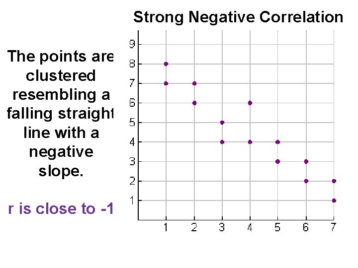
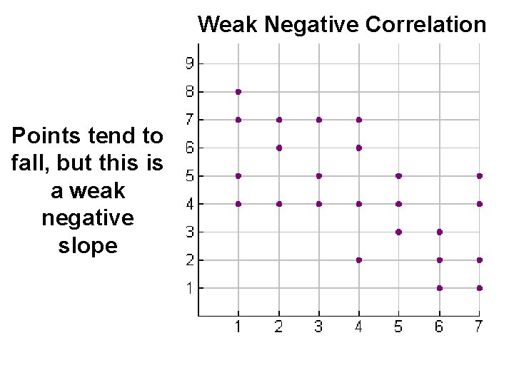
Negative Correlation Relationship between paired data when y tends to decrease as x increases

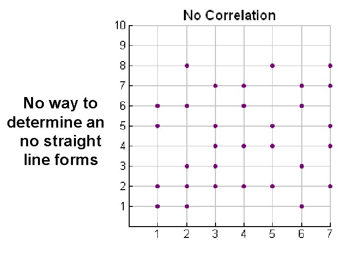
No Correlation (or Zero Correlation) The points do not lie close to any line

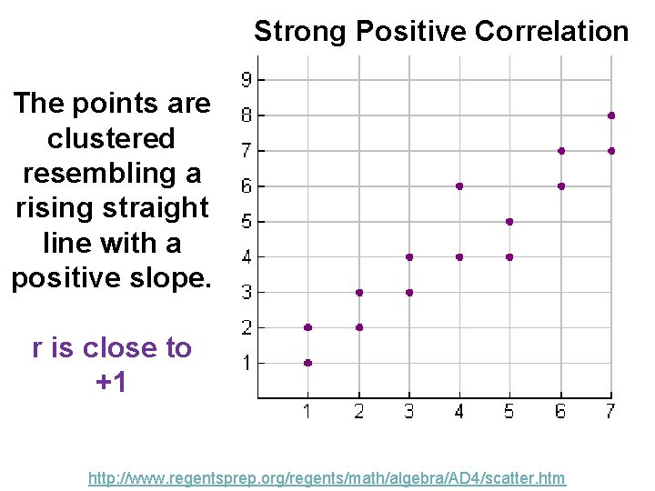
Strong Positive Correlation The points are clustered resembling a rising straight line with a positive slope. r is close to +1 http: //www. regentsprep. org/regents/math/algebra/AD 4/scatter. htm

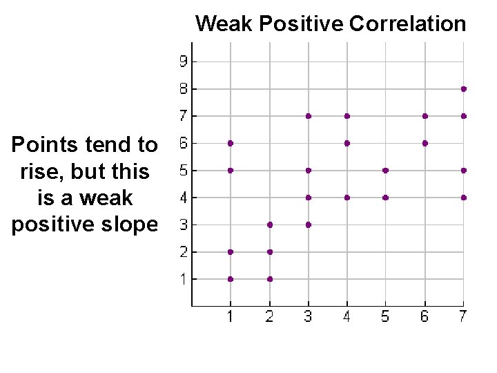
Weak Positive Correlation Points tend to rise, but this is a weak positive slope

Strong Negative Correlation The points are clustered resembling a falling straight line with a negative slope. r is close to -1

Weak Negative Correlation Points tend to fall, but this is a weak negative slope

No way to determine and no straight line forms

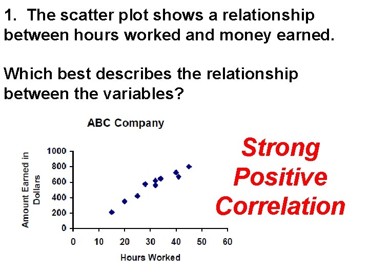
1. The scatter plot shows a relationship between hours worked and money earned. Which best describes the relationship between the variables? Strong Positive Correlation

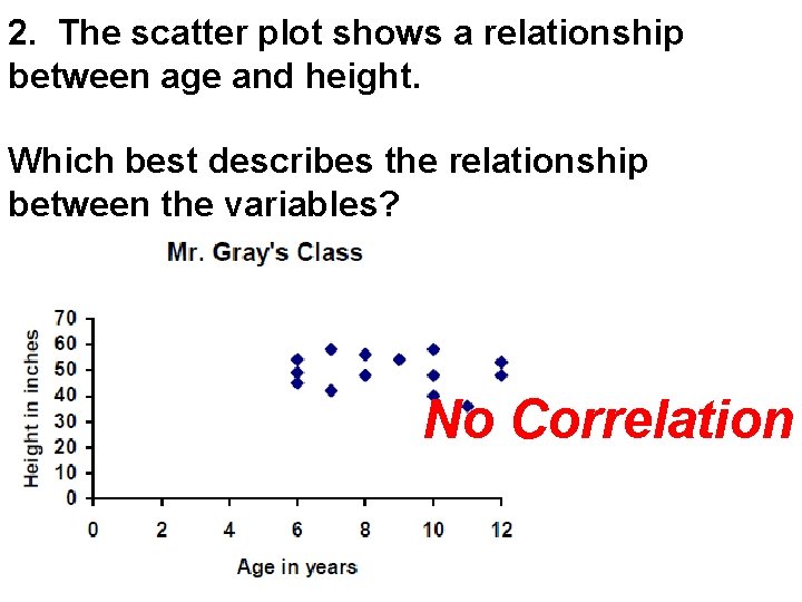
2. The scatter plot shows a relationship between age and height. Which best describes the relationship between the variables? No Correlation

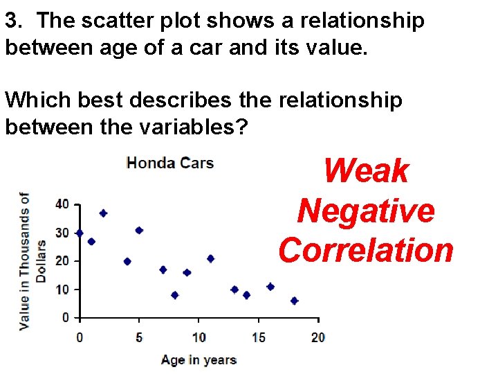
3. The scatter plot shows a relationship between age of a car and its value. Which best describes the relationship between the variables? Weak Negative Correlation

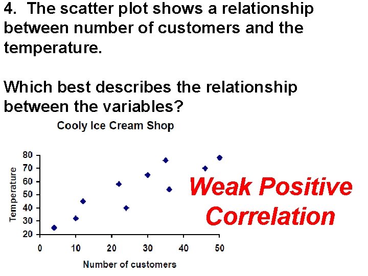
4. The scatter plot shows a relationship between number of customers and the temperature. Which best describes the relationship between the variables? Weak Positive Correlation

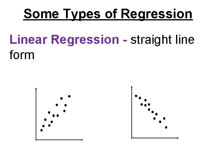
Some Types of Regression Linear Regression - straight line form

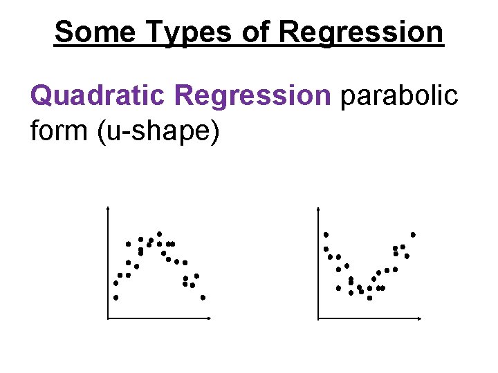
Some Types of Regression Quadratic Regression parabolic form (u-shape)

Linear Regression A method for finding the equation of the best-fitting line,

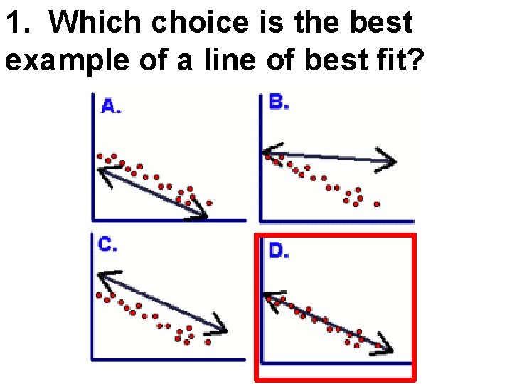
1. Which choice is the best example of a line of best fit?

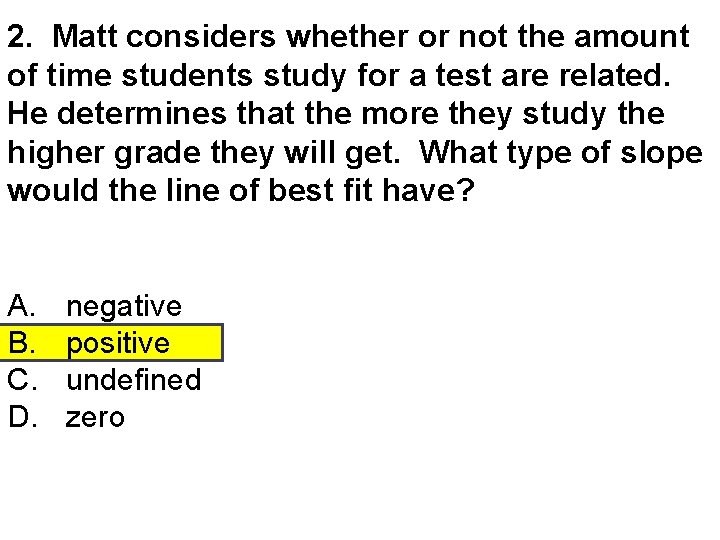
2. Matt considers whether or not the amount of time students study for a test are related. He determines that the more they study the higher grade they will get. What type of slope would the line of best fit have? A. B. C. D. negative positive undefined zero

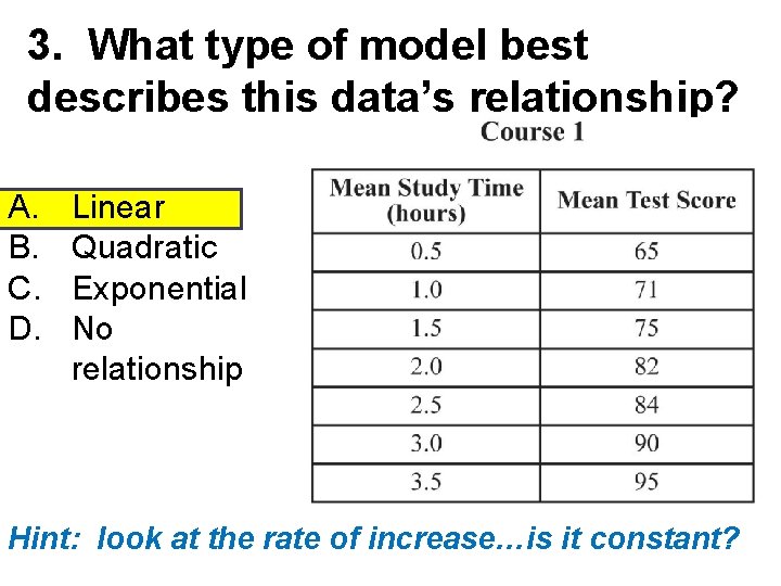
3. What type of model best describes this data’s relationship? A. B. C. D. Linear Quadratic Exponential No relationship Hint: look at the rate of increase…is it constant?

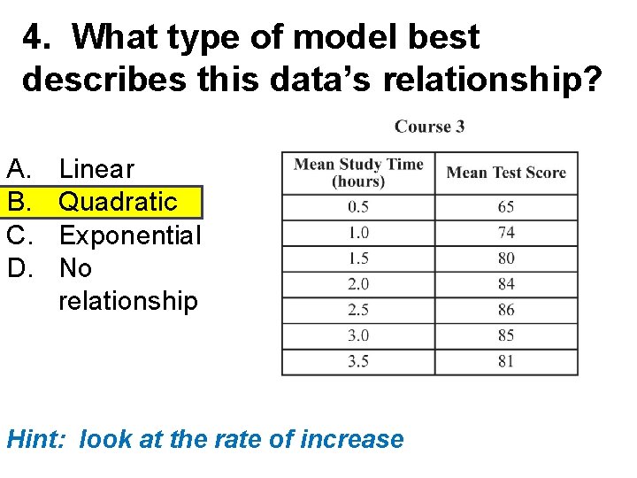
4. What type of model best describes this data’s relationship? A. B. C. D. Linear Quadratic Exponential No relationship Hint: look at the rate of increase

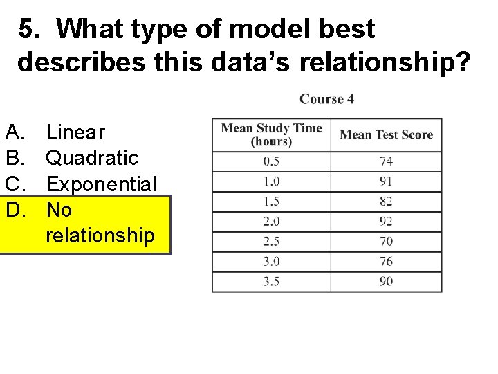
5. What type of model best describes this data’s relationship? A. B. C. D. Linear Quadratic Exponential No relationship

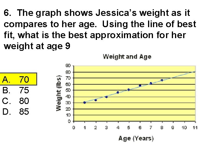
6. The graph shows Jessica’s weight as it compares to her age. Using the line of best fit, what is the best approximation for her weight at age 9 A. B. C. D. 70 75 80 85

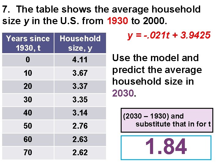
7. The table shows the average household size y in the U. S. from 1930 to 2000. y = -. 021 t + 3. 9425 Years since Household 1930, t 0 size, y 4. 11 10 3. 67 20 3. 37 30 3. 35 40 3. 14 50 2. 76 60 2. 63 70 2. 62 Use the model and predict the average household size in 2030. (2030 – 1930) and substitute that in for t 1. 84

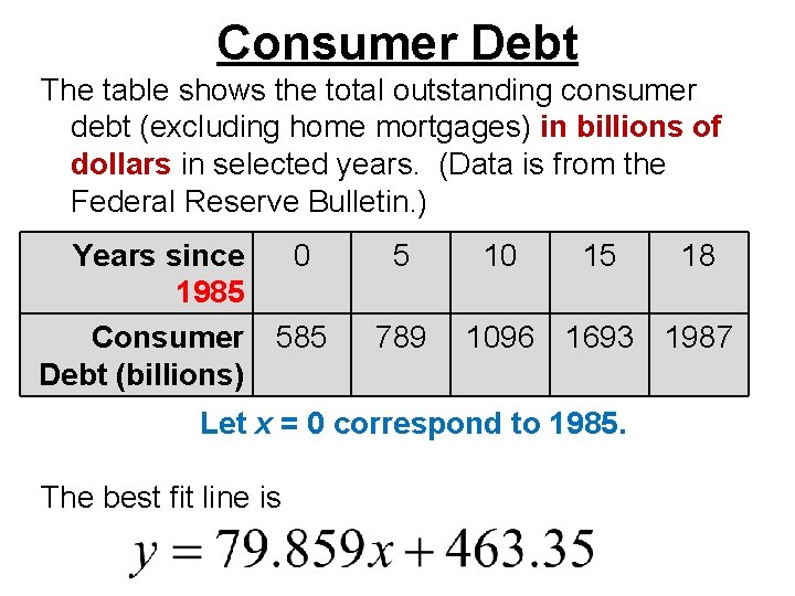
Consumer Debt The table shows the total outstanding consumer debt (excluding home mortgages) in billions of dollars in selected years. (Data is from the Federal Reserve Bulletin. ) Years since 1985 Consumer Debt (billions) 0 5 585 789 10 15 1096 1693 1987 Let x = 0 correspond to 1985. The best fit line is 18

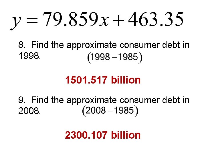
8. Find the approximate consumer debt in 1998. 1501. 517 billion 9. Find the approximate consumer debt in 2008. 2300. 107 billion

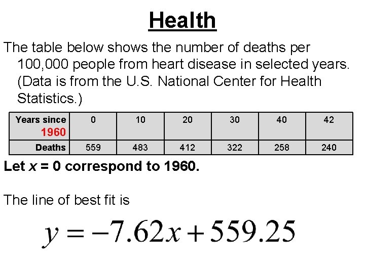
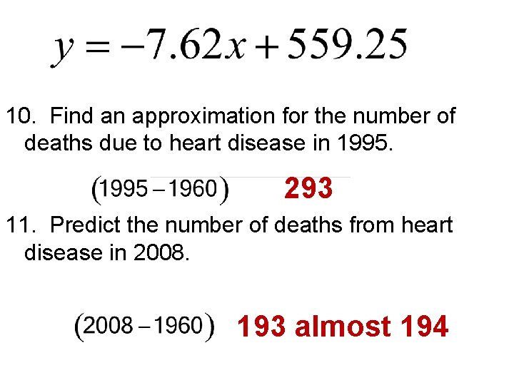
Health The table below shows the number of deaths per 100, 000 people from heart disease in selected years. (Data is from the U. S. National Center for Health Statistics. ) Years since 0 10 20 30 40 42 559 483 412 322 258 240 1960 Deaths Let x = 0 correspond to 1960. The line of best fit is

10. Find an approximation for the number of deaths due to heart disease in 1995. 293 11. Predict the number of deaths from heart disease in 2008. 193 almost 194

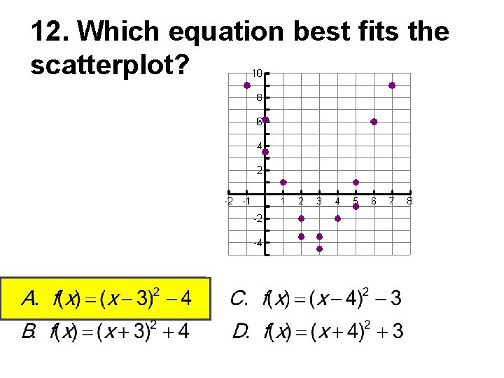
12. Which equation best fits the scatterplot?

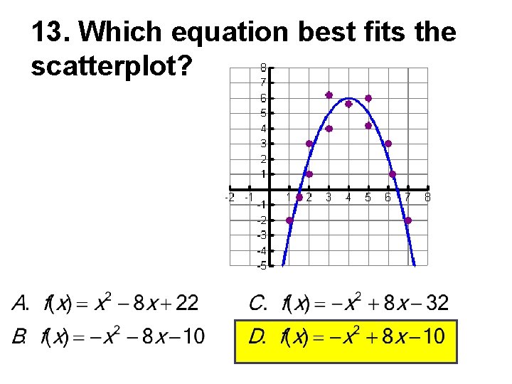
13. Which equation best fits the scatterplot?

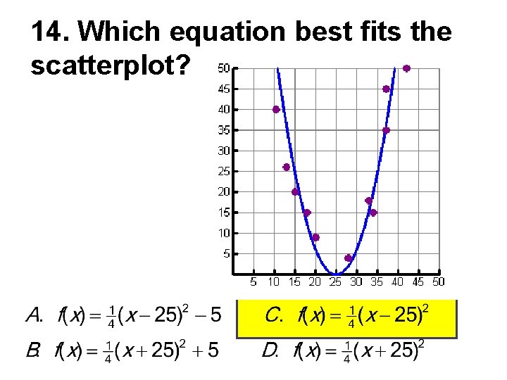
14. Which equation best fits the scatterplot?

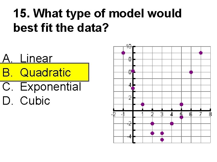
15. What type of model would best fit the data? A. B. C. D. Linear Quadratic Exponential Cubic

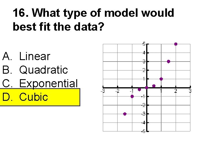
16. What type of model would best fit the data? A. B. C. D. Linear Quadratic Exponential Cubic