Scatter Plot 3 Notes 2619 Example 1 Housing

- Slides: 12

Scatter Plot 3 Notes 2/6/19

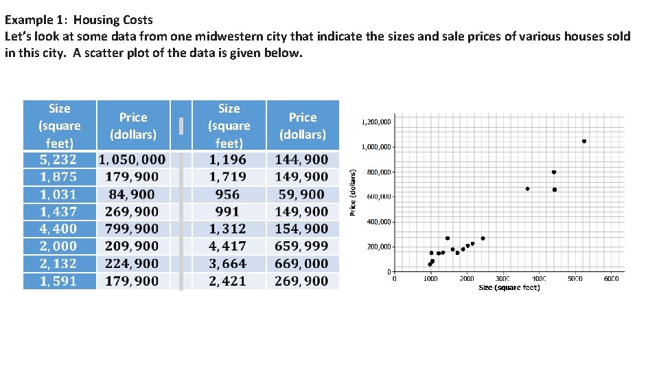
Example 1: Housing Costs Let’s look at some data from one midwestern city that indicate the sizes and sale prices of various houses sold in this city. A scatter plot of the data is given below. Size (square feet) Price (dollars)


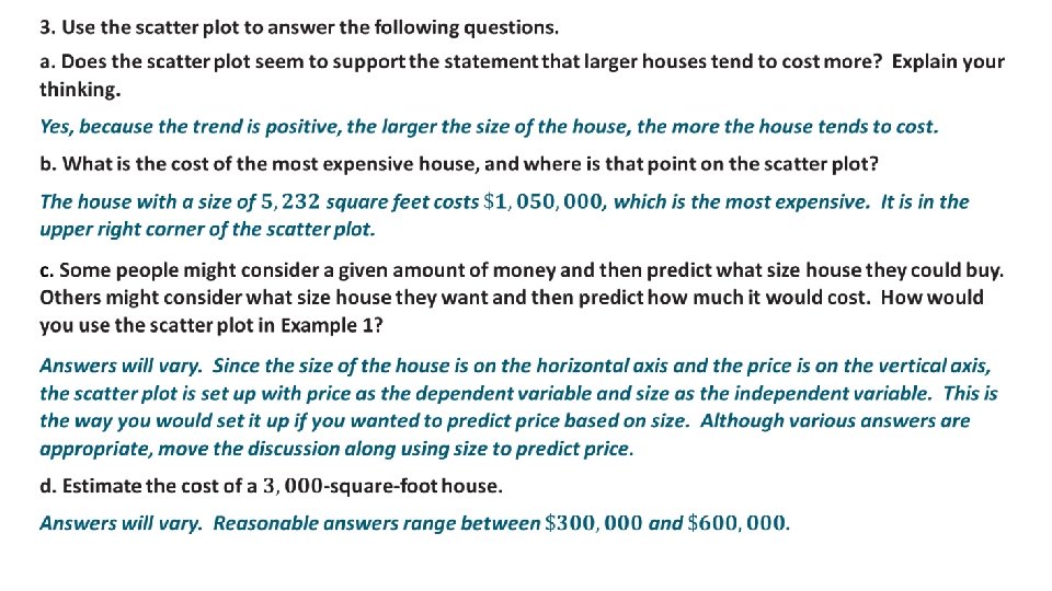
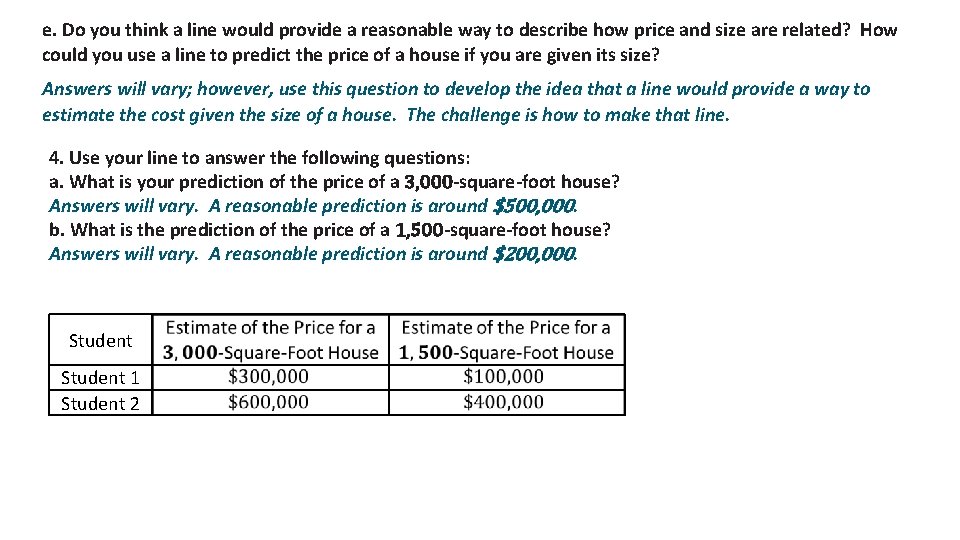
e. Do you think a line would provide a reasonable way to describe how price and size are related? How could you use a line to predict the price of a house if you are given its size? Answers will vary; however, use this question to develop the idea that a line would provide a way to estimate the cost given the size of a house. The challenge is how to make that line. 4. Use your line to answer the following questions: a. What is your prediction of the price of a 3, 000 -square-foot house? Answers will vary. A reasonable prediction is around $500, 000. b. What is the prediction of the price of a 1, 500 -square-foot house? Answers will vary. A reasonable prediction is around $200, 000. Student 1 Student 2

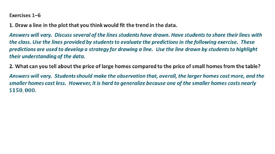
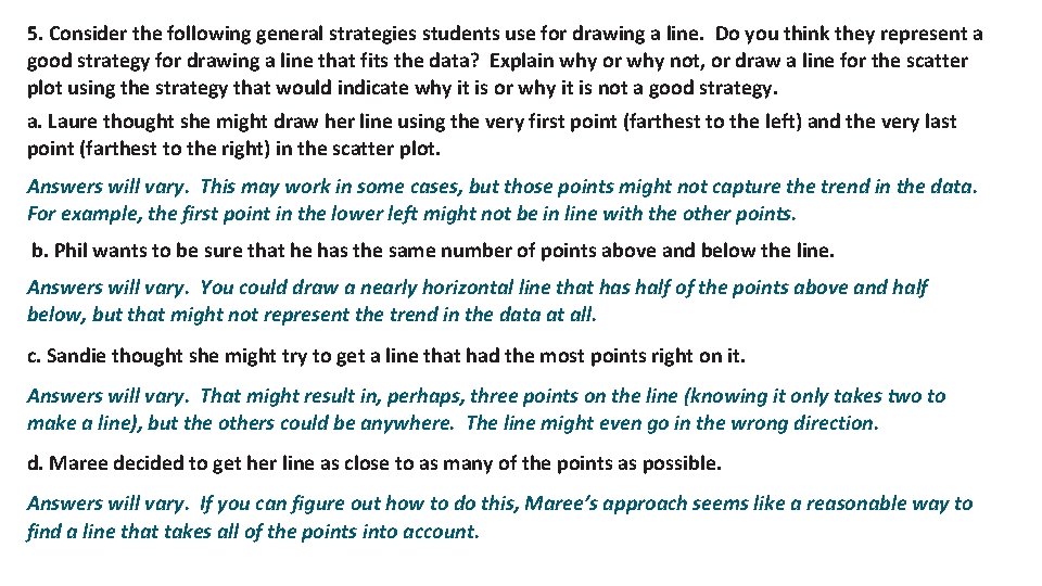
5. Consider the following general strategies students use for drawing a line. Do you think they represent a good strategy for drawing a line that fits the data? Explain why or why not, or draw a line for the scatter plot using the strategy that would indicate why it is or why it is not a good strategy. a. Laure thought she might draw her line using the very first point (farthest to the left) and the very last point (farthest to the right) in the scatter plot. Answers will vary. This may work in some cases, but those points might not capture the trend in the data. For example, the first point in the lower left might not be in line with the other points. b. Phil wants to be sure that he has the same number of points above and below the line. Answers will vary. You could draw a nearly horizontal line that has half of the points above and half below, but that might not represent the trend in the data at all. c. Sandie thought she might try to get a line that had the most points right on it. Answers will vary. That might result in, perhaps, three points on the line (knowing it only takes two to make a line), but the others could be anywhere. The line might even go in the wrong direction. d. Maree decided to get her line as close to as many of the points as possible. Answers will vary. If you can figure out how to do this, Maree’s approach seems like a reasonable way to find a line that takes all of the points into account.

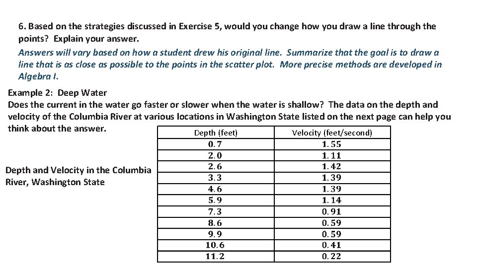
6. Based on the strategies discussed in Exercise 5, would you change how you draw a line through the points? Explain your answer. Answers will vary based on how a student drew his original line. Summarize that the goal is to draw a line that is as close as possible to the points in the scatter plot. More precise methods are developed in Algebra I. Example 2: Deep Water Does the current in the water go faster or slower when the water is shallow? The data on the depth and velocity of the Columbia River at various locations in Washington State listed on the next page can help you think about the answer. Depth (feet) Velocity (feet/second) Depth and Velocity in the Columbia River, Washington State

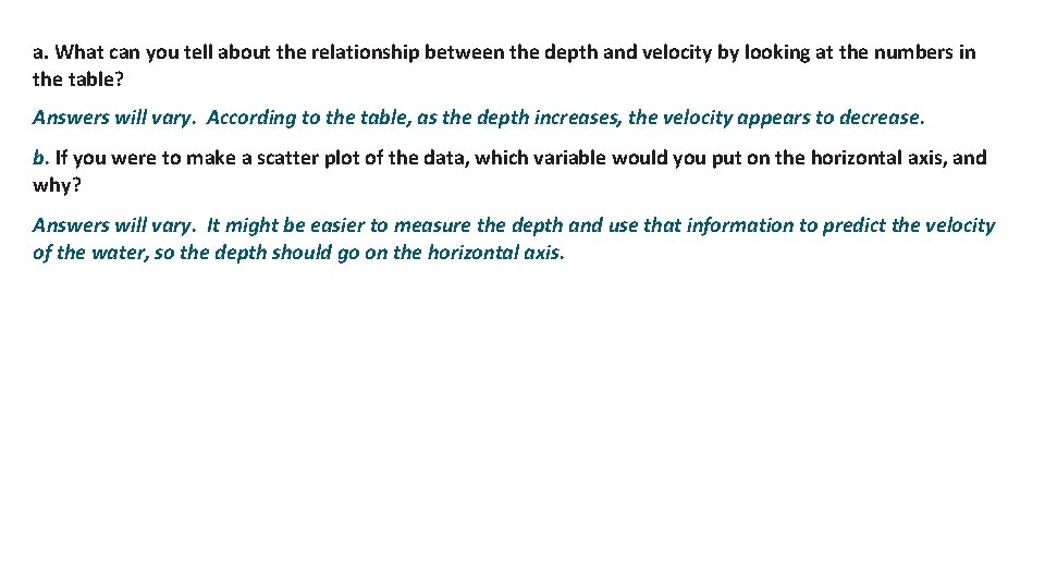
a. What can you tell about the relationship between the depth and velocity by looking at the numbers in the table? Answers will vary. According to the table, as the depth increases, the velocity appears to decrease. b. If you were to make a scatter plot of the data, which variable would you put on the horizontal axis, and why? Answers will vary. It might be easier to measure the depth and use that information to predict the velocity of the water, so the depth should go on the horizontal axis.

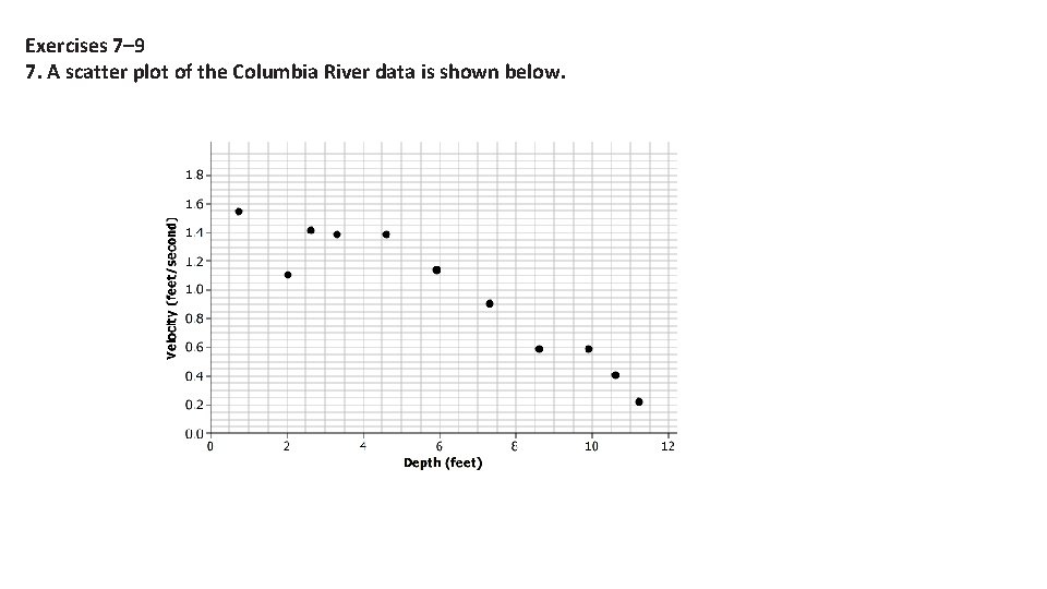
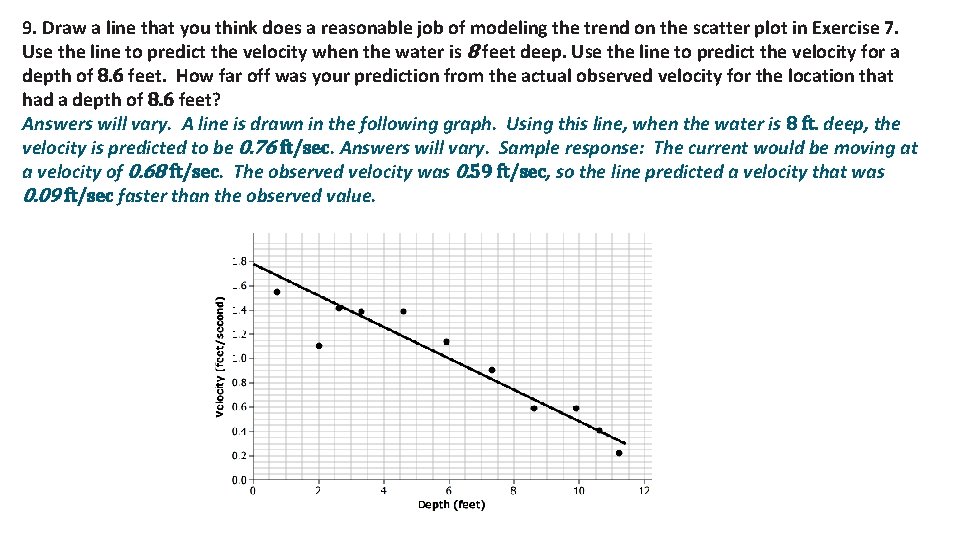
Exercises 7– 9 7. A scatter plot of the Columbia River data is shown below.


9. Draw a line that you think does a reasonable job of modeling the trend on the scatter plot in Exercise 7. Use the line to predict the velocity when the water is 8 feet deep. Use the line to predict the velocity for a depth of 8. 6 feet. How far off was your prediction from the actual observed velocity for the location that had a depth of 8. 6 feet? Answers will vary. A line is drawn in the following graph. Using this line, when the water is 8 ft. deep, the velocity is predicted to be 0. 76 ft/sec. Answers will vary. Sample response: The current would be moving at a velocity of 0. 68 ft/sec. The observed velocity was 0. 59 ft/sec, so the line predicted a velocity that was 0. 09 ft/sec faster than the observed value.

How do scatter plots and tables of data differ in helping you understand the “story” when looking at bivariate numerical data? The numbers in a table can give you a sense of how big or small the values are, but it is easier to see a relationship between the variables in a scatter plot. What is the difference between predicting an outcome by looking at a scatter plot and predicting the outcome using a line that models the trend? When you look at the plot, the points are sometimes very spread out, and for a given value of an independent variable, some values you might be interested in may not be included in the data set. Using a line takes all of the points into consideration, and your prediction is based on an overall pattern rather than just one or two points. In a scatter plot, which variable goes on the horizontal axis, and which goes on the vertical axis? The independent variable (or the variable not changed by other variables) goes on the horizontal axis, and the dependent variable (or the variable to be predicted by the independent variable) goes on the vertical axis.