Scatter graphs Use and interpret scatter graphs If
- Slides: 20

Scatter graphs Use and interpret scatter graphs If you have any questions regarding these resources or come across any errors, please contact helpful-report@pixl. org. uk

Key vocabulary Line of best fit Relationship Predict Estimate Trend Variable Bivariate data Positive/negative/no correlation Outlier

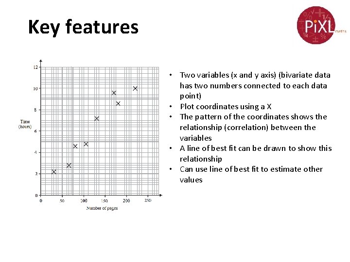
Key features • Two variables (x and y axis) (bivariate data has two numbers connected to each data point) • Plot coordinates using a X • The pattern of the coordinates shows the relationship (correlation) between the variables • A line of best fit can be drawn to show this relationship • Can use line of best fit to estimate other values

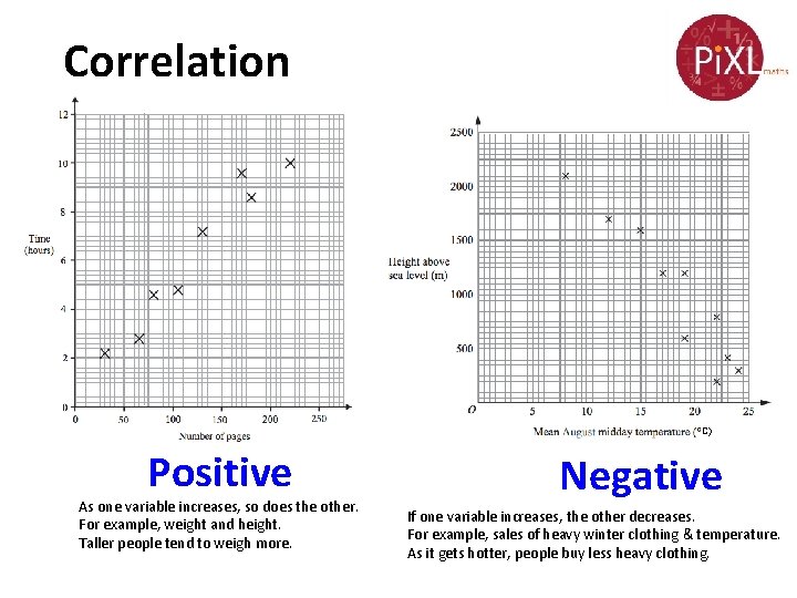
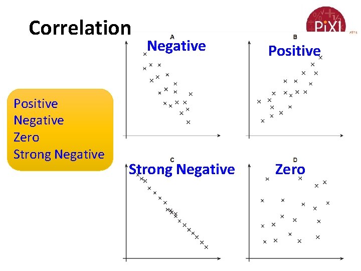
Correlation C) Positive As one variable increases, so does the other. For example, weight and height. Taller people tend to weigh more. Negative If one variable increases, the other decreases. For example, sales of heavy winter clothing & temperature. As it gets hotter, people buy less heavy clothing.

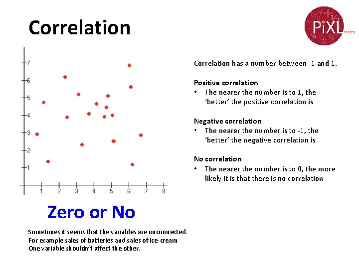
Correlation has a number between -1 and 1. Positive correlation • The nearer the number is to 1, the ‘better’ the positive correlation is Negative correlation • The nearer the number is to -1, the ‘better’ the negative correlation is No correlation • The nearer the number is to 0, the more likely it is that there is no correlation Zero or No Sometimes it seems that the variables are unconnected. For example sales of batteries and sales of ice-cream One variable shouldn’t affect the other.

Correlation Positive Negative Zero Strong Negative Positive Zero

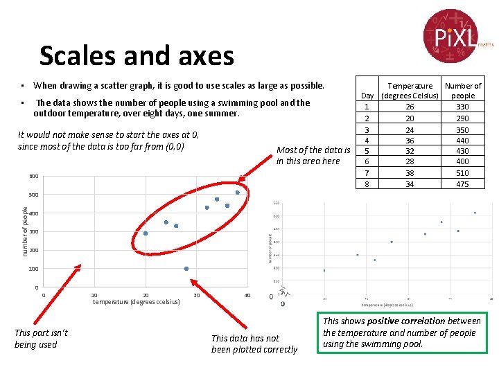
Scales and axes • When drawing a scatter graph, it is good to use scales as large as possible. • The data shows the number of people using a swimming pool and the outdoor temperature, over eight days, one summer. It would not make sense to start the axes at 0, since most of the data is too far from (0, 0) Most of the data is in this area here 600 Temperature Number of Day (degrees Celsius) people 1 26 330 2 20 290 3 24 350 4 36 440 5 32 430 6 28 400 7 38 510 8 34 475 number of people 500 400 300 200 100 0 0 This part isn’t being used 10 20 temperature (degrees ccelsius) 30 40 This data has not been plotted correctly This shows positive correlation between the temperature and number of people using the swimming pool.

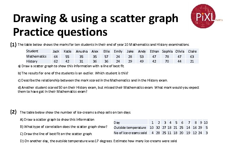
Drawing & using a scatter graph Practice questions (1) The table below shows the marks for ten students in their end of year 10 Mathematics and History examinations. Student Jack Katie Anusha Alex Ellie Emily Jake Mathematics 64 55 35 35 57 24 28 History 62 42 31 36 36 24 29 a) Draw a scatter graph to show this information with a line of best fit. Andy 53 49 Ethan Sophia Olivia 47 78 47 42 70 44 Claire 63 21 b) The results for one of the students is an outlier. Which student is this? c) Describe the relationship between the mark scored in the Mathematics and in the History exam. d) Another student scored 50 on their History exam, but missed their Mathematics exam. What mark would you expect them to have got in their Mathematics exam? (2) The table below show the number of ice-creams a shop sells on ten days. A) Draw a scatter graph to show this information B) What type of correlation does the scatter graph show? C) Draw the line of best fit on the scatter graph. Day 1 2 3 4 5 6 7 8 9 10 Outside temperature 10 32 27 18 21 25 14 16 29 5 No of ice-creams sold 4 28 25 11 18 20 19 12 24 3 D) On another day, the outside temperature was 17 degrees. Estimate how many ice-creams were sold.

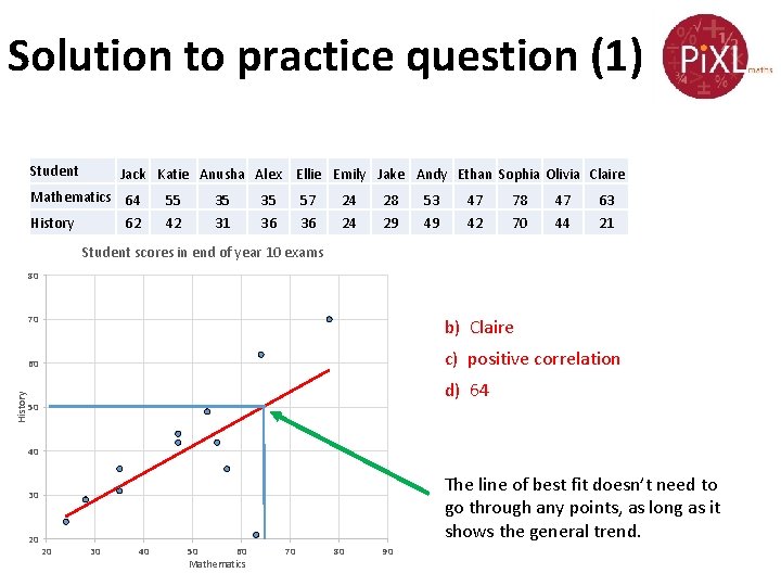
Solution to practice question (1) Student Jack Katie Anusha Alex Ellie Emily Jake Andy Ethan Sophia Olivia Claire Mathematics 64 History 62 55 42 35 31 35 36 57 36 24 24 28 29 53 49 47 42 78 70 47 44 63 21 Student scores in end of year 10 exams 80 70 b) Claire c) positive correlation 60 History d) 64 50 40 The line of best fit doesn’t need to go through any points, as long as it shows the general trend. 30 20 20 30 40 50 60 Mathematics 70 80 90

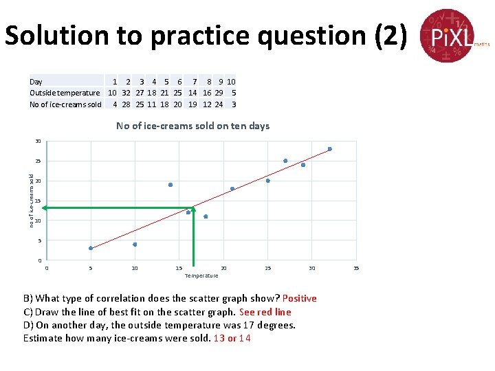
Solution to practice question (2) Day 1 2 3 4 5 6 7 8 9 10 Outside temperature 10 32 27 18 21 25 14 16 29 5 No of ice-creams sold 4 28 25 11 18 20 19 12 24 3 No of ice-creams sold on ten days 30 no of ice-creams sold 25 20 15 10 5 0 0 5 10 15 Temperature 20 25 30 B) What type of correlation does the scatter graph show? Positive C) Draw the line of best fit on the scatter graph. See red line D) On another day, the outside temperature was 17 degrees. Estimate how many ice-creams were sold. 13 or 14 35

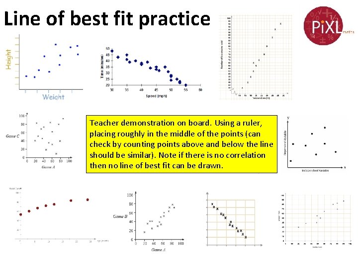
Line of best fit practice Teacher demonstration on board. Using a ruler, placing roughly in the middle of the points (can check by counting points above and below the line should be similar). Note if there is no correlation then no line of best fit can be drawn.

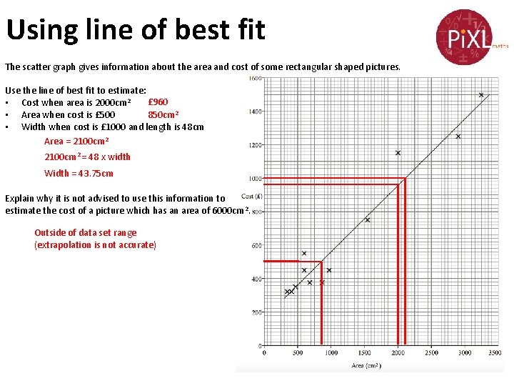
Using line of best fit The scatter graph gives information about the area and cost of some rectangular shaped pictures. Use the line of best fit to estimate: £ 960 • Cost when area is 2000 cm 2 • Area when cost is £ 500 850 cm 2 • Width when cost is £ 1000 and length is 48 cm Area = 2100 cm 2 = 48 x width Width = 43. 75 cm Explain why it is not advised to use this information to estimate the cost of a picture which has an area of 6000 cm 2. Outside of data set range (extrapolation is not accurate)

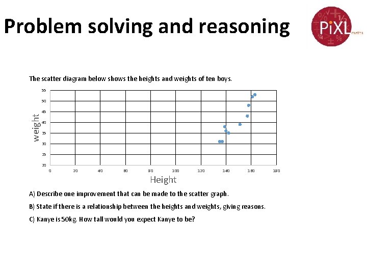
Problem solving and reasoning The scatter diagram below shows the heights and weights of ten boys. 55 50 weight 45 40 35 30 25 20 0 20 40 60 80 100 Height 120 140 160 A) Describe one improvement that can be made to the scatter graph. B) State if there is a relationship between the heights and weights, giving reasons. C) Kanye is 50 kg. How tall would you expect Kanye to be? 180

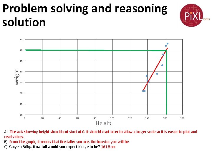
Problem solving and reasoning solution 55 50 weight 45 40 35 30 25 20 0 20 40 60 80 100 Height 120 140 160 180 A) The axis showing height should not start at 0. It should start later to allow a larger scale so it is easier to plot and read values. B) From the graph, it seems that the taller you are, the heavier you will be. C) Kanye is 50 kg. How tall would you expect Kanye to be? 161. 5 cm

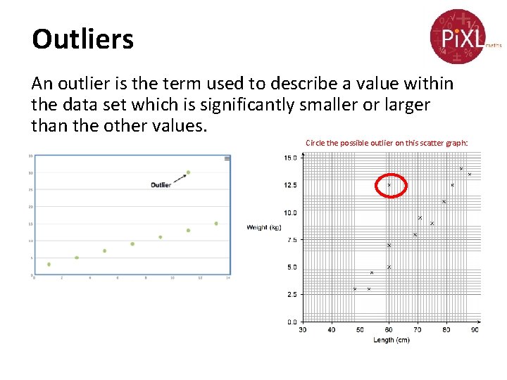
Outliers An outlier is the term used to describe a value within the data set which is significantly smaller or larger than the other values. Circle the possible outlier on this scatter graph:

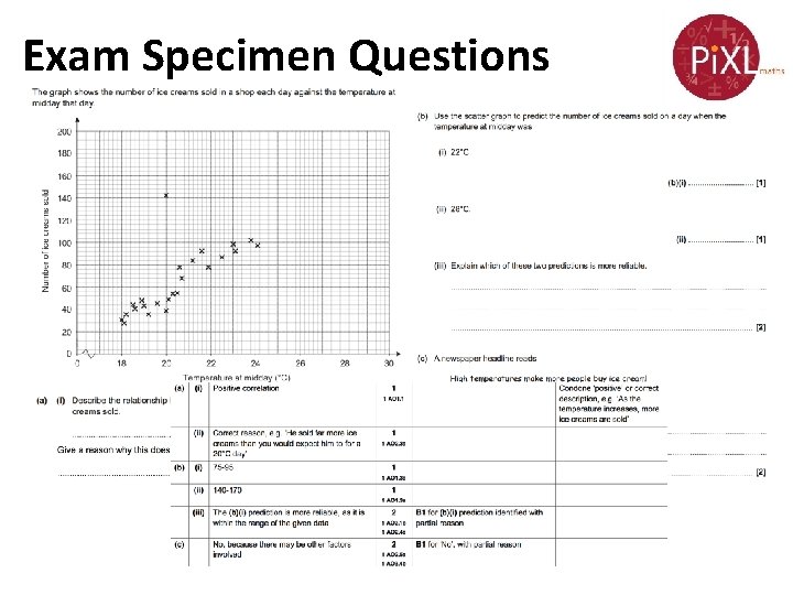
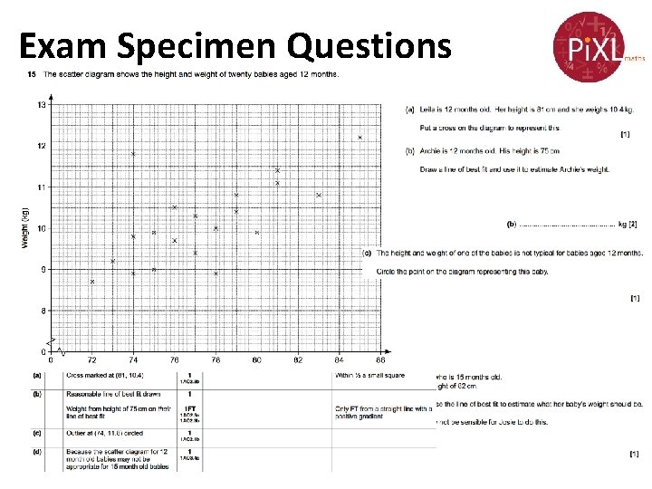
Exam Specimen Questions

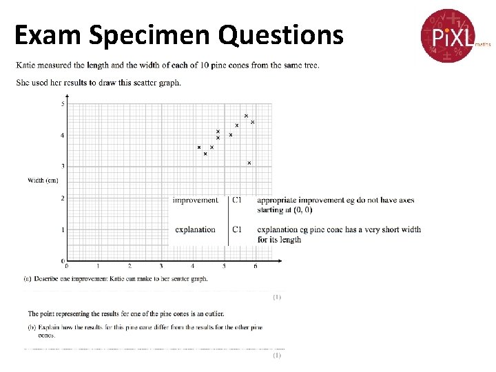
Exam Specimen Questions

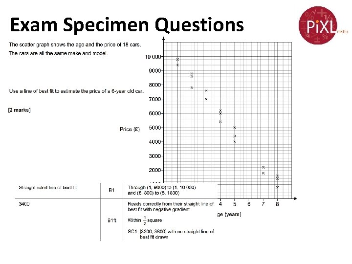
Exam Specimen Questions

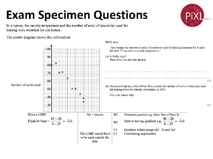
Exam Specimen Questions

Exam Specimen Questions