Scatter Graphs Demonstration This resource provides animated demonstrations


 Use")
 Use")


- Slides: 15
Scatter Graphs – Demonstration This resource provides animated demonstrations of the mathematical method. Check animations and delete slides not needed for your class.
Ms Wilson wants to do some market-research. She records the temperature each day and the amount of ice cream she sells in her shop. On Monday it is 20°C and she sells 15 ice creams. On Tuesday it is 15°C and she sells 10 ice creams. The weather forecast for tomorrow says it will be 23°C. How many ice creams will she sell? Can you be certain?
Scatter Graphs Ms Wilson records the temperature each day and the amount of ice cream she sells in her shop. She plots each day on a graph. Outlier Line of Best Fit 20 15 15 10 23 16 Can we expect a pattern in the data? Ms Wilson plots more points. A scatter graph compares two variables to analyse whethere is a relationship between them. Ice Creams Sold 25 20 15 10 5 0 0 We can see more ice creams are sold on hotter days. As one variable increases so does the other: there is a positive correlation between the variables. 5 10 15 20 Temperature °C 25
Ms Wilson also recorded the amount of sausages she sells in her shop. Positive Correlation When one variable increases the other increases. What type of relationship might we expect with this scatter graph? Negative Correlation When one variable increases the other decreases. Walls sausages started making ice-cream in the summer to keep their factory staff employed!
Variable A Strong Positive Weak Positive Variable A Strong Negative Variable A No Correlation can be weak or strong. Variable B Variable B Variable A A stronger correlation means the relationship between variables is more exact. Variable A Weak Negative Points on a scatter graph will more-closely follow a line of best fit.
Ice creams cause skateboard accidents! Skateboard accidents Is Tom correct? What is the underlying relationship? Ice cream sales Correlation does not imply causation!
Scatter Graphs Decide whether you expect each pair of variables to have a positive correlation, negative correlation or no correlation. Rainfall & umbrellas sold Positive Temperature & jumpers sold Negative Sunny days in a year & girls born No correlation Revision time & test results Positive Height & arm span Positive Sweets eaten per week & age Negative Height & hours playing computer games No correlation
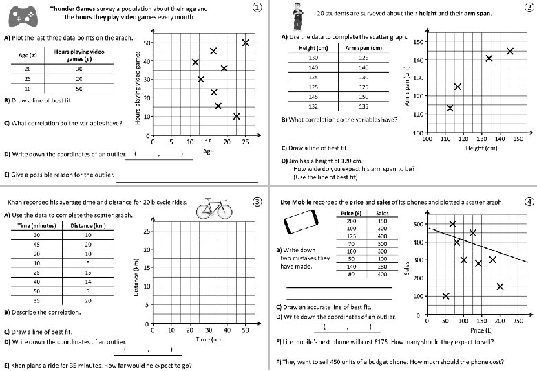
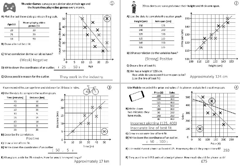
① Thunder Games survey a population about their age and the hours they play video games every month. A) Plot the last three data points on the graph. 30 25 20 10 50 The line is an estimate, B) Draw a line of best fit. as close as possible it should pass to all points. C) What correlation do the variables have? Hours playing video games 20 50 (Weak) Negative D) Write down the coordinates of an outlier. E) Give a possible reason for the outlier. 40 30 20 10 0 ( 0 25 5 , 50 10 ) 15 Age 20 They work in the industry. 25
② 20 students are surveyed about their height and their arm span. A) Use the data to complete the scatter graph. Arm span (cm) 130 125 140 125 130 125 145 150 132 135 B) What correlation do the variables have? (Strong) Positive 140 Arms pan (cm) Height (cm) 150 130 120 110 100 C) Draw a line of best fit. D) Jim has a height of 120 cm. How wide do you expect his arm span to be? (Use the line of best fit) 110 120 130 140 Height (cm) Approximately 124 cm 150
③ Khan recorded his average time and distance for 20 bicycle rides. A) Use the data to complete the scatter graph. Distance (km) 30 10 45 20 20 10 10 5 25 15 40 14 50 5 35 20 25 20 Distance (km) Time (minutes) 10 5 B) Describe the correlation. Positive C) Draw a line of best fit. D) Write down the coordinates of an outlier. ( 15 0 50 , 0 10 5 20 30 40 Time (m) 50 ) E) Khan plans a ride for 35 minutes. How far would he expect to go? Approximately 17 km
④ Lite Mobile recorded the price and sales of its phones and plotted a scatter graph. Sales 150 300 400 500 300 100 280 400 Incorrect plotting (125, 400) Inaccurate line of best fit. C) Draw an accurate line of best fit. D) Write down the coordinates of an outlier. ( 50 , 100 ) 500 400 Sales B) Write down two mistakes they have made. Price (£) 200 125 70 180 50 140 80 300 200 100 0 0 50 100 150 200 Price (£) E) Lite mobile’s next phone will cost £ 175. How many should they expect to sell? 250 F) They want to sell 450 units of a budget phone. How much should the phone cost? £ 75 250
Questions? Comments? Suggestions? …or have you found a mistake!? Any feedback would be appreciated . Please feel free to email: tom@goteachmaths. co. uk