Scatter Diagrams Keywords What is your starting point
- Slides: 5

Scatter Diagrams Keywords What is your starting point? GCSE Correlation Scatter Diagrams Regression lines The PMCC Hypothesis Testing Starters Number 23 www. prydemaths. weebly. com

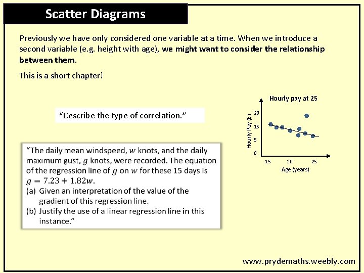
Keywords Scatter Diagrams Previously we have only considered one variable at a time. When we introduce a second variable (e. g. height with age), we might want to consider the relationship between them. This is a short chapter! “Describe the type of correlation. ” Hourly Pay (£) Hourly pay at 25 20 15 5 0 15 20 25 Age (years) www. prydemaths. weebly. com

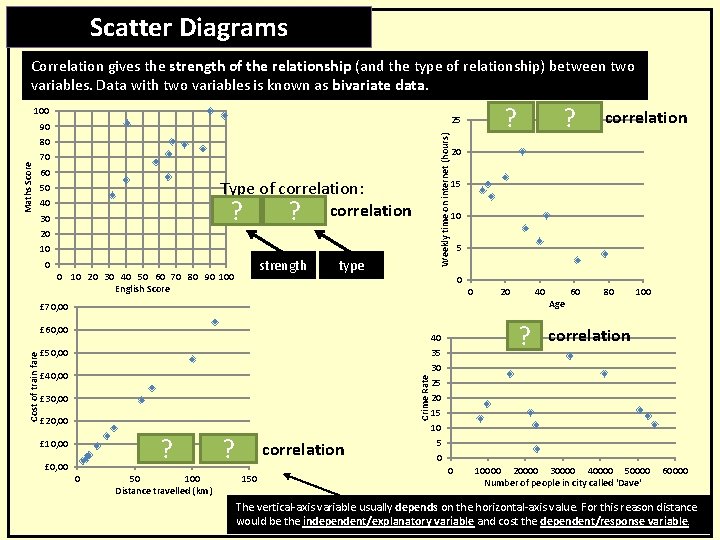
Scatter Diagrams Keywords Correlation gives the strength of the relationship (and the type of relationship) between two variables. Data with two variables is known as bivariate data. 100 Weekly time on internet (hours) Maths Score 80 70 60 Type of correlation: Weak ? positive ? correlation 50 40 30 20 10 strength 0 0 10 20 30 40 50 60 70 80 90 100 English Score type 20 15 10 0 £ 60, 00 £ 50, 00 Crime Rate £ 40, 00 £ 30, 00 £ 20, 00 Strong ? positive ? correlation £ 10, 00 £ 0, 00 0 50 100 Distance travelled (km) 5 0 £ 70, 00 Cost of train fare Weak ? negative ? correlation 25 90 150 20 40 Age 60 80 100 No ? correlation 40 35 30 25 20 15 10 5 0 0 10000 20000 30000 40000 50000 Number of people in city called 'Dave' 60000 The vertical-axis variable usually depends on the horizontal-axis value. For this reason distance would be the independent/explanatory variable and cost the dependent/response variable.

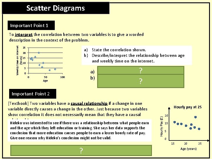
Scatter Diagrams Keywords Important Point 1 Weekly time on internet (hours) To interpret the correlation between two variables is to give a worded description in the context of the problem. 25 a) State the correlation shown. b) Describe/interpret the relationship between age and weekly time on the internet. 20 15 10 ? a) Negative correlation. b) As age increases, the weekly time on ? decrease. the internet tends to 5 0 0 50 Age 100 Important Point 2 Hideko was interested to see if there was a relationship between what people earn and the age which they left education or training. She says her data supports the conclusion that more education causes people to earn a lower hourly rate of pay. Give one reason why Hideko’s conclusion might not be valid. ? “Respondents who left education later would have significantly less work experience than those who left education earlier. This could be the cause of the reduced income shown in her results. ” Hourly pay at 25 Hourly Pay (£) [Textbook] Two variables have a causal relationship if a change in one variable directly causes a change in the other. Just because two variables show correlation it does not necessarily mean that they have a causal relationship. 20 15 5 0 15 20 Age (years) 25

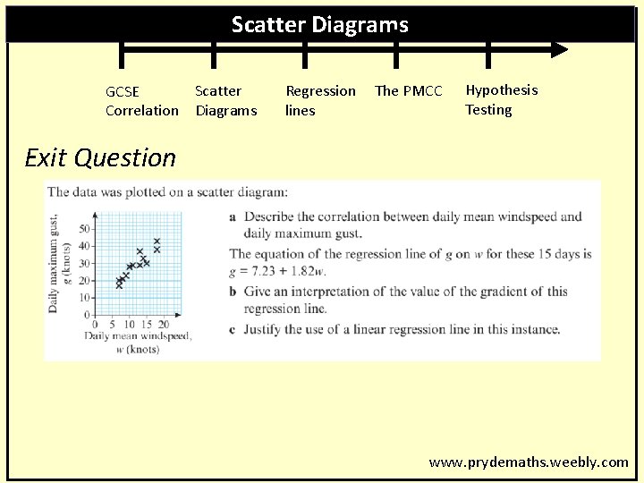
Scatter Diagrams Keywords GCSE Correlation Scatter Diagrams Regression lines The PMCC Hypothesis Testing Exit Question www. prydemaths. weebly. com