Run Charts Slide 1 of 3 Run Charts


- Slides: 10
Run Charts Slide 1 of 3 • Run Charts Defined – Run charts are used to analyze processes according to time or order.
Run Charts Slide 2 of 3 • Creating a Run Chart – Gathering Data • Some type of process or operation must be available to take measurements for analysis. – Organizing Data • Data must be divided into two sets of values X and Y. X values represent time and values of Y represent the measurements taken from the manufacturing process or operation. – Charting Data • Plot the Y values versus the X values. – Interpreting Data • Interpret the data and draw any conclusions that will be beneficial to the process or operation.
Run Charts Slide 3 of 3 • An Example of Using a Run Chart – An organization’s desire is to have their product arrive to their customers on time, but they have noticed that it doesn’t take the same amount of time each day of the week. They decided to monitor the amount of time it takes to deliver their product over the next few weeks.
Control Charts Slide 1 of 3 • Control Charts Defined – Control charts are used to determine whether a process will produce a product or service with consistent measurable properties.
Control Charts Slide 2 of 3 • Steps Used in Developing Process Control Charts – Identify critical operations in the process where inspection might be needed. – Identify critical product characteristics. – Determine whether the critical product characteristic is a variable or an attribute. – Select the appropriate process control chart. – Establish the control limits and use the chart to monitor and improve. – Update the limits.
Control Charts Slide 3 of 3 • An Example of When to Use a Control Chart – Counting the number of defective products or services • Do you count the number of defects in a given product or service? • Is the number of units checked or tested constant?
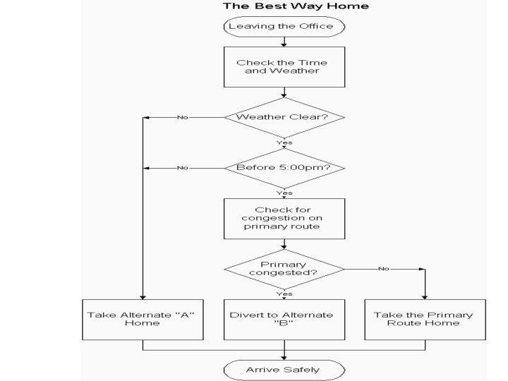
Activity • Process Flow Chart for Finding the Best Way Home – Construct a process flow chart by making the best decisions in finding the best route home. – Refer to the prior notes on flowcharts. • Remember: Define and analyze the process, build a step-by step picture of the process, and define areas of improvement in the process. » Answer is on the next slide » Example obtained from: <http: //deming. eng. clemson. edu/pub/tutorials/qctools/flow m. htm#Example>
Summary This presentation provided learning material for each of Ishikawa’s seven basic tools of quality. Each tool was clearly defined with definitions, a step-by-step process and an example of how the tool can be used. As seen through the presentation, these tools are rather simple and effective.
Works - Cited • • Histograms and Bar Graphs. <http: //www. shodor. org/interactivate/lessons/sm 3. html> Your MBA: The Business Study Reference Site. http: //yourmba. co. uk/pareto_diagram. htm Hci Home Services. Cause and Effect Diagram. http: //hci. com. au/hcisite/toolkit/causeand. htm Scatter Diagram. http: //sytsma. com/tqmtools/Scat. html Flowchart. <http: //deming. eng. clemson. edu/pub/tutorials/qctools/flowm. htm> Run Charts/Time Plot/ Trend Chart. <http: //www. deming. edu. clemson. edu/pub/tutorials/qctools/runm. htm> Foster Thomas S. Managing Quality An Integrative Approach. New Jersey: Prentice Hall, 2001