RiskAdjusted PChart Using Python Author and Narrator Sara

- Slides: 13

Risk-Adjusted P-Chart Using Python Author and Narrator: Sara Scannell Part of HAP 752 taught by Farrokh Alemi, Ph. D. George Mason University

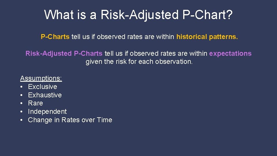
What is a Risk-Adjusted P-Chart? P-Charts tell us if observed rates are within historical patterns. Risk-Adjusted P-Charts tell us if observed rates are within expectations given the risk for each observation. Assumptions: • Exclusive • Exhaustive • Rare • Independent • Change in Rates over Time

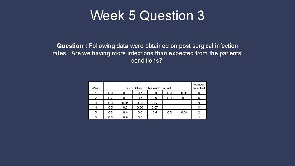
Week 5 Question 3 Question : Following data were obtained on post surgical infection rates. Are we having more infections than expected from the patients' conditions? Week Number Infected Risk of Infection for each Patient 1 0. 9 0. 8 0. 7 0. 8 0. 9 0. 85 6 2 0. 7 0. 8 0. 7 0. 6 0. 8 0. 9 5 3 0. 8 0. 95 0. 92 0. 87 4 4 0. 5 0. 66 0. 67 3 5 0. 3 0. 4 0. 5 0. 4 6 0. 3 0. 4 0. 5 0. 34 2 1

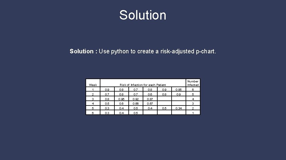
Solution : Use python to create a risk-adjusted p-chart. Week Number Infected Risk of Infection for each Patient 1 0. 9 0. 8 0. 7 0. 8 0. 9 0. 85 6 2 0. 7 0. 8 0. 7 0. 6 0. 8 0. 9 5 3 0. 8 0. 95 0. 92 0. 87 4 4 0. 5 0. 66 0. 67 3 5 0. 3 0. 4 0. 5 0. 4 6 0. 3 0. 4 0. 5 0. 34 2 1

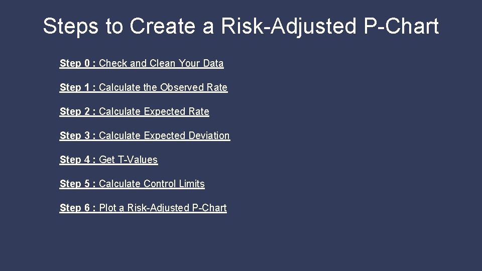
Steps to Create a Risk-Adjusted P-Chart Step 0 : Check and Clean Your Data Step 1 : Calculate the Observed Rate Step 2 : Calculate Expected Rate Step 3 : Calculate Expected Deviation Step 4 : Get T-Values Step 5 : Calculate Control Limits Step 6 : Plot a Risk-Adjusted P-Chart

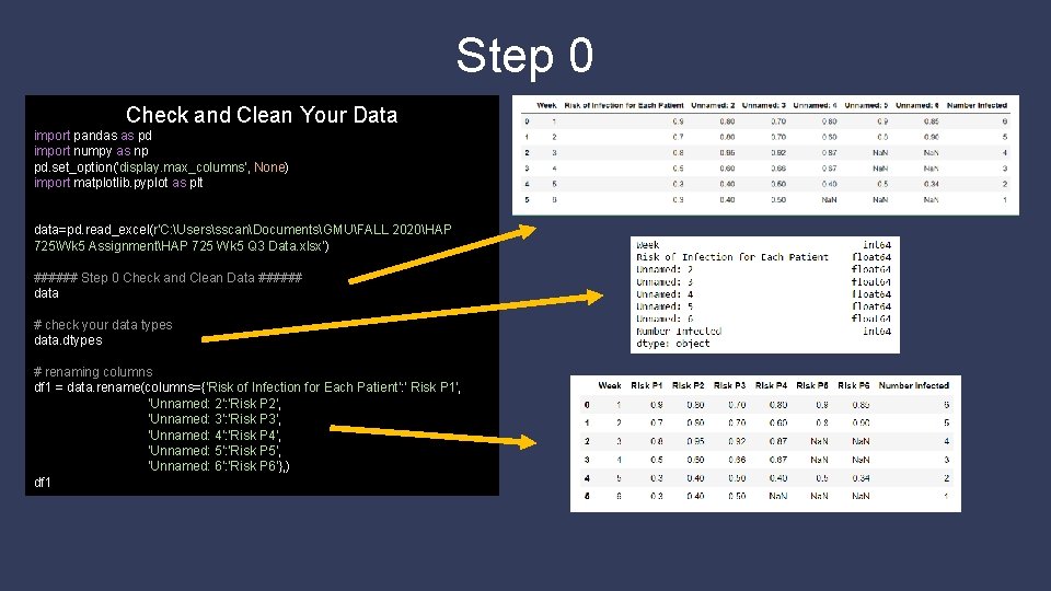
Step 0 Check and Clean Your Data import pandas as pd import numpy as np pd. set_option('display. max_columns', None) import matplotlib. pyplot as plt data=pd. read_excel(r'C: UserssscanDocumentsGMUFALL 2020HAP 725Wk 5 AssignmentHAP 725 Wk 5 Q 3 Data. xlsx') ###### Step 0 Check and Clean Data ###### data # check your data types data. dtypes # renaming columns df 1 = data. rename(columns={'Risk of Infection for Each Patient': ' Risk P 1', 'Unnamed: 2': 'Risk P 2', 'Unnamed: 3': 'Risk P 3', 'Unnamed: 4': 'Risk P 4', 'Unnamed: 5': 'Risk P 5', 'Unnamed: 6': 'Risk P 6'}, ) df 1

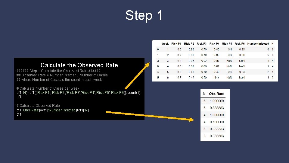
Step 1 Calculate the Observed Rate ###### ## Observed Rate = Number Infected / Number of Cases ## where Number of Cases is the count in each week. # Calculate Number of Cases per week df 1['N']=df 1[['Risk P 1', 'Risk P 2', 'Risk P 3', 'Risk P 4', 'Risk P 5', 'Risk P 6']]. count(1) df 1 # Calculate Observed Rate df 1['Obs Rate']=df 1['Number Infected']/df 1['N'] df 1

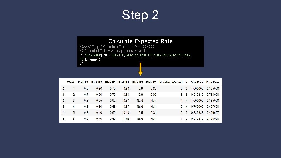
Step 2 Calculate Expected Rate ###### ## Expected Rate = Average of each week df 1['Exp Rate']=df 1[['Risk P 1', 'Risk P 2', 'Risk P 3', 'Risk P 4', 'Risk P 5', 'Risk P 6']]. mean(1) df 1

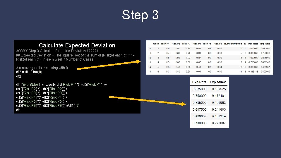
Step 3 Calculate Expected Deviation ###### ## Expected Deviation = The square root of the sum of [Risk(of each pt) * 1 Risk(of each pt)] in each week / Number of Cases # removing nulls, replacing with 0 df 2 = df 1. fillna(0) df 2 df 1['Exp Stdev']=(np. sqrt((df 2['Risk P 1']*(1 -df 2['Risk P 1']))+ (df 2['Risk P 2']*(1 -df 2['Risk P 2']))+ (df 2['Risk P 3']*(1 -df 2['Risk P 3']))+ (df 2['Risk P 4']*(1 -df 2['Risk P 4']))+ (df 2['Risk P 5']*(1 -df 2['Risk P 5']))+ (df 2['Risk P 6']*(1 -df 2['Risk P 6']))))/df 1['N'] df 1

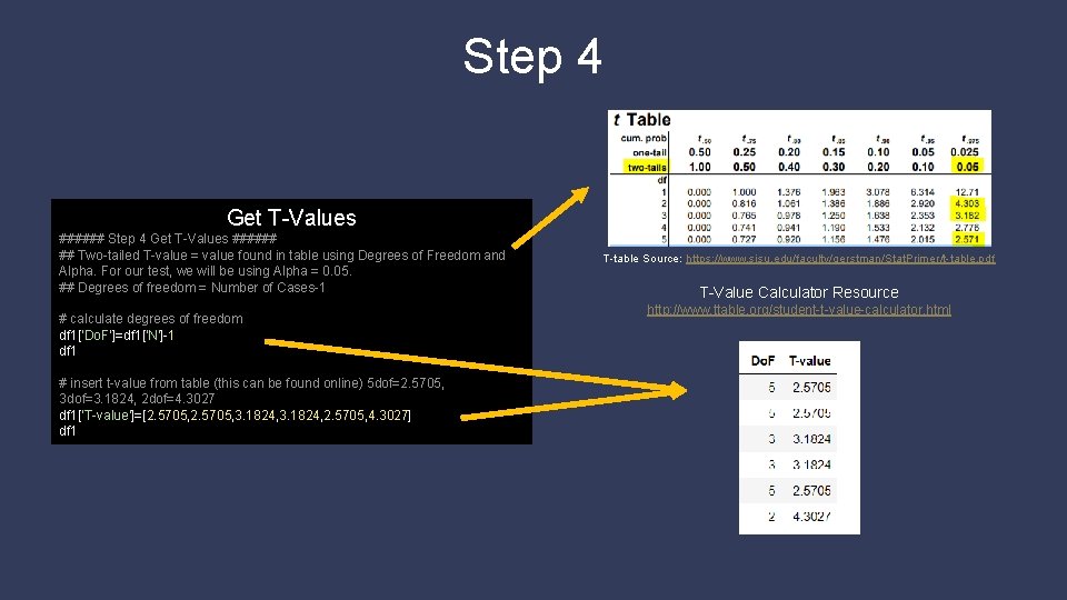
Step 4 Get T-Values ###### ## Two-tailed T-value = value found in table using Degrees of Freedom and Alpha. For our test, we will be using Alpha = 0. 05. ## Degrees of freedom = Number of Cases-1 # calculate degrees of freedom df 1['Do. F']=df 1['N']-1 df 1 # insert t-value from table (this can be found online) 5 dof=2. 5705, 3 dof=3. 1824, 2 dof=4. 3027 df 1['T-value']=[2. 5705, 3. 1824, 2. 5705, 4. 3027] df 1 T-table Source: https: //www. sjsu. edu/faculty/gerstman/Stat. Primer/t-table. pdf T-Value Calculator Resource http: //www. ttable. org/student-t-value-calculator. html

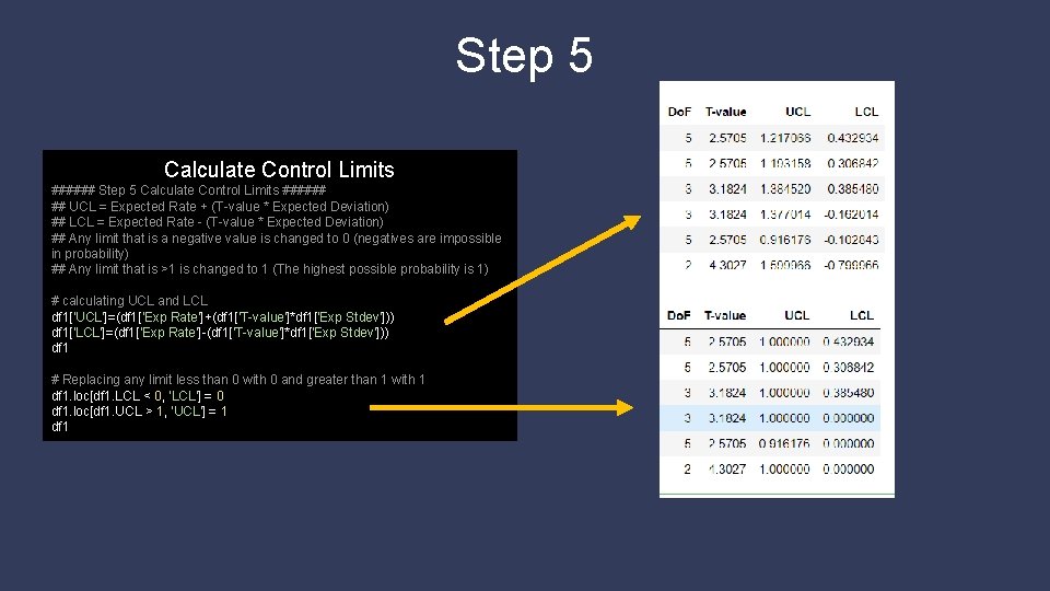
Step 5 Calculate Control Limits ###### ## UCL = Expected Rate + (T-value * Expected Deviation) ## LCL = Expected Rate - (T-value * Expected Deviation) ## Any limit that is a negative value is changed to 0 (negatives are impossible in probability) ## Any limit that is >1 is changed to 1 (The highest possible probability is 1) # calculating UCL and LCL df 1['UCL']=(df 1['Exp Rate']+(df 1['T-value']*df 1['Exp Stdev'])) df 1['LCL']=(df 1['Exp Rate']-(df 1['T-value']*df 1['Exp Stdev'])) df 1 # Replacing any limit less than 0 with 0 and greater than 1 with 1 df 1. loc[df 1. LCL < 0, 'LCL'] = 0 df 1. loc[df 1. UCL > 1, 'UCL'] = 1 df 1

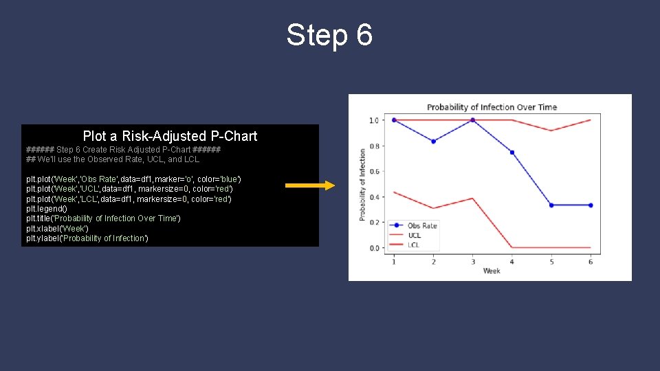
Step 6 Plot a Risk-Adjusted P-Chart ###### Step 6 Create Risk Adjusted P-Chart ###### ## We'll use the Observed Rate, UCL, and LCL plt. plot('Week', 'Obs Rate', data=df 1, marker='o', color='blue') plt. plot('Week', 'UCL', data=df 1, markersize=0, color='red') plt. plot('Week', 'LCL', data=df 1, markersize=0, color='red') plt. legend() plt. title('Probability of Infection Over Time') plt. xlabel('Week') plt. ylabel('Probability of Infection')

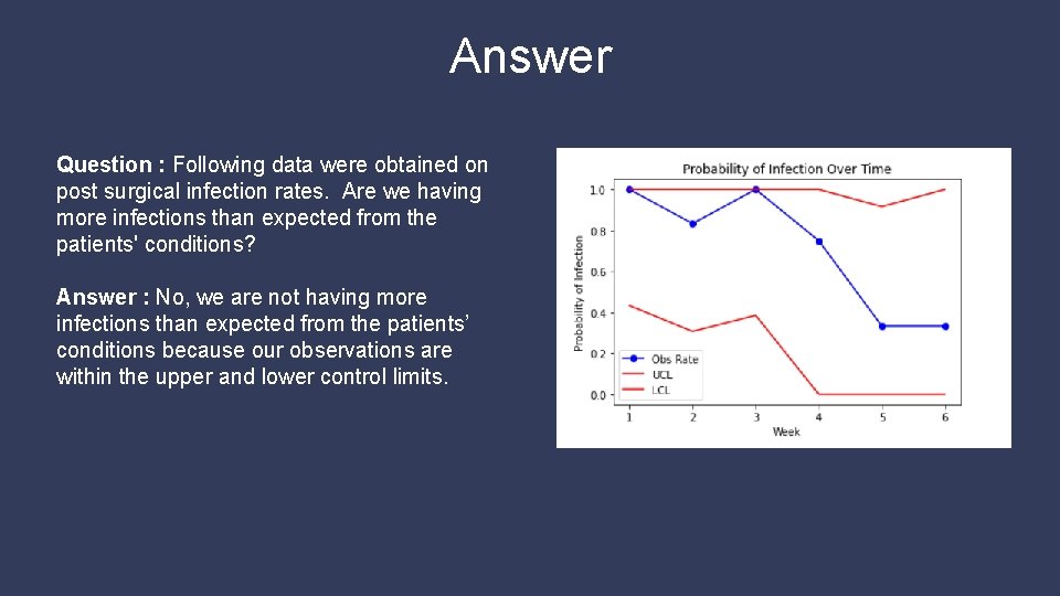
Answer Question : Following data were obtained on post surgical infection rates. Are we having more infections than expected from the patients' conditions? Answer : No, we are not having more infections than expected from the patients’ conditions because our observations are within the upper and lower control limits.