Review Mean As A Balancing Point Mean as

Review Mean As A Balancing Point
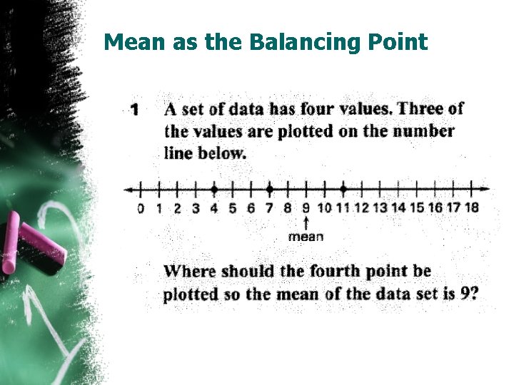
Mean as the Balancing Point
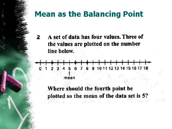
Mean as the Balancing Point

Mean as the Balancing Point
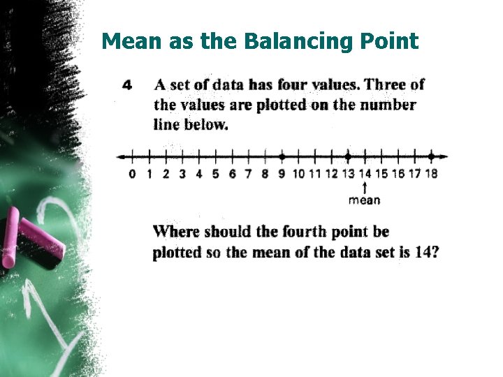
Mean as the Balancing Point
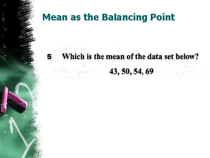
Mean as the Balancing Point
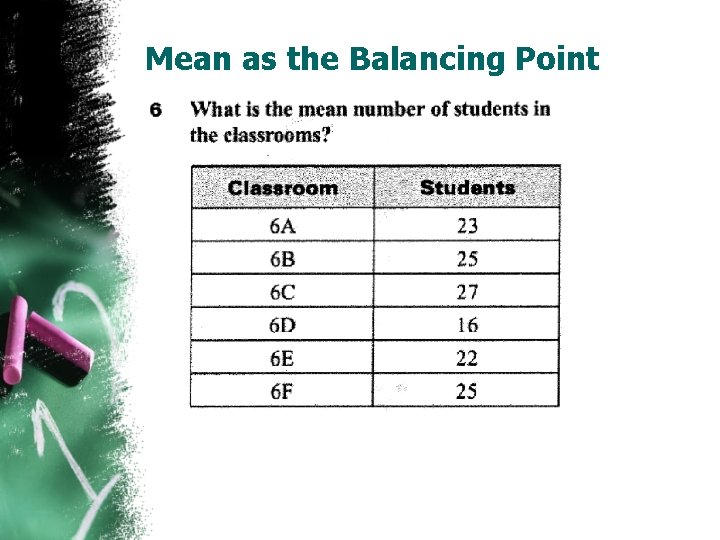
Mean as the Balancing Point

Review Histograms

Time to get up!!! • Scavenger Hunt….

Interquartile Range and Boxplots Module 9 Math 075 Fall 2015
Box plots • Find your group • Foldable Box and Whisker plots • Let’s review • Box and whisker plot worksheet • Find your new group • Let’s create a box plot…. Back to the cereal data…now we look at fiber.
Variability about the median • Quartiles: Divides the data into four equal parts. (25% of the data will be in each quartile) • Some quartiles have more variability than others. • We find the Interquartile range: Q 3 – Q 1
The 5 Number Summary • The five number summary consist of : Ø The median ( 2 nd quartile) Ø The 1 st quartile Ø The 3 rd quartile Ø The maximum value in a data set Ø The minimum value in a data set
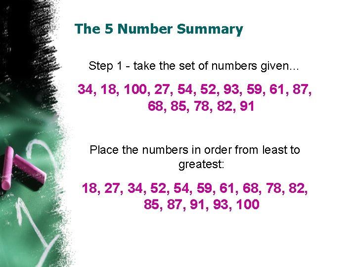
The 5 Number Summary Step 1 - take the set of numbers given… 34, 18, 100, 27, 54, 52, 93, 59, 61, 87, 68, 85, 78, 82, 91 Place the numbers in order from least to greatest: 18, 27, 34, 52, 54, 59, 61, 68, 78, 82, 85, 87, 91, 93, 100
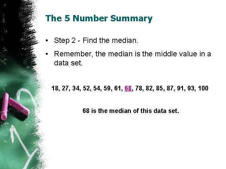
The 5 Number Summary • Step 2 - Find the median. • Remember, the median is the middle value in a data set. 18, 27, 34, 52, 54, 59, 61, 68, 78, 82, 85, 87, 91, 93, 100 68 is the median of this data set.
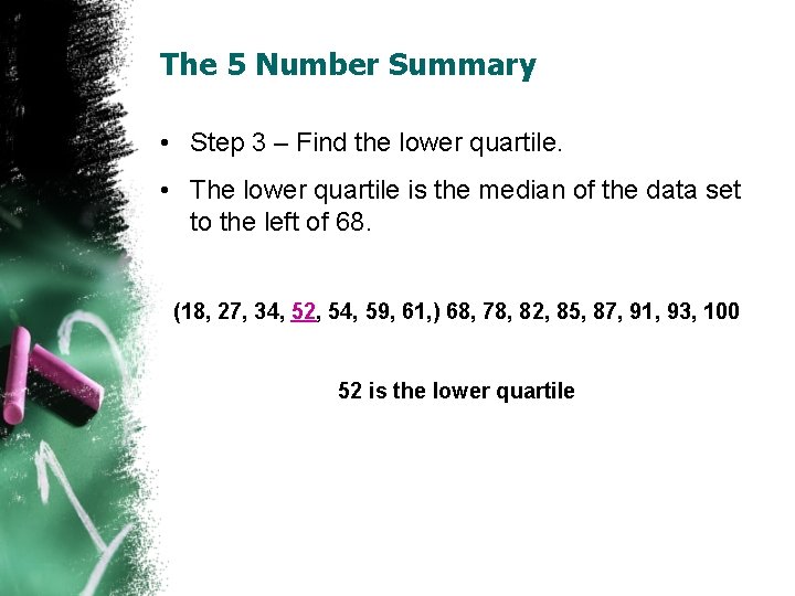
The 5 Number Summary • Step 3 – Find the lower quartile. • The lower quartile is the median of the data set to the left of 68. (18, 27, 34, 52, 54, 59, 61, ) 68, 78, 82, 85, 87, 91, 93, 100 52 is the lower quartile
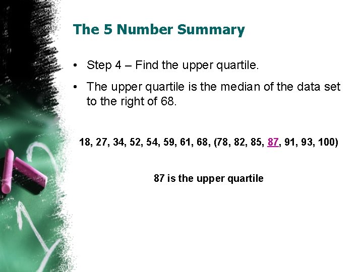
The 5 Number Summary • Step 4 – Find the upper quartile. • The upper quartile is the median of the data set to the right of 68. 18, 27, 34, 52, 54, 59, 61, 68, (78, 82, 85, 87, 91, 93, 100) 87 is the upper quartile
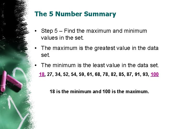
The 5 Number Summary • Step 5 – Find the maximum and minimum values in the set. • The maximum is the greatest value in the data set. • The minimum is the least value in the data set. 18, 27, 34, 52, 54, 59, 61, 68, 78, 82, 85, 87, 91, 93, 100 18 is the minimum and 100 is the maximum.
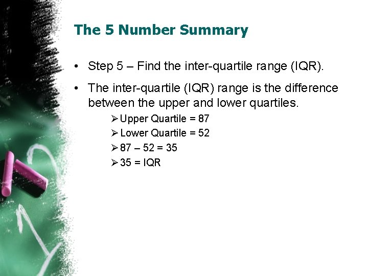
The 5 Number Summary • Step 5 – Find the inter-quartile range (IQR). • The inter-quartile (IQR) range is the difference between the upper and lower quartiles. Ø Upper Quartile = 87 Ø Lower Quartile = 52 Ø 87 – 52 = 35 Ø 35 = IQR
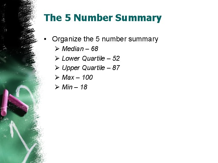
The 5 Number Summary • Organize the 5 number summary Ø Median – 68 Ø Lower Quartile – 52 Ø Upper Quartile – 87 Ø Max – 100 Ø Min – 18
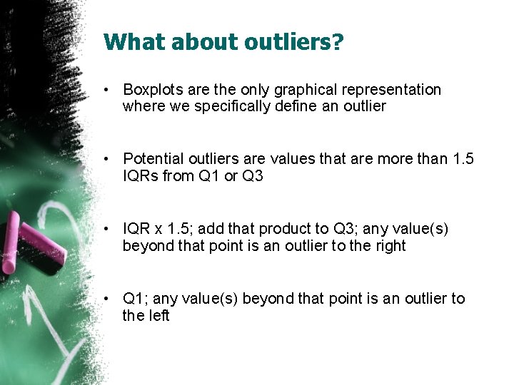
What about outliers? • Boxplots are the only graphical representation where we specifically define an outlier • Potential outliers are values that are more than 1. 5 IQRs from Q 1 or Q 3 • IQR x 1. 5; add that product to Q 3; any value(s) beyond that point is an outlier to the right • Q 1; any value(s) beyond that point is an outlier to the left
Siblings data. . . • Using Stat Crunch, calculate descriptive statistics • Let’s calculate (by hand) to see if we have any outliers • Q 3 – Q 1 = IQR • IQR x 1. 5; add this product to Q 3; are there any values in our data set beyond this point to the right? • IQR x 1. 5; subtract product from Q 1; are there any values in our data set bey this point to the left? • Now use Stat Crunch to create a boxplot; are our calculations confirmed with our boxplot?
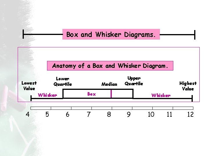
Box and Whisker Diagrams. Anatomy of a Box and Whisker Diagram. Lower Quartile Lowest Value Box Whisker 4 5 Median Upper Quartile 6 7 Highest Value Whisker 8 9 10 11 12 Box Plots
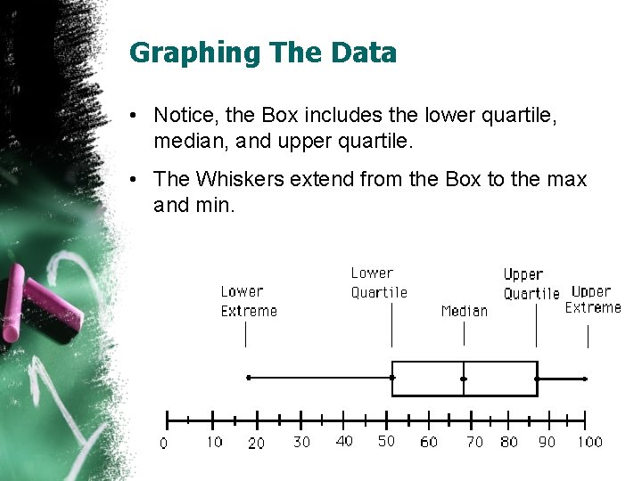
Graphing The Data • Notice, the Box includes the lower quartile, median, and upper quartile. • The Whiskers extend from the Box to the max and min.
You should include the following in your interpretation: • Range or spread of the data and what it means to your graph • Quartiles—compare them. What are they telling you about the data? • Median- this is an important part of the graph, and should be an important part of the interpretation. • Percentages should be used to interpret the data, where relevant.
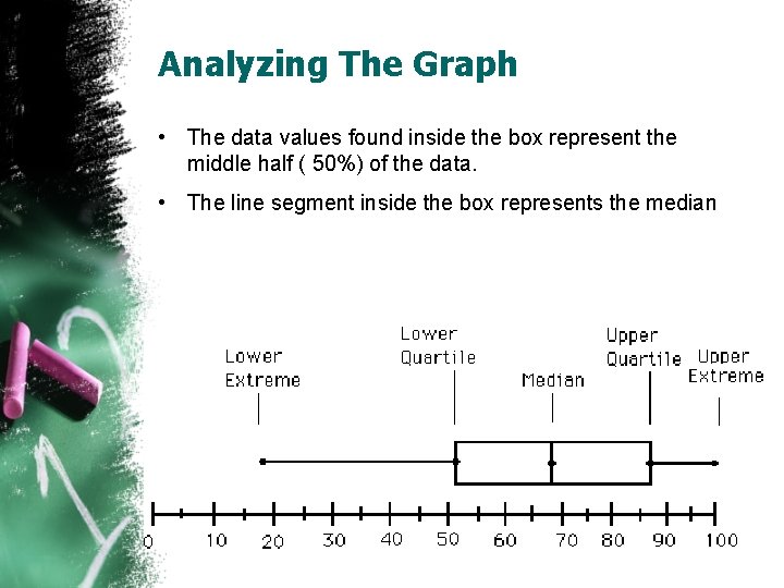
Analyzing The Graph • The data values found inside the box represent the middle half ( 50%) of the data. • The line segment inside the box represents the median
Your turn. . . • In pairs, choose a set of data from the Math 075 spreadsheet that is skewed (to left or right); you probably won’t know if the data is skewed until you copy and paste into Stat Crunch and create a graph • Create a box plot; print out; put your names on it • Label (on the graph) the 5 -number summary (with arrows pointing to each value on the graph) • Analyze through SOCS (which measure of central tendency should you use? Which measure of spread should you use? ); be sure you show your work to justify that a point/points are outliers • Now, using the same data, create a histogram. What characteristics of the data does the histogram show that the box plot does not?
- Slides: 27