Responsive Web Design What is it Test A
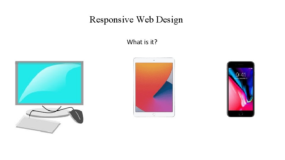
Responsive Web Design What is it?
Test A Few Sites Using Full Screen And Smaller Screen www. Gordon. edu www. gcts. edu (3 columns) www. boston. com (3 columns then 2 columns? )
View. Port • https: //developer. mozilla. org/en. US/docs/Mozilla/Mobile/Viewport_ meta_tag • "The browser's viewport is the area of the window in which web content can be seen. This is often not the same size as the rendered page, in which case the browser provides scrollbars for the user to scroll around access all the content. "
Viewport A typical mobile-optimized site contains the following between <head> and </head> : <head> <meta name="viewport" content="width=device-width, initial-scale=1"> </head> This meta tag tells mobile browsers that they should set the width of the viewport to the device width, and scale the document to 100% of its intended size.

What IS My Viewport Size? http: //www. computewithgrace. com/jsviewportsize. html Run this on you cell phone browser and laptop browser. Resize your laptop browser and then REFRESH the browser. What are the 2 numbers reported? First one is width. Second one is height.

<meta name="viewport" content="width=device-width, initial-scale=1"> • Why is this needed? Because mobile browsers tend to lie about their viewport width. "This meta tag exists because when the original i. Phone launched and people started to view websites on a small phone screen, most sites were not mobile optimized. The mobile browser would, therefore, set the viewport width to 960 pixels, render the page at that width, and show the result as a zoomed-out version of the desktop layout. Other mobile browsers (e. g. on Google Android) did the same thing. Users could zoom in and pan around the website to view the bits they were interested in, but it looked bad. . " Look at wide. Screen. html
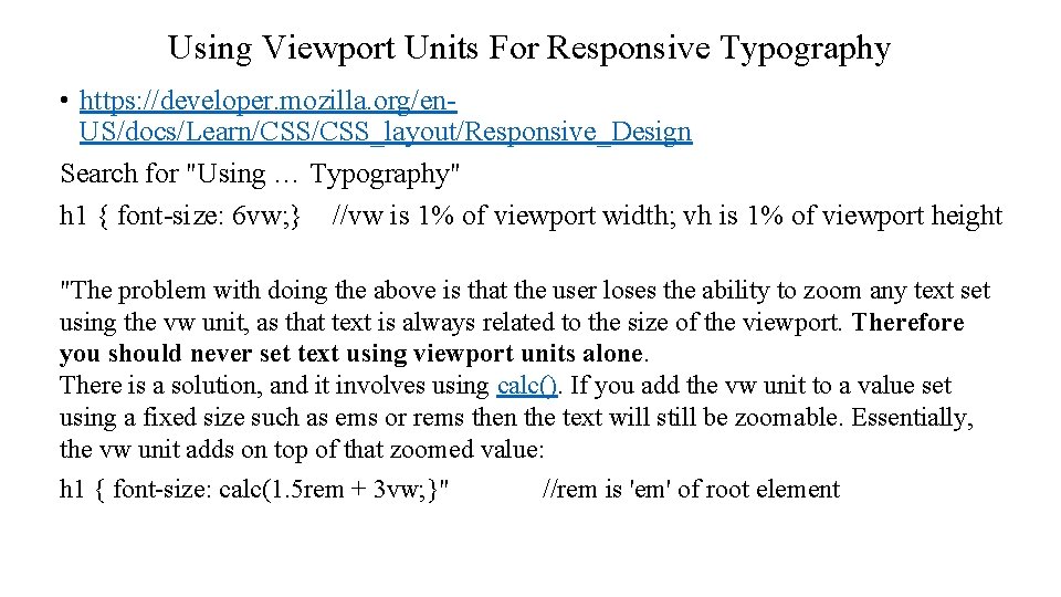
Using Viewport Units For Responsive Typography • https: //developer. mozilla. org/en. US/docs/Learn/CSS_layout/Responsive_Design Search for "Using … Typography" h 1 { font-size: 6 vw; } //vw is 1% of viewport width; vh is 1% of viewport height "The problem with doing the above is that the user loses the ability to zoom any text set using the vw unit, as that text is always related to the size of the viewport. Therefore you should never set text using viewport units alone. There is a solution, and it involves using calc(). If you add the vw unit to a value set using a fixed size such as ems or rems then the text will still be zoomable. Essentially, the vw unit adds on top of that zoomed value: h 1 { font-size: calc(1. 5 rem + 3 vw; }" //rem is 'em' of root element
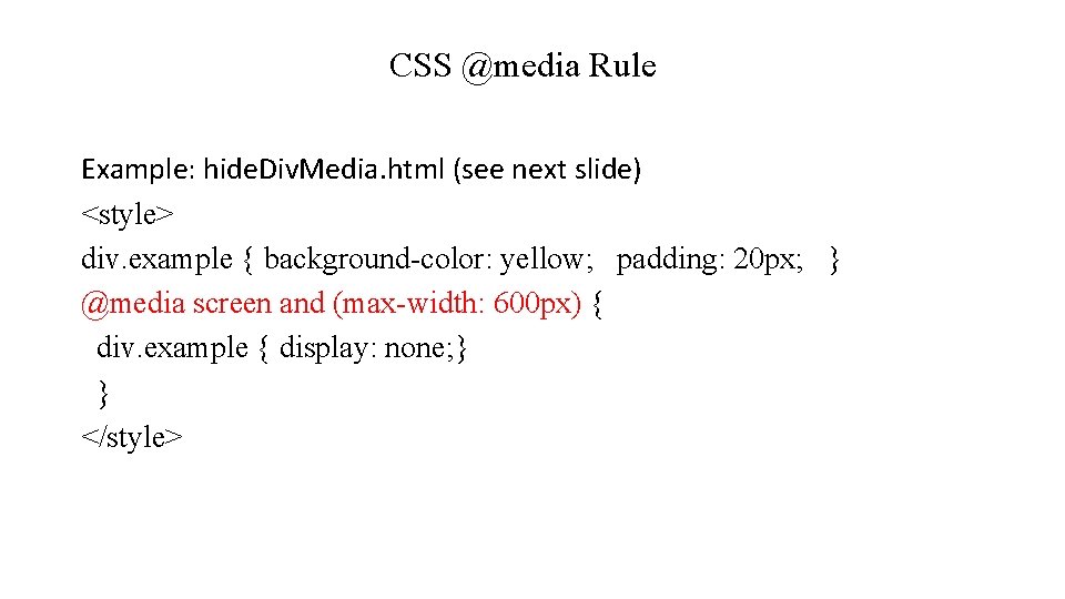
CSS @media Rule Example: hide. Div. Media. html (see next slide) <style> div. example { background-color: yellow; padding: 20 px; } @media screen and (max-width: 600 px) { div. example { display: none; } } </style>
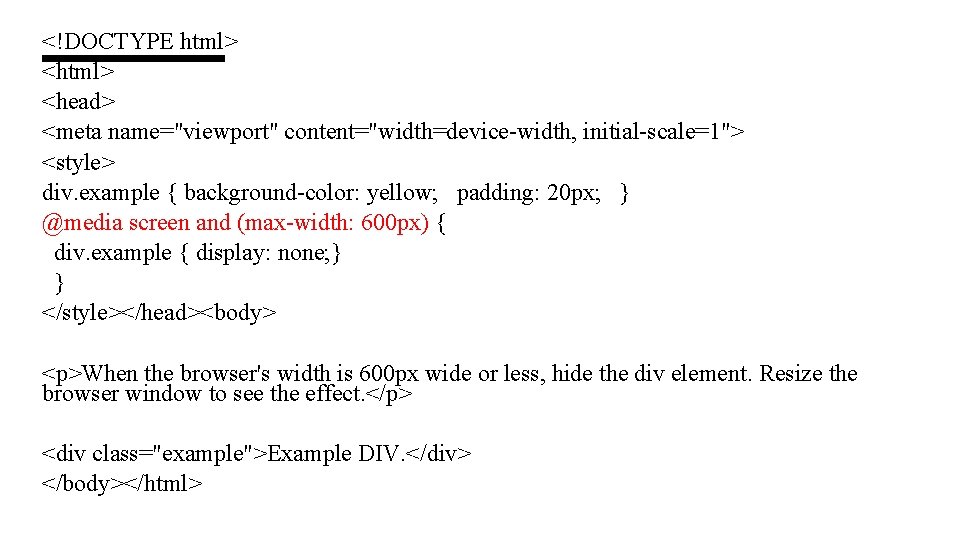
<!DOCTYPE html> <head> <meta name="viewport" content="width=device-width, initial-scale=1"> <style> div. example { background-color: yellow; padding: 20 px; } @media screen and (max-width: 600 px) { div. example { display: none; } } </style></head><body> <p>When the browser's width is 600 px wide or less, hide the div element. Resize the browser window to see the effect. </p> <div class="example">Example DIV. </div> </body></html>
CSS @media Rule cont'd • Examples: columns. html (not responsive), floating. Columns. html (responsive)
Responsive Menu • https: //www. w 3 schools. com/w 3 css/tryit. asp? filename=tryw 3 css_nav igation_bar_mobile

Responsive Images • https: //developer. mozilla. org/en. US/docs/Learn/HTML/Multimedia_and_embedding/Responsive_ima ges
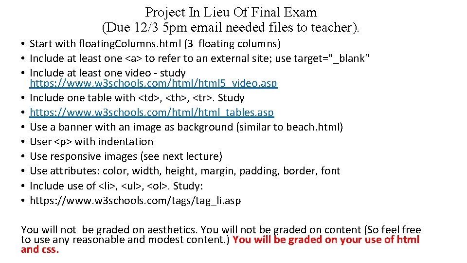
Project In Lieu Of Final Exam (Due 12/3 5 pm email needed files to teacher). • Start with floating. Columns. html (3 floating columns) • Include at least one <a> to refer to an external site; use target="_blank" • Include at least one video - study https: //www. w 3 schools. com/html 5_video. asp • Include one table with <td>, <th>, <tr>. Study • https: //www. w 3 schools. com/html_tables. asp • Use a banner with an image as background (similar to beach. html) • User <p> with indentation • Use responsive images (see next lecture) • Use attributes: color, width, height, margin, padding, border, font • Include use of <li>, <ul>, <ol>. Study: • https: //www. w 3 schools. com/tags/tag_li. asp You will not be graded on aesthetics. You will not be graded on content (So feel free to use any reasonable and modest content. ) You will be graded on your use of html and css.
- Slides: 13