Responsive Design that Adapts to Different Devices Table
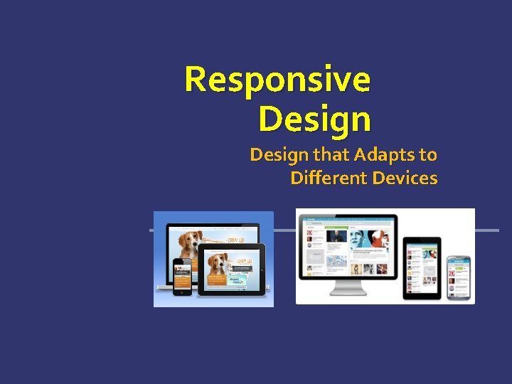
Responsive Design that Adapts to Different Devices
Table of Contents Responsive Design Creating Responsive Design Fluid Layout Flexible Images and Fonts Flexible Tables and Menus Media Queries Everywhere Constructing Responsive Design 2
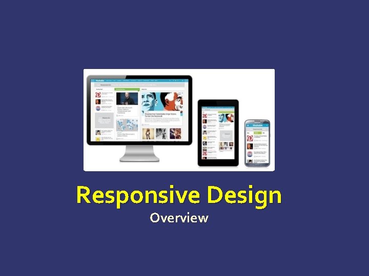
Responsive Design Overview
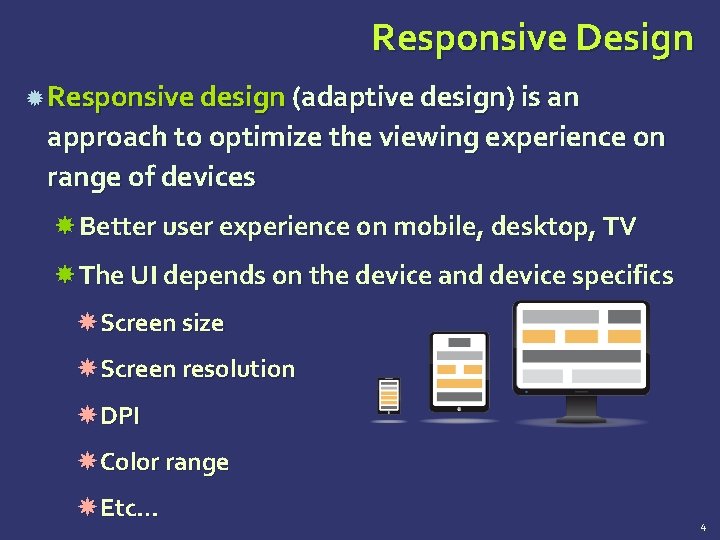
Responsive Design Responsive design (adaptive design) is an approach to optimize the viewing experience on range of devices Better user experience on mobile, desktop, TV The UI depends on the device and device specifics Screen size Screen resolution DPI Color range Etc… 4
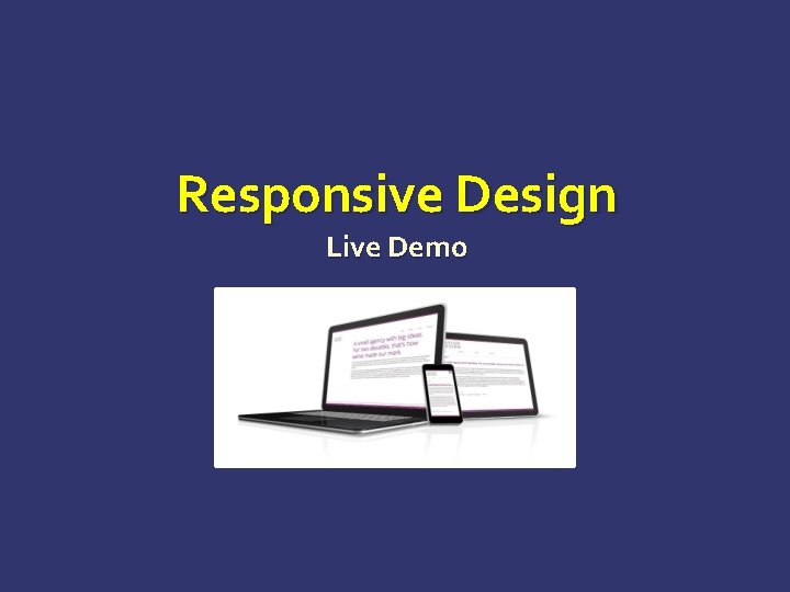
Responsive Design Live Demo
Creating Responsive Design Ways to Implement a Nice UI
Creating Responsive Design Responsive design involves one or more of the following: Fluid layout Use proportional values for widths, margins, etc… Flexible fonts Fonts based on the root Flexible images Images cannot go beyond their container Media queries Apply styles based on the client screen size 7
Fluid Layout Make the Elements Flow on the Screen
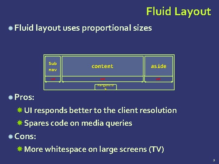
Fluid Layout Fluid layout uses proportional sizes Sub nav content aside 12% 60% 20% Margins: 2 % Pros: UI responds better to the client resolution Spares code on media queries Cons: More whitespace on large screens (TV) 9
Fluid Layout Live Demo

Flexible Images
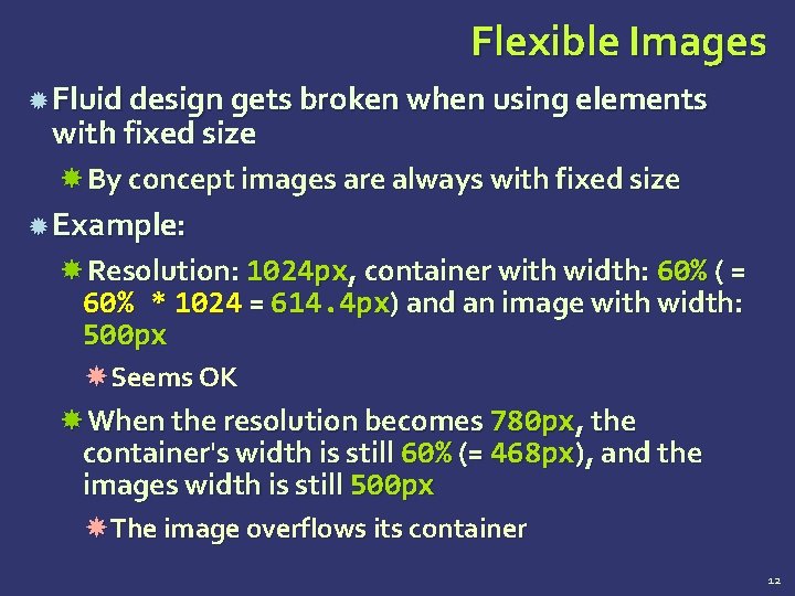
Flexible Images Fluid design gets broken when using elements with fixed size By concept images are always with fixed size Example: Resolution: 1024 px, container with width: 60% ( = 60% * 1024 = 614. 4 px) and an image with width: 500 px Seems OK When the resolution becomes 780 px, the container's width is still 60% (= 468 px), and the images width is still 500 px The image overflows its container 12
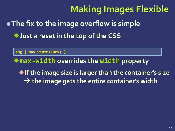
Making Images Flexible The fix to the image overflow is simple Just a reset in the top of the CSS img { max-width: 100%; } max-width overrides the width property If the image size is larger than the container's size the image gets the entire container's width 13
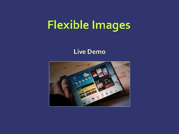
Flexible Images Live Demo
Flexible Fonts
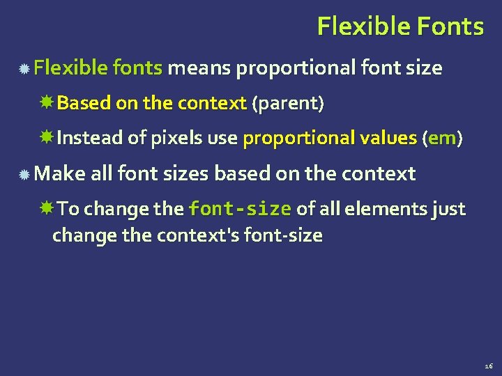
Flexible Fonts Flexible fonts means proportional font size Based on the context (parent) Instead of pixels use proportional values (em) Make all font sizes based on the context To change the font-size of all elements just change the context's font-size 16
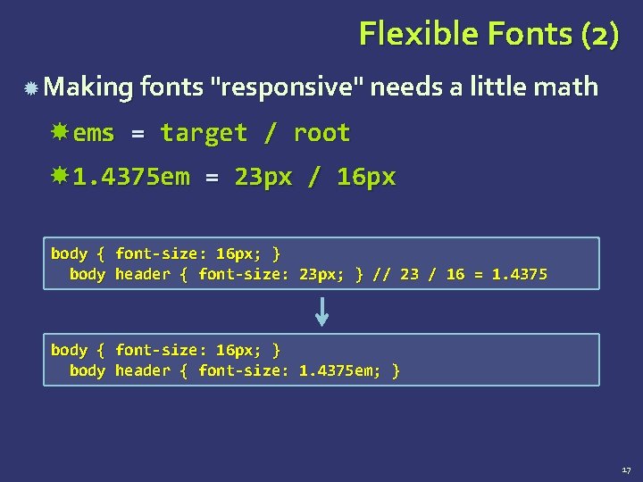
Flexible Fonts (2) Making fonts "responsive" needs a little math ems = target / root 1. 4375 em = 23 px / 16 px body { font-size: 16 px; } body header { font-size: 23 px; } // 23 / 16 = 1. 4375 body { font-size: 16 px; } body header { font-size: 1. 4375 em; } 17
Flexible Fonts Live Demo
Flexible Tables and Menus
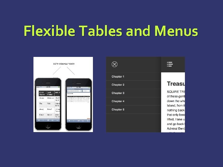
Responsive Tables and Menus Responsive tables Tables are ugly and not scalable http: //css-tricks. com/responsive-data-tableroundup/ Responsive menus Menus take to much space http: //css-tricks. com/responsive-menuconcepts/ 20
Media Queries
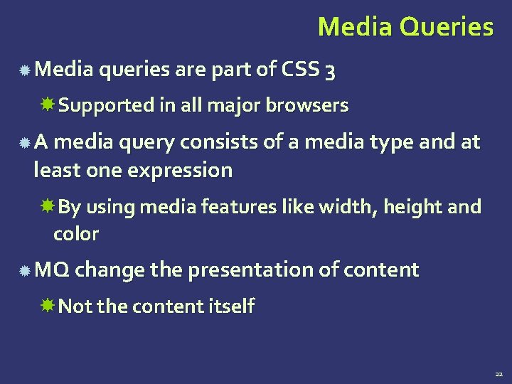
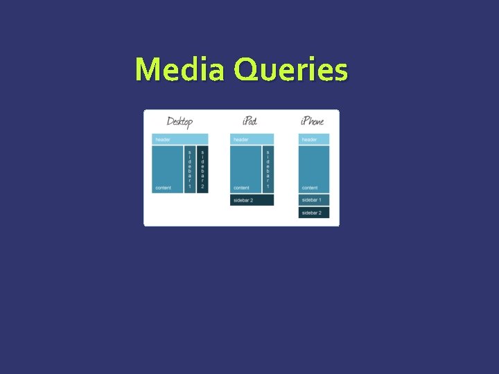
Media Queries Media queries are part of CSS 3 Supported in all major browsers A media query consists of a media type and at least one expression By using media features like width, height and color MQ change the presentation of content Not the content itself 22
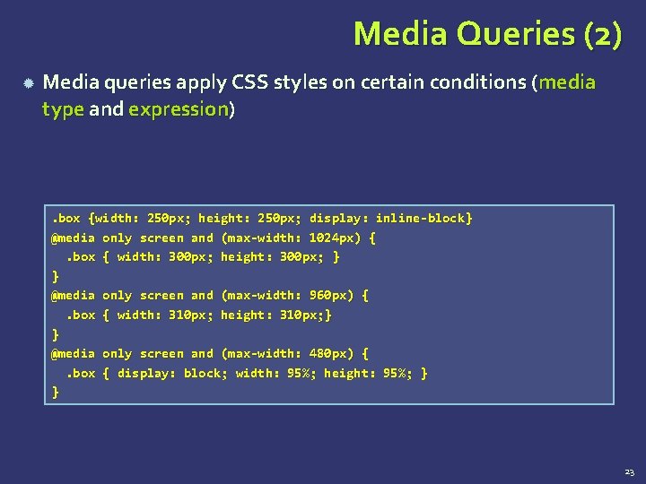
Media Queries (2) Media queries apply CSS styles on certain conditions (media type and expression) . box {width: 250 px; height: 250 px; display: inline-block} @media only screen and (max-width: 1024 px) {. box { width: 300 px; height: 300 px; } } @media only screen and (max-width: 960 px) {. box { width: 310 px; height: 310 px; } } @media only screen and (max-width: 480 px) {. box { display: block; width: 95%; height: 95%; } } 23

Media Queries Live Demo
BOOTSTRAP
Contents Bootstrap Overview – Introduction File Structure Grid System CSS Overview Typography Tables Forms Buttons Images Helper Class
What is Bootstrap? Bootstrap is a free front-end framework for faster and easier web development Bootstrap includes HTML and CSS based design templates for typography, forms, buttons, tables, navigation, modals, image carousels and many other, as well as optional Java. Script plugins Bootstrap also gives you the ability to easily create responsive designs 27
Bootstrap History Bootstrap was developed by Mark Otto and Jacob Thornton at Twitter, and released as an open source product in August 2011 on Git. Hub. In June 2014 Bootstrap was the No. 1 project on Git. Hub! 28
Why Use Bootstrap? Advantages of Bootstrap: Easy to use: Anybody with just basic knowledge of HTML and CSS can start using Bootstrap Responsive features: Bootstrap's responsive CSS adjusts to phones, tablets, and desktops Mobile-first approach: In Bootstrap 3, mobilefirst styles are part of the core framework Browser compatibility: Bootstrap is compatible with all modern browsers (Chrome, Firefox, Internet Explorer, Safari, and Opera) 29
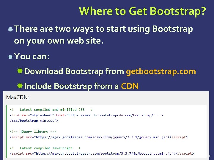
Where to Get Bootstrap? There are two ways to start using Bootstrap on your own web site. You can: Download Bootstrap from getbootstrap. com Include Bootstrap from a CDN 30
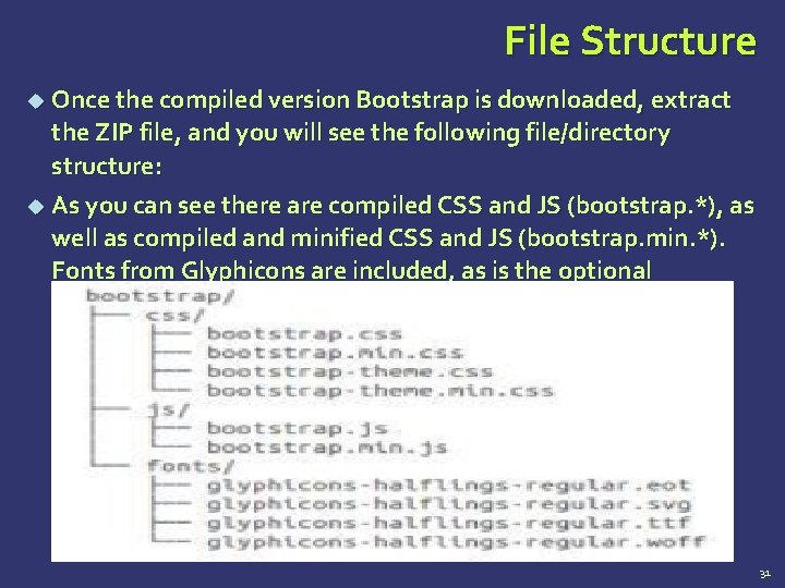
File Structure Once the compiled version Bootstrap is downloaded, extract the ZIP file, and you will see the following file/directory structure: As you can see there are compiled CSS and JS (bootstrap. *), as well as compiled and minified CSS and JS (bootstrap. min. *). Fonts from Glyphicons are included, as is the optional Bootstrap theme. 31
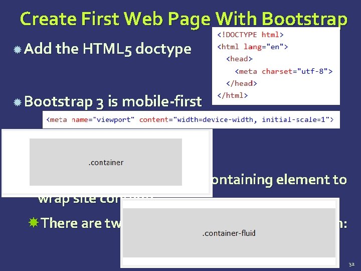
Create First Web Page With Bootstrap Add the HTML 5 doctype Bootstrap 3 is mobile-first Containers: Bootstrap also requires a containing element to wrap site contents. There are two container classes to choose from: 32
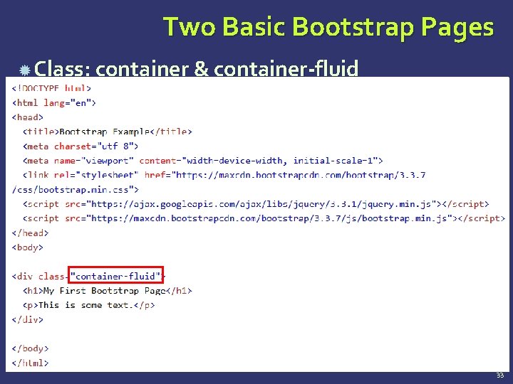
Two Basic Bootstrap Pages Class: container & container-fluid 33
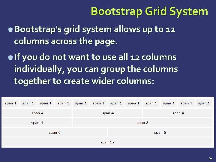
Bootstrap Grid System Bootstrap's grid system allows up to 12 columns across the page. If you do not want to use all 12 columns individually, you can group the columns together to create wider columns: 34
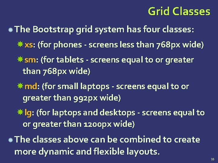
Grid Classes The Bootstrap grid system has four classes: xs: (for phones - screens less than 768 px wide) sm: (for tablets - screens equal to or greater than 768 px wide) md: (for small laptops - screens equal to or greater than 992 px wide) lg: (for laptops and desktops - screens equal to or greater than 1200 px wide) The classes above can be combined to create more dynamic and flexible layouts. 35
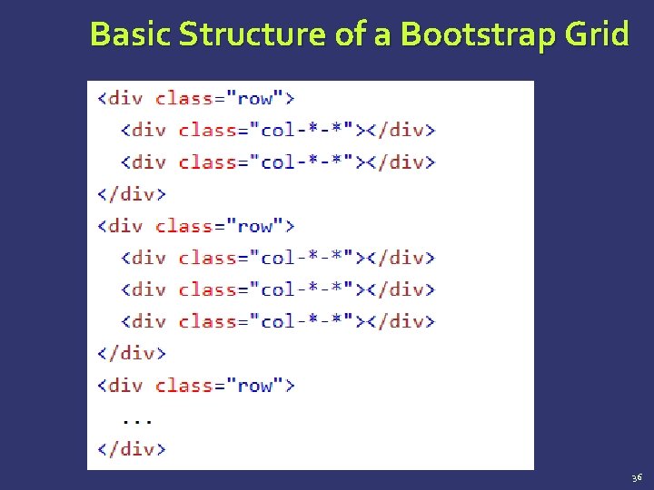
Basic Structure of a Bootstrap Grid 36
BASIC GRID STRUCTURE Let us see some simple grid examples: Example: Stacked-to-horizontal Example: Medium and Large Device Example: Mobile, tablet, desktops
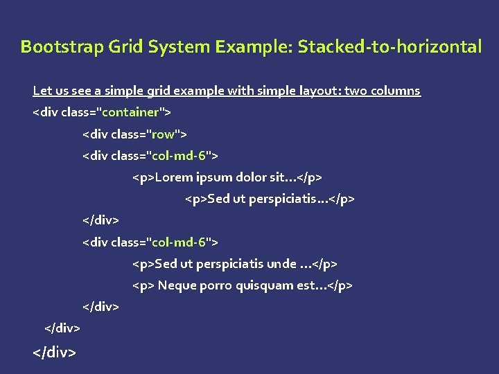
Bootstrap Grid System Example: Stacked-to-horizontal Let us see a simple grid example with simple layout: two columns <div class="container"> <div class="row"> <div class="col-md-6"> <p>Lorem ipsum dolor sit. . . </p> <p>Sed ut perspiciatis. . . </p> </div> <div class="col-md-6"> <p>Sed ut perspiciatis unde. . . </p> <p> Neque porro quisquam est. . . </p> </div>
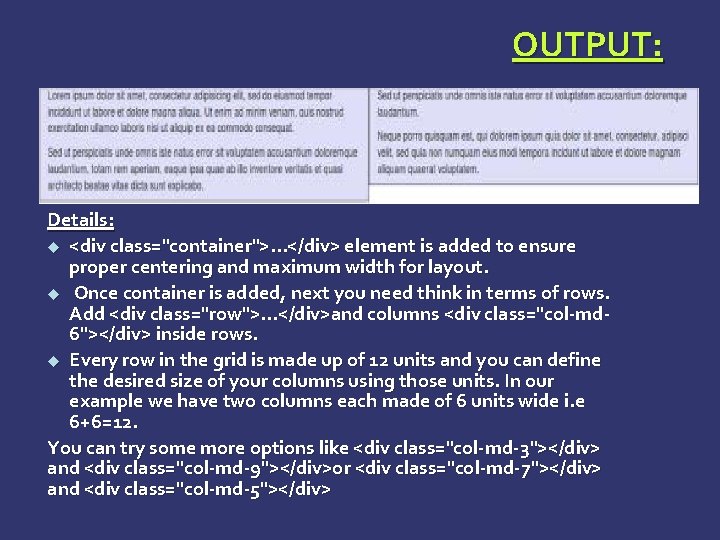
OUTPUT: Details: <div class="container">. . . </div> element is added to ensure proper centering and maximum width for layout. Once container is added, next you need think in terms of rows. Add <div class="row">. . . </div>and columns <div class="col-md 6"></div> inside rows. Every row in the grid is made up of 12 units and you can define the desired size of your columns using those units. In our example we have two columns each made of 6 units wide i. e 6+6=12. You can try some more options like <div class="col-md-3"></div> and <div class="col-md-9"></div>or <div class="col-md-7"></div> and <div class="col-md-5"></div>
Bootstrap Grid System Example: Medium and Large Device Here we had used 2 divs and gave them the 50%/50% split at the medium viewport width: <div class="container"> <div class="row"> <div class="col-md-6 col-lg-4"> <p>Lorem ipsum dolor sit. . . </p> <p>Sed ut perspiciatis unde. . . </p> </div> <div class="col-md-6 col-lg-8"> <p>Sed ut perspiciatis un. . . </p> <p> Neque porro quisquam est. . . </p> </div>
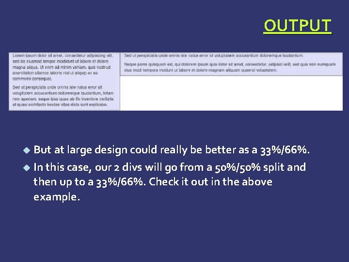
OUTPUT But at large design could really be better as a 33%/66%. In this case, our 2 divs will go from a 50%/50% split and then up to a 33%/66%. Check it out in the above example.
Bootstrap Grid System Example: Mobile, Tablet, Desktops Now this gives us 3 different column layouts <div class="container"> Ø Ø On a phone, it will be 25% on the left, and 75% on the right. On a tablet, it will be 50%/50% again, Large viewport, it will be 33%/66%. 3 different layouts for each of the 3 responsive sizes. Check it out in the following example.
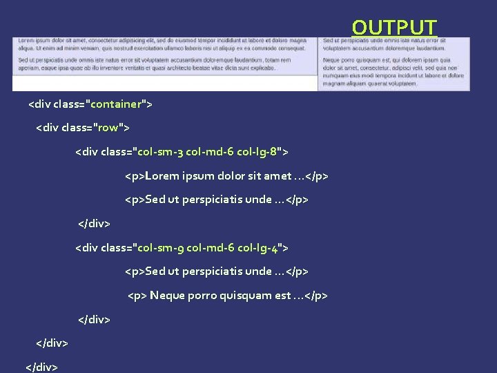
OUTPUT <div class="container"> <div class="row"> <div class="col-sm-3 col-md-6 col-lg-8"> <p>Lorem ipsum dolor sit amet. . . </p> <p>Sed ut perspiciatis unde. . . </p> </div> <div class="col-sm-9 col-md-6 col-lg-4"> <p>Sed ut perspiciatis unde. . . </p> <p> Neque porro quisquam est. . . </p> </div>
Typography Bootstrap uses Helvetica Neue, Helvetica, Arial, and sans-serif in its default font stack. Using typography feature of Bootstrap you can create headings, paragraphs, lists and other inline elements. Headings: All HTML headings (h 1 to h 6) are styled in Bootstrap. An example is as shown below: <h 1>I'm Heading 1 h 1</h 1> <h 2>I'm Heading 2 h 2</h 2> <h 3>I'm Heading 3 h 3</h 3> <h 4>I'm Heading 4 h 4</h 4> <h 5>I'm Heading 5 h 5</h 5> <h 6>I'm Heading 6 h 6</h 6>
Typography INLINE SUBHEADINGS: To add an inline subheading to any of the headings, simply add <small> around any of the elements or add. small class and you will get smaller text in a lighter color as shown in the example below: <h 1>I'm Heading 1 h 1. <small> I'm secondary Heading 1 h 1</small></h 1> <h 2>I'm Heading 2 h 2. <small>I'm secondary Heading 2 h 2</small></h 2> <h 3>I'm Heading 3 h 3. <small>I'm secondary Heading 3 h 3</small></h 3> <h 4>I'm Heading 4 h 4. <small>I'm secondary Heading 4 h 4</small></h 4> <h 5>I'm Heading 5 h 5. <small>I'm secondary Heading 5 h 5</small></h 5> <h 6>I'm Heading 6 h 6. <small>I'm secondary Heading 1 h 6</small></h 6>
Typography LISTS: Bootstrap supports ordered lists, unordered lists, and definition lists. Ø Ordered lists: An ordered list is a list that falls in some sort of sequential order and is prefaced by numbers. Ø Unordered lists: An unordered list is a list that doesn’t have any particular order and is traditionally styled with bullets. If you do not want the bullets to appear then you can remove the styling by using the class. listunstyled. You can also place all list items on a single line using the class. list-inline.
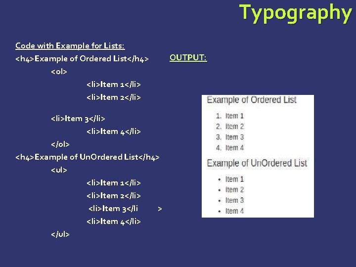
Typography Code with Example for Lists: <h 4>Example of Ordered List</h 4> <ol> <li>Item 1</li> <li>Item 2</li> <li>Item 3</li> <li>Item 4</li> </ol> <h 4>Example of Un. Ordered List</h 4> <ul> <li>Item 1</li> <li>Item 2</li> <li>Item 3</li > <li>Item 4</li> </ul> OUTPUT:
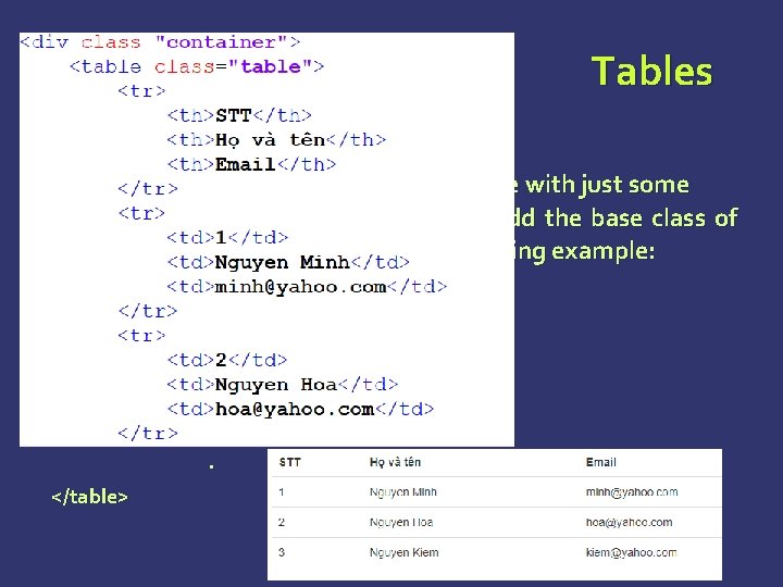
Tables Basic Table: If you want a nice, basic table style with just some light padding and horizontal dividers, add the base class of. table to any table as shown in the following example: <table class="table"> <caption>Basic Table Layout</caption>. . . </table>
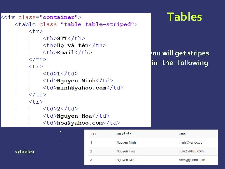
Tables STRIPED TABLE : By adding the. table-striped class, you will get stripes on rows within the <tbody> as seen in the following example: <table class="table-striped"> <caption>Striped Table Layout</caption>. . . </table>
Tables BORDERED TABLE : By adding the. table-bordered class, you will get borders surrounding every element and rounded corners around the entire table as seen in the following example: <table class="table-bordered"> <caption>Striped Table Layout</caption>. . . </table>
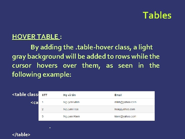
Tables HOVER TABLE : By adding the. table-hover class, a light gray background will be added to rows while the cursor hovers over them, as seen in the following example: <table class="table-hover"> <caption>Striped Table Layout</caption>. . . </table>
Tables RESPONSIVE TABLES: By wrapping any. table in. table-responsive class, you will make the table scroll horizontally up to small devices (under 768 px). When viewing on anything larger than 768 px wide, you will not see any difference in these tables. <div class="table-responsive"> <table class="table"> <caption>Responsive Table Layout</caption>. . . </table>
Forms Here we will discuss, how to create forms with ease using Bootstrap. Form Layout: Bootstrap provides you with following types of form layouts: Ø Vertical (default) form Ø Inline form Ø Horizontal form
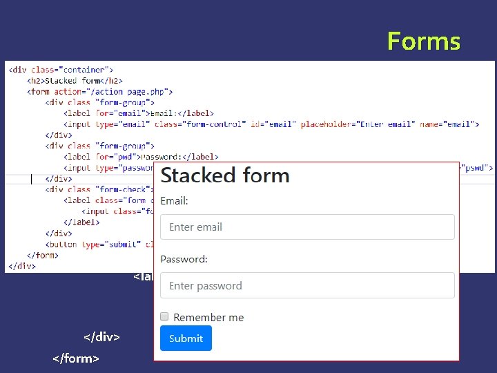
Forms VERTICAL OR BASIC FORM: Ø Add a role form to the parent <form> element. Ø Wrap labels and controls in a <div> with class. form-group. This is needed for optimum spacing. Ø Add a class of. form-control to all textual <input>, <textarea>, and <select> elements. <form role="form"> <div class="form-group"> <label for="name">Name</label> <input type="text" class="form-control" id="name" placeholder="Enter Name"> </div> </form>
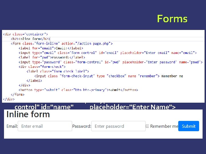
Forms INLINE FORM : To create a form where all of the elements are inline, left aligned and labels are alongside, add the class. forminline to the <form> tag. <form class="form-inline" role="form"> <div class="form-group"> <label class="sr-only" for="name">Name</label> <input type="text" class="formcontrol" id="name" placeholder="Enter Name"> </div> </form>
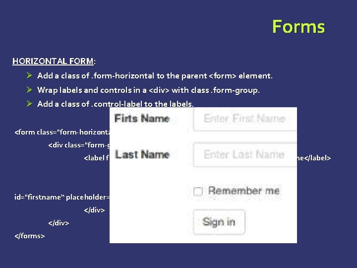
Forms HORIZONTAL FORM: Ø Add a class of. form-horizontal to the parent <form> element. Ø Wrap labels and controls in a <div> with class. form-group. Ø Add a class of. control-label to the labels. <form class="form-horizontal" role="form"> <div class="form-group"> <label for="firstname" class="col-sm-2 control-label">First Name</label> <div class="col-sm-10"> <input type="text" class="form-control" id="firstname“ placeholder="Enter First Name"> </div> </forms>
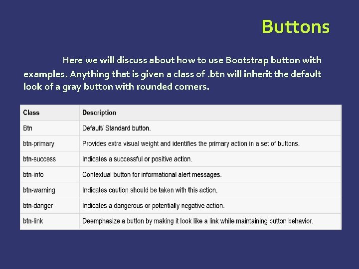
Buttons Here we will discuss about how to use Bootstrap button with examples. Anything that is given a class of. btn will inherit the default look of a gray button with rounded corners.
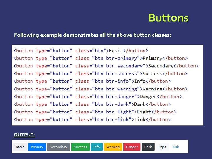
Buttons Following example demonstrates all the above button classes: OUTPUT:
Images Bootstrap provides three classes that can be used to apply some simple styles to images: Ø Ø Ø . img-rounded: adds border-radius: 6 px to give the image rounded corners. . img-circle: makes the entire image round by adding border-radius: 500 px. . img-thumbnail: adds a bit of padding and a gray border:
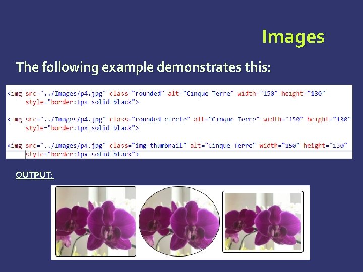
Images The following example demonstrates this: OUTPUT:
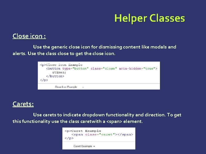
Helper Classes Close icon : Use the generic close icon for dismissing content like modals and alerts. Use the class close to get the close icon. Carets: Use carets to indicate dropdown functionality and direction. To get this functionality use the class caretwith a <span> element.
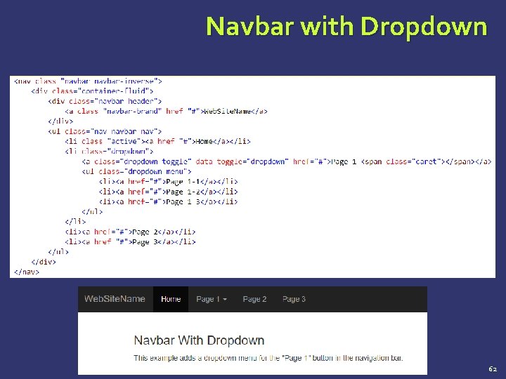
Navbar with Dropdown 62
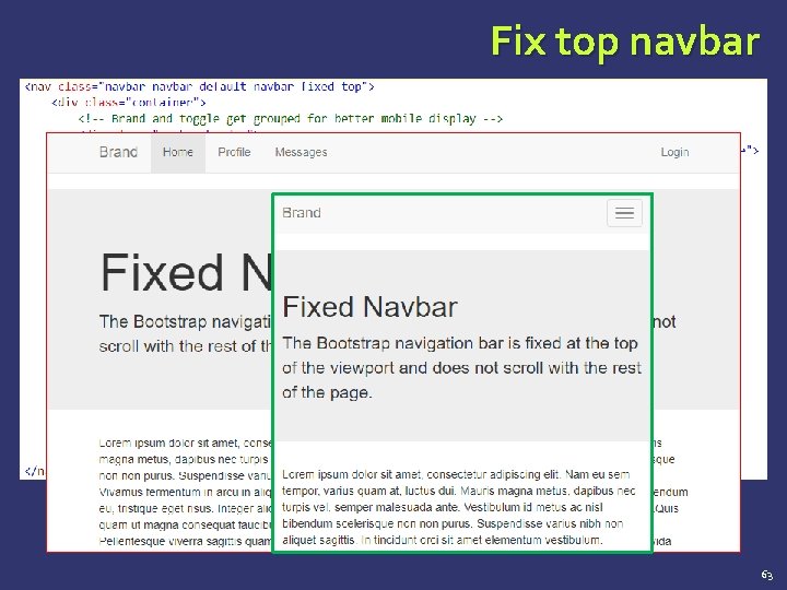
Fix top navbar 63
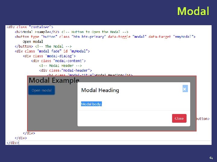
Modal 64
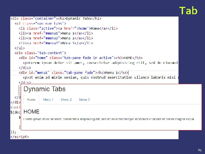
Tab 65
Carousel Tooltip … https: //www. w 3 schools. com/bootstrap 4 66
Summary Bootstrap Overview – Introduction File Structure Grid System CSS Overview Typography Tables Forms Buttons Images Helper Class 67
QUESTIONS…
- Slides: 68