Representing data Population data Lesson 3 Bar charts

Representing data Population data: Lesson 3
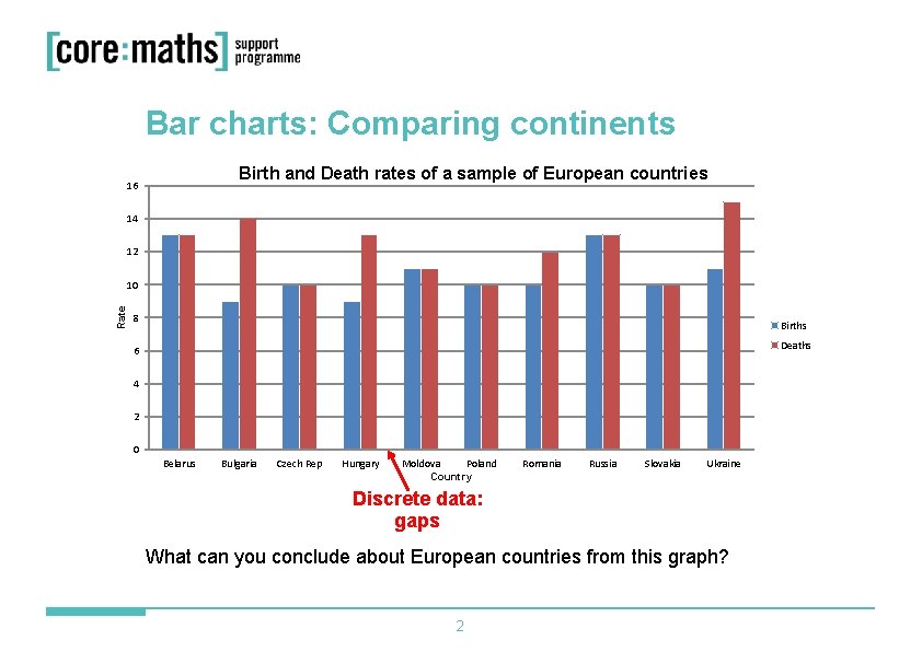
Bar charts: Comparing continents Birth and Death rates of a sample of European countries 16 14 12 Rate 10 8 Births Deaths 6 4 2 0 Belarus Bulgaria Czech Rep Hungary Moldova Poland Country Romania Russia Slovakia Ukraine Discrete data: gaps What can you conclude about European countries from this graph? 2
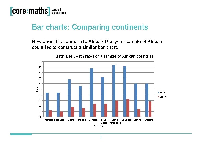
Bar charts: Comparing continents How does this compare to Africa? Use your sample of African countries to construct a similar bar chart. Birth and Death rates of a sample of African countries 50 45 40 35 Rate 30 25 Births 20 Deaths 15 10 5 0 Morocco Cape Verde Ghana Ethiopia Somalia South Central DR Congo Namibia Swaziland Sudan African Rep Country 3
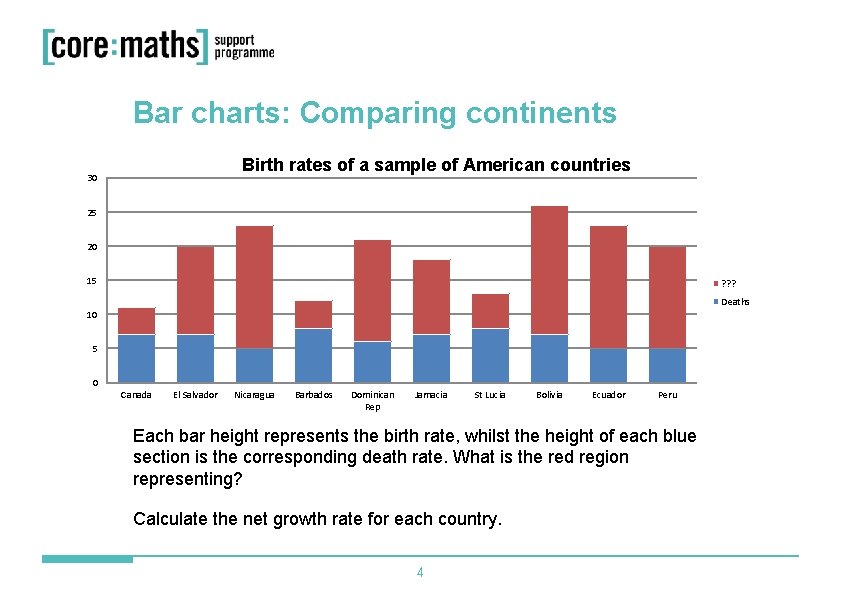
Bar charts: Comparing continents Birth rates of a sample of American countries 30 25 20 15 ? ? ? Deaths 10 5 0 Canada El Salvador Nicaragua Barbados Dominican Rep Jamacia St Lucia Bolivia Ecuador Peru Each bar height represents the birth rate, whilst the height of each blue section is the corresponding death rate. What is the red region representing? Calculate the net growth rate for each country. 4
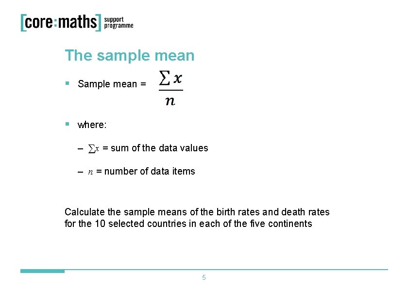
The sample mean § Sample mean = § where: – ∑x = sum of the data values – n = number of data items Calculate the sample means of the birth rates and death rates for the 10 selected countries in each of the five continents 5
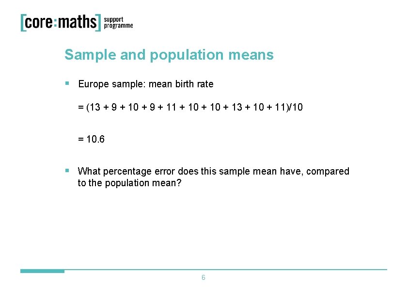
Sample and population means § Europe sample: mean birth rate = (13 + 9 + 10 + 9 + 11 + 10 + 13 + 10 + 11)/10 = 10. 6 § What percentage error does this sample mean have, compared to the population mean? 6
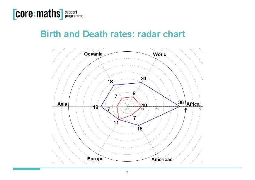
Birth and Death rates: radar chart 20 18 8 7 18 10 7 7 11 16 7 36
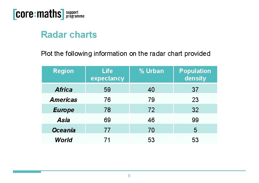
Radar charts Plot the following information on the radar chart provided Region Life expectancy % Urban Population density Africa 59 40 37 Americas 76 79 23 Europe 78 72 32 Asia 69 46 99 Oceania 77 70 5 World 71 53 53 8
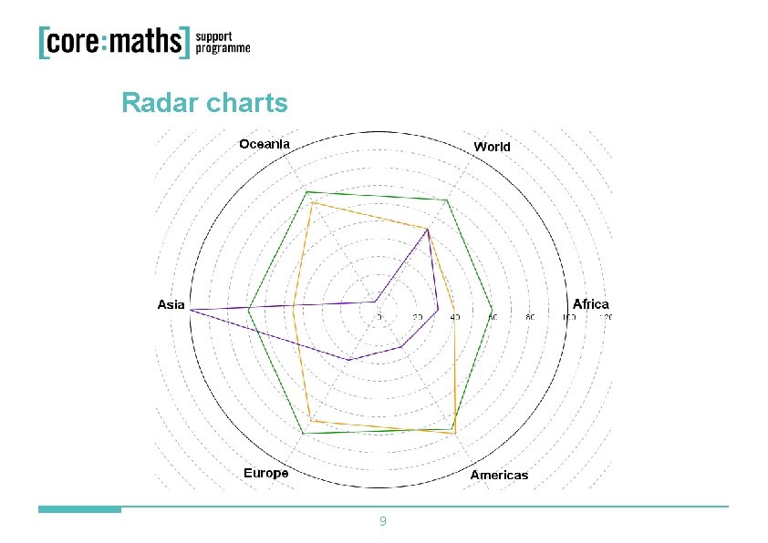
Radar charts 9

Core Maths Support Programme 60 Queens Road Reading RG 1 4 BS E-mail cmsp@cfbt. com Call 0118 902 1243
- Slides: 10