Report Samples Golf Operations Golf Course Maintenance Rounds


- Slides: 22
Report Samples • Golf Operations • Golf Course Maintenance • Rounds & Revenue Filters (if selected) Peer Cluster High End Daily Fee
The charts in this sample report illustrate the powerful metrics and ratios available to Links Insight subscribers. The aggregated data you’ll be seeing is REAL data from a filtered comparison set that includes the clubs listed below. Comparison Set • The Plantation Course at Kapalua • Omni Orlando Resort at Champions Gate • TPC Deere Run • TPC Las Vegas • TPC San Antonio • TPC Scottsdale • Troon North • Turtle Bay Palmer • Turtle Bay Resort • Waikoloa Kings Course • Westin Kierland Golf Club • Whirlwind Golf Club at Wild Horse Pass
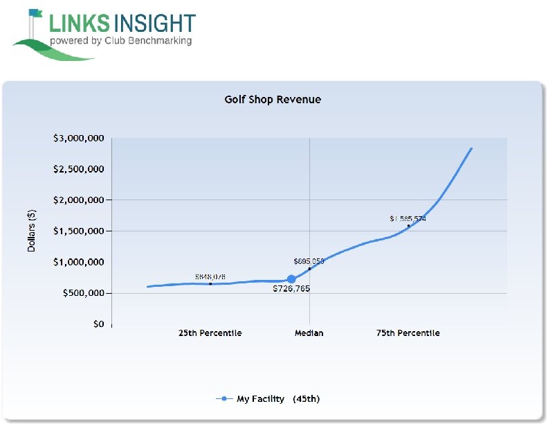
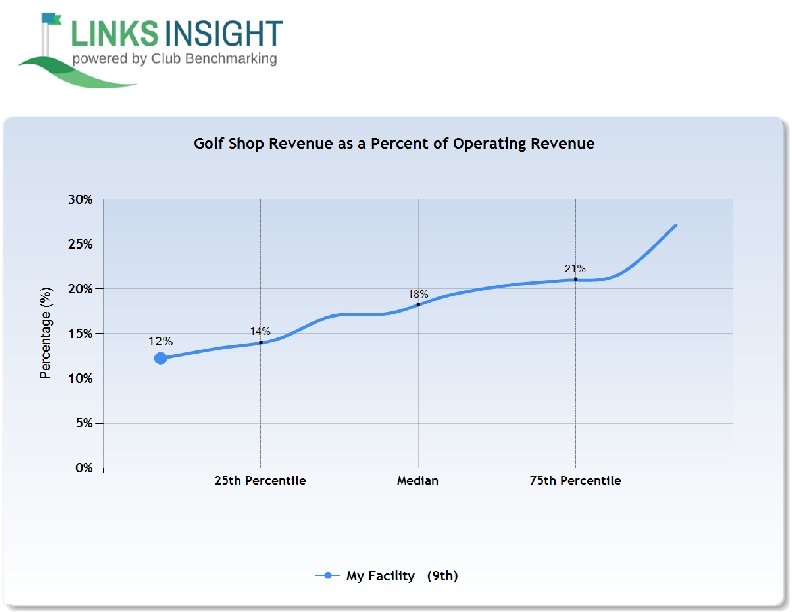
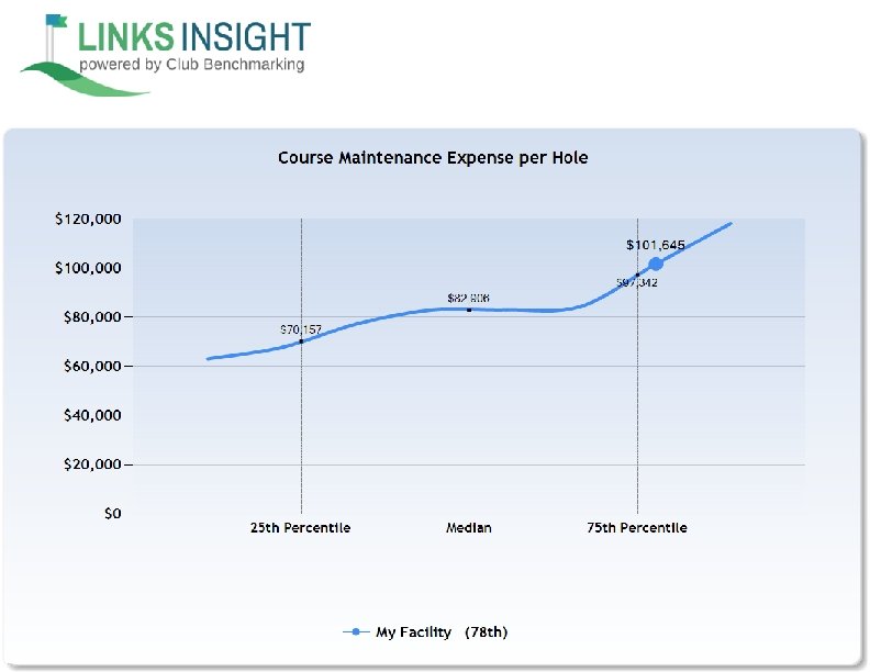
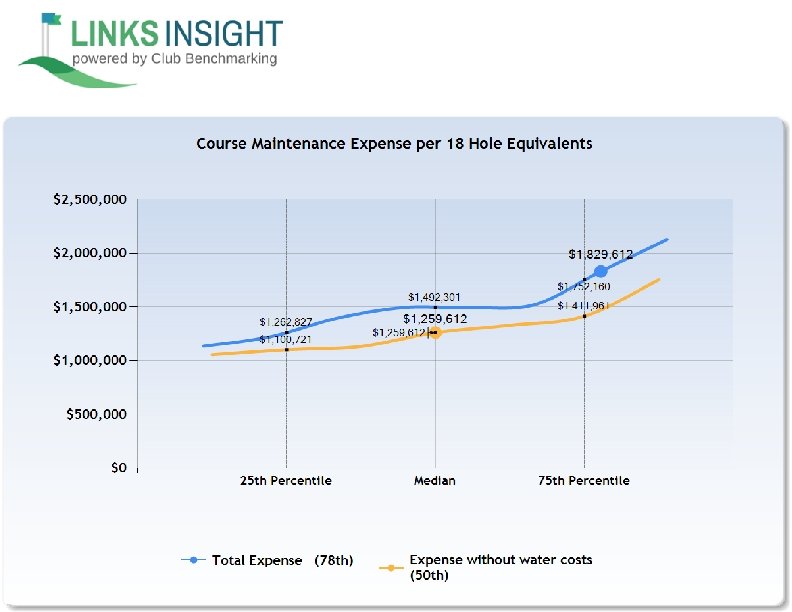
Reading the Reports The charts in this sample report show data presented in quartiles and percentiles. This approach eliminates the risk of results being skewed by a particularly high or low response and reveals variations in the data that would be blurred by averaging. 25 th Percentile (First Quartile): One quarter (25%) of the responses are below this percentile. 50 th Percentile (Median): This is the middle number, where half of the responses are lower and half are higher. For example, in the series 1, 5, 24, 50, 68, the median is 24. 75 th Percentile (Fourth Quartile): One quarter (25%) of the responses are above this percentile. NOTE: While data from comparison sets are always presented in the aggregate, a subscriber will actually see their own numbers overlaid on the chart, typically reported as a dot on a line chart or under the heading of “My Facility” in a pie chart.
Slide Samples • Golf Operations Report • Golf Shop Report
“My Facility” Dot “My Facility” Percentile
The blue line represents the distribution of data for facilities in this peer set. In this case, the golf ops and shop margin range from just above 60% to more than 78%. For a subscriber, the blue dot at the far right (91 st percentile) represents their facility’s position on the curve relative to the comparison set.
What percentage of your total Operating Revenue comes from Golf Operations & Shop? Here’s what the chart tells us. The median for all facilities in this particular comparison set is 92%. For the facility represented by the blue dot, we can say that about 3/4 of the clubs in this set get a higher percentage of total operating revenue from Golf Operations & Shop.
Graphical representations of your club’s data make it easy to see variations from industry norms Golf Operations Revenue Breakdown
Slide Samples • Course Maintenance Report
Course Maintenance Expense
Course Maintenance Expense Breakdown
Course Maintenance Labor VS. Non Labor Expense Detail
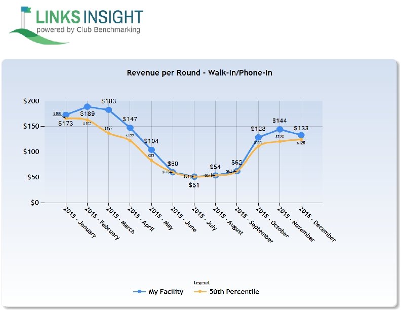
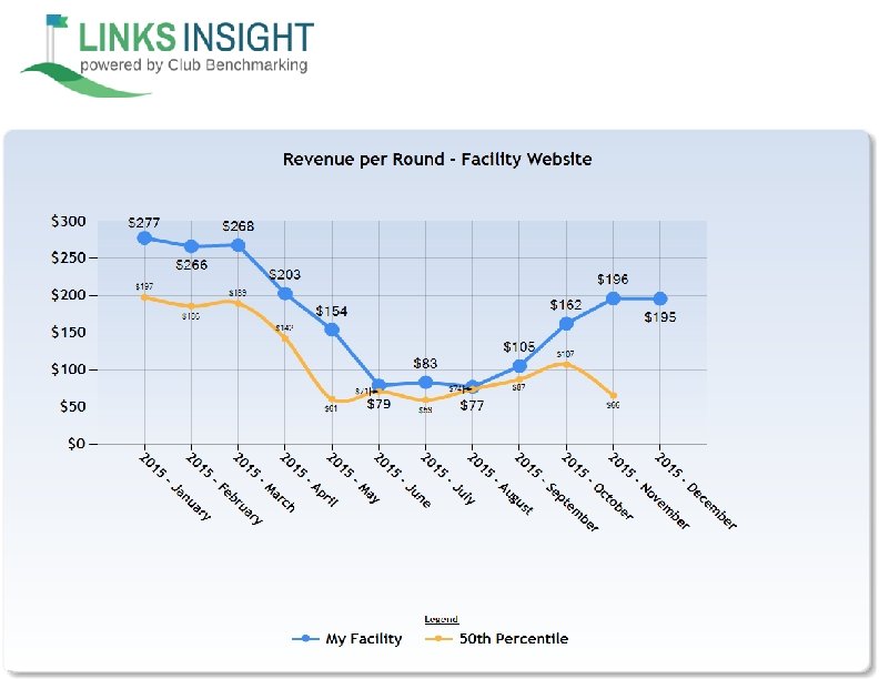
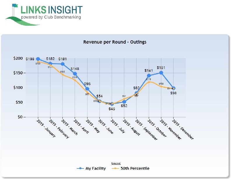
Slide Samples • Rounds & Revenue Report
A Links Insight subscriber would see their data represented by the blue line & dots on this chart The yellow line shows the median for clubs in this peer set