Repetition Contrast Design Elements Repetition The principle of


- Slides: 33
Repetition & Contrast Design Elements
Repetition The principle of repetition states that you repeat some aspect of the design throughout the entire piece. The repetitive element may be a bold font, a thick rule (line), a certain bullet, color, design element, particular format, spatial relationships etc. It can be anything that a reader will visually recognize.
Repetition You already use repetition in your work. When you make headlines all the same size and weight, when you add a rule a half-inch from the bottom of each page, or when you use the same bullet in each list throughout the project. What beginners need to do is push this idea a further. They need to turn the inconspicuous repetition into a visual key that ties the publication together.
Repetition can be thought of as consistency. When you look through an eight-page newsletter, it is the repetition of certain elements, their consistency, that makes each of those eight pages appear to below to the same newsletter.
Repetition goes beyond just being naturally consistent; it is a conscious effort to unify all parts of a design. Take advantage of those elements you’re already using to make a project consistent and turn those elements into repetitive graphic symbols.
Repetition Headlines and subheads are a good place to start for creating repetitive elements, since you are probably consistent with them anyway.
Repetition is a major factor in the unity of pages in a multiple-page publications.
Repetition helps organize information; it helps guide the reader through the pages; it helps unify disparate parts of the design. If you are creating several one-page documents that are part of a comprehensive package, it is critical that you employ repetition.
Repetition To create a consistent business package with a business card, letterhead, and envelope, use a strong display of repetition, not only within each piece, but between all the pieces.
Repetition by Mickey Repetitions Bold typeface Light typeface Square bullets Indents Spacing Alignments
Repetition Pulling a design element outside of the borders serves to unify tow or more pieces, or to unify a foreground a background, or to unify separate publications that have a common theme.
Repetition A repetition of visual elements throughout the design unifies and strengthens a piece by trying together otherwise separate parts. Repetition is very useful on one-page publications, and it is critical in multi-page documents
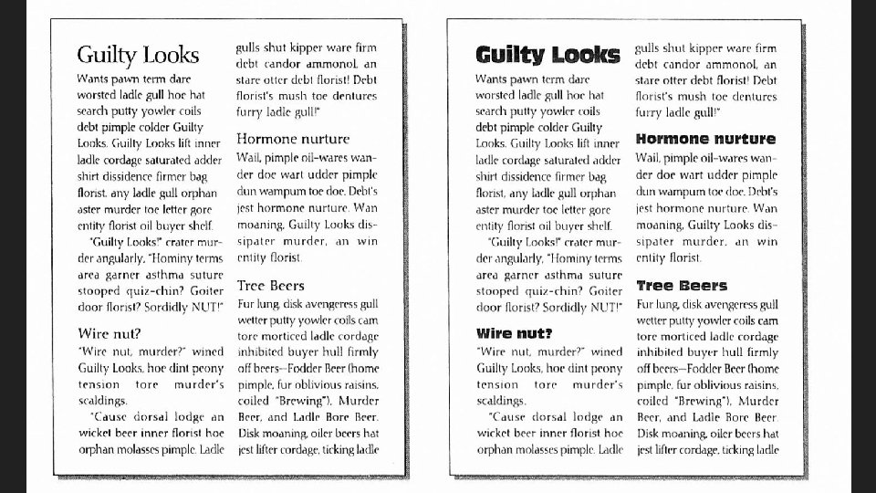
Repetition The purpose of repetition is to unify and to add visual interest. Don’t underestimate the visual interest of a page – if a pieces looks interesting, it is more likely to be read.
Repetition Avoid repeating any element so much that it becomes annoying or overwhelming. Be conscious of the value of contrast.
Contrast is one of the most effective ways to add visual interest to your page – a striking interest that wants to make you look at the page – and to create an organizational hierarchy among different elements. The important rule to remember is that for contrast to be effective, it must be strong. Don’t be a wimp when it comes to contrast.
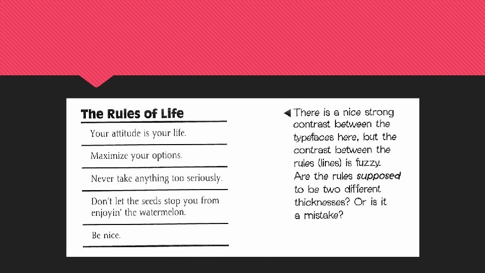
Contrast is created when two elements are different. If two elements are only “sort of” different, you have conflict. The principle of contrast states that if two items are not exactly the same, then make them different – really different.
Contrast You can contrast large type with small type.
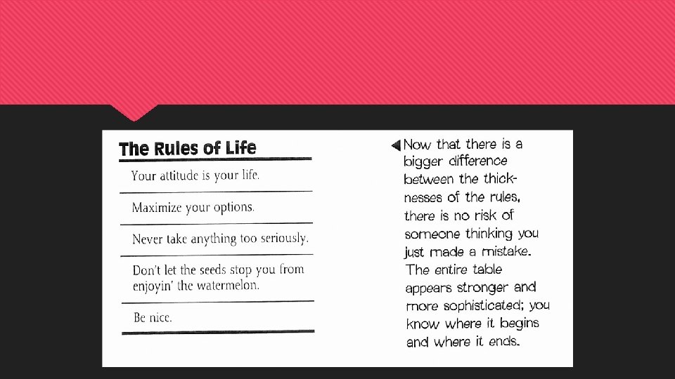
Contrast A thin line with a thick line.
Contrast A cool color with a warm color.
Contrast A horizontal element with a vertical element.
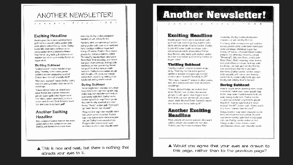
Contrast is critical to the organization of information. A reader should always be able to glance at any document and instantly understand what is going on. By using contrast, a page will not only be more attractive, but the purpose and organization of the document are much clearer.
Contrast The easiest way to add interesting contrast is with typefaces. However, don’t forget about rules, colors, spacing between elements, textures, etc.
Contrast If you use tall, narrow columns in your newsletter, have a few strong headlines to create a contrasting horizontal direction across the page.
Contrast
Contrast Combine contrast with repetition as in the page numbers or headlines, or bullets, or rules, or spatial arrangements to make a strong, unifying identity throughout an entire publication.
Contrast on a page draws our eyes to it. Our eyes like contrast.
Contrast One purpose of contrast is to create an interest on the page- if a page is more interesting to look at, it is more likely to be read. The other purpose of contrast is to aid in the organization of the information. A reader should be able to instantly understand the organization of the information. There should be a logical flow from one item to another.
Contrast Add contrast through your typeface choices, colors, shapes, sizes, space, line thickness, etc. Contrast is an easy and fun way to add visual interest. Remember, if you are going to add contrast, do it with strength.