
Relationship Between Race and Free Lunch Megan Schneider
Relationship Between Race and Free Lunch Megan Schneider GIS II May 2015
Project Goals • Analyze the relationship between school enrollment by race and the percent of students receiving free lunch. • Use of exploratory and explanatory spatial data analysis.

Free Lunch Program • Free lunches are provided for eligible students through the National Lunch Program. • Eligibility is determined by the student’s household’s income and size. • Family of 4 making less than $30, 615 is eligible. Table from Iowa Department of Education
Data Used • I used student demographic data as well as free and reduced lunch data. • Student demographic data: – Iowa Department of Education – In an Excel file format standardization – Joined with School Districts Boundary shapefile from Iowa DNR • Free lunch data: – joined with Iowa school building data
Steps • Exploratory data analysis – Map it out – 3 D extrusion • Explanatory data analysis – Definition query – Clustering check (Moran’s I Spatial Autocorrelation) – Cluster and Outlier Analysis • Relationship/correlation between race and free lunch
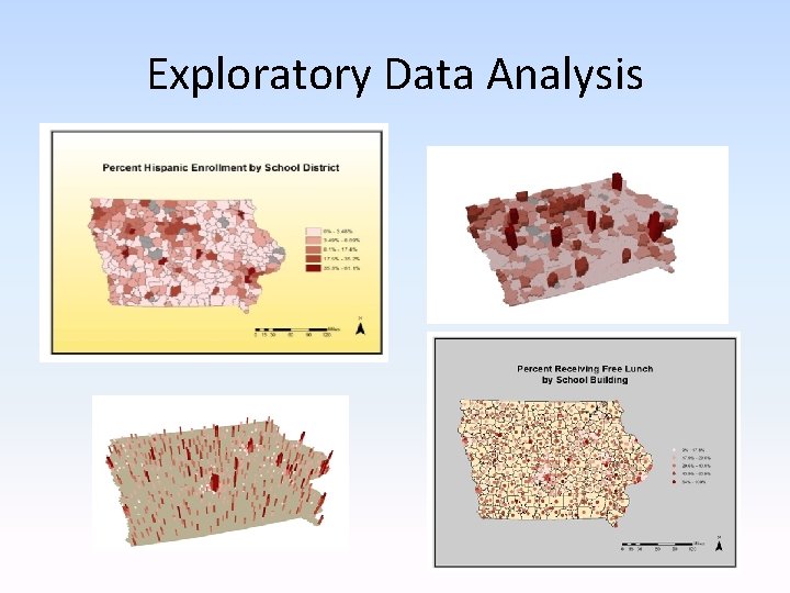
Exploratory Data Analysis
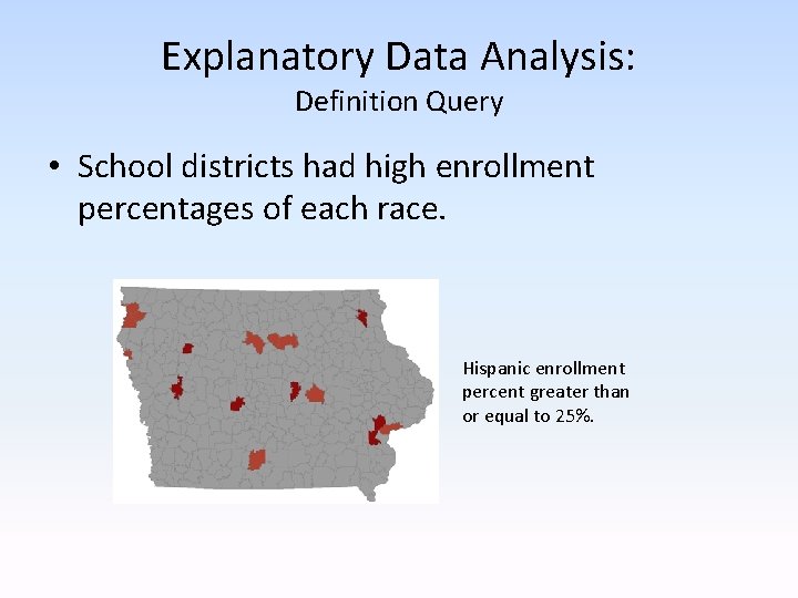
Explanatory Data Analysis: Definition Query • School districts had high enrollment percentages of each race. Hispanic enrollment percent greater than or equal to 25%.
Explanatory Data Analysis: Clustering Check • Moran’s I Spatial Autocorrelation tool – Checks for clustering – Reports on likelihood of results being by chance • Clustering shows whether a phenomenon is random or if it is spatially significant. • Hispanic, White, and free lunch all are clustered with less than 1% likelihood that the distribution is due to chance. • African American enrollment clustered with 5% likelihood due to chance.
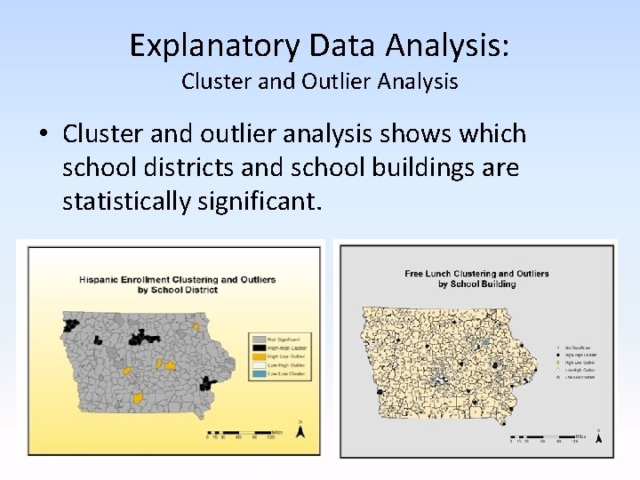
Explanatory Data Analysis: Cluster and Outlier Analysis • Cluster and outlier analysis shows which school districts and school buildings are statistically significant.
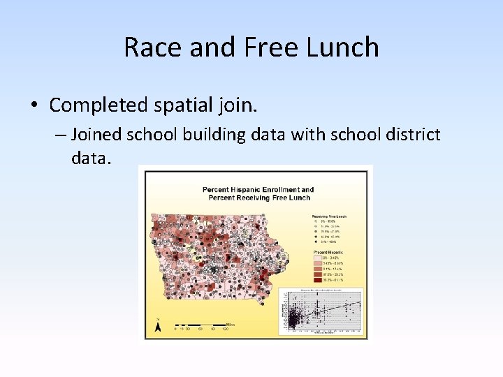
Race and Free Lunch • Completed spatial join. – Joined school building data with school district data.
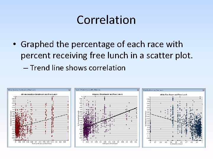
Correlation • Graphed the percentage of each race with percent receiving free lunch in a scatter plot. – Trend line shows correlation
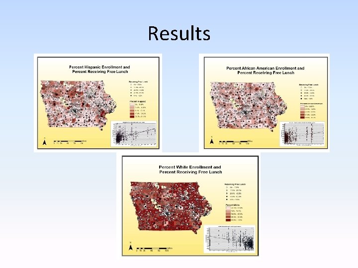
Results
Conclusions • Use of exploratory and explanatory spatial data analysis. – Visualize percentages of students receiving free lunch as well as student race. – Find buildings and districts of statistical importance. – Understand the relationship between different races and the receiving of free lunches. • Positive correlation between African American and Hispanic enrollment and the receiving of free lunch. • Negative correlation between White enrollment and the receiving of free lunch.
- Slides: 13