Relationship Between Chicago Residents Living in Poverty and

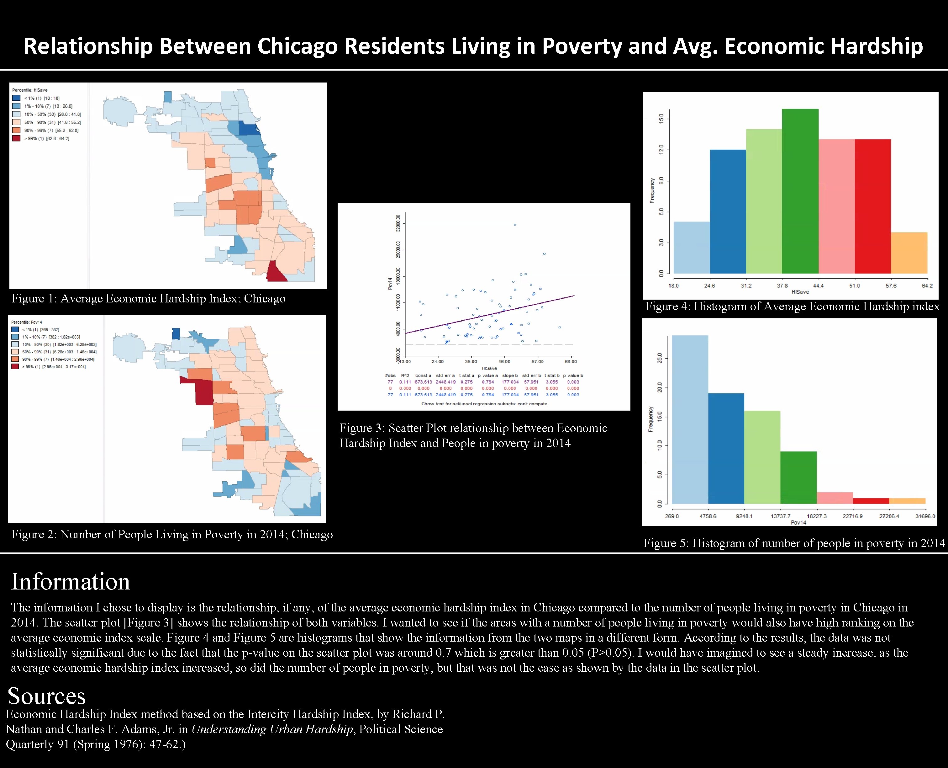
Relationship Between Chicago Residents Living in Poverty and Avg. Economic Hardship Figure 1: Average Economic Hardship Index; Chicago Figure 4: Histogram of Average Economic Hardship index Figure 3: Scatter Plot relationship between Economic Hardship Index and People in poverty in 2014 Figure 2: Number of People Living in Poverty in 2014; Chicago Figure 5: Histogram of number of people in poverty in 2014 Information The information I chose to display is the relationship, if any, of the average economic hardship index in Chicago compared to the number of people living in poverty in Chicago in 2014. The scatter plot [Figure 3] shows the relationship of both variables. I wanted to see if the areas with a number of people living in poverty would also have high ranking on the average economic index scale. Figure 4 and Figure 5 are histograms that show the information from the two maps in a different form. According to the results, the data was not statistically significant due to the fact that the p-value on the scatter plot was around 0. 7 which is greater than 0. 05 (P>0. 05). I would have imagined to see a steady increase, as the average economic hardship index increased, so did the number of people in poverty, but that was not the case as shown by the data in the scatter plot. Sources Economic Hardship Index method based on the Intercity Hardship Index, by Richard P. Nathan and Charles F. Adams, Jr. in Understanding Urban Hardship, Political Science Quarterly 91 (Spring 1976): 47 -62. )
- Slides: 1