Regression Analysis Regression analysis is used to estimate
")


 is the unconditional expected value of Y. • E(Y|X) – expected")


 calculates the expected value of Y conditional on the")


=ß 1 The expected value of b 1 is ß")


=ß 0+ ß 1 X 1 may not")
= αXß")

=ln(α)+ß ln(X) • Performing ordinary least")


 Hourly Wage 24 20 Male Wage 16 Female Wage")


 15 Linear(North)")

- Slides: 52
Regression Analysis • Regression analysis is used to estimate relationship between dependent variable (Y) and one or more independent variables (X). • Our theory states Y=f(X) • Regression is used to test theory. • To empirically support or reject idea. 1
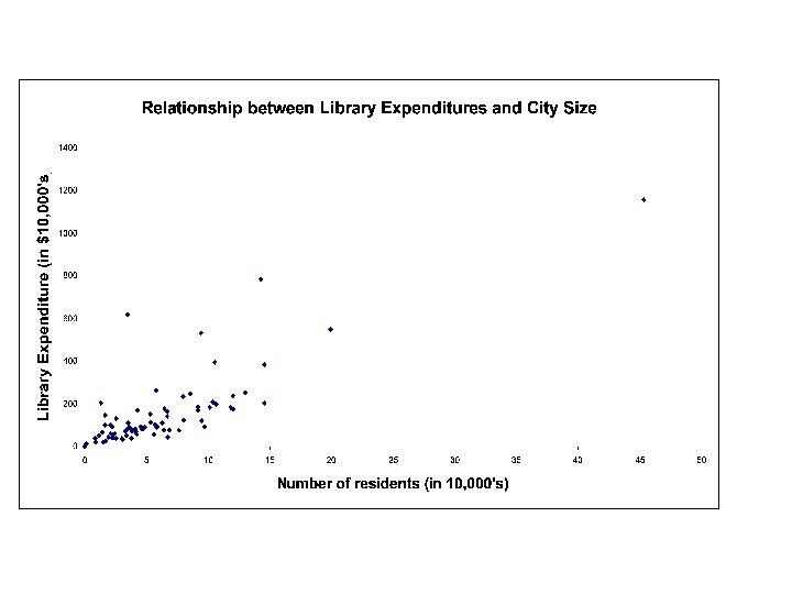
• Consider the variable, total library expenditure in cities within Los Angeles County in 1999. • The library expenditure data can summarized by the distribution of the variable. • A distribution assigns the chance a variable equals a value or range of values. • It may illustrate patterns in the data. 2
Regression Analysis • What accounts for the differences in expenditures across cities? • What is causing library expenditure in Alhambra to be greater than in Arcadia? • Theory attempts to answer question and regression attempts to verify theory.
• What is the meant by data being a population? A sample? • Let’s assume the data represent a population. • The expected value of library expenditures, E(Y), would be the population mean expenditure, µ. • E(Y) = $1, 571, 126. 093 – interpret. 4
Relationship between library expenditure and other variables • If library expenditure related to other variables, the conditional expected value of Y will differ from the unconditional. • The average value of Y will vary for different values of X
• E(Y) is the unconditional expected value of Y. • E(Y|X) – expected value of Y conditional on the variable X. • E(Y|X) ≠ E(Y) indicates there is relationship between Y and X. 6
• Suppose X indicates whether the library is run by the individual city or is part of the county library system: • X =1 if city run; =0 if county run. • E(Y|X=1) – expected value of library expenditures conditional on the library being city-run. • E(Y|X=0) – expected value of library expenditures conditional on the library being county-run. • E(Y|X=1)=2, 450, 547. 42; E(Y|X=0) = 951, 533. 80. – Libraries run by individual cities have greater mean expenditures than the average library. – Libraries run by individual cities have greater mean expenditures than libraries in the county system.
Regression Analysis • Given that we have defined the data as the population we can say definitely the results indicate a relationship between Y and X within the population. • Our analysis however doesn’t necessarily mean the relationship is causal. • Causation is stated only by our theory. • If data represents a sample, we don’t know if the relationship that exists in sample also exists within the population.
Population • We theorize that within the population there is a function that relates the dependent variable to its determinants: • Y = f(X) + e. – where X can be a number of variables that “cause” the dependent variable Y – f(X) is the specific function that relates X to Y – e is the error term, the difference between the actual value of Y and the value generated by f(X). • Normally f(X) will not completely account for all the variation in Y. The best it will do is calculate the expected value of Y given specific values of X.
• The function f(X) calculates the expected value of Y conditional on the independent variable(s) X: – f(X) calculates E(Y|X) • If we theorize that the function representing the relationship between X and Y is linear, the expected values of Y can be expressed as: – E(Y|X)=ß 0+ ß 1 X 1+ ß 2 X 2+…. This is the population regression equation.
Sample • In practice we won’t have all the data that make up Y and X. • Therefore we won’t be able to actually calculate the ß parameters in the population equation. • We will calculate the sample equation: – ŷ = b 0 + b 1 X 1+ b 2 X 2+…… – where ŷ is the estimate of E(Y|X) – b 0 is the estimate for the ß 0 – b 1 is the estimate for the ß 1 etc.
Sample • Inferences from the sample are used to describe relationships within the larger population. • Assume the simple regression model: ŷ = b 0 + b 1 X 1 – where y is expenditures by the sampled libraries – X represents the number of residents in the sampled cities.
The SAS System (note: 15: 08 Sunday, March 21, 2004 Y and X are untransformed) 1 The REG Procedure Model: MODEL 1 Dependent Variable: expend Analysis of Variance Source DF Sum of Squares Model Error Corrected Total 1 73 74 1. 620351 E 14 8. 517114 E 13 2. 472063 E 14 Root MSE Dependent Mean Coeff Var 1080152 1571126 68. 75017 Mean Square 1. 620351 E 14 1. 166728 E 12 R-Square Adj R-Sq F Value Pr > F 138. 88 <. 0001 0. 6555 0. 6507 Parameter Estimates Variable DF Parameter Estimate Intercept residents 1 1 49667 24. 30238 Standard Error t Value Pr > |t| 179511 2. 06219 0. 28 11. 78 0. 7828 <. 0001
• Equation: ŷ = 49667 + 24. 30 X 1 • Interpret b 0, b 1. ∆ŷ= b 1 ∆X 1 ∆ŷ= 24. 30 ∆X 1 • An additional resident in a city is estimated to increase predicted library expenditure by $24. 30. • What is the relationship between b 1 and ß 1?
R 2 • The sample equation is not accounting for all the variation in the dependent variable, y. • Interpret coefficient of determination, R 2 – R 2 measures the proportion of the variation in dependent variable that is explained by the model. – How much of the variation in library expenditures across cities is explained by differences in city size?
• R 2=65. 55% – Our model accounts for 65. 55% of the variation in library expenditures. – City size explains 65. 55% of the variation in library expenditures. • Part of the variation in library expenditures remains unexplained.
Residual Term • Residual term, ê, is the difference between the actual and predicted value of the dependent variable • yi = ŷi + êi – Actual value of dependent variable = predicted value + residual • Interpret residual terms (êi= yi- ŷi) from regression model. • The non-zero residual terms and the R 2 value less than 100% both indicate the model doesn’t perfectly predict each y-value.
• Stochastic relationship: there is a whole distribution of Y-values for each value for X. • The predicted values, ŷ, are estimates of the expected value of Y conditional on X. • The ŷ’s are estimates of mean library expenditures conditional on city size.
Regression Analysis • The relationship between city size and expenditures found within the sample may not necessarily hold within the population. • b 1 is an estimate for ß 1 • The slope of the sample regression equation (b 1) is only an estimate of the “true” relationship between Y and X within the population. • b 1 is a variable, its value depends on the specific sample taken.
Regression Analysis • E(b 1)=ß 1 The expected value of b 1 is ß 1 but there still may be a difference between a particular calculated b 1 and ß 1. • This difference is called sampling error. • The slope estimate b 1 follows a sampling distribution with a standard deviation equal to Sb 1 (=2. 062 in our regression output). • Population Equation: E(Y|X)=ß 0+ ß 1 X 1 • Interpret hypotheses: H 0: ß 1=0 H 1: ß 1≠ 0
Steps to perform hypothesis test. 1. State null and alternative hypotheses, H 0 and H 1. 2. Use t-distribution. 3. Set level of significance, α. This gives the size of the rejection region. 4. Find the critical values. For a two tailed test, the critical values are ± tα/2, γ where γ is degrees of freedom n-k-1. 5. Calculate test statistic t=(b 1 -ß 1)/Sb 1. 6. Reject H 0 if test statistic, t<- t α/2, , γ or t> t α/2, , γ
Regression Analysis • Multiple Regression – The “true” model would have all the X’s on the right hand side that have a systematic relationship with Y. Example of linear model ŷ = b 0+b 1 X 1+b 2 X 2+ b 3 X 3+b 4 X 4 • Where ŷ is predicted library expenditure; X 1 is number of residents in city; X 2 =1 if library run by city =0 if library run by county; X 3 is percent of city residents who are school aged children; X 4 is median household income by city. a. b. c. Interpret each of the b coefficients (be careful in interpreting b 2, the coefficient for the dummy variable X 2) Interpret R 2 (why is R 2 higher in the multiple regression compared to the simple regressions? ) Perform and interpret the hypothesis tests for ß
25
Nonlinear Models • The linear model E(Y|X)=ß 0+ ß 1 X 1 may not be appropriate for some relationships between variables. For example: Non-linear Relationship 100000 80000 Y 60000 40000 20000 0 0 5 10 15 X 20 25 30
Regression Analysis • Assume theoretical relationship between X and Y within population: F(X)= αXß (assume α is positive) • If ß=1 then relationship between X and Y is positive and linear. Slope of relationship is α. • If 0<ß<1 relationship is positive and nonlinear (concave). Slope no longer constant. (Use calculus to solve for slope). • If ß>1, convex nonlinear relationship. What if ß is less than 0; for example ß=-1?
• Nonlinear models can be estimated by taking the natural log transformation of the data. • Natural log value e=2. 718 • Example of transformation: – if X=21, 900 ln(X) equals t where et=21, 900 – ln(X)=9. 994
Model: Y=αXß • Take log of both sides: ln(Y)=ln(α)+ß ln(X) • Performing ordinary least squares model on transformed data converts unit changes into percentage changes.
Log/log model The SAS System 21: 22 Sunday, March 21, 2004 1 The REG Procedure Model: MODEL 1 Dependent Variable: logexpend Analysis of Variance Source DF Sum of Squares Mean Square Model Error Corrected Total 1 73 74 61. 21866 24. 68482 85. 90347 61. 21866 0. 33815 Root MSE Dependent Mean Coeff Var 0. 58151 13. 81488 4. 20927 R-Square Adj R-Sq F Value Pr > F 181. 04 <. 0001 0. 7126 0. 7087 Parameter Estimates Variable Intercept logresidents DF Parameter Estimate Standard Error t Value Pr > |t| 1 1 5. 29263 0. 80086 0. 63693 0. 05952 8. 31 13. 46 <. 0001
Regression Analysis • Log/log regression model: – ŷ=b 0+b 1 X 1 = 5. 29263 + 0. 80086 X 1 Interpret b 1 coefficient: • A 10% increase in city size will cause predicted library expenditures to increase by 8%. • b 1 is an elasticity. • Interpret and compare R 2 – does the higher R 2 mean this model is more appropriate than the linear model?
Log/linear regression model – Model where dependent variable is log transformed but right hand variable(s) is not. – Commonly used in growth time series studies, for example, where y is the log of GNP and X is an index of time (year). Also used in labor wage models.
• Log/linear model results for our data where y is the log of library expenditures and X is number of residents by city. – ŷ=b 0+b 1 X 1 = 13. 137+. 00001 X 1 Interpret b 1 – Suppose ∆X 1=1000; ∆ŷ would equal. 01 or 1% – A city size increase of 1000 residents would induce a 1% increase in predicted library expenditures. Limitations of log models.
Exercise Using Labor Data • Suppose we collect data on wages and years of experience for a sample of people in the workforce. • The scatter diagram of the data suggests wages rise with experience regardless of gender. • The fitted regression lines suggest females earn on average a fixed amount less than males for a given level of experience. 34
Wage Equation • 38
• Interpret the coefficient for years of experience. • Does the model imply males and females experience the same return in wages for an additional year of experience? • Interpret the coefficient for gender. • Do the sample results imply females are treated differently than men in the labor market? 39
• Go back to the data and calculate the sample mean wage separately for males and females. • Does the comparison of the sample means tell the same story as the regression coefficient for the gender variable? • Why is the gender coefficient from the regression more appropriate evidence of possible labor market discrimination than the comparison of the sample means? 40
• Perform the hypothesis test using a level of significance of. 05. H 0: β 2 = 0 H 0: β 2 < 0 At the test conclusion can we confidently state a negative wage effect exists for females in the labor market? Why should we perform a hypothesis test before using our regression statistics to arrive at general conclusions? Can we generalize that years of experience has an effect on expected wage within the population? Perform a hypothesis test. 41
Model Specification • Suppose we collect data on wages and years of experience for a sample of people in the workforce. • The scatter diagram of the data suggests a positive relationship between years of experience and wage. • The fitted regression line implies an additional year of experience causes predicted wage to increase by 53 cents.
Model Specification • The coefficient for the experience variable may be a biased estimate of the relationship within the population due to model misspecification. • The scatter diagram separating male and female wages indicates gender represents a fixed effect on predicted wage. • The fitted regression lines suggests an extra year of experience increases predicted wage by 50 cents for both groups.
Model Specification The wage regression model controlling for experience: where x is years of experience and y is hourly wage. Standard errors of the parameter estimates in parentheses. (perform hypothesis test for β 1)
Model Specification The wage regression model controlling for experience and gender: where y is hourly wage, x 1 is years of experience and x 2=1 if male, 0 if female. Standard errors of the parameter estimates in parentheses. (perform hypothesis tests for β 1 and β 2)
Model Specification (different wage data) Hourly Wage 24 20 Male Wage 16 Female Wage 12 Male Wage 8 Female Wage 4 0 0 2 4 6 8 10 12 14 16 18 Years of Experience 20 22
Control for Region • Suppose we had data on wages and the mean January temperature of the city the wageearner lived • We want to test the hypothesis that there is a relationship between wages and weather conditions • Our data is for fourteen individuals; hourly wage is in dollars and temperature is Fahrenheit degrees 52
Wage 18 10 14 19 9 18 10 28 20 24 29 19 28 20 Winter Mean Temp 35 35 40 50 50 65 65 10 10 20 30 30 40 40 Region South South North North 53
Control for Region • The scatter diagram indicates an inverse relationship between wages and mean January temperature • The estimated linear trend indicates a one point increase in mean January temperature is associated with a 21 cent decrease in predicted wage. 54
Scatter Diagram for Wages 35 30 25 Wage 20 15 10 5 0 0 10 20 30 40 50 60 70 Mean January Temperature 55
Scatter Diagram for Wages 35 30 25 Wage 20 15 R 2 = 0. 2925 10 5 0 0 10 20 30 40 50 60 70 Mean January Temperature 56
Control for Region • Climate broadly correlates with region: • The North is colder than the South • Our sample data consists of people from both regions • This scatter diagram distinguishes the sample by region 57
Scatter Diagram for Wages 35 30 25 Wage 20 South North 15 10 5 0 0 10 20 30 40 50 60 70 Mean January Temperature 58
Control for Region • 59
Scatter Diagram for Wages 35 30 25 20 Wage South North Linear(South) 15 Linear(North) 10 5 0 0 10 20 30 40 50 60 70 Mean January Temperature 60
Control for Region • 61