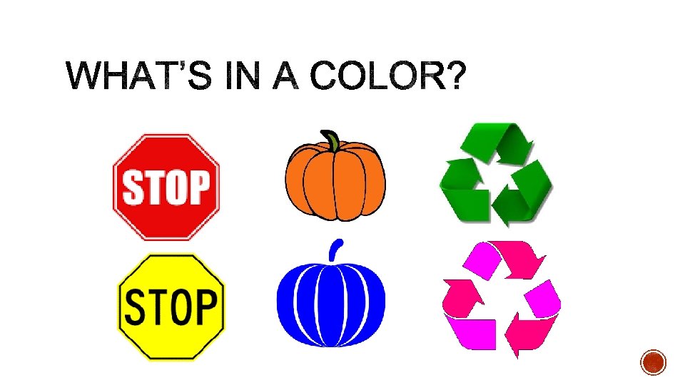
Red means stop green means go Green is


- Slides: 18
§ Red means stop, green means go § Green is organic, recycle § Holidays: red/green = Christmas § Wedding: white is pure, clean § Black: funeral, evil § Love: pink and red § Caution: yellow road signs § Sports Teams § State flag/country flag § Fall: orange/yellow
§ Color offers an instantaneous method for conveying meaning and message without words. § Color is the visual component people remember most about a brand followed closely by shapes/symbols then numbers and finally words. § Research has reinforced that 60% of the time people will decide if they are attracted or not to a message - based on color alone! § Color increases brand recognition by up to 80 percent. § Color can improve readership by 40 percent 1, learning from 55 to 78 percent 2, and comprehension by 73 percent 3.
Case Study: Heinz § Consider the phenomenal success Heinz EZ Squirt Blastin' Green ketchup has had in the marketplace. More than 10 million bottles were sold in the first seven months following its introduction, with Heinz factories working 24 hours a day, seven days a week to keep up with demand. The result: $23 million in sales attributable to Heinz green ketchup [the highest sales increase in the brand's history]. All because of a simple color change. Case Study: Apple Computer § Apple brought color into a marketplace where color had not been seen before. By introducing the colorful i. Macs, Apple was the first to say, "It doesn't have to be beige". The i. Macs reinvigorated a brand that had suffered $1. 8 billion of losses in two years. (And now we have the colorful i. Pods. )
§ http: //philosophycommunication. com/marketing/advertising-color-theory/ § http: //blog. theloomisagency. com/infographic-the-psychology-of-color/ § http: //www. ufunk. net/en/design/psychology-of-color/
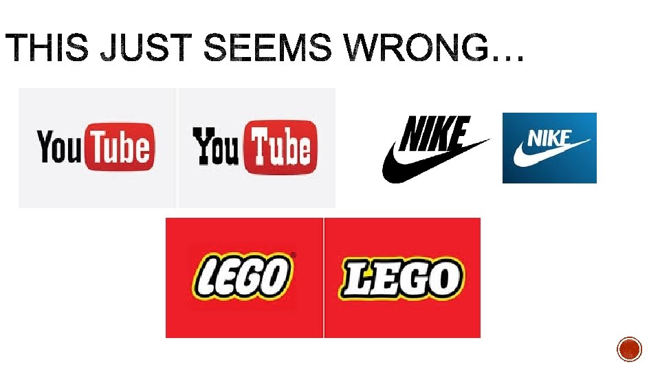
§ Typography is great for enhancing a theme § adding personality § increasing emphasis of an idea or reinforcing a thought § demonstrating emotion § creating interest § crafting aesthetic appeal
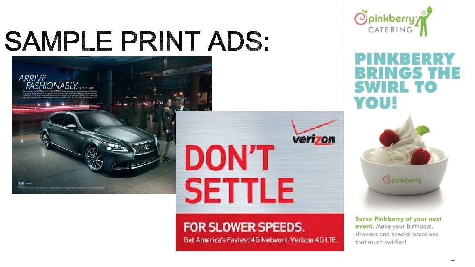
print digital
SIZE AND SPACING STOP
communication voice Visual appeal
Remember – elements of good design are made up of: 1. Consistency – Keeping your chosen font families fairly close, don’t use Novecento Neue in your headline and Papyrus in your text! 2. Hierarchy – Headlines or more important parts in your text layout should be underlined. Be it bold, italics, uppercase, or simply a more defined typeface. 3. Alignment – Don’t let your text flow in a rivery shape. Keep your rulers, guides, and baselines consistent.
§ http: //studiod. com/typography-matters-a-font-of-content-marketing-inspiration/ § http: //bonfx. com/23 -really-bad-font-choices/