React Native Animation Overview Goals of animation Stationary
![const App = () => { const [expanded, set. Expanded] = use. State(false); Animation const App = () => { const [expanded, set. Expanded] = use. State(false); Animation](https://slidetodoc.com/presentation_image_h/1a5176c4d3d2a131919de42d5c301582/image-17.jpg)
![Example 2 const App = () => { const [box. Position, set. Box. Position] Example 2 const App = () => { const [box. Position, set. Box. Position]](https://slidetodoc.com/presentation_image_h/1a5176c4d3d2a131919de42d5c301582/image-21.jpg)
- Slides: 23

React Native Animation

Overview • Goals of animation • Stationary objects must overcome inertia as they start moving. • Objects in motion have momentum and rarely come to a stop immediately. • Animations allow you to convey physically believable motion in your interface. • React Native provides two complementary animation systems: • Animated for granular and interactive control of specific values • Layout. Animation for animated global layout transactions.

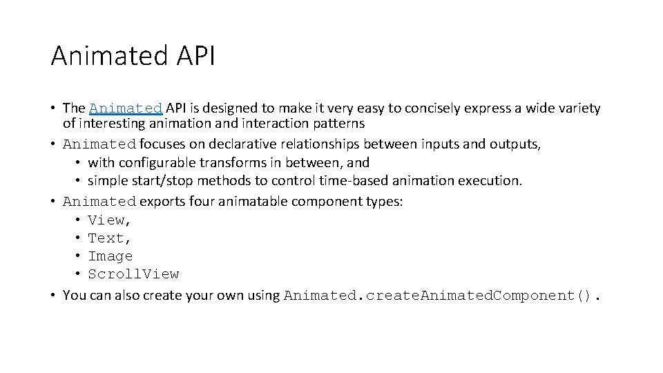
Animated API • The Animated API is designed to make it very easy to concisely express a wide variety of interesting animation and interaction patterns • Animated focuses on declarative relationships between inputs and outputs, • with configurable transforms in between, and • simple start/stop methods to control time-based animation execution. • Animated exports four animatable component types: • View, • Text, • Image • Scroll. View • You can also create your own using Animated. create. Animated. Component().

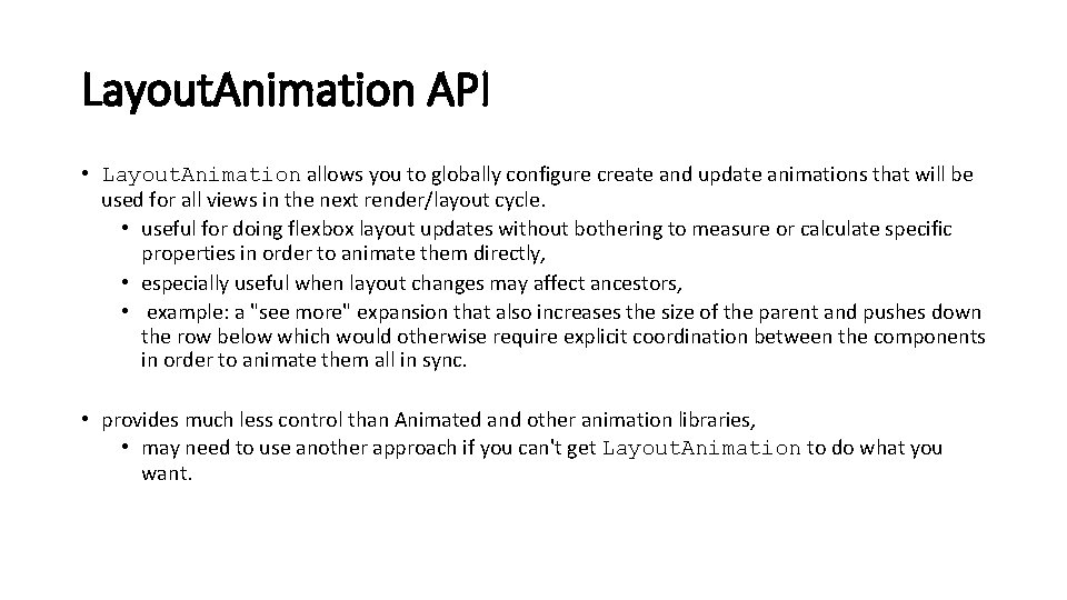
Layout. Animation API • Layout. Animation allows you to globally configure create and update animations that will be used for all views in the next render/layout cycle. • useful for doing flexbox layout updates without bothering to measure or calculate specific properties in order to animate them directly, • especially useful when layout changes may affect ancestors, • example: a "see more" expansion that also increases the size of the parent and pushes down the row below which would otherwise require explicit coordination between the components in order to animate them all in sync. • provides much less control than Animated and other animation libraries, • may need to use another approach if you can't get Layout. Animation to do what you want.

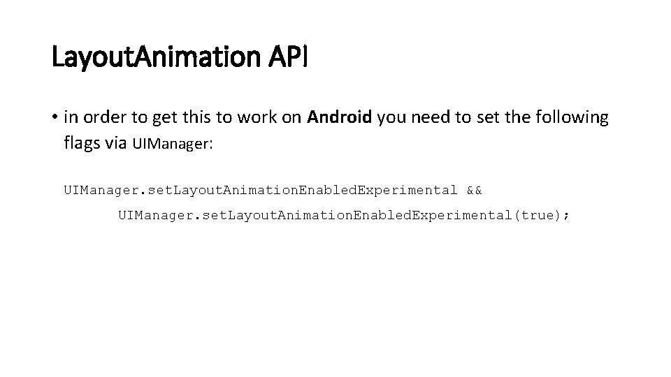
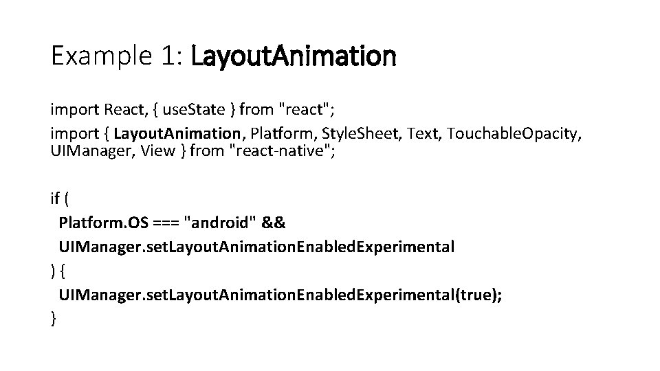
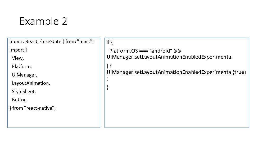
Layout. Animation API • in order to get this to work on Android you need to set the following flags via UIManager: UIManager. set. Layout. Animation. Enabled. Experimental && UIManager. set. Layout. Animation. Enabled. Experimental(true);

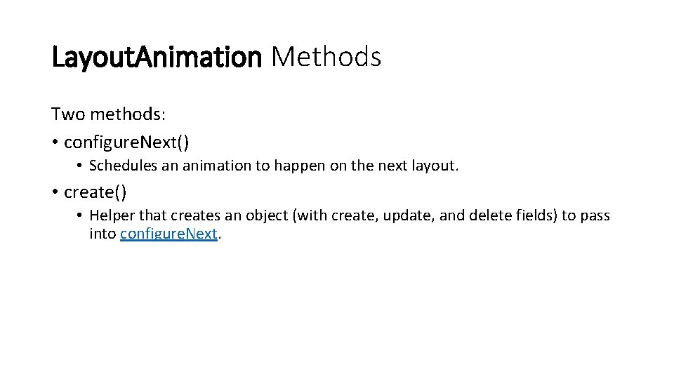
Layout. Animation Methods Two methods: • configure. Next() • Schedules an animation to happen on the next layout. • create() • Helper that creates an object (with create, update, and delete fields) to pass into configure. Next.

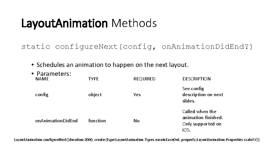
Layout. Animation Methods static configure. Next(config, on. Animation. Did. End? ) • Schedules an animation to happen on the next layout. • Parameters: NAME config on. Animation. Did. End TYPE object function REQUIRED DESCRIPTION Yes See config description on next slides. No Called when the animation finished. Only supported on i. OS. Layout. Animation. configure. Next({duration: 2000, create: {type: Layout. Animation. Types. ease. In. Ease. Out, property: Layout. Animation. Properties. scale. XY}})

Shortcuts for the config paramter • create returns a valid object for config, and • the Presets objects (see later slide) can also all be passed as the config.

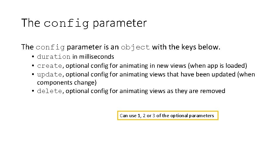
The config parameter is an object with the keys below. • duration in milliseconds • create, optional config for animating in new views (when app is loaded) • update, optional config for animating views that have been updated (when components change) • delete, optional config for animating views as they are removed Can use 1, 2 or 3 of the optional parameters

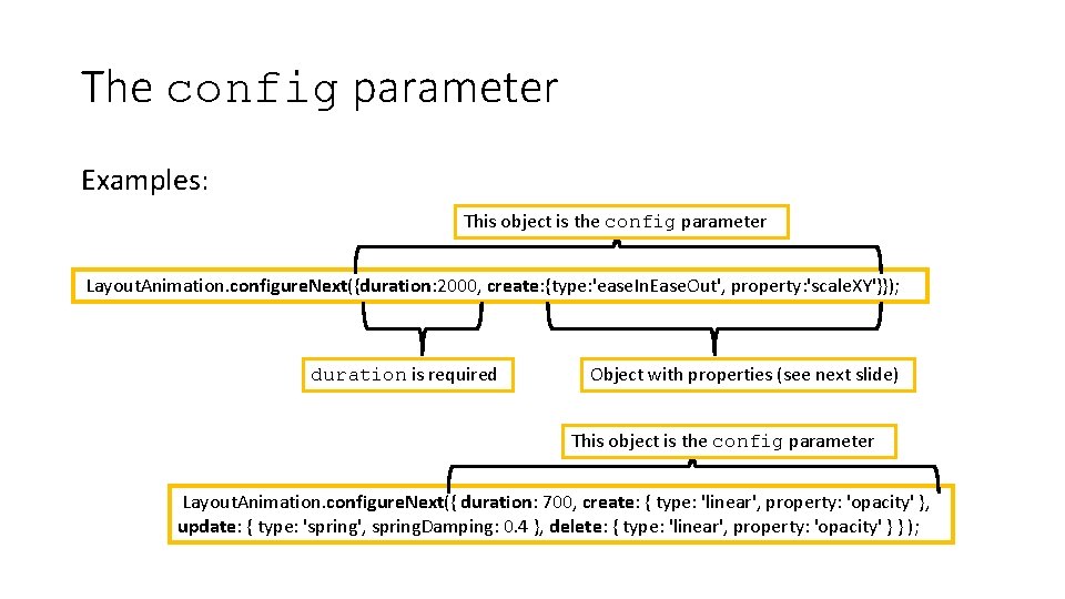
The config parameter Examples: This object is the config parameter Layout. Animation. configure. Next({duration: 2000, create: {type: 'ease. In. Ease. Out', property: 'scale. XY'}}); duration is required Object with properties (see next slide) This object is the config parameter Layout. Animation. configure. Next({ duration: 700, create: { type: 'linear', property: 'opacity' }, update: { type: 'spring', spring. Damping: 0. 4 }, delete: { type: 'linear', property: 'opacity' } } );

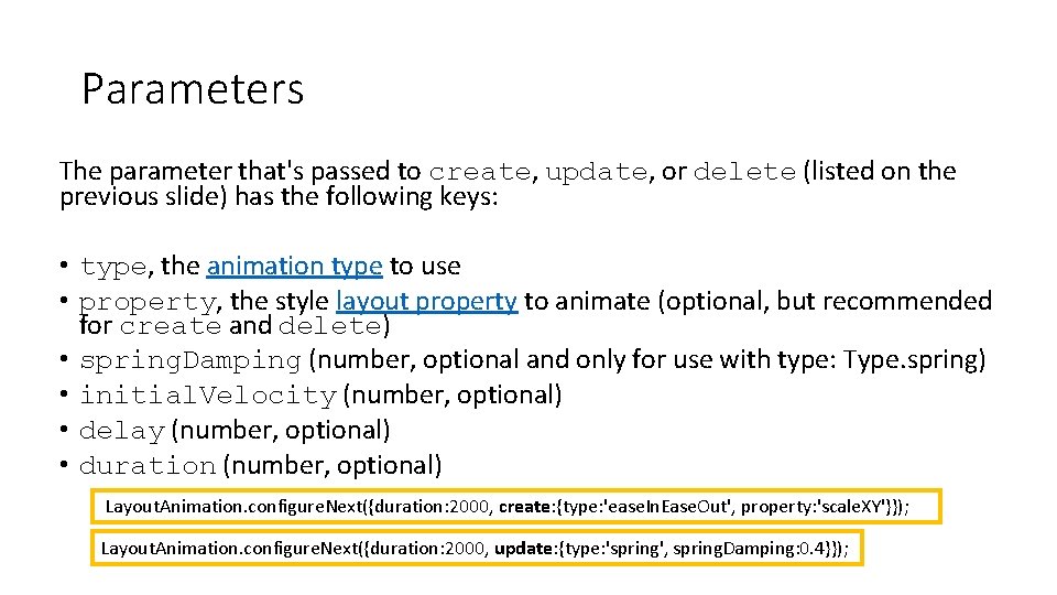
Parameters The parameter that's passed to create, update, or delete (listed on the previous slide) has the following keys: • type, the animation type to use • property, the style layout property to animate (optional, but recommended for create and delete) • spring. Damping (number, optional and only for use with type: Type. spring) • initial. Velocity (number, optional) • delay (number, optional) • duration (number, optional) Layout. Animation. configure. Next({duration: 2000, create: {type: 'ease. In. Ease. Out', property: 'scale. XY'}}); Layout. Animation. configure. Next({duration: 2000, update: {type: 'spring', spring. Damping: 0. 4}});

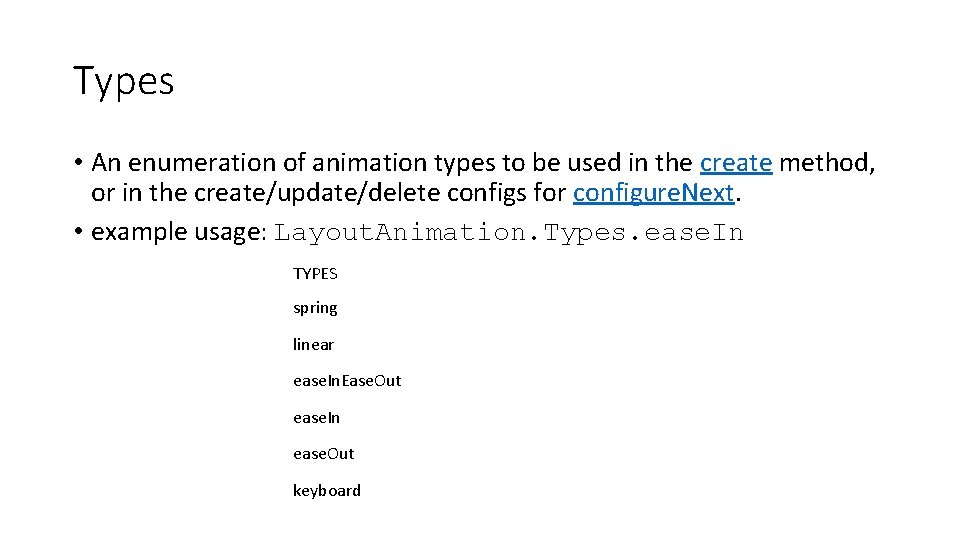
Types • An enumeration of animation types to be used in the create method, or in the create/update/delete configs for configure. Next. • example usage: Layout. Animation. Types. ease. In TYPES spring linear ease. In. Ease. Out ease. In ease. Out keyboard

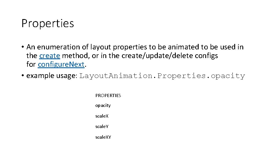
Properties • An enumeration of layout properties to be animated to be used in the create method, or in the create/update/delete configs for configure. Next. • example usage: Layout. Animation. Properties. opacity PROPERTIES opacity scale. X scale. Y scale. XY

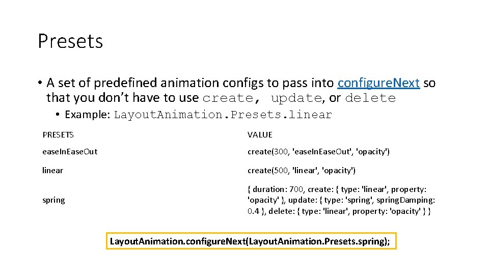
Presets • A set of predefined animation configs to pass into configure. Next so that you don’t have to use create, update, or delete • Example: Layout. Animation. Presets. linear PRESETS VALUE ease. In. Ease. Out create(300, 'ease. In. Ease. Out', 'opacity') linear create(500, 'linear', 'opacity') spring { duration: 700, create: { type: 'linear', property: 'opacity' }, update: { type: 'spring', spring. Damping: 0. 4 }, delete: { type: 'linear', property: 'opacity' } } Layout. Animation. configure. Next(Layout. Animation. Presets. spring);

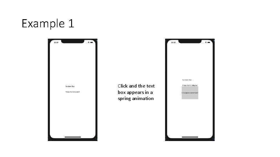
Example 1 Click and the text box appears in a spring animation

Example 1: Layout. Animation import React, { use. State } from "react"; import { Layout. Animation, Platform, Style. Sheet, Text, Touchable. Opacity, UIManager, View } from "react-native"; if ( Platform. OS === "android" && UIManager. set. Layout. Animation. Enabled. Experimental ) { UIManager. set. Layout. Animation. Enabled. Experimental(true); }
![const App const expanded set Expanded use Statefalse Animation const App = () => { const [expanded, set. Expanded] = use. State(false); Animation](https://slidetodoc.com/presentation_image_h/1a5176c4d3d2a131919de42d5c301582/image-17.jpg)
const App = () => { const [expanded, set. Expanded] = use. State(false); Animation automatically runs when layout is next rendered. return ( <View style={style. container}> <Touchable. Opacity on. Press={() => { Other animation options are ease. In. Ease. Out , linear, ease. In, ease. Out, keyboard Layout. Animation. configure. Next(Layout. Animation. Presets. spring); set. Expanded(!expanded); }} Toggle the value in the state variable expanded > <Text>Random Text {'nn'}</Text> <Text>Press me to {expanded ? "collapse" : "expand"}!</Text> Note that the components that change location are the ones that will animate. In this case the expanding text doesn’t move (just grows), so it doesn’t animate. Could use: Layout. Animation. configure. Next({duration: 2000, update: {type: 'spring’, spring. Damping: 0. 4}});

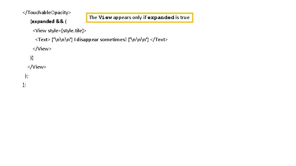
</Touchable. Opacity> {expanded && ( The View appears only if expanded is true <View style={style. tile}> <Text> {'nnn'} I disappear sometimes! {'nnn'} </Text> </View> )} </View> ); };

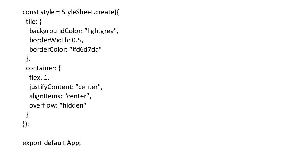
const style = Style. Sheet. create({ tile: { background. Color: "lightgrey", border. Width: 0. 5, border. Color: "#d 6 d 7 da" }, container: { flex: 1, justify. Content: "center", align. Items: "center", overflow: "hidden" } }); export default App;

Example 2 import React, { use. State } from "react"; if ( import { Platform. OS === "android" && UIManager. set. Layout. Animation. Enabled. Experimental View, Platform, UIManager, Layout. Animation, Style. Sheet, Button } from "react-native"; ) { UIManager. set. Layout. Animation. Enabled. Experimental(true) ; }
![Example 2 const App const box Position set Box Position Example 2 const App = () => { const [box. Position, set. Box. Position]](https://slidetodoc.com/presentation_image_h/1a5176c4d3d2a131919de42d5c301582/image-21.jpg)
Example 2 const App = () => { const [box. Position, set. Box. Position] = use. State("left"); const toggle. Box = () => { This will be applied the next time the app is re-rendered Layout. Animation. configure. Next( Layout. Animation. create( 500, Layout. Animation. Types. ease. In. Ease. Out, Layout. Animation. Properties. scale. XY ) ); set. Box. Position(box. Position === "left" ? "right" : "left"); };

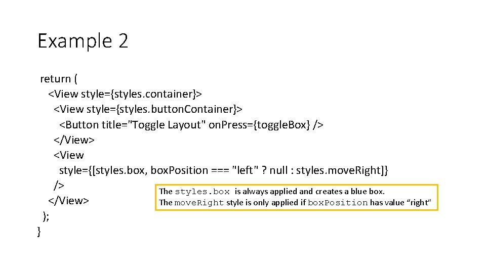
Example 2 return ( <View style={styles. container}> <View style={styles. button. Container}> <Button title="Toggle Layout" on. Press={toggle. Box} /> </View> <View style={[styles. box, box. Position === "left" ? null : styles. move. Right]} /> The styles. box is always applied and creates a blue box. </View> The move. Right style is only applied if box. Position has value “right” ); }

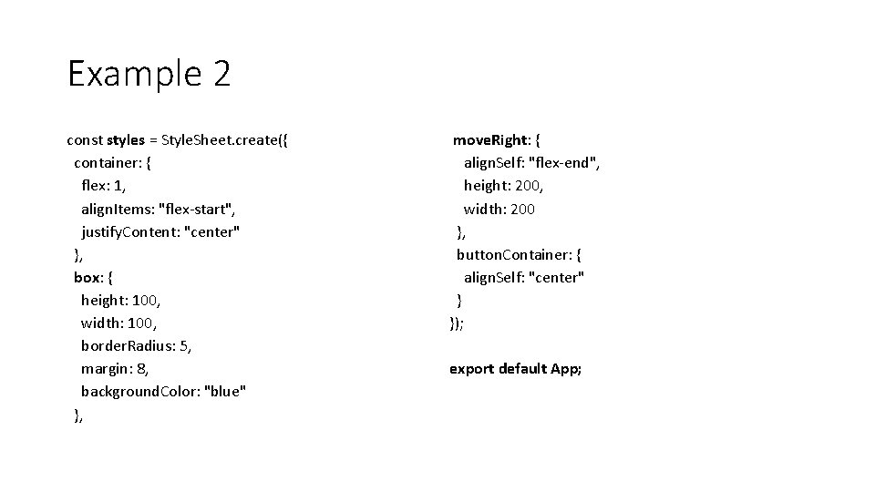
Example 2 const styles = Style. Sheet. create({ container: { flex: 1, align. Items: "flex-start", justify. Content: "center" }, box: { height: 100, width: 100, border. Radius: 5, margin: 8, background. Color: "blue" }, move. Right: { align. Self: "flex-end", height: 200, width: 200 }, button. Container: { align. Self: "center" } }); export default App;