Raising Awareness of Environmental Issues in a Statistics


- Slides: 17
Raising Awareness of Environmental Issues in a Statistics Course Thomas J. Pfaff Ithaca College
http: //ipcc-wg 1. ucar. edu/wg 1/FAQ/wg 1_faq-3. 1. html
http: //ipcc-wg 1. ucar. edu/wg 1/FAQ/wg 1_faq-3. 1. html
How should we use this? Have students try to read and interpret the graph before covering regression. Cover regression. Go back and have students interpret again, reproduce the graph (with analysis), and explain differences. Good question: Is a line the best fit of this data?
http: //data. giss. nasa. gov/gistemp/maps/
This graphic shows the ratio of record daily highs to record daily lows observed at about 1, 800 weather stations in the 48 contiguous United States from January 1950 through September 2009. (20 -to-1 by mid-century and 50 -to-1 by 2100) http: //www. ucar. edu/news/releases/2009/maxmin. jsp#
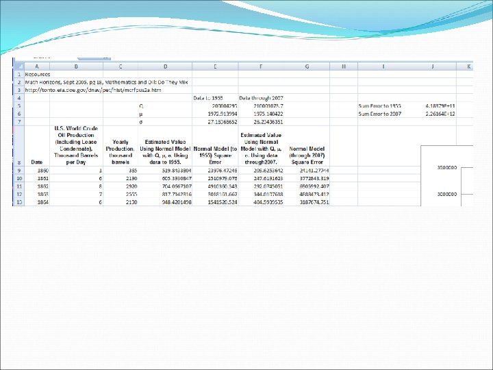
Yearly U. S. Oil Production to 1955 3500000 3000000 Thousdands of Barrels 2500000 2000000 Data to 1955 Model through 2007 1500000 1000000 500000 0 1840 1860 1880 1900 1920 Year 1940 1960 1980 2000 2020
4000000 Yearly U. S. Oil Production through 2007 3500000 thousand barrels 3000000 2500000 2000000 Original Data Model 1500000 1000000 500000 0 1840 1860 1880 1900 1920 year 1940 1960 1980 2000 2020
How Should we Use This? According to the model, what percentage of our oil supply did we use from 1960 to 1990? According to the model, what percentage of our oil will we consume after 2010? What is the interquartile range for the model? In what year will we have consumed 95% of our oil? (~2026)
http: //www. theoildrum. com/story/2006/1/22/04219/1102
Resources http: //data. giss. nasa. gov/gistemp/maps/ http: //ipcc-wg 1. ucar. edu/wg 1/FAQ/wg 1_faq-3. 1. html http: //www. ucar. edu/news/releases/2009/maxmin. jsp# http: //www. theoildrum. com/story/2006/1/22/04219/110 2 http: //www. ithaca. edu/tpfaff/sustainability. htm tpfaff@ithaca. edu