R Visualization with ggplot What is ggplot Package


- Slides: 42

R Visualization with ggplot

What is ggplot? • Package specifically for data visualization • Created by Hadley Wickham in 2005 (Rice professor!!!!) • Open source, most popular visualization tool in R • ggplot 2 extension

Key Distinguishing features • ggplot 2 allows the user to add, remove or alter components in a plot at a high level of abstraction • More complexity in visualization schemes available compared to base R functions

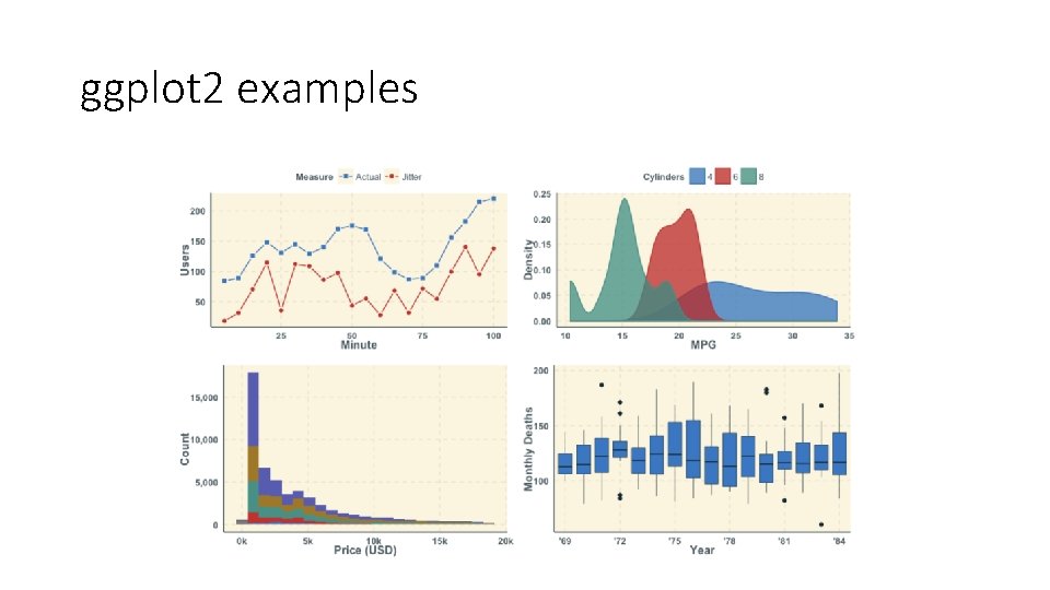
ggplot 2 examples

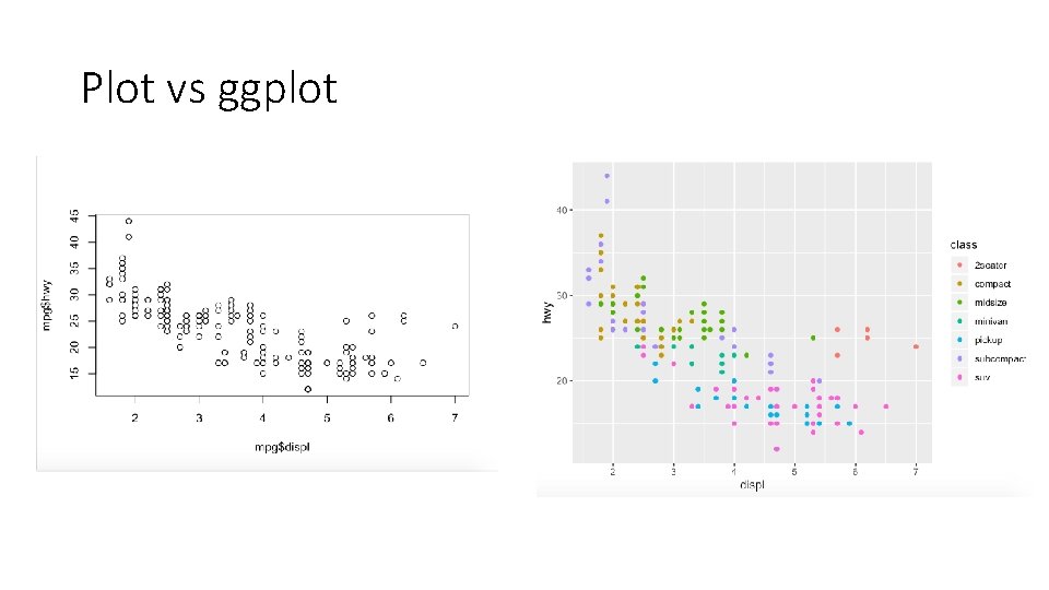
Plot vs ggplot

The different parts to the plotting function we will cover today • Data • Aesthetic Mappings • Geometric Objects • Statistical Transformations • Scales

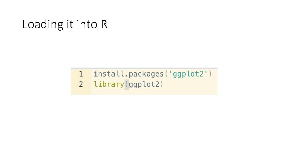
Loading it into R

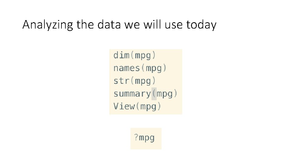
Analyzing the data we will use today

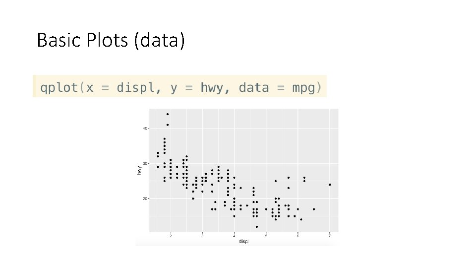
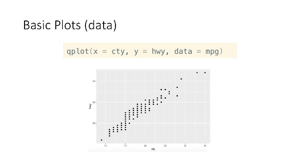
Basic Plots (data)

Basic Plots (data)

Instead of using qplot, use ggplot for the two examples I showed previously

Your Turn! Create a qplot of Old Faithful’s eruption time vs. waiting time

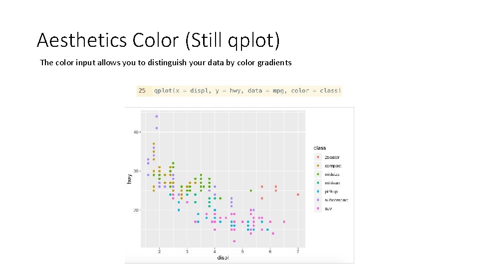
Aesthetic Inputs • ggplot will not work unless there a set of aesthetic inputs • color, size, and shape (visual properties that affect the display) • Other plot functions don’t have this issue because they don’t have specific inputs for display characteristics

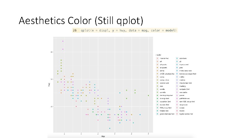
Aesthetics Color (Still qplot) The color input allows you to distinguish your data by color gradients

Aesthetics Color (Still qplot)

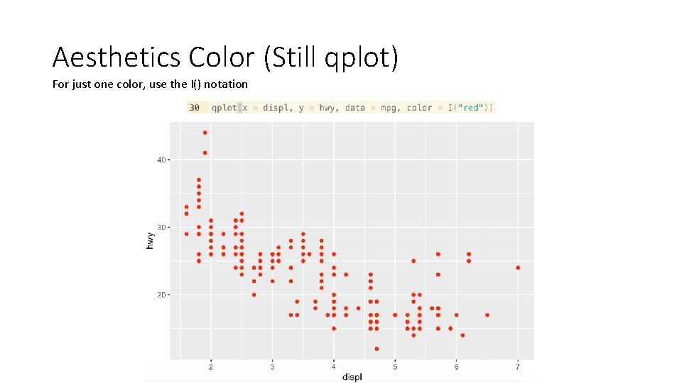
Aesthetics Color (Still qplot) For just one color, use the I() notation

Your Turn! Make a plot of old faithful’s eruptions vs waiting time with all the points orange Change the color to the value of eruption time

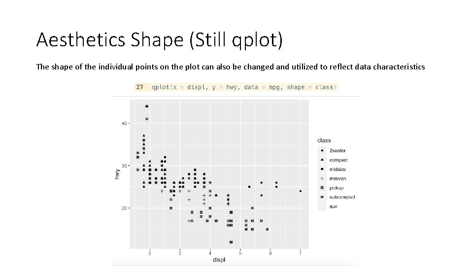
Aesthetics Shape (Still qplot) The shape of the individual points on the plot can also be changed and utilized to reflect data characteristics

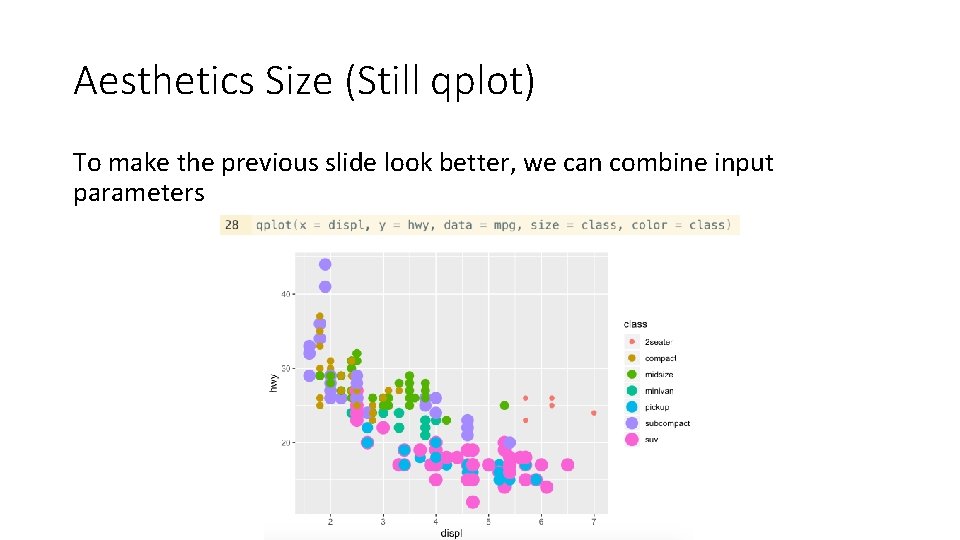
Aesthetics Size (Still qplot) Same can be done with the size of the points

Aesthetics Size (Still qplot) To make the previous slide look better, we can combine input parameters

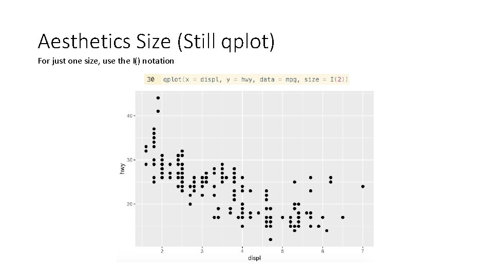
Aesthetics Size (Still qplot) For just one size, use the I() notation

Your Turn • Spend two to three minutes playing around with different sizing, shapes, and coloring with the mpg and airquality data set • Airquality dataset is new. Spend some time to familiarize yourself with it

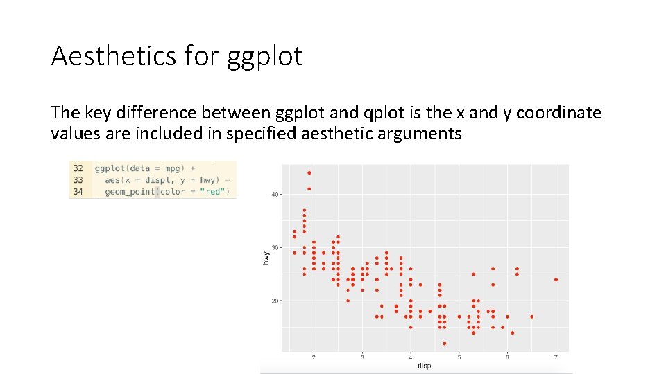
Aesthetics for ggplot The key difference between ggplot and qplot is the x and y coordinate values are included in specified aesthetic arguments

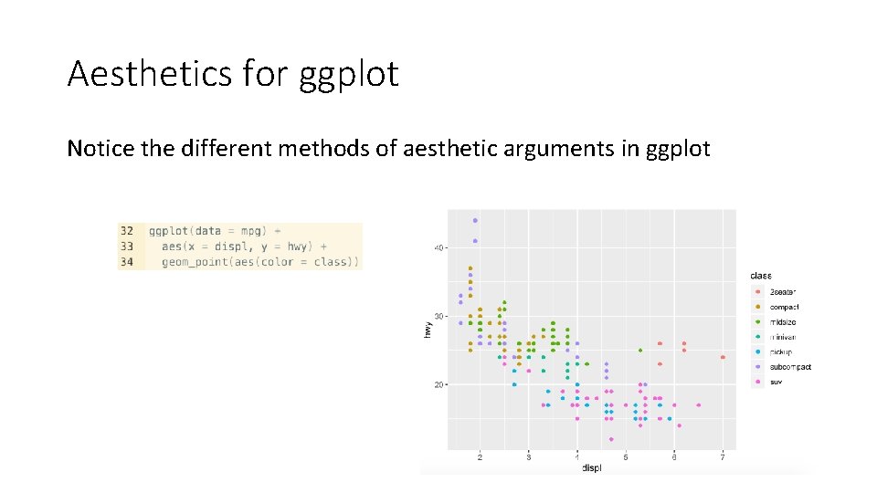
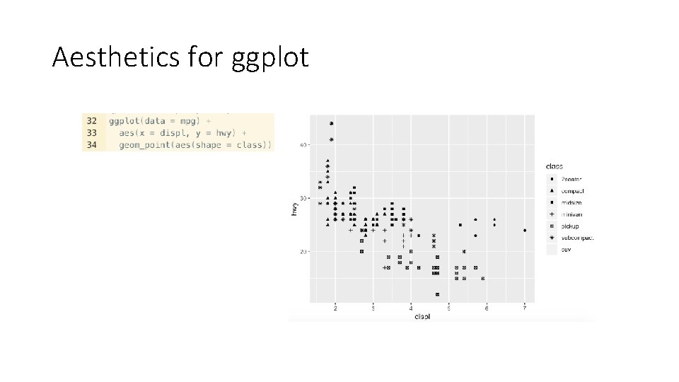
Aesthetics for ggplot Notice the different methods of aesthetic arguments in ggplot

Aesthetics for ggplot

Your Turn! Use ggplot to do the same old faithful plot we’ve been using (color is orange)

Your Turn! Now with the airquality data, use ggplot to plot ozone vs temp with color as the month and size as the day

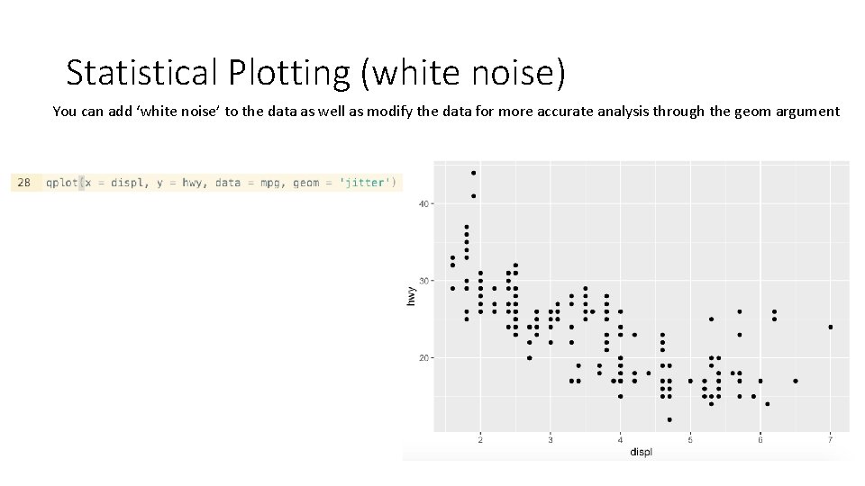
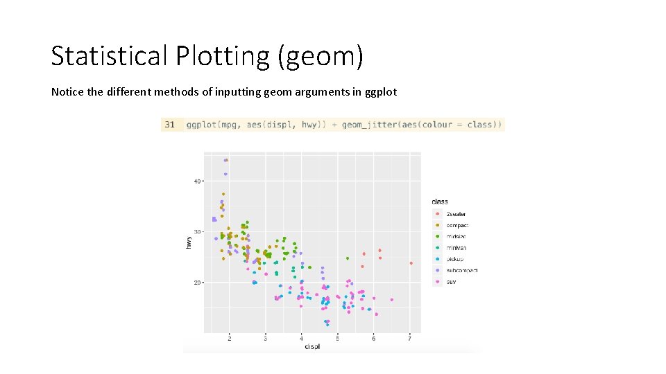
Statistical Plotting (white noise) You can add ‘white noise’ to the data as well as modify the data for more accurate analysis through the geom argument

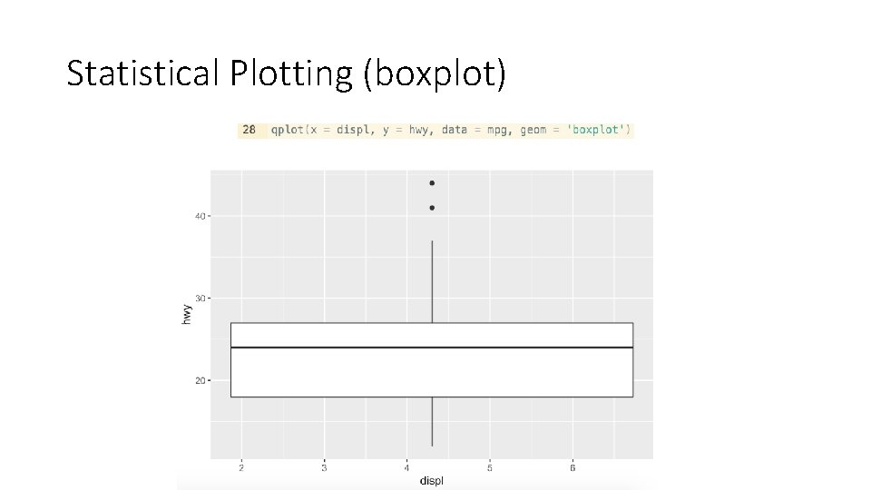
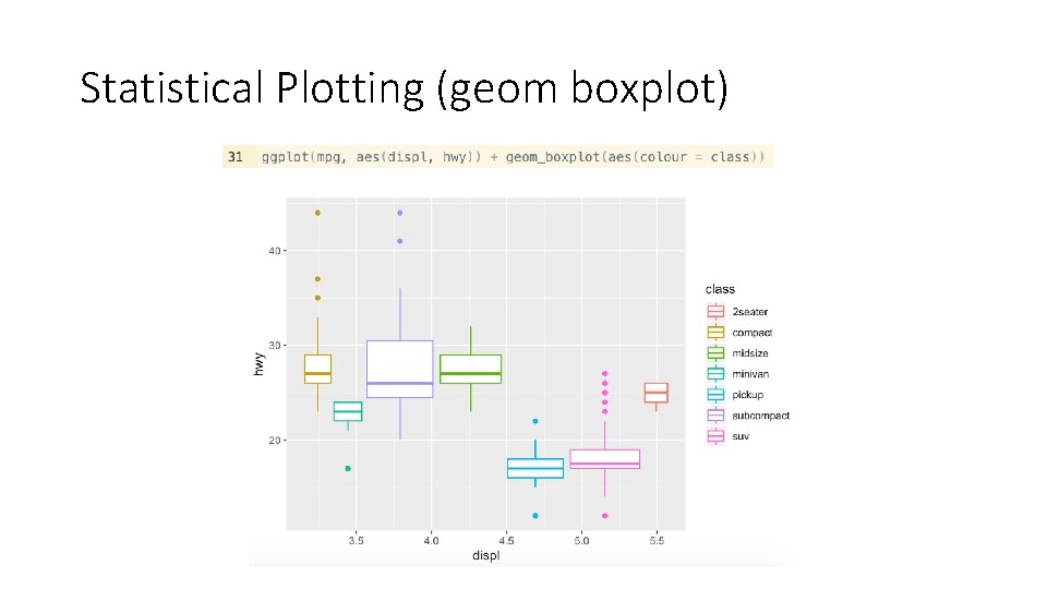
Statistical Plotting (boxplot)

Your Turn • Produce a jittery plot of the ozone vs temperature in the airquality data set • Make a boxplot

Statistical Plotting (geom) Notice the different methods of inputting geom arguments in ggplot

Statistical Plotting (geom boxplot)

Your Turn • Use ggplot to make the same plots you made previously of airquality

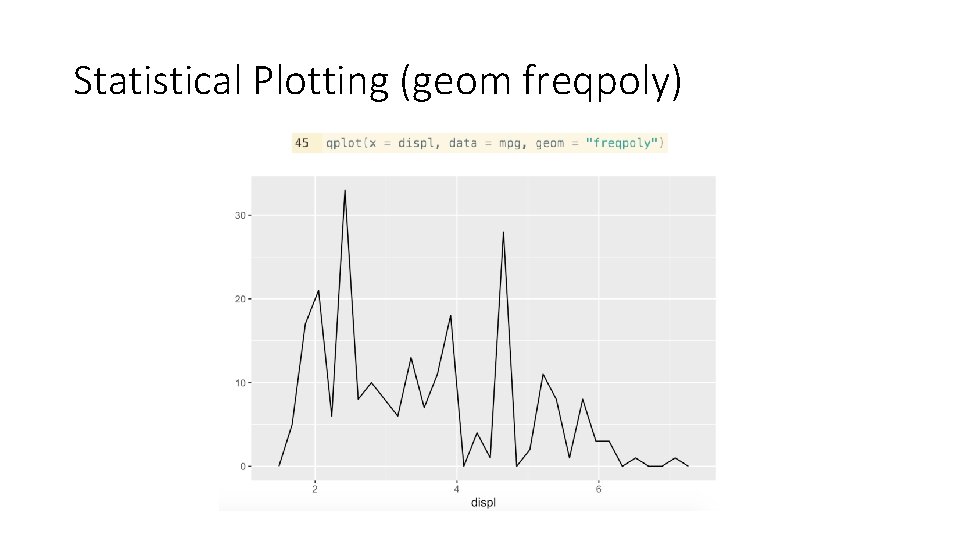
Statistical Plotting (geom freqpoly)

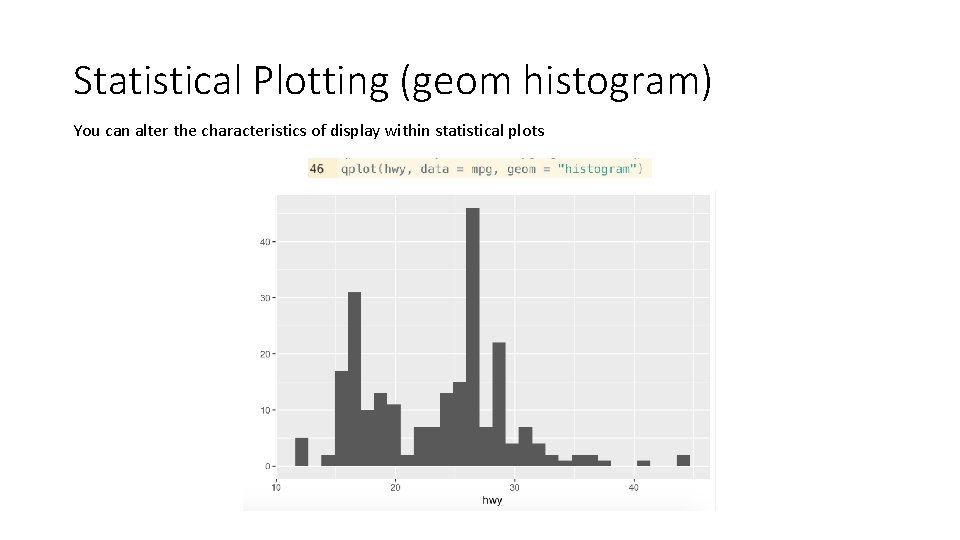
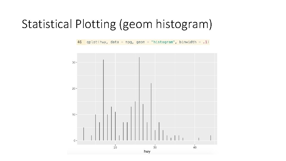
Statistical Plotting (geom histogram) You can alter the characteristics of display within statistical plots

Statistical Plotting (geom histogram)

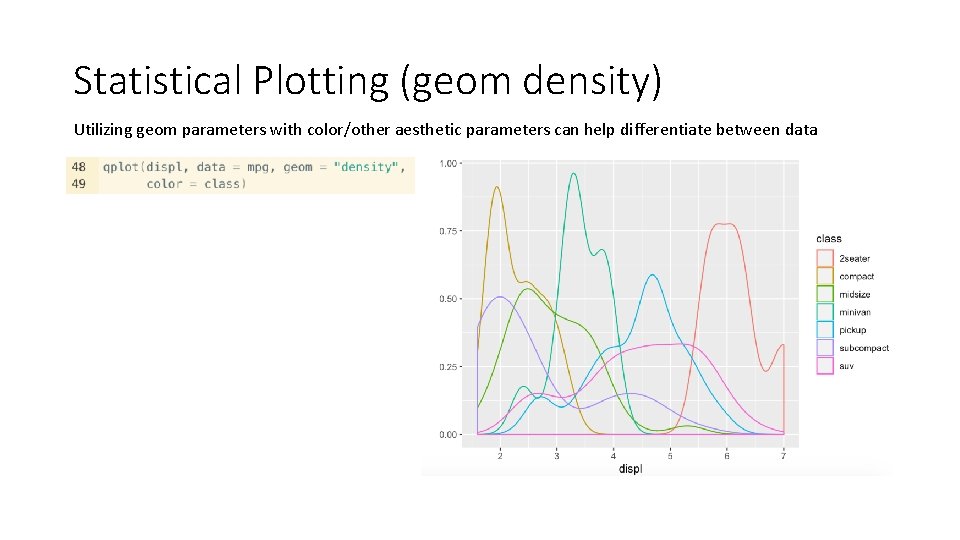
Statistical Plotting (geom density) Utilizing geom parameters with color/other aesthetic parameters can help differentiate between data

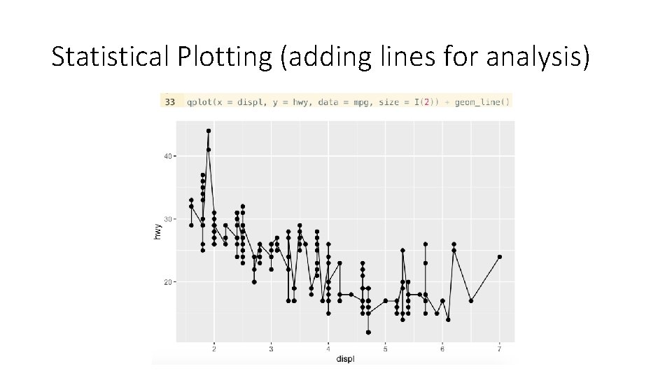
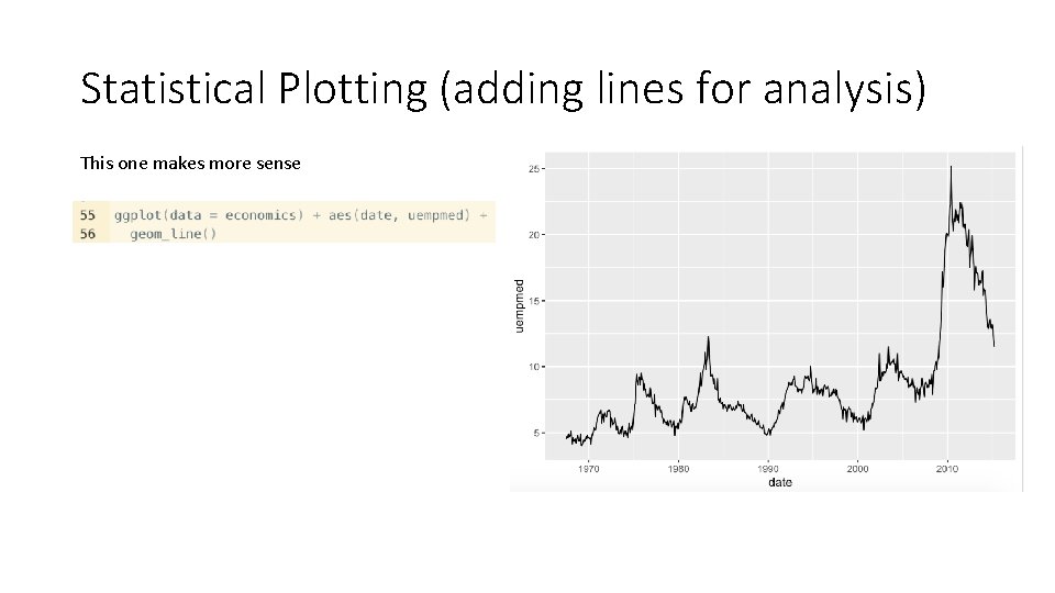
Statistical Plotting (adding lines for analysis)

Statistical Plotting (adding lines for analysis) This one makes more sense

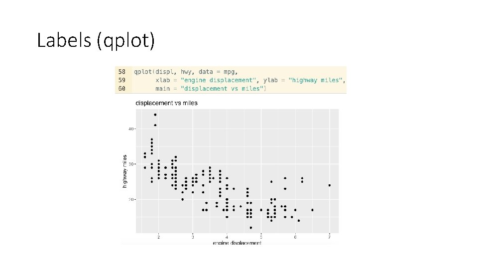
Labels (qplot)

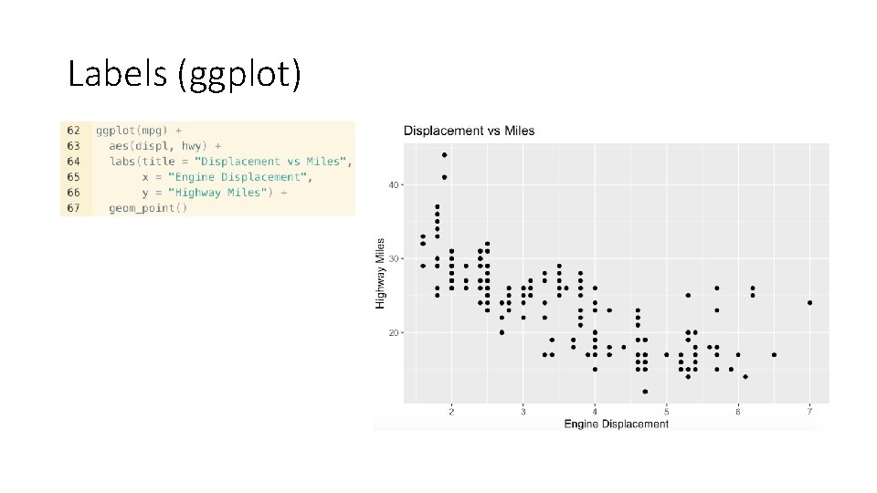
Labels (ggplot)

Your Final Turn! • Create some nice cool-looking plots of the airquality dataset (keep in mind the plots must depict some type of coherent analysis) • That’s all the instruction you have. Nicest plot wins a prize!