R statistics Useful packages for visualisation GIS analysis

- Slides: 16

R statistics Useful packages for visualisation, GIS analysis and more

Packages in R Huge list of packages available (statistics, analysis, visualization, …): • https: //cran. r-project. org/ • https: //support. rstudio. com/hc/en-us/articles/201057987 -Quick-listof-useful-R-packages • Installing package: install. packages(”package_name”) • After installed: library(package_name) • You can also make your own package

Data visualization in R Basic commands: • plot(x, y), boxplot(y~x), hist(y), … plot(A$D, A$VOLUME, xlab=”Diameter, cm”, ylab=”Total volume, m 3”) plot(A$VOLUME~ A$SP_GROUP, xlab=”Species”, ylab=”Total volume, m 3”) hist(A$VOLUME, xlab=”Total volume, m 3/ha”)

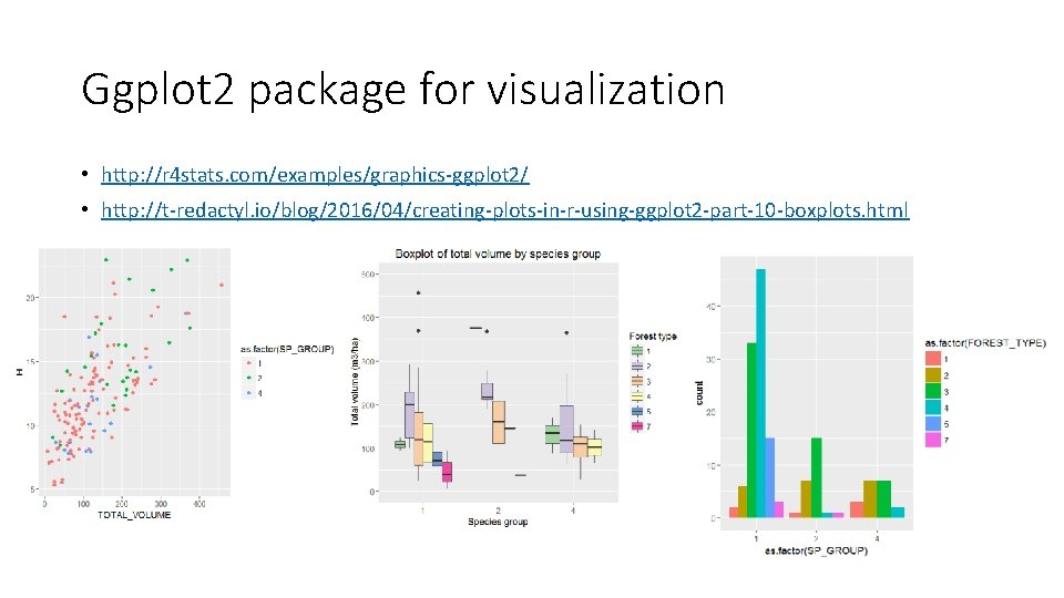
Ggplot 2 package for visualization • http: //r 4 stats. com/examples/graphics-ggplot 2/ • http: //t-redactyl. io/blog/2016/04/creating-plots-in-r-using-ggplot 2 -part-10 -boxplots. html

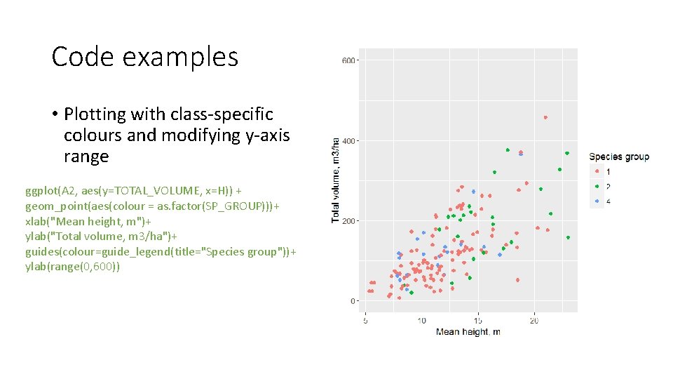
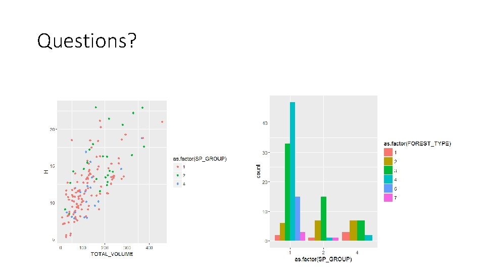
Code examples • Plotting with class-specific colours and modifying y-axis range ggplot(A 2, aes(y=TOTAL_VOLUME, x=H)) + geom_point(aes(colour = as. factor(SP_GROUP)))+ xlab("Mean height, m")+ ylab("Total volume, m 3/ha")+ guides(colour=guide_legend(title="Species group"))+ ylab(range(0, 600))

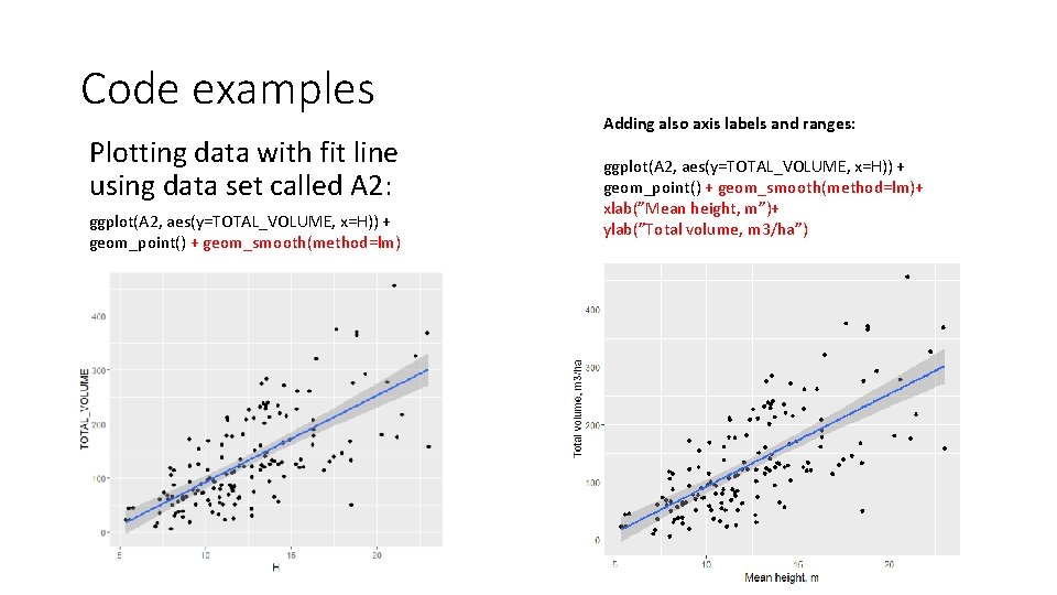
Code examples Plotting data with fit line using data set called A 2: ggplot(A 2, aes(y=TOTAL_VOLUME, x=H)) + geom_point() + geom_smooth(method=lm) Adding also axis labels and ranges: ggplot(A 2, aes(y=TOTAL_VOLUME, x=H)) + geom_point() + geom_smooth(method=lm)+ xlab(”Mean height, m”)+ ylab(”Total volume, m 3/ha”)

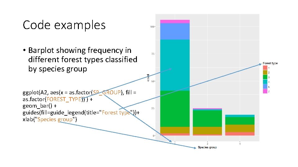
Code examples • Barplot showing frequency in different forest types classified by species group ggplot(A 2, aes(x = as. factor(SP_GROUP), fill = as. factor(FOREST_TYPE)) ) + geom_bar() + guides(fill=guide_legend(title="Forest type"))+ xlab("Species group")

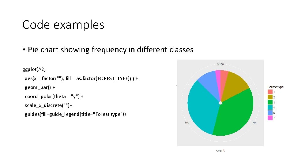
Code examples • Pie chart showing frequency in different classes ggplot(A 2, aes(x = factor(""), fill = as. factor(FOREST_TYPE)) ) + geom_bar() + coord_polar(theta = "y") + scale_x_discrete("")+ guides(fill=guide_legend(title="Forest type"))

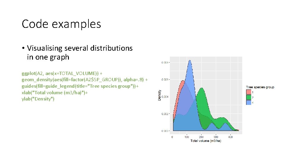
Code examples • Visualising several distributions in one graph ggplot(A 2, aes(x=TOTAL_VOLUME)) + geom_density(aes(fill=factor(A 2$SP_GROUP)), alpha=. 8) + guides(fill=guide_legend(title="Tree species group"))+ xlab("Total volume (m 3/ha)")+ ylab("Density")

GIS analysis in R • Several packages available • raster • sp • rgdal Nice tutorials are available, check e. g. http: //neondataskills. org/R/Raster-Data-In-R/

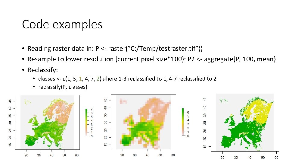
Code examples • Reading raster data in: P <- raster(”C: /Temp/testraster. tif”)) • Resample to lower resolution (current pixel size*100): P 2 <- aggregate(P, 100, mean) • Reclassify: • classes <- c(1, 3, 1, 4, 7, 2) #here 1 -3 reclassified to 1, 4 -7 reclassified to 2 • reclassify(P, classes)

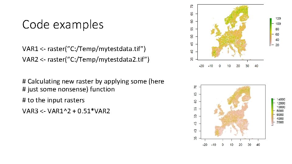
Code examples VAR 1 <- raster(”C: /Temp/mytestdata. tif”) VAR 2 <- raster(”C: /Temp/mytestdata 2. tif”) # Calculating new raster by applying some (here # just some nonsense) function # to the input rasters VAR 3 <- VAR 1^2 + 0. 51*VAR 2

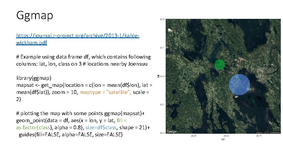
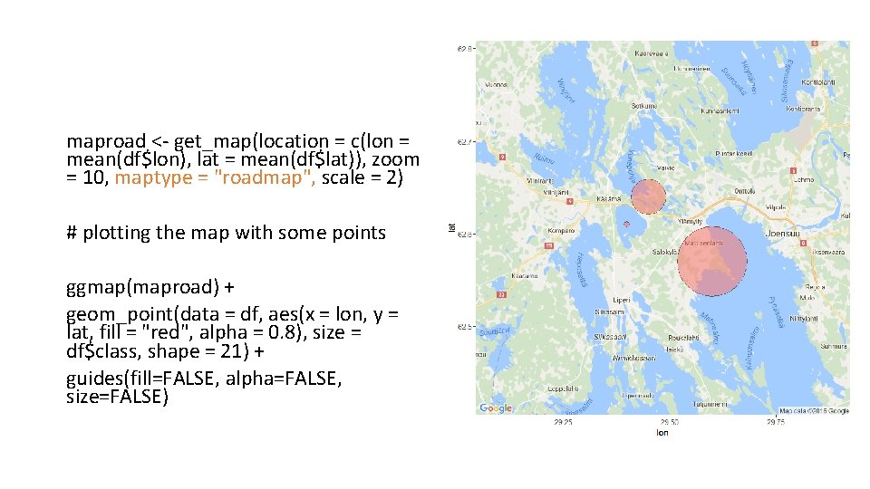
Ggmap https: //journal. r-project. org/archive/2013 -1/kahlewickham. pdf # Example using data frame df, which contains following columns: lat, lon, class on 3 # locations nearby Joensuu library(ggmap) mapsat <- get_map(location = c(lon = mean(df$lon), lat = mean(df$lat)), zoom = 10, maptype = "satellite", scale = 2) # plotting the map with some points ggmap(mapsat)+ geom_point(data = df, aes(x = lon, y = lat, fill = as. factor(class), alpha = 0. 8), size=df$class, shape = 21)+ guides(fill=FALSE, alpha=FALSE, size=FALSE)

maproad <- get_map(location = c(lon = mean(df$lon), lat = mean(df$lat)), zoom = 10, maptype = "roadmap", scale = 2) # plotting the map with some points ggmap(maproad) + geom_point(data = df, aes(x = lon, y = lat, fill = "red", alpha = 0. 8), size = df$class, shape = 21) + guides(fill=FALSE, alpha=FALSE, size=FALSE)

Questions?

R modeling exercise in nutshell • Linear regression • • • Check visually the correlation of dependent vs independent variables in your data set Check normality of the variables Do you need to do transformation for some variables? Try fitting with the most relevant variables Check model output: significance of variables, R-squared, residuals (homoscedasticity, normality) • Model validation • RMSE, bias, significance of bias (T-test) • Applying the selected model with raster data • Making thematic map by reclassifying the resulting raster