Quick turn off the burner 1 Heuristic Evaluation
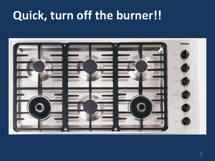
Quick, turn off the burner!! 1
Heuristic Evaluation 3 CPSC 481: HCI I Fall 2012 Anthony Tang with acknowledgements to Saul Greenberg and Ehud Sharlin 2
Split class… Pull out a piece of paper, or something to scrawl something onto. Half of the class, put your head down. 3
You are my favourite half of the class Write down the answer to this question: Can you tell me the name of the president of Russia? Who is it? 4

Switch!!! 5

You are my favourite half of the class Write down the answer to this question: Who is the president of Russia? (a) Vladamir Putin (b) Boris Yeltsin (c) Mikhail Gorbachev (d) Someone else… 6

Up! 7

So… Who’s confident of their answer? 8

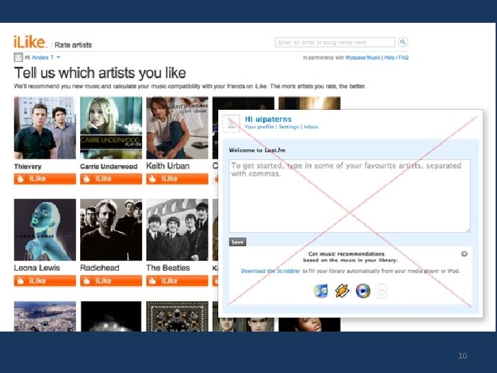
7 Recognition rather than recall Making objects, actions, and options visible to minimize the user’s memory load The user should not have to remember information from one part of the dialogue to another Instructions for use of the system should be visible or easily retrievable whenever appropriate 9
10
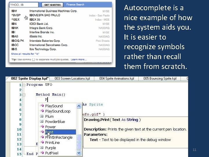
Autocomplete is a nice example of how the system aids you. It is easier to recognize symbols rather than recall them from scratch. 11
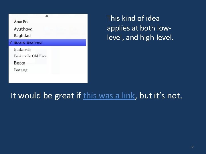
This kind of idea applies at both lowlevel, and high-level. It would be great if this was a link, but it’s not. 12
7 Recognition rather than recall Making objects, actions, and options visible to minimize the user’s memory load The user should not have to remember information from one part of the dialogue to another Instructions for use of the system should be visible or easily retrievable whenever appropriate 13
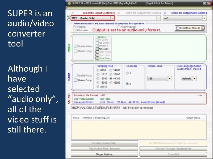
SUPER is an audio/video converter tool Although I have selected “audio only”, all of the video stuff is still there. 14
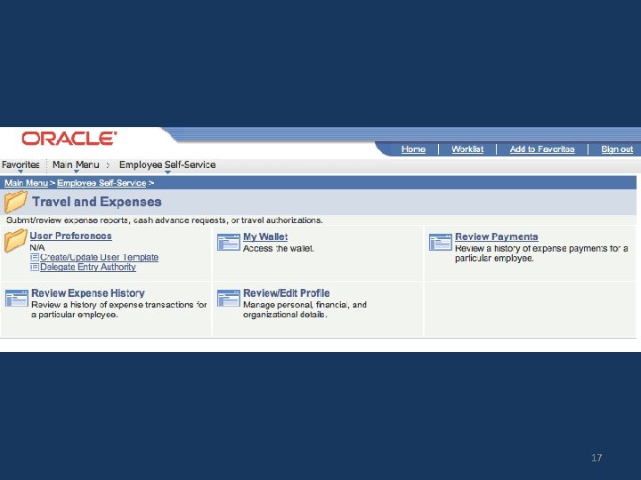
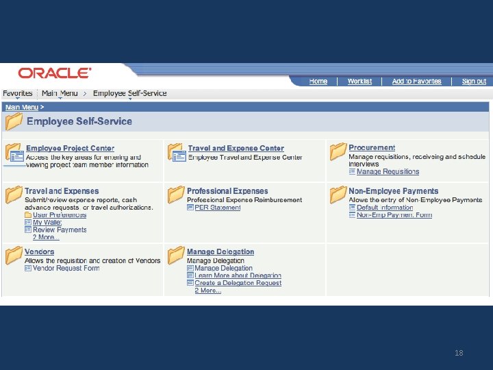
8 Aesthetic and minimalist design Dialogues should not contain information which is irrelevant or rarely needed Every extra unit of information in a dialogue competes with the relevant units of information and diminishes their relative visibility. 15

16
17
18
19
20

21
22
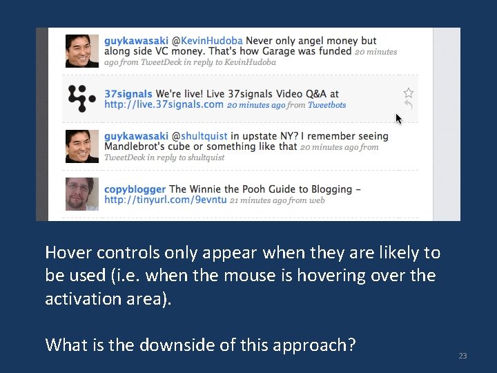
Hover controls only appear when they are likely to be used (i. e. when the mouse is hovering over the activation area). What is the downside of this approach? 23
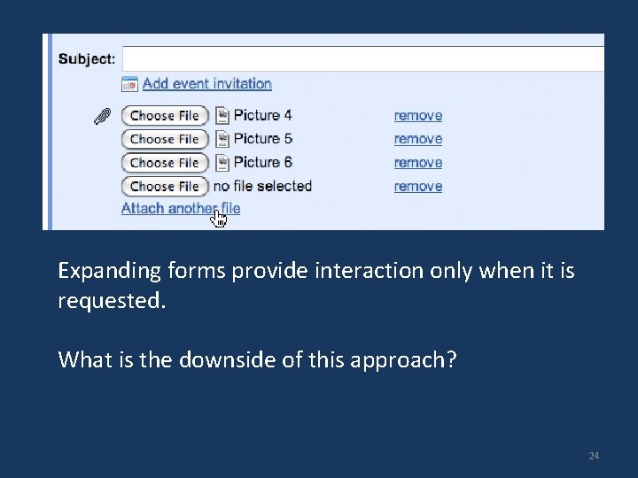
Expanding forms provide interaction only when it is requested. What is the downside of this approach? 24

How does Twitter. com’s homepage guide the user’s attention? In what ways has it used a minimalist design? 25

8 Aesthetic and minimalist design Dialogues should not contain information which is irrelevant or rarely needed Every extra unit of information in a dialogue competes with the relevant units of information and diminishes their relative visibility. 26
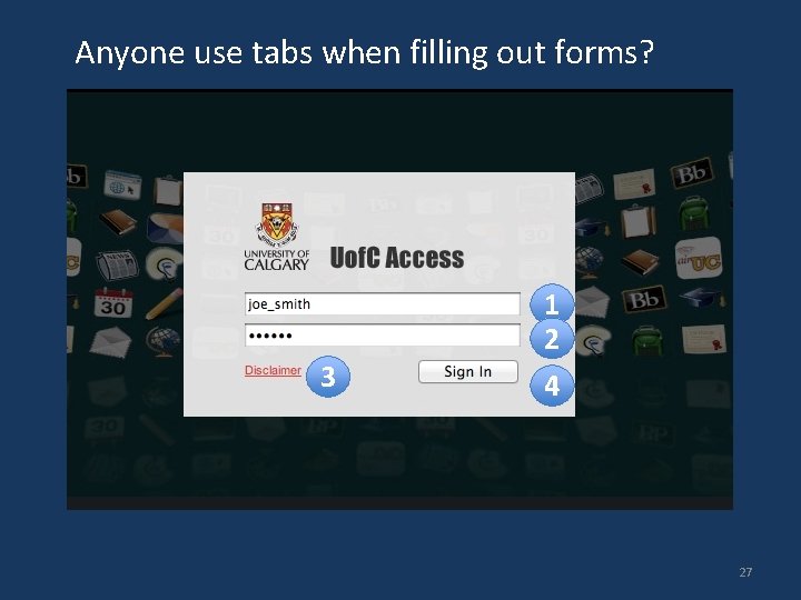
Anyone use tabs when filling out forms? 1 2 3 4 27
9 Flexibility and efficiency of use Accelerators -- unseen by the novice user -- may often speed up the interaction for the expert user such that the system can cater to both inexperienced and experienced users » allow existing/common accelerators to work » provide accelerators Allow users to tailor frequent actions » macros 28
Example of People. Soft’s super-official speedy form fill modes 29
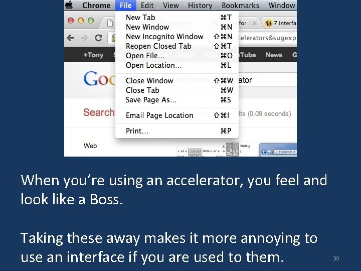
When you’re using an accelerator, you feel and look like a Boss. Taking these away makes it more annoying to use an interface if you are used to them. 30
10 Help and documentation Even though it is better if the system can be used without documentation, it may be necessary to provide help and documentation. Any such information should be easy to search, focused on the user's task, list concrete steps to be carried out, and not be too large. 31
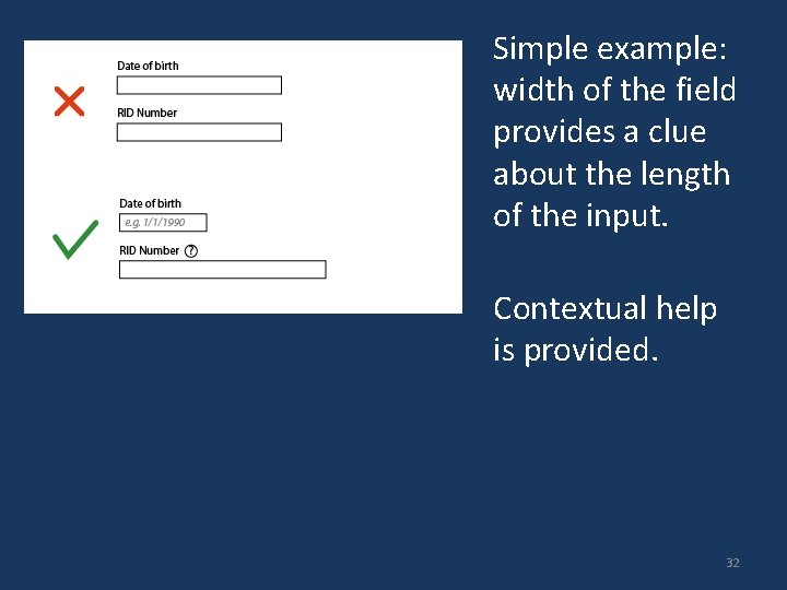
Simple example: width of the field provides a clue about the length of the input. Contextual help is provided. 32
What constitutes help? Tutorials / get started manuals Reference manuals Reminders Wizards Tips 33
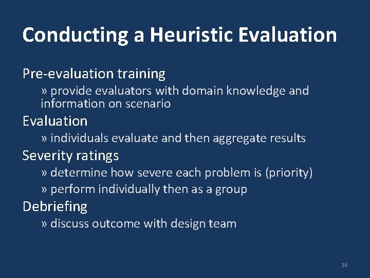
Conducting a Heuristic Evaluation Pre-evaluation training » provide evaluators with domain knowledge and information on scenario Evaluation » individuals evaluate and then aggregate results Severity ratings » determine how severe each problem is (priority) » perform individually then as a group Debriefing » discuss outcome with design team 34
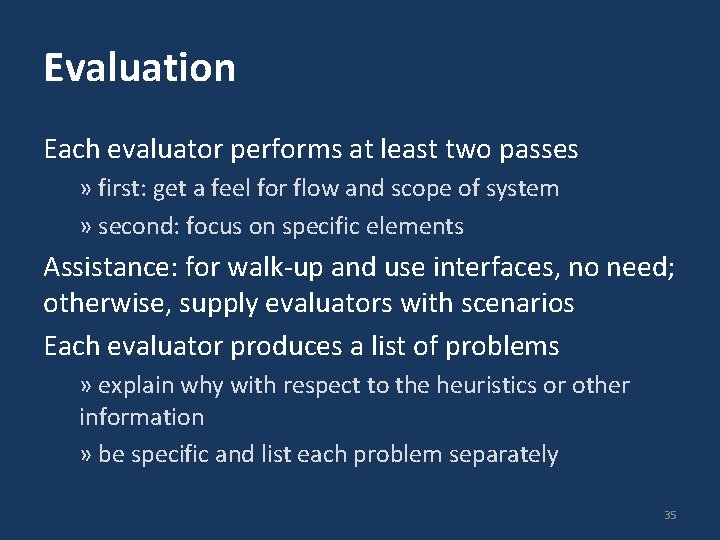
Evaluation Each evaluator performs at least two passes » first: get a feel for flow and scope of system » second: focus on specific elements Assistance: for walk-up and use interfaces, no need; otherwise, supply evaluators with scenarios Each evaluator produces a list of problems » explain why with respect to the heuristics or other information » be specific and list each problem separately 35
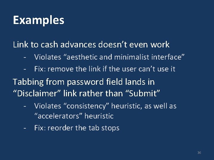
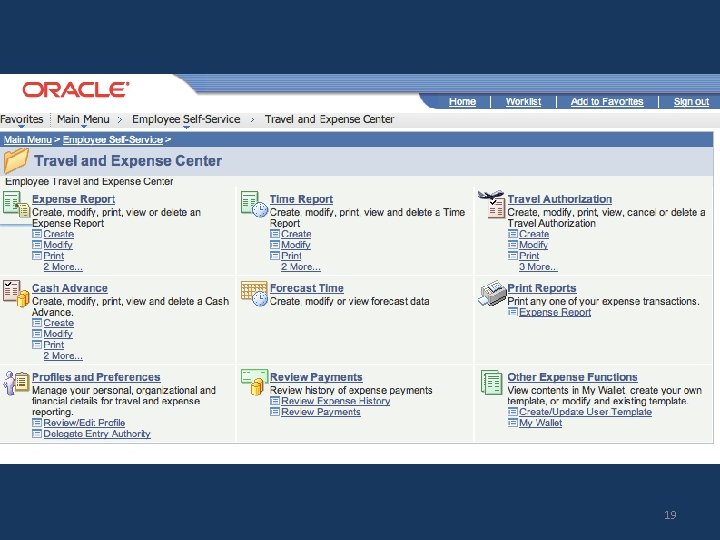
Examples Link to cash advances doesn’t even work - Violates “aesthetic and minimalist interface” - Fix: remove the link if the user can’t use it Tabbing from password field lands in “Disclaimer” link rather than “Submit” - Violates “consistency” heuristic, as well as “accelerators” heuristic - Fix: reorder the tab stops 36
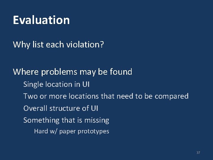
Evaluation Why list each violation? Where problems may be found Single location in UI Two or more locations that need to be compared Overall structure of UI Something that is missing Hard w/ paper prototypes 37
Severity Rating Used to allocate resources to fix problems Combination of: Frequency Impact Persistence (one time or repeating) Should be estimated after all problems have been seen Independently first is good 38
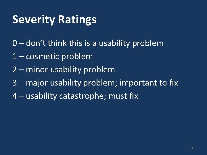
Severity Ratings 0 – don’t think this is a usability problem 1 – cosmetic problem 2 – minor usability problem 3 – major usability problem; important to fix 4 – usability catastrophe; must fix 39
Examples - Severity Link to cash advances doesn’t even work - Violates “aesthetic and minimalist interface” - Fix: remove the link if the user can’t use it Tabbing from password field lands in “Disclaimer” link rather than “Submit” - Violates “consistency” heuristic, as well as “accelerators” heuristic - Fix: reorder the tab stops 40
Debriefing Conduct with evaluators, observers, and development team members Discuss general characteristics of UI Suggest potential improvements to address major usability problems Dev. team rates how hard things are to fix Make it a brainstorming session little criticism until end of session 41
- Slides: 41