Quick Map Quiz After each map list what


")


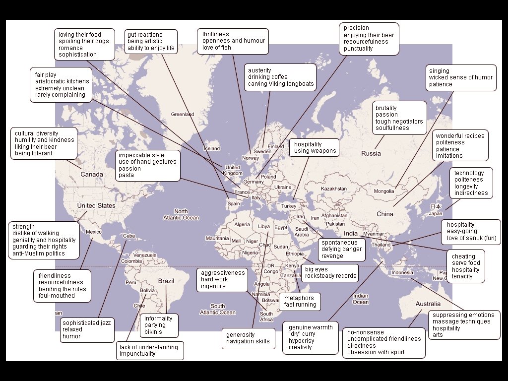
 Map • This map was generated by google search terms to produce")

- Slides: 33
Quick Map Quiz • After each map, list what type of map it is, what is the variable that is represented (what kind of information we could use that map for/what kind of conclusions could we make based on the map data) • Some maps it will be easier to tell what kind than to know what kind of information. • Disclaimer: My answers are not in full detail so it is up to you to fully learn about each map.
World according to GDP
• Cartogram • The size of the countries is substituted for the representative size of their GDP
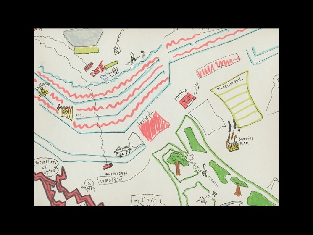
Mental Map • Someone’s random drawing of some random event
The World At Night
Choropleth Map • Thematic map equating the world according to the light they produce at night • Notice North Korea
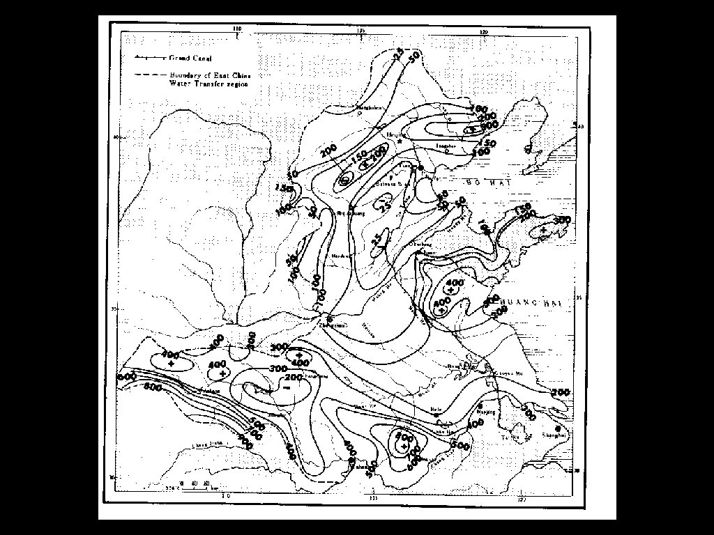
Isoline Map • Isoline maps are the easiest to detect because they have swurvy lines that represent varying levels of something • This map is demonstrating varying water transfer regions
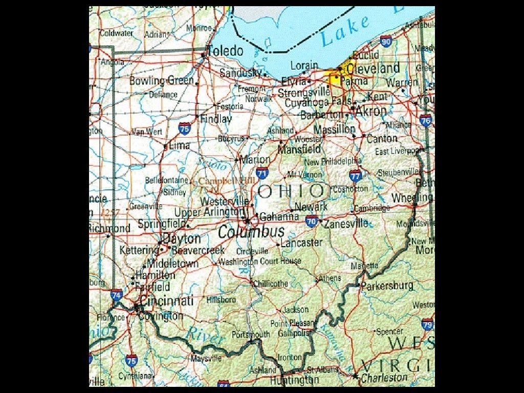
Reference Map • Strictly the facts • Could be used for navigation or general reference
World Gross Domestic Product
Cartogram • Another GDP Cartogram, in another format
Population Density
Choropleth Map • The theme is population density
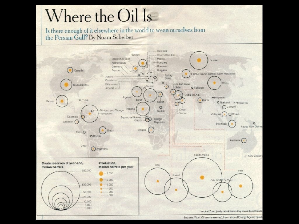
Proportional Symbol Map • symbol represents certain amounts of oil
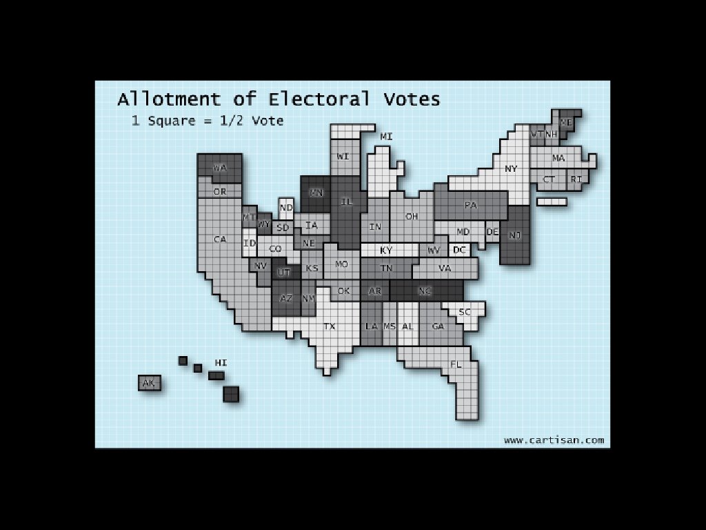
Cartogram • electoral votes are substituted for area
Choropleth Map • common variable applied across a region
U. K. Conservation sites
Dot Map • dots represent specific sites • dots can also be used to represent density
Pop vs Soda vs Coke
Choropleth Map • theme is the term used to reference soda (its proper name)
• REFERENCE!!!
• Proportional Symbol!! DUH
Mental (Cognitive) Map • This map was generated by google search terms to produce prejudices regarding each region of the world
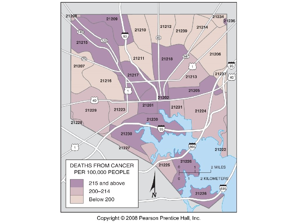
• Choropleth Map • Variable - cancer rates • One could make interesting correlations between the demographics of Baltimore and the occurances of cancer. Does it have to do with lifestyle? Income? Race? Could get controversial. . .