QUEST MOBILE PHASE 2 PROJECT OVERVIEW Jason Trodd

QUEST MOBILE PHASE 2 PROJECT OVERVIEW Jason Trodd, Grey. Heller, Enterprise Architect Tracey Sinclair, GSO, Assistant Director, Graduate Admissions & Records Systems Adam Wlad, IST, Information Systems Specialist watitis. uwaterloo. ca @watitisconf #watitis 2015
TIMELINES • Initiation and Planning Phase 1 – 12 months (Records, CC) Phase 2 – 6. 5 months • Execution Phase 1 – 6. 5 months Phase 2 • Part 1 – 2. 5 months (upgrade) • Part 2 – 3 months (enhancements, FA and Admissions) • Part 3 – 1 month (SF) #watitis 2015
PHASE 1 – NOVEMBER, 2014 • Partnered with GH to implement People. Mobile • Students can easily perform core Quest functionality on personal mobile devices in a secure manner • 48 pages providing the ability to: view grades and class schedules add, drop, and swap classes search for classes view and update personal information upload citizenship documentation view program and advisor information register for a GO pass Went live near the end of the “early adopter” phase of People. Mobile #watitis 2015
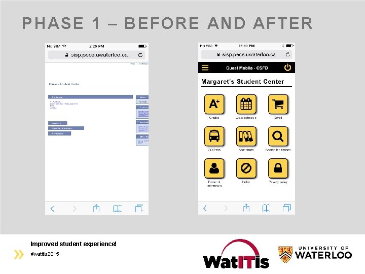
PHASE 1 – BEFORE AND AFTER Improved student experience! #watitis 2015
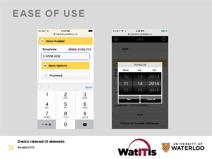
EASE OF USE Device relevant UI elements #watitis 2015
PHASE 1 – RECEPTION • Very simple, easy. Any student should be able to use it with ease. • A+ formatting! • Great! Much better than fighting with the desktop version of Quest on my phone. • Quest Mobile is a great tool…I love how you can search for courses and add the courses to your shopping cart on your phone without having to go onto a desktop. • Grades, right there. So much faster to check. • I like it more than the desktop version! The calendar looks a little weird #watitis 2015
PHASE 2, PART 1 – AUGUST, 2015 • Improvements include: A minimalist and modern “flat design” Consistent font and UI styling Menu-based navigation, replacing breadcrumbs Optimized display of errors, warnings, and popups A redesigned Class Schedule with swiping gestures A multi-column layout for improved tablet usage All image-based icons have been replaced with highdefinition quality vector-based icons Full support for “pinch-to-zoom” People. Mobile has matured! #watitis 2015
FLAT DESIGN • Wikipedia: a style of interface design without any stylistic elements that give the illusion of three dimensions (such as drop shadows, gradients or textures) and is focused on a minimalist use of simple elements, typography and flat colors • Examples: Windows 8, i. OS 7+ and OS X (since Mavericks) Google’s Material design (Gmail, You. Tube, Docs, etc. ) UI Trend – examples in the coming slides #watitis 2015
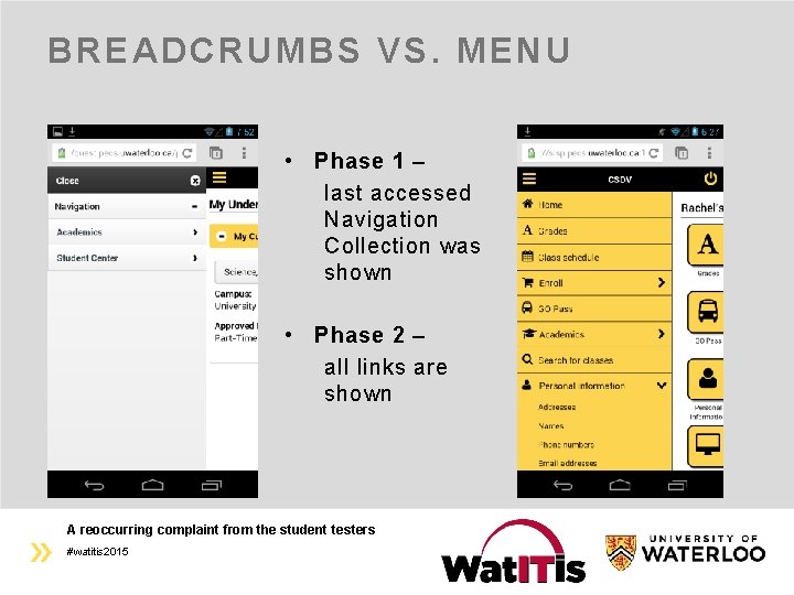
BREADCRUMBS VS. MENU • Phase 1 – last accessed Navigation Collection was shown • Phase 2 – all links are shown A reoccurring complaint from the student testers #watitis 2015
MULTI-COLUMN RESPONSIVENESS • Phase 1 Tablets were largely big phones Still responsive with respect to breakpoints, but did not take full advantage of the extra space • Phase 2 Two columns: menu for large form factors (LFFs) Three columns: Activity Guides in a third column Buttons: fixed for small form factors (SFFs) and rightjustified for LFFs • Phase X Multi-rows in multi-columns: Related Content Part of what GH calls “True Responsiveness” #watitis 2015
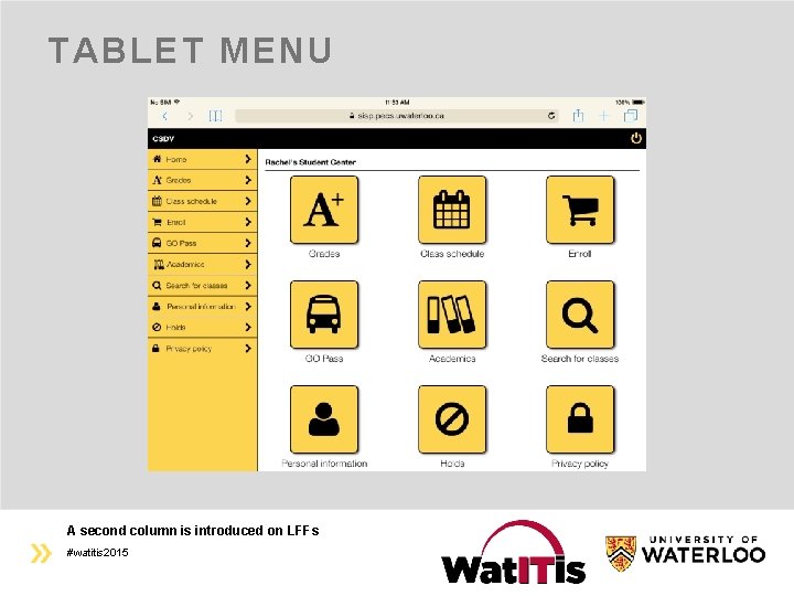
TABLET MENU A second column is introduced on LFFs #watitis 2015
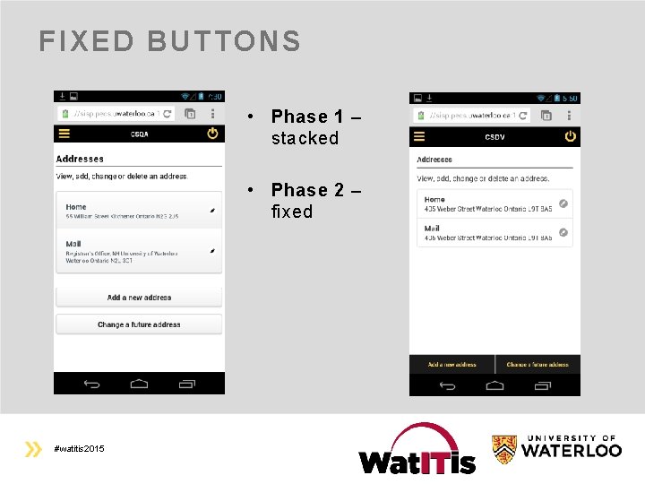
FIXED BUTTONS • Phase 1 – stacked • Phase 2 – fixed #watitis 2015
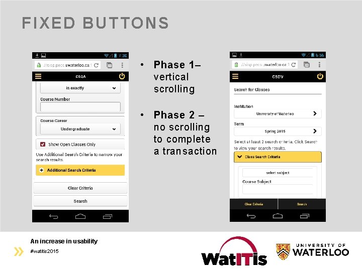
FIXED BUTTONS • Phase 1– vertical scrolling • Phase 2 – no scrolling to complete a transaction An increase in usability #watitis 2015
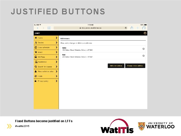
JUSTIFIED BUTTONS Fixed Buttons become justified on LFFs #watitis 2015
FONTS AND STYLING • Phase 1 Different fonts in custom and delivered pages made it hard to standardize Page header bolding – on a page-by-page basis • Phase 2 Consistent fonts, changed globally Global bolding of page headers All UI elements can now be stylized globally!! Bootstrap, Foundation, Fluid, etc. – Multiple UIs at once #watitis 2015
MESSAGING AND ICONS • Phase 1 Popovers: very “mobile-ie” on LFFs Messaging: legacy images often disrupted layout • Phase 2 Popovers: usable on LFFs Messaging: all images have been replaced with vector-based icons • 4 to 54 inches – looks great on an i. Phone and a Play. Station • All People. Tools images are gone! Waterloo’s Font. Awesome implementation made it into the product! #watitis 2015
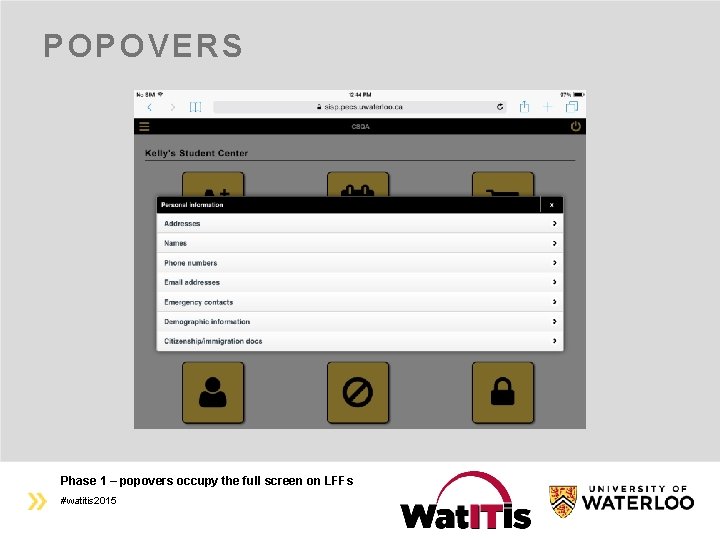
POPOVERS Phase 1 – popovers occupy the full screen on LFFs #watitis 2015
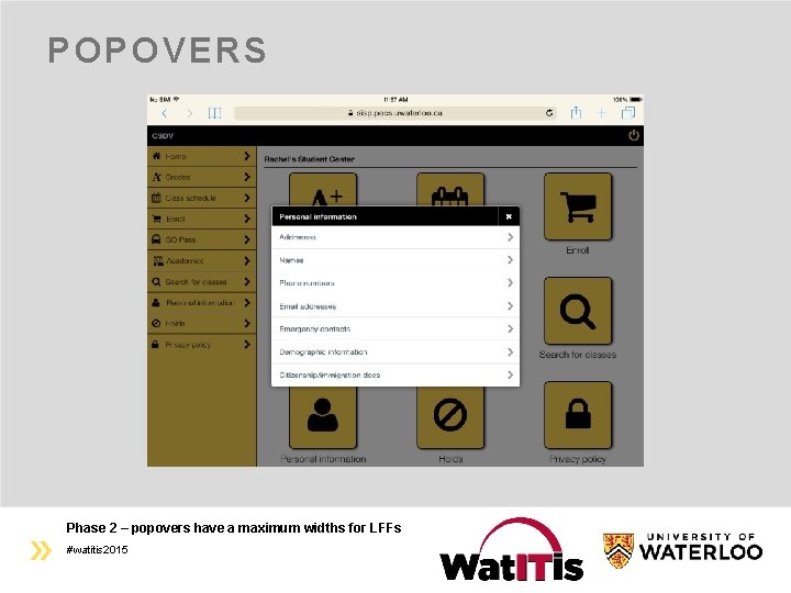
POPOVERS Phase 2 – popovers have a maximum widths for LFFs #watitis 2015
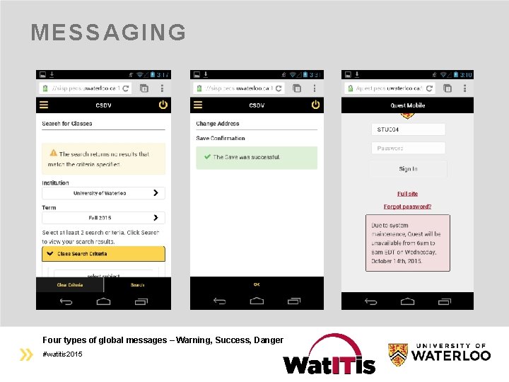
MESSAGING Four types of global messages – Warning, Success, Danger #watitis 2015
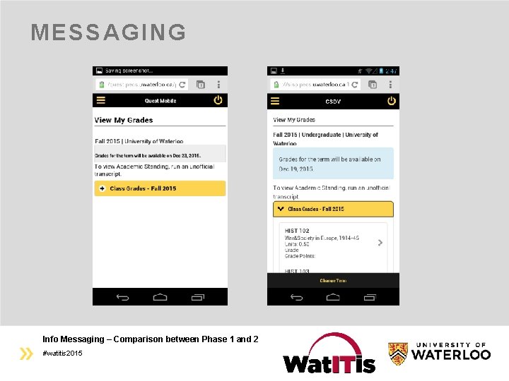
MESSAGING Info Messaging – Comparison between Phase 1 and 2 #watitis 2015
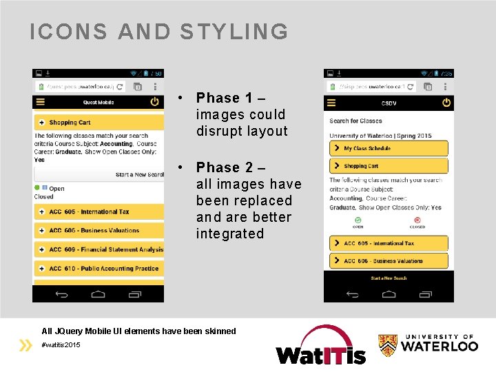
ICONS AND STYLING • Phase 1 – images could disrupt layout • Phase 2 – all images have been replaced and are better integrated All JQuery Mobile UI elements have been skinned #watitis 2015
CLASS SCHEDULE • Phase 1 The most visually awkward page • Complaints from student testers and students on social media A lot of data “jammed together” Hard to navigate • Phase 2 One of the best mobile pages • Most of the new features in one page Data is cleanly laid out Easy to navigate • Swiping (a new gesture) This technology also introduces sortable column functionality #watitis 2015
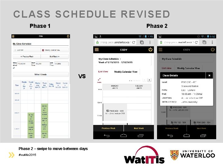
CLASS SCHEDULE REVISED Phase 1 Phase 2 VS Phase 2 – swipe to move between days #watitis 2015
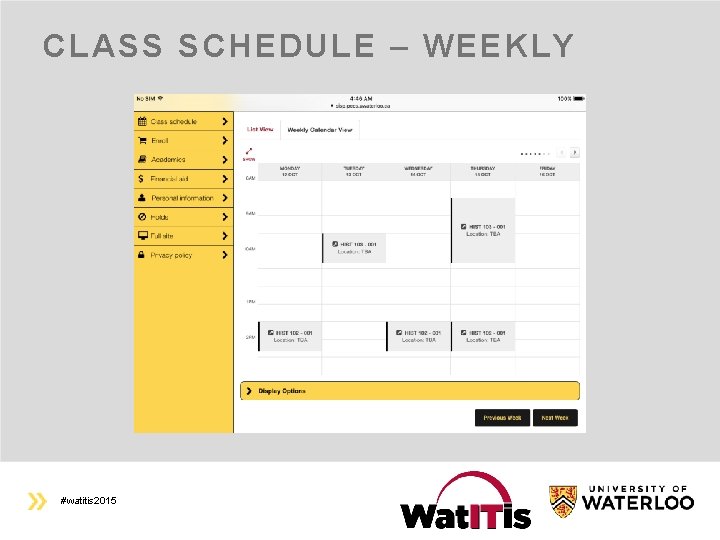
CLASS SCHEDULE – WEEKLY #watitis 2015
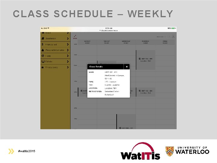
CLASS SCHEDULE – WEEKLY #watitis 2015
PHASE 2, PART 2 – OCTOBER, 2015 • Improvements include: Notification Bubbles a redesigned login page for LFFs additional style enhancements “Full site” link within the application • 15 pages for students and applicants: view financial aid award summary and anticipated aid detail view application status, offer conditions, education profile, and test scores upload documents (transcripts, resumes, portfolios, etc) accept/decline offers apply for an entrance bursary (undergrad) view official offers (grad) What’s new? More content and UI enhancements #watitis 2015
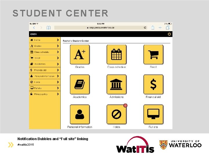
STUDENT CENTER Notification Bubbles and “Full site” linking #watitis 2015
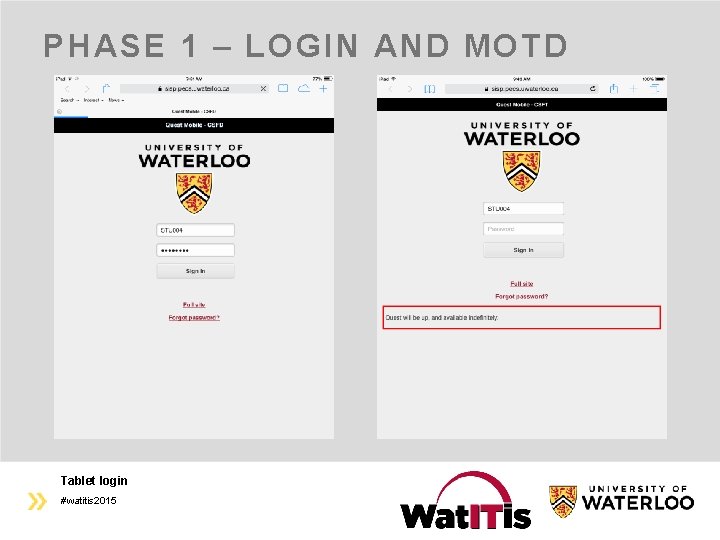
PHASE 1 – LOGIN AND MOTD Tablet login #watitis 2015
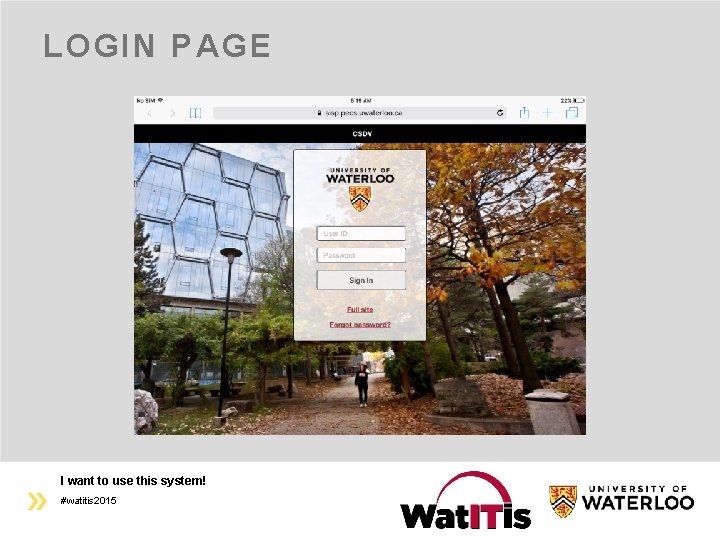
LOGIN PAGE I want to use this system! #watitis 2015
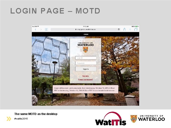
LOGIN PAGE – MOTD The same MOTD as the desktop #watitis 2015
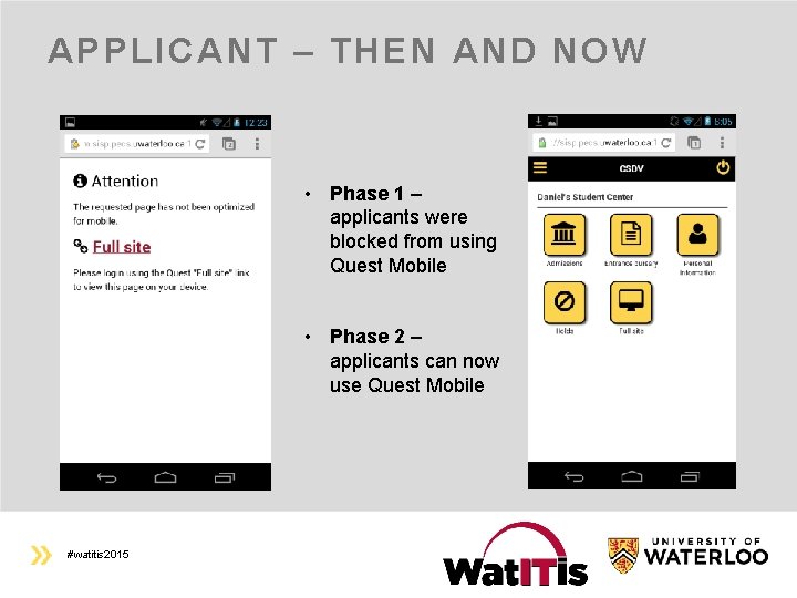
APPLICANT – THEN AND NOW • Phase 1 – applicants were blocked from using Quest Mobile • Phase 2 – applicants can now use Quest Mobile #watitis 2015
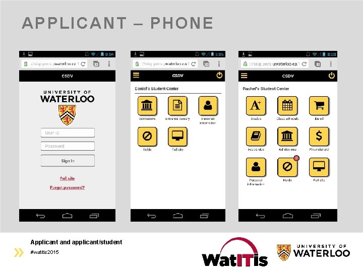
APPLICANT – PHONE Applicant and applicant/student #watitis 2015
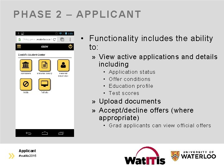
PHASE 2 – APPLICANT • Functionality includes the ability to: View active applications and details including • • Application status Offer conditions Education profile Test scores Upload documents Accept/decline offers (where appropriate) • Grad applicants can view official offers Applicant #watitis 2015
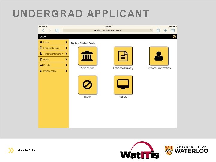
UNDERGRAD APPLICANT #watitis 2015
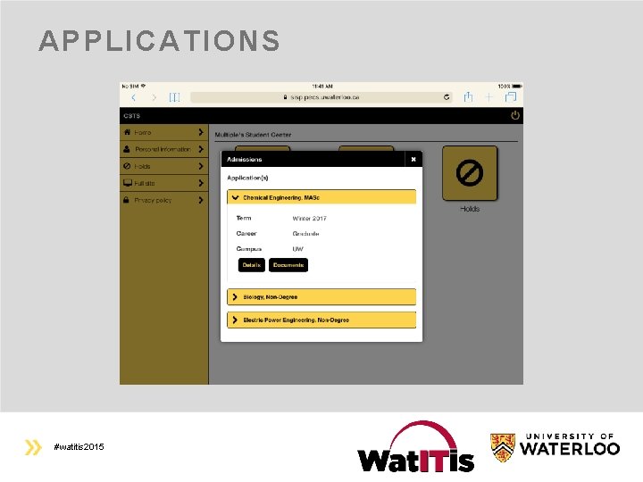
APPLICATIONS #watitis 2015
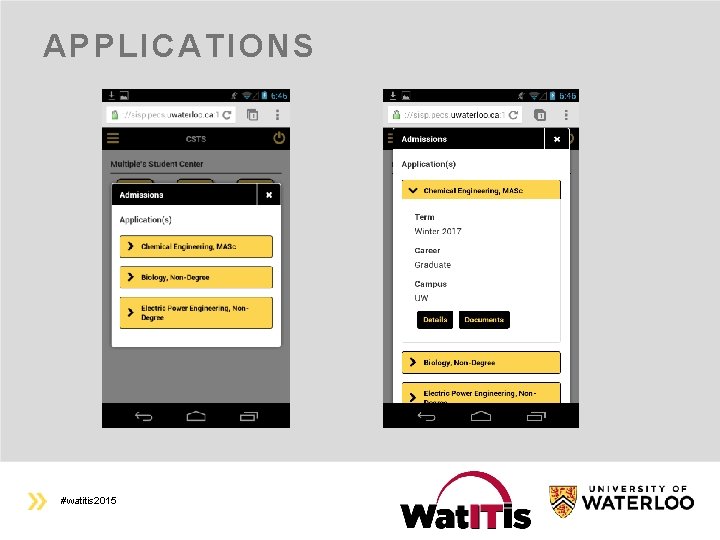
APPLICATIONS #watitis 2015
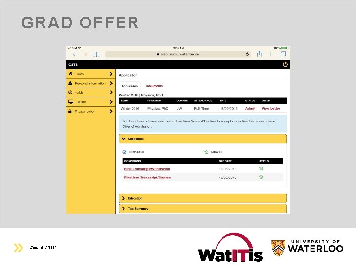
GRAD OFFER #watitis 2015
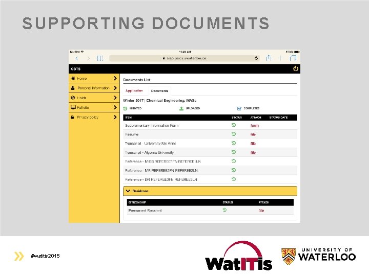
SUPPORTING DOCUMENTS #watitis 2015
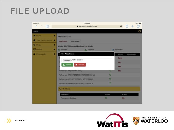
FILE UPLOAD #watitis 2015
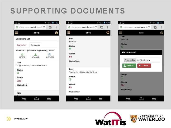
SUPPORTING DOCUMENTS #watitis 2015
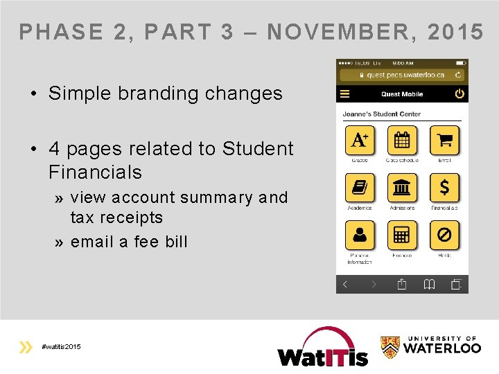
PHASE 2, PART 3 – NOVEMBER, 2015 • Simple branding changes • 4 pages related to Student Financials view account summary and tax receipts email a fee bill #watitis 2015

QUESTIONS #watitis 2015

#watitis 2015
- Slides: 43