Quantitative Reasoning 1 TOPIC 1 ORGANIZING INFORMATION PICTORIALLY
- Slides: 21

Quantitative Reasoning 1 TOPIC 1 ORGANIZING INFORMATION PICTORIALLY USING CHARTS AND GRAPHS CSE 111 Spring 2017

Objectives 2 �Distinguish between quantitative and categorical variables. �Draw bar graphs and pie charts, and interpret them in the context of the data they represent. �Compute percentage of the whole and percent change. �Interpret stemplots and histograms and group data to create them. �Decide when each type of graph is appropriate. CSE 111 Spring 2017

Variables 3 �A variable is a characteristic of an object or a person (called an individual/case). �Numerical variables are quantitative variables. Eg. , age, height, revenue �Variables containing a category called categorical variables. Eg. , movie genre, city, job title, color CSE 111 Spring 2017

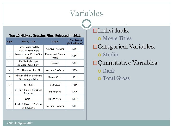
Variables 4 �Individuals: Movie Titles �Categorical Variables: Studio �Quantitative Variables: Rank Total Gross CSE 111 Spring 2017

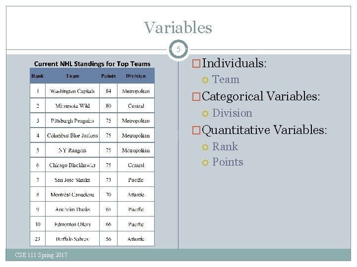
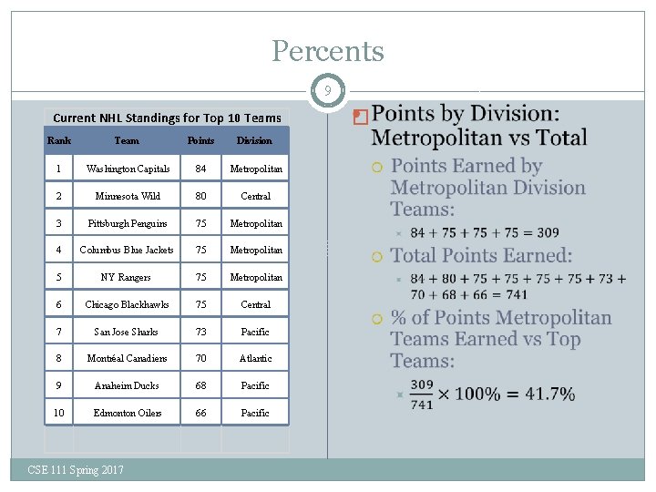
Variables 5 �Individuals: Team �Categorical Variables: Division �Quantitative Variables: Rank Points CSE 111 Spring 2017

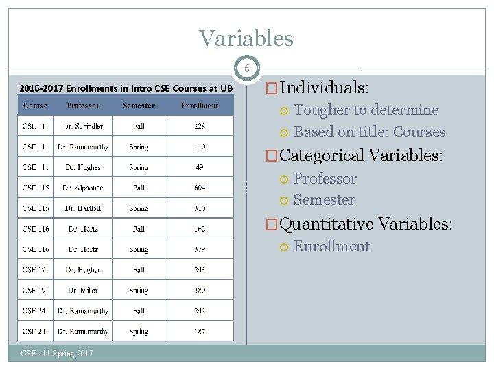
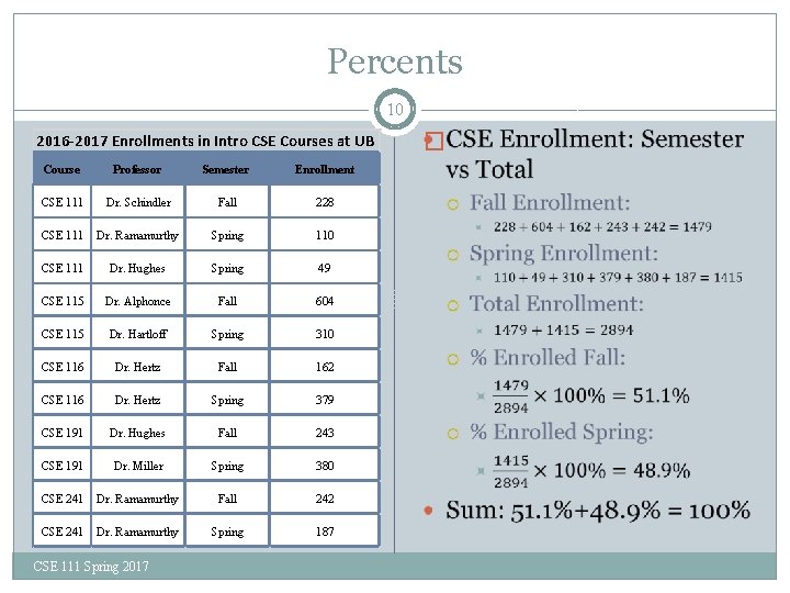
Variables 6 �Individuals: Tougher to determine Based on title: Courses �Categorical Variables: Professor Semester �Quantitative Variables: Enrollment CSE 111 Spring 2017

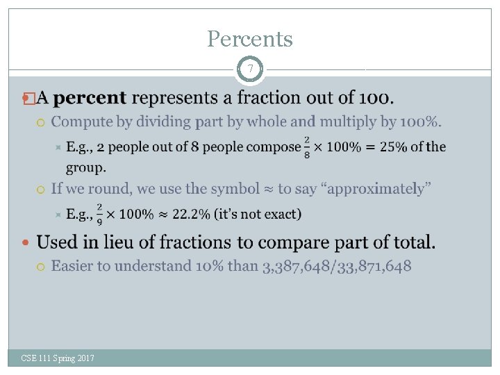
Percents 7 � CSE 111 Spring 2017

Percents 8 �Sum of % for each part is always 100%. Sum of all parts equals the whole If 2 people each get 25% of a pizza, and one person gets 50%, you have finished your pizza. � 25% + 50% = 100%. If the percentages didn’t add back to 100%, there would be remaining pizza unaccounted for. CSE 111 Spring 2017

Percents 9 Current NHL Standings for Top 10 Teams Rank Team Points Division 1 Washington Capitals 84 Metropolitan 2 Minnesota Wild 80 Central 3 Pittsburgh Penguins 75 Metropolitan 4 Columbus Blue Jackets 75 Metropolitan 5 NY Rangers 75 Metropolitan 6 Chicago Blackhawks 75 Central 7 San Jose Sharks 73 Pacific 8 Montréal Canadiens 70 Atlantic 9 Anaheim Ducks 68 Pacific 10 Edmonton Oilers 66 Pacific CSE 111 Spring 2017 �

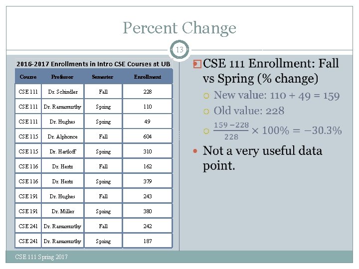
Percents 10 2016 -2017 Enrollments in Intro CSE Courses at UB Course Professor Semester Enrollment CSE 111 Dr. Schindler Fall 228 CSE 111 Dr. Ramamurthy Spring 110 CSE 111 Dr. Hughes Spring 49 CSE 115 Dr. Alphonce Fall 604 CSE 115 Dr. Hartloff Spring 310 CSE 116 Dr. Hertz Fall 162 CSE 116 Dr. Hertz Spring 379 CSE 191 Dr. Hughes Fall 243 CSE 191 Dr. Miller Spring 380 CSE 241 Dr. Ramamurthy Fall 242 CSE 241 Dr. Ramamurthy Spring 187 CSE 111 Spring 2017 �

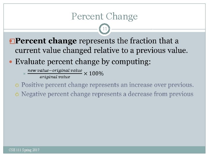
Percent Change 11 � CSE 111 Spring 2017

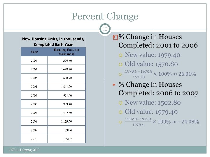
Percent Change 12 � CSE 111 Spring 2017

Percent Change 13 2016 -2017 Enrollments in Intro CSE Courses at UB Course Professor Semester Enrollment CSE 111 Dr. Schindler Fall 228 CSE 111 Dr. Ramamurthy Spring 110 CSE 111 Dr. Hughes Spring 49 CSE 115 Dr. Alphonce Fall 604 CSE 115 Dr. Hartloff Spring 310 CSE 116 Dr. Hertz Fall 162 CSE 116 Dr. Hertz Spring 379 CSE 191 Dr. Hughes Fall 243 CSE 191 Dr. Miller Spring 380 CSE 241 Dr. Ramamurthy Fall 242 CSE 241 Dr. Ramamurthy Spring 187 CSE 111 Spring 2017 �

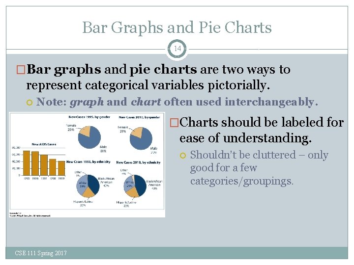
Bar Graphs and Pie Charts 14 �Bar graphs and pie charts are two ways to represent categorical variables pictorially. Note: graph and chart often used interchangeably. �Charts should be labeled for ease of understanding. CSE 111 Spring 2017 Shouldn’t be cluttered – only good for a few categories/groupings.

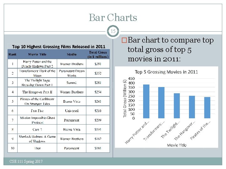
Bar Charts 15 �Bar chart to compare top total gross of top 5 movies in 2011: CSE 111 Spring 2017

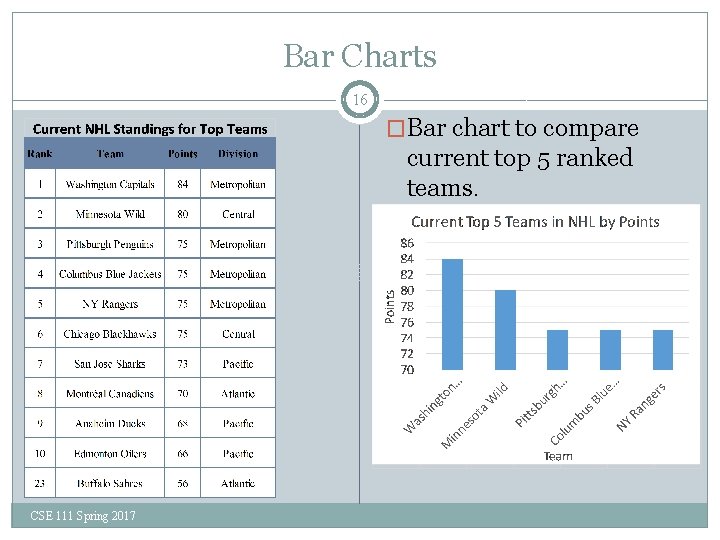
Bar Charts 16 �Bar chart to compare current top 5 ranked teams. CSE 111 Spring 2017

Bar Charts 17 �In bar charts, bars have height equal to the total value it represents. Can compare values visually by comparing height. �The horizontal axis is labeled with the name of the object or group it is representing. �The vertical axis is labeled with the values each height represents. Vertical axis must contain a quantitative variable. Vertical axis labels must cover the range of values represented. � May start from 0, or start from another value. � Each marking must be equally spaced. CSE 111 Spring 2017

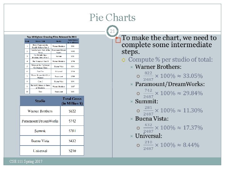
Pie Charts 18 �A pie chart visualizes data as a percentage of the total. To construct the chart, we need to determine: � The total value of everything we will consider. � The total value of each group. Multiple items may lump into the same group. E. g. , comparing enrollments for the year between CSE courses – multiple offerings of same course should be lumped together. � The percentage of the total that each group consumes. Better for visualizing a comparison of ratios. CSE 111 Spring 2017

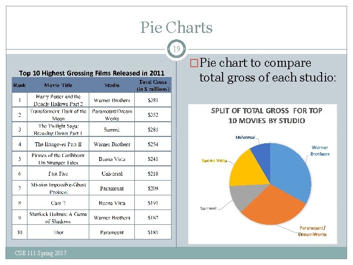
Pie Charts 19 �Pie chart to compare total gross of each studio: CSE 111 Spring 2017

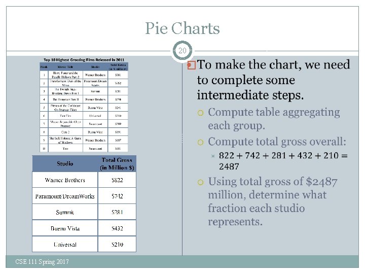
Pie Charts 20 � CSE 111 Spring 2017

Pie Charts 21 � CSE 111 Spring 2017