Quality Tools 12192021 Quality Tools http www kwaliteg


- Slides: 19

Quality Tools 12/19/2021 Quality Tools - http: //www. kwaliteg. co. za 1

Table of Contents • Quality techniques – 7 Basic Quality techniques – – – – Histograms Pareto Charts Run Charts Scatter Diagrams Control Charts Flow Charts Cause and Effect Diagrams – New techniques – Other Tools 12/19/2021 Quality Tools - http: //www. kwaliteg. co. za 2

Introduction • In the following we will Examine the Techniques and Tools that Support Quality Management within a company. There are for the 7 Basic Tools which we are going to define. Generally they can be subdivided into: • mathematical statistical Tools • logical tools 12/19/2021 Quality Tools - http: //www. kwaliteg. co. za 3

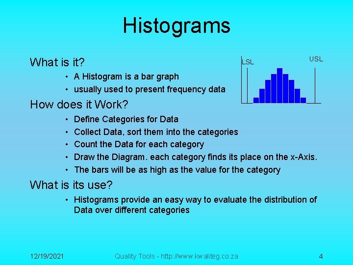
Histograms What is it? LSL USL • A Histogram is a bar graph • usually used to present frequency data How does it Work? • • • Define Categories for Data Collect Data, sort them into the categories Count the Data for each category Draw the Diagram. each category finds its place on the x-Axis. The bars will be as high as the value for the category What is its use? • Histograms provide an easy way to evaluate the distribution of Data over different categories 12/19/2021 Quality Tools - http: //www. kwaliteg. co. za 4

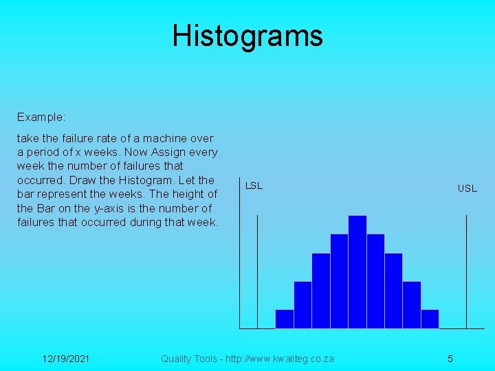
Histograms Example: take the failure rate of a machine over a period of x weeks. Now Assign every week the number of failures that occurred. Draw the Histogram. Let the bar represent the weeks. The height of the Bar on the y-axis is the number of failures that occurred during that week. 12/19/2021 LSL Quality Tools - http: //www. kwaliteg. co. za USL 5

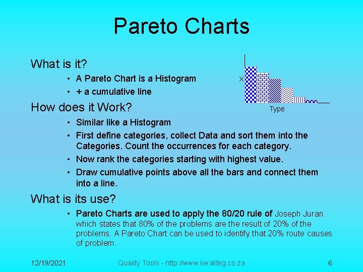
Pareto Charts What is it? • A Pareto Chart is a Histogram • + a cumulative line X How does it Work? Type • Similar like a Histogram • First define categories, collect Data and sort them into the Categories. Count the occurrences for each category. • Now rank the categories starting with highest value. • Draw cumulative points above all the bars and connect them into a line. What is its use? • Pareto Charts are used to apply the 80/20 rule of Joseph Juran which states that 80% of the problems are the result of 20% of the problems. A Pareto Chart can be used to identify that 20% route causes of problem. 12/19/2021 Quality Tools - http: //www. kwaliteg. co. za 6

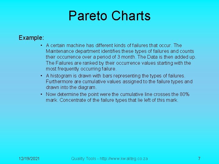
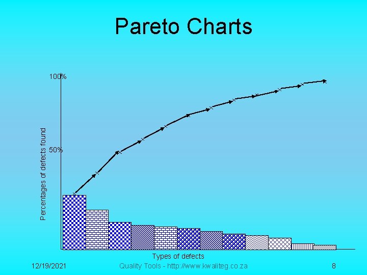
Pareto Charts Example: • A certain machine has different kinds of failures that occur. The Maintenance department identifies these types of failures and counts their occurrence over a period of 3 month. The Data is then added up. The Failures are ranked by their occurrence values starting with the most frequently occurring failure. • A histogram is drawn with bars representing the types of failures. Furthermore are cumulative values assigned to the failure types and drawn into the diagram. • Now determine the point were the cumulative line crosses the 80% mark. Concentrate of the failure types that lie left of this mark. 12/19/2021 Quality Tools - http: //www. kwaliteg. co. za 7

Pareto Charts Percentages of defects found 100% 50% 12/19/2021 Types of defects Quality Tools - http: //www. kwaliteg. co. za 8

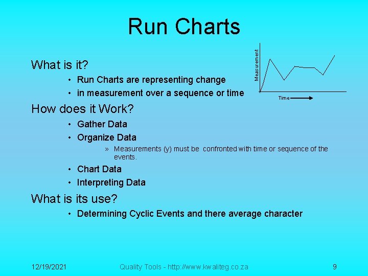
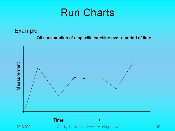
What is it? • Run Charts are representing change • in measurement over a sequence or time Measurement Run Charts Time How does it Work? • Gather Data • Organize Data » Measurements (y) must be confronted with time or sequence of the events. • Chart Data • Interpreting Data What is its use? • Determining Cyclic Events and there average character 12/19/2021 Quality Tools - http: //www. kwaliteg. co. za 9

Run Charts Example Measurement • Oil consumption of a specific machine over a period of time. Time 12/19/2021 Quality Tools - http: //www. kwaliteg. co. za 10

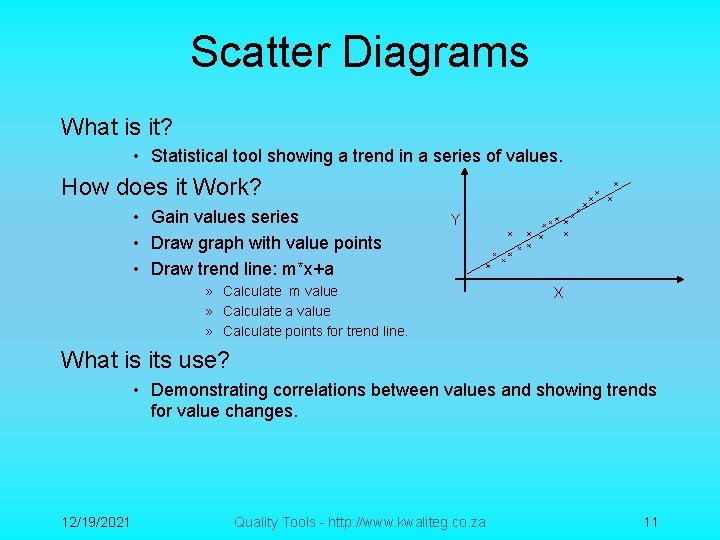
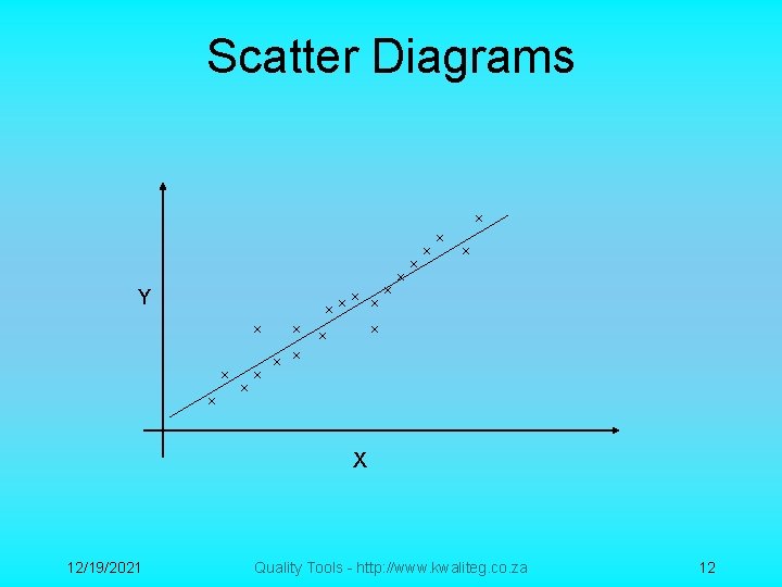
Scatter Diagrams What is it? • Statistical tool showing a trend in a series of values. How does it Work? • Gain values series • Draw graph with value points • Draw trend line: m*x+a Y » Calculate m value » Calculate a value » Calculate points for trend line. X What is its use? • Demonstrating correlations between values and showing trends for value changes. 12/19/2021 Quality Tools - http: //www. kwaliteg. co. za 11

Scatter Diagrams Y X 12/19/2021 Quality Tools - http: //www. kwaliteg. co. za 12

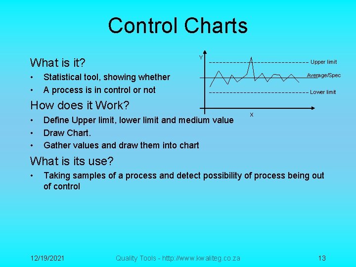
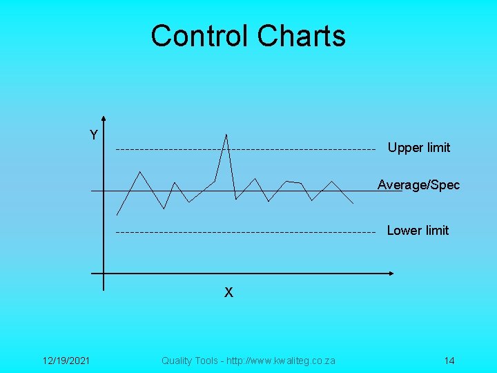
Control Charts Y What is it? • • Statistical tool, showing whether A process is in control or not How does it Work? • • • Upper limit Define Upper limit, lower limit and medium value Draw Chart. Gather values and draw them into chart Average/Spec Lower limit X What is its use? • Taking samples of a process and detect possibility of process being out of control 12/19/2021 Quality Tools - http: //www. kwaliteg. co. za 13

Control Charts Y Upper limit Average/Spec Lower limit X 12/19/2021 Quality Tools - http: //www. kwaliteg. co. za 14

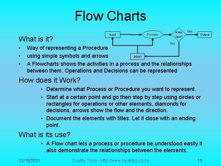
Flow Charts Input What is it? • • • Within Process Yes Spec? Output No Way of representing a Procedure adjust using simple symbols and arrows A Flowcharts shows the activities in a process and the relationships between them. Operations and Decisions can be represented How does it Work? • Determine what Process or Procedure you want to represent. • Start at a certain point and go then step by step using circles or rectangles for operations or other elements, diamonds for decisions, arrows show the flow and the direction. • Document the elements with titles. Let it close with an ending point. What is its use? • A Flow chart lets a process or procedure be understood easily it also demonstrate the relationships between the elements. 12/19/2021 Quality Tools - http: //www. kwaliteg. co. za 15

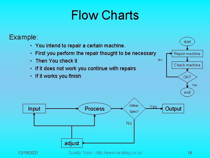
Flow Charts Example: • • • You intend to repair a certain machine. First you perform the repair thought to be necessary Then You check it If it does not work you continue with repairs If it works you finish start Repair machine No Check machine OK? Yes end Input Process Within Spec? Yes Output No adjust 12/19/2021 Quality Tools - http: //www. kwaliteg. co. za 16

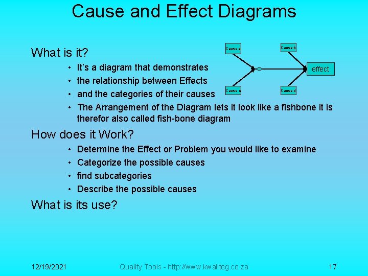
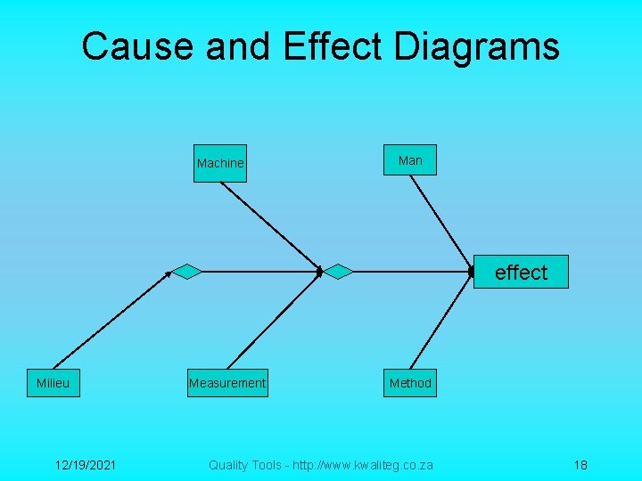
Cause and Effect Diagrams What is it? • • Cause a Cause b It’s a diagram that demonstrates effect the relationship between Effects Cause c Cause d and the categories of their causes The Arrangement of the Diagram lets it look like a fishbone it is therefor also called fish-bone diagram How does it Work? • • Determine the Effect or Problem you would like to examine Categorize the possible causes find subcategories Describe the possible causes What is its use? 12/19/2021 Quality Tools - http: //www. kwaliteg. co. za 17

Cause and Effect Diagrams Machine Man effect Milieu 12/19/2021 Measurement Method Quality Tools - http: //www. kwaliteg. co. za 18

Thank You 12/19/2021 Quality Tools - http: //www. kwaliteg. co. za 19