QUALITY CIRCLE What is Quality Circle A Quality


 Decision Document symbol Flow")


 and Also")


, during his study of distribution of wealth")


 – (X min. ) R =")


 /K where")


 This is a trend Some Caution Time")
 This is a run Time")


 Variables Control")


 Variables Control Charts We will study here three")


- Slides: 174
QUALITY CIRCLE
What is Quality Circle? A Quality Control Circle is a small group consisting of first – line employees within the same work area who voluntarily, continually improve the quality of their work & services by, Solving the work related problems, Utilizing problem solving tools & techniques, With all members participating, As a part of total quality control activities, Autonomously, Leading to Self & mutual development.
Why Quality Circle is necessary ? 1. 2. 3. 4. To facilitate one to fully develop his potential. To create pleasant work environment. Help organization development. Make people happy at work place.
What is the history behind the Quality Circle? 1. Industrial product quality was in in shambles after World War II. 2. Japan’s Industry has invited Dr. W. E. Deming and got trained its engineers in SQC, and Dr. J. M. Juran had lectured on Management Quality and inspired by them, Dr. K. Ishikawa has amalgamated theories of motivation and quality and taken Quality to Gemba i. e shopfloor. Dr. K. Ishikawa has started Quality Control Circles (QCC) in Japan in 1962. He is known as Father of Quality Circles.
How to start quality circle activity ? 1. Exposure programme to Sr. Executives. 2. Forming steering committee and selection of a co-ordinator. 3. Selection of trainers and facilitators. 4. Exposure programme to workers & staff members. 5. Formation of Quality circles.
SUPPORT STRUCTURE FOR QUALITY CIRCLE? Top Mgt. Coordinator Facilitator Leader / Dy. leader Members Potential members
Structure Of Quality Circle In Individual Dept HOD COORDINATOR FACILITATOR LEADER / DY. LEADER MEMBERS POTENTIAL MEMBERS
How does Quality Circle function? They meet regularly & periodically, once in a week for one hour. How many members should be there in a circle? 4 to 5 members What are the principle components of Quality Circle? 1. 2. 3. 4. Regular Q. C meetings Training in problem solving tools, Management presentation Review & monitoring of steering committee.
What are the responsibilities of Co-ordinator? 1. Convene steering committee meeting regularly 2. Handling request for starting new Quality Circle 3. Arrange facilities for Quality circle meetings 4. Monitor meeting of Quality Circle regularly. What are the roles of a Facilitator? 1. To ensure regularity of meetings. 2. Regularity of member’s attendance. 3. He should help in clarifying and defining problem. 4. Help in preparation for management presentation.
What are the roles of a Leader? 1. Conduct meeting regularly 2. Involve all people 3. To co-ordinate between members 4. Take the team towards goal. 5. Works to plan and assigns roles to members. 6. Maintains record of activities. 7. Prepares management presentation involving all members.
What is the role of members ? 1. To attend Q. C meetings regularly. 2. Co-operate with the leader and perform roles assigned to him/her efficiently. 3. Respect other members and co-operate with them. 4. Learn to listen, appreciate other’s view points or opinions. 5. Share Q. C team’s goals and objectives. 6. Interact with members freely. 7. Do the home work before every meeting. 8. Contribute to the success of the group.
What is a problem ? It is the gap between the present situation and the ideal situation or objective. The problems are classified according to the obviousness of the causes and the countermeasures needed. 1. Simple problems (C) 2. Problems requiring high degree of technology. (B) 3. Problems where necessary action to be taken is known but, do not understand about causes. (D) 4. Problems where causes are not known and countermeasures are not known (A) QC teams should try to solve these(A) type problems using QC tools and pooling the abilities and talents of the team.
How to conduct meeting effectively? 1. Commitment to task. 1. Informality in the meeting. 2. Openness 3. Conflict on ideas, not between persons. 4. Constructive criticism. 5. General agreements. 6. Action plan after the meeting.
How to conduct meeting effectively? What is Effectiveness and Efficiency. Effectiveness is producing the intended or expected result. Efficiency – performing in the best possible manner with least wastage of time, effort and materials. Efficiency focuses on means, whereas Effectiveness focuses on goal.
Why meetings are to be conducted? 1. To share the knowledge. 2. To find out the problem. 3. To share ideas. 4. To develop team spirit 5. To learn from others. 6. To improve the communication 7. To better understand the problem 8. To correct our mistakes. 9. To discuss , & decide.
How to conduct meeting effectively PLAN. 1. 2. 3. 4. 5. Who should attend ? Purpose of discussion. Where and when the meeting is going to be. How long it would be. Prior information to members be given for a fruitful discussion.
How to conduct meeting effectively During the meeting. 1. Start on time and end on time. 2. Reach consensus on agenda. 3. Stick to agenda. 4. Ensure and encourage so that all members participate. 5. Encourage listening and thinking among members. 6. Summarize the discussions at the end of meeting. 7. Assign roles and responsibilities to members.
How to conduct meeting effectively At the end of the meeting. 1. Summarize the meeting and assign roles and responsibilities 2. Draw out action plan. After the meeting. 1. Circulate the minutes and action plan 2. Evaluate the meeting results
Action Plan/ Responsibility chart Sl. No 1. 2. Responsibility Action to be taken by Collect data Mr. XYZ On breakdown Date of completion Check the accuracy Of measurement Gauge/syst 17. 01. 2017 Mr. ABC 17. 01. 2017
Characteristics of persons participating in meetings Sl. no. 1 1. 2. Types Bull Dog Horse characteristics Fight for everything Agree for everything 3 Monkey 4. 5. 6. Frog Doe Pork pine Thinks he knows everything Continuously talking Shy, rarely talk Always come up with some objections 7. Hippo 8. Zeraffe 9. Fox No Response. Go with crowd Superman-Knows all Putting dangerous questions
DEMING CYCLE Or P-D-C-A Cycle
ACT PLAN CHECK DO
Follow up Review Regular Implementation Trial Implementation Foresee Resistanc e and Prepare Identify work related problems 12 1 11 10 9 Action (Control) Plan 2 Check Do (Collect data) 3 4 5 8 7 Defin e the probl em Ana Id ca enti su fy se s y ntif Ide t roo es s cau Data Analysis Develop Solution 6 Selection of problem lyse
Problems can be controlled or minimized by effective use of PDCA cycle. Plan indicates that before under taking a task one should try to understand the objective behind doing it and should know the proper method for it. DO indicates learning the method and carrying out the task. CHECK indicates verifying whether our effort has given the deserved result. ACT indicates taking appropriate action to rectify the short fall or problems faced.
Decide on the objectives and targets ACT PLAN Take action Decide method of achieving the objective Carry out education and training CHECK DO Check the result Do the work
1. Regular implementation 2. Follow up and review ACT 1. Identification of problems 2. Selection of problems 3. Define the problem Decide on the objectives and targets PLAN Take action Decide method of achieving the objective Carry out education and training CHECK DO Check the result Do the work 1. Foreseeing probable resistance 2. Trial implementation 1. Analysisng the problem 2. Identification of causes 3. Finding out root causes 4. Data analysis 5. Developing solutions
Continuous improvement cycle Or DEMING Wheel
12 steps for problem solving 1. Identification of work Related problems 2. Selection of problem 3. Define the problem 4. Analyse the problem 5. Identification of causes 6. finding out the root causes 7. Data analysis 8. Developing solution 9. Forseeing probable resistance 10. Trial implementation 11. Regular implementation 12. Follow-up & review
STEP 1 : Identification of work related problems Tool used : Brain storming Problem’s at work area are identified and listed out. Same problems to be divided into ‘A’, ‘B’ and ‘C’ category for easy segregation and attending the problems. ‘A’ category problems : Minimum involvement of other departments in solving them.
‘B’ category problems : Involvement of other department is a necessity. ‘C’ category problems : Management sanction may be needed in implementing the solution. In the beginning of Quality circle it is always better to take ‘A’ type problems which involves the department people only.
Step 2 : Selection of problem Tool used : Ranking analysis, Priority number, Pareto analysis 1. Among the ‘A’, ‘B’ and ‘C’ category problems 2. One category to be choosed for selection of problem. 3. Ranking to be given to all the problems in that category based on the importance of the problem. 4. Top ranked 4 to 5 problems to be listed out and priority analysis to be done for these problem by giving scores.
Step 3 : Define the problem Tool used : Flow diagram, Brain storming Even through people are from the same area it does not mean that all have a clarity about the problem selected. So it is necessary to define the problem. The best way to do is using a ‘Flow Diagram’ showing the entire process related to that area and indicating the problem spot. Reason for selection of problem : Why this problem is selected? Different reasons for the selection of problems to be noted down.
Step 4 : Analyse the problem Tool used : Data collection In order to find the magnitude of the problem data to be collected regarding the problem.
Step 5 : Identification of causes Tool used : Brain storming, Cause & Effect diagram Different reasons for the problem to be identified by using the Cause & Effect diagram. Man Machine Effect Material Method Reasons for the problem to be listed out under four categories Man, machine, Material and method.
Step 6 : Finding out the root causes Tool used : Brain storming, data collection 1. To know the main root cause data collection to be done on the main reasons listed out in the Cause & Effect diagram. 2. Pareto diagram to be made for the collected data 3. Through pareto diagram, main root cause which can be 1 or 2 for the problem will be identified.
Step 7 : Root Cause Data analysis Tool used : Line graph, Bar graph, Pie graph Stratification and scatter diagram Collection of data for analyzsing the problem under different reasons.
Step 8 : Developing solutions Tool used : Brainstorming 1. We need some solutions to solve the problem. So, brain storming to be done among the circle members for developing the solution. 2. Different solutions to be listed out. Then one by one solution to be discussed with respective problem and to be accepted if all the members feel that problem will be solved by that solution. 3. If any solution is not accepted same will be rejected.
Step 9 : Foreseeing probable resistance Tool used : Brainstorming 1. Identifying the probable constraints and finding ways to overcome them. 2. Make a presentation to all involved with the solution. That is department head, facilitator other officials and non-members involved with the implementation. Discuss and evaluate a system for implementation.
Step 10 : Trial implementation & Check performance 1. Discuss with H. O. D and all department people regarding the trial. 2. Developed solution to be implemented as a trial and results to be studied. 3. Data collection after implementation compared with the data collected before solving the problem. If performance is good regular implementation to be done.
Step 11 : Regular implementation If improvement is observed after trial implementation, then regular implementation to be done. Step 12 : Follow-up/Review 1. Results before regular implementation & after regular implementation to be compared. 2. Schedule checks to be done every one or two months and see the consistency of results Standardise all the procedure that are implemented.
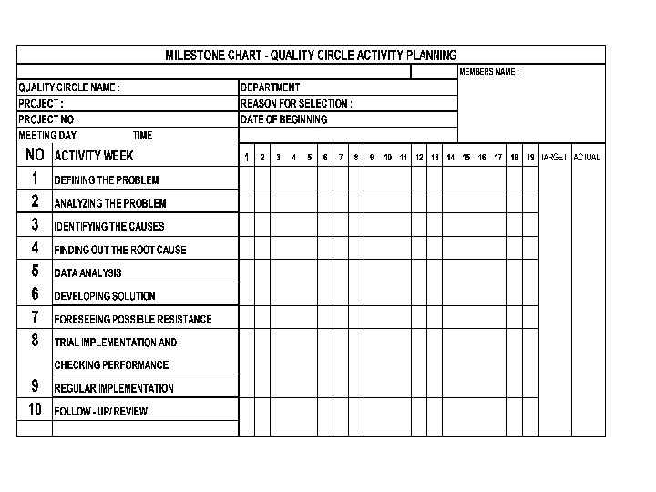
MILESTONE CHART Now problem is selected. What is the time taken to solve the problem ? That is mile stone chart. Mile stone chart is prepared after selection of problem. Project study planning is an effective method by which Quality circle members attain the skill To plan their activities and effective time management.
Planning Step details • • • Defining the problem Analysis of problem Identification of causes Activity involved Time estimation in No. Of meetings • • Discussion 1 meeting Making flow diagram 2 meetings • Data collection & discussion • • Brain storming Making cause & effect diagram Verification Discussion • • 2 meetings Total 3 2 2 meetings 1 meeting 2 meetings 7
BRAINSTORMING
What is Brainstorming? Brainstorming is a group technique for generating new and useful ideas. It uses a few simple rules for discussion on a subject matter that contributes to originality and innovation.
Mr. Alex Osborn of USA developed this technique in 1950 s to solve advertising and marketing problems.
Brainstorming is probably the best known technique and most widely used for idea generation. By shop floor personnel, Managers, Politicians etc.
Methods of Brainstorming can be done in three ways viz. , - Free Wheeling or Unstructured - Slip Method - Round Robin or Structured Method
There are two types of thinking, one is LOGICAL and another is CREATIVE. We use both types of thinking whenever we want to generate ideas using brainstorming.
Mr. J. P. Guilford who conducted research on the creative behaviour, identified Five key elements concerning Human ability to creative. 1. FLUENCY As we look for quantity over quality in Brainstorming, generally generating more ideas within a given time is important. It is found that more the quantity effective & useful ideas emerge.
2. FLEXIBILITY This is the ability of a mind to move from one area to another quickly. In this aspect , the process of thinking helps. Another gain is that , in a group, people think divergently. When we listen to others, it opens up new avenues for our thinking. We call this hitch-hiking process. Flexibility is measured by the no. of categories of ideas generated.
3. ORIGINALITY Thinking without any barrier & away from unconventional methods lead to originality in people. 4. AWARENESS This is the ability to look into the future i. e. beyond the immediate facts, what can the need of future be? 5. DRIVE This is a willingness to contribute to achieve the end goal without fear or failure.
LEFT BRAIN FUNCTIONS uses logic detail oriented facts rule words and language present and past math and science can comprehend knowing acknowledges order/pattern perception knows object name reality based forms strategies practical safe
RIGHT BRAIN FUNCTIONS uses feeling “big picture” oriented imagination rules symbols and images present and future philosophy & religion knows object function fantasy based presents possibilities impetuous risk taking Many people associate the right brain with creativity and lateral thinking, and there’s certainly something to that.
How to Conduct a Brain Storming Session ? Q. C Leader should conduct brain storming. He should be open minded, amiable, and motivating. He should encourage flow of ideas. Prior intimation to the group regarding issue is essential. 1. Leader should record the ideas as told by members. 2. A blackboard or flipchart should be used for this purpose. 3. This helps members to see and stimulate their thinking. 4. You can invite sometimes a guest who is knowledgeable on the subject.
7. There should be neither criticism nor appreciation of the ideas. 8. Try to build ideas over others ideas. This is called Hitch Hiking. 9. Every body should contribute in turn. One idea per turn. 10. Say Pass if one can not give idea on his turn. 11. Ideas expressed should be specific and clear. 12. Ideas should not be biased. 13. When brainstorming sessions slows down, leader may suggest piggy backing. 14. Keep acceptable pace.
15. In brain storming generating more number of ideas i. e quantity is more important than quality. 16. Another technique is to suggest opposites. 17. Before completing Brain Storming make sure : 18. You have covered all possible areas 19. Make a list of general areas and ensure all areas covered. 20. In this, major factors of production, 4 M should be included. Maximum time for a session could be 40 -45 minutes and should never allow to go beyond fatigue point.
Uses of Brain Storming can be used at various stages of problem solving 1. Identification of problems. 2. Finding out possible causes of a problem. 3. Generating ideas for arriving at solutions. 4. Predicting possible resistance to solution.
FLOW DIAGRAM
FLOW DIAGRAM Flow Diagram is a graphical or a pictorial way to depict a process. With the help of a flow diagram we can show a process sequence. TYPES OF FLOW DIAGRAM 1) High level Flow Diagram 2) Matrix Flow diagram 3) Detailed Flow diagram
level flow High diagram : This is making the diagram of the total process a broad way. Here details are avoided.
Matrix flow diagram : Flow diagram drawn taking in to consideration the actual procedure of material procurement.
Detailed flow diagram : This is making the diagram of the total process in detail. Detailed flow diagrams clarify or give better understanding of the process.
Symbols are used in this type Activity Terminator (Start/ End) Decision Document symbol Flow lines Connector Data Base
Old 7 tools New 7 tools 1. Data collection 1. Affinity diagrm 2. Stratification 2. Tree diagram 3. Graphs 3. Relation diagram 4. Cause & effect diagram 4. PDPC 5. Pareto chart 5. Matrix diagram 6. Scatter diagram 6. Arrow diagram 7. Histogram 7. Matrix data
DATA COLLECTION
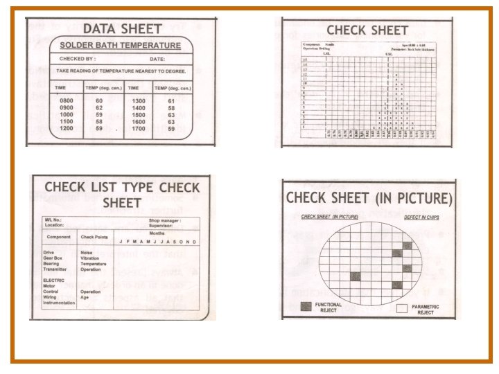
What is Data Collection? Data collection is nothing but collection of the required ‘information’ in figures for statistical analysis of a problem. This provides a sound basis for decision making and corrective action.
DATA COLLECTION Data are of 2 types. 1. Measurement data : Data which can be collected with the help of instruments. Diameter, strength Etc. Ex : Weight, 2. Attribute data : Data obtained by counting Ex. : No. of accidents, No. of defective ok. These data are in whole numbers and are called discontinuous or discrete variables. CHECK LIST
Check-sheets are of the following types: - Process control information checks. - Product quality assurance checks. - Defective item checks. - Defective location checks. - Defective cause checks. - Process variation distribution checks
Purpose of Data Collection Data are collected for a variety of purposes. In industry, the following are more common. Quality Evaluation: Raw materials, semi finished products and finished products. Process Control: To assure that products turned out meet the specified requirements of customer/design.
Improvement Trials: To improve product quality, to reduce costs and to increase productivity. Problem Solving: For information throughout the problem solving process by Quality Circles. To Compare Performance: From time to time measure improvement in production, profit, quality, competitiveness etc.
STRATIFICATION
STRATIFICATION Stratification is the process of separation of data in to categories. It is normally done for identifying the categories contributing to the problem tackled.
Stratification is carried out as under: * Material based * Quality based * Worker based * Machine based * Processing based
GRAPHS
What is Graph? Graph is a pictorial representation of data which, when presented, is easily understandable. It helps to represent large amount of information comprehensively and in a compact manner.
GRAPHS Graph is a pictorial presentation of data which , when presented, is easily understandable. It helps to represent large amount of information in a compact manner. Types of graphs A) Commonly used graph 1. Line Graph 2. Bar chart/graph 3. Pie chart or circle graph 4. Pictorial graph
Line Graph Bar Graph Pie Graph PICTORIAL GRAPH
1. Compound graphs-bar : A compound graph is a combination of bar and line graph. & line 1. Strata graph : This is used to show the trend in the total and components of the total problem solving techniques. Compound graphs-bar & line
5. Float graph : This is an idea graph for comparison of two district aspects. 1. Zee graph : This graph has three values. Monthly, cumulative and comparison with the last twelve months.
CAUSE AND EFFECT DIAGRAM
What is a Cause and Effect Diagram? Any defect in a component, a product or service could be due to one or more causes. To find out the relationship between the causes and effect, a diagram is drawn systematically by mapping out all the probable causes influencing the effect. This is called a Cause and Effect Diagram.
This was introduced by Dr. K. Ishikawa. He used it in Kawasaki Iron Works in 1943. Earlier, it was used for research work. This is also known as Ishikawa Diagram. Since final diagram looks fish bone it is also called as Fish Bone Diagram. Looking into its usefulness Japan Standards Institute recognized it as a statistical tool.
How to make a Cause and Effect Diagram? Even though it looks very simple, making a Cause and effect diagram is not an easy task. One who wants to make a Cause and Effect diagram should first understand the Cause/effect relationship.
Cause & effect diagram 1. Dispersion analysis type : A diagram drawn asking why does this dispersion occur? This helps to organize and relate the factors for dispersion. 1. Production process classification type : this system follows the process and all things that may effect at various stages of processing. 1. Cause enumeration type : in this all possible causes are simply listed. After eliminating irrelevant causes remaining causes are arranged in orderly manner as Main cause, Sub-sub cause and soon.
Cause Enumeration Type C&E Diagram Second type is ‘Cause Enumeration Type’. Here we write the problem i. e. defeat in ‘Cricket Test Match’ and do a brainstorming without any restriction. Causes flowing in through the brainstorming will be about various aspects. Free flowing of various views enables you to get a large number of ideas.
Cause Enumeration Type C&E Diagram Here once the brainstorming is over, after eliminating superfluous and irrelevant causes, based on discussion we have to organize the remaining causes in an orderly manner. That means arranging them as Main Cause, sub-cause, sub-sub cause and so on.
Cause Enumeration Type C&E Diagram This is a laborious process but the benefit is that a large number of likely causes eliminate the probability of overlooking any major problem area. Final diagram may look like the one made using Dispersion method, but as one can see the approach is different
Production Process Classification Type C&E Diagram Third type of Cause and Effect diagram is “Production Process Classification Type”. Here the process flow is followed.
Let us apply this system to the same problem “Defeat in the Cricket Test Match”. Here we have selected the process as ‘Selection’, Practice & Conditioning ‘Strategic Planning’ and ‘Application’.
Improper ratio of Batsmen & Bowlers Lack of foresight Captain & team not consulted Deserving players not selected Regional politics Few players having fitness problems SELECTION Tracks do not help pacers Not enough fast bowlers in India Not enough pace academies Not enough Fast bowlers in team No proper selection method No professional consulted
We can similarly use 5 Ms (MAN, MATERIAL, METHOD, MACHINE, and MEASUREMENT) and Also 4 Ps (PEOPLE, PROVISION (Material), PROCEDURE, PLACE) appropriately.
Cause & effect diagram Man Sub cause Machine Sub cause Effect Sub cause Material Sub cause Method
Cause & effect diagram Man Sub cause Sub sub cause Material Machine Sub cause Sub sub cause Sub cause Effect Sub cause Sub sub cause Method Sub cause
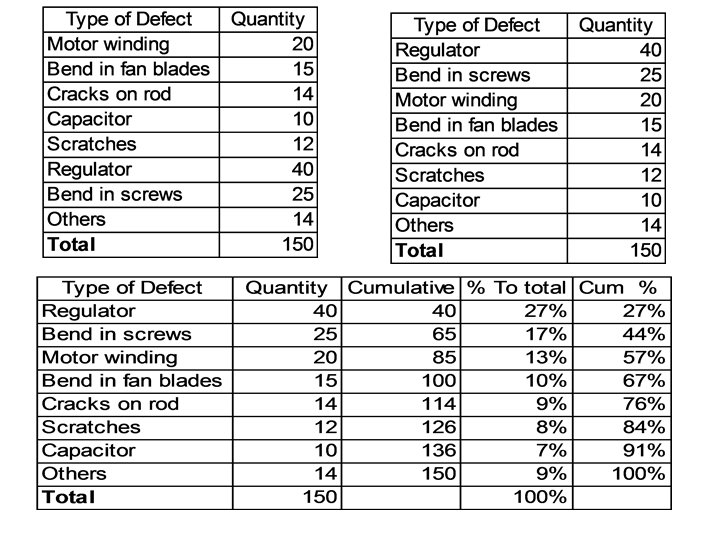
PARETO DIAGRAM OR PARETO ANALYSIS
What is a Pareto Diagram? Pareto Diagram is a technique of arranging data according to priority or importance and using it into a problem solving frame work. This helps to find out the “VITAL FEW” from the “USEFUL MANY” for problem selection.
The Italian economist Vilfredo Pareto (1848 -1923), during his study of distribution of wealth in his country observed that 80% to 90% of Italy’s wealth lay in the hands of 10% to 20% of the population. The U. S. Economist M. G. Lorenz presented this distribution in a theoretical curve in 1907. This curve is called Lorenz’s curve of concentration.
Construct a bar diagram to represent the data as per tally sheet Draw cumulative curve and write down all values Pareto diagram before & after solving a problem BEFORE AFTER
SCATTER DIAGRAM
What is Scatter Diagram? Scatter Diagram is a graphical representation of relationship between two variables. It can be between a Cause and Effect and between two causes. It also reveals the nature of relationship between two variables and their approximate strength.
Dr. Buxton. Developed printed graph paper which spurred the uses of Scatter diagram. In 1837 J. F. W. Herschal, an Englishman, used Scatter diagram. In 1950 s Dr. K. Ishikawa popularised the use of Scatter diagram. In our day to day life we can see exact relationship between two variables in very few cases like mathematical formula.
How to find out the approximate strength of the correlation? This can be found out by using a formula. Procedure is as follows: Step 1 Take sample of observation for the two variables under study.
‘Data on Hardness and Tensile strength of copper alloy casting’. Tensile strength
Show all the values i. e. , x 2, y 2 and XY as in table below:
Find out ‘n’ and obtain total of x, y, x 2, y 2 and XY. = n = 25. 0 = x = 2147. 0 = Y = 899. 7 = X 2 = 185597. 0 = Y 2 = 32715. 29 = XY = 77749. 2
Find out the value of x 2 i. e. 84 x 84 = 7056, 93 x 93 = 8849 and so on. Find out the value of y 2 i. e. 38 x 38 = 1444, 40. 7 x 40. 7 = 1656. 49 and so on. Find out the ‘XY’ value of observation 84 x 38 = 3192, 93 x 40. 7 = 3785. 1 and so on.
Simplified formula for coefficient of correlation.
Substitute the values in the formula.
Find out the value of ‘r’. If the ‘r’ value is above 0. 7, then the correlation is useful.
Find out 100 r 2. This gives percentage of variation in ‘y’ influenced by ‘x’ i. e. , the independent variable. In this case 100 x r 2 = 57. 1 r 2 = 0. 5710 and therefore, correlation between these two variables is useful.
Assessing correlation with scatter diagram We will see here a method called ‘Median method’ Take a scatter diagram where the values are already plotted.
First find out the median of X i. e. count the dots across and when you complete half the number, mark a straight line i. e. parallel to ‘Y’ axis.
In the same way count the dots bottom to top and when you complete half the number, mark a straight line i. e. parallel to ‘X’ axis.
Now you can see dots scattered in 4 quarters and mark them in ‘Anti clock wise’ direction as shown in the figure as Area I, Area III and Area IV. Count the dots in each quarter and write down against each quadrant as shown below.
Find the number of points in II and IV and ‘N’ (i. e. total number of dots made minus number of points on the line) number of points in II & IV is 4+5 = 9, and N = 50 -2 = 48. Compare the total number of points in II and IV with the “limit of number of points” column indicated in sign test Table below. If the number of points of the two areas is less than the limit numbers shown, then we can say that a correlation exists.
When N=48, the point number limit is 16. As number points observed in the example is <16, a positive correlation exists.
Pitfalls When stratified as shown in ‘b’ the same data does not show any correlation.
Pitfalls Similarly mix up data at times give deceptive correlation as shown here. Look at ‘a’ with mix up data showing correlation.
HISTOGRAM
What is Histogram? Histogram is a graphical representation of a frequency distribution which is a summary of variation in a product or process.
Mr A. M. Gurrey a French Statesman is credited with this. He studied through bar graph the relation of the number of crimes committed to the continuous variable like age of the criminal etc. , He could convincingly establish the relationship and arrive at a conclusion from it.
2. 42 1. 98 2. 04 2. 33 2. 14 2. 34 2. 23 2. 04 2. 33 2. 14 2. 24 2. 10 2. 06 2. 29 1. 92 1. 86 2. 02 2. 06 2. 29 1. 92 2. 08 2. 52 2. 07 2. 05 2. 08 2. 52 1. 96 2. 17 2. 23 2. 02 2. 08 2. 04 2. 17 2. 23 2. 02 2. 16 2. 89 2. 24 2. 07 2. 31 2. 16 1. 92 2. 31 2. 16 2. 13 2. 08 1. 92 2. 05 1. 92 2. 25 1. 95 2. 64 2. 17 2. 02 2. 16 1. 74 1. 96 2. 13 2. 08 2. 05 1. 92 2. 25 1. 95 1. 94 2. 13 2. 43 1. 75 ER CONSUMPTION (KWH) OF REFRIGERATO
Find out the smallest and highest number of each row and suitably mark them for example as Xs and XI.
Write them as follows: Row 1. 2. 3. 4. 5. 6. 7. 8. 9. 10. XS 1. 75 1. 84 1. 89 1. 74 1. 91 1. 83 1. 95 1. 87 XL 2. 31 2. 49 2. 23 2. 29 2. 24 2. 28 2. 64 2. 54 2. 46 2. 56 Mark the lowest among Xs and highest value among XL They are the lowest and highest value of the group .
X min is 1. 74 and X max is 2. 64 Row 1. 2. 3. 4. 5. 6. 7. 8. 9. 10. Xs 1. 75 1. 84 1. 89 1. 74 1. 91 1. 83 1. 95 1. 87 XL 2. 31 2. 49 2. 23 2. 29 2. 24 2. 28 2. 64 2. 54 2. 46 2. 45 They are the lowest and highest value of the group, i. e. , X min. is 1. 74 and X max. is 2. 64
Compute the range: R = (X max. ) – (X min. ) R = (2. 64) – (1. 74) = 0. 90 Given here is the standard table for number of classes or groups. In our example suggested number of classes is 7. Number of Observations (N) < 50 51 - 100 101 - 200 201 - 500 501 - 1000 Here therefore Recommended No of classes or groups (K) 6 7 8 9 10 N = 100 K = 7
Now specify the class boundaries. The lower limit of the first class is X min – 0. 5 W i. e. 1. 74 – 0. 05 = 1. 735 Upper limit of that class is 1. 735 + 0. 13 = 1. 865 Subsequent classes are obtained by adding class width ‘C’. We have to ensure a) Classes are continuous b) All classes have same width
Based on that we get 1. 7351. 8651. 9952. 1252. 2552. 3852. 515 - 1. 865 1. 995 2. 125 2. 255 2. 385 2. 515 2. 645
Calculate the approximate width of class intervals based on the formula (R+W) /K where ‘R’ is the range which is 0. 90 ‘W’ is the accuracy in observation which is 0. 01 and ‘K’ is No. of classes which is 7 Based on that, width of class interval is: (0. 90 + 0. 01) 0. 91 --------- = 0. 13 7 7
Now specify the class boundaries. The lower limit of the first class is X min – 0. 5 W i. e. 1. 74 – 0. 05 = 1. 735 Upper limit of that class is 1. 735 + 0. 13 = 1. 865 Subsequent classes are obtained by adding class width ‘C’. We have to ensure a) Classes are continuous b) All classes have same width
Based on that we get 1. 7351. 8651. 9952. 1252. 2552. 3852. 515 - 1. 865 1. 995 2. 125 2. 255 2. 385 2. 515 2. 645
Now prepare a table as shown below and enter the observation in order and for each observation put a mark against the interval containing that value.
Count the total number of tally marks to give the frequency of that class. This gives frequency table.
6 26 25 25 8 6 4 Upper spec. Limit 1. 54 1. 67 1. 80 1. 93 2. 06 2. 19 2. 32 2. 45 2. 58 Lower spec. Limit Histogram
a) This is a trend Some Caution Time
Some Caution b) This is a run Time
Some shapes of Histogram Asymmetrical i. e. skewed Positive. Asymmetrical with more observations to the right of mean. Such patterns may result from measurements on characteristics like ovality, taper etc. Also data on accidents, defects etc. may give rise to this type of histogram. Asymmetrical i. e. skewed Positive
Some shapes of Histogram Asymmetrical Skewed Negative. Asymmetrical with more observations to the left of mean. Asymmetrical Skewed Negative
Cliff like Histogram This is a truncated type. Frequencies drop abruptly on the left. This may arise when parts are inspected and those below lower specification limits are removed and the lot is reinspected. Similarly, truncation can be on right side (corresponding to upper specification limit. ) Cliff like Histogram
Double Peaked This pattern arises from a mixture of two conditions-two suppliers of same parts, two machines, two operators. Separate histogram for each condition has to be made. Double Peaked
Comb Type This pattern is usually traceable to errors in measurements, and observations are rounded off. Check for bias for even numbers in the data. Comb Type
Isolated Peak It is a small group of data from a different lot/process condition. It shows that means or process levels are different and variation is different. Isolated Peak
Plateau Type This is a mixture of several process conditions. Output of several days mixed together in a lot. Plateau Type
CONTROL CHART
What is Control Chart? Control Chart is a graphical device to aid in process control. It consist of a graph with a central line denoting the target value or standard and two limit lines on either side of the central line called ‘Upper Control Limit’ and ‘Lower Control Limit’. Quality measured periodically is plotted on the chart and status of control assessed.
Introduction As mentioned Control Chart is a graphical device to aid in process control. It consists of a graph with a central line denoting the target value or standard value or mean value and
Two limit lines on either side of the central line called ‘Upper Control Limit’ and ‘Lower Control Limit’ generally indicated in dotted line. Upper control Limit Central Line Lower control Limit
Quality characteristics measured periodically is plotted on the chart and status of control assessed. Upper control Limit Central Line Lower control Limit
Chances Causes: As we know, however sophisticated the systems, production condition etc. , chance Causes are bound to be there. Assignable Causes: They are not present under normal working conditions. They suddenly creep in due to various reasons causing changes in the control parameters
They can be due to setting changes in a machine. Changes in operations/processes Changes in raw material batches. Operator error etc. They are all called assignable causes. When no assignable causes of variation are present in a process and it operates only under a constant system of chance cause, the process is said to be in a state of Statistical
Sometimes even points within the control limit can also be attributed to assignable cause. We will see them later on. The control chart was first proposed in 1924 by Dr. Walter A. Shewhart, an engineer in the Bell Telephone Laboratories, USA with a view to eliminate abnormal variations in process output by distinguishing variations due to assignable causes from those due to chance causes.
How to set control limits? This distribution is described completely by the mean and standard deviation. One feature of this distribution is that with a span of +/- 3 standard deviation (+/- 3 ) from the mean, 99. 73% of observations lie. Thus +/= 3 standard deviation limits from the mean form the limits for variation due to chance cause. Hence, on the control chart, control limits are set at +/- 3 standard deviation (+/- 3) from the mean.
Types of Control Charts They are classified into two categories viz. a) Variables Control Chart and b) Attributes Control Charts
Variables Control Chart If the quality characteristic can be measured with the help of an instrument, equipment or measuring process, it is called a measurable characteristic.
Attributes Control Charts Some quality characteristics may not be possible to measure on a quantitative scale. In such cases, we classify the product as good or bad, acceptable, not acceptable, pass, reject etc.
Attributes Control Charts Or we may count defects in a product. Data obtained in this case are called attributes. Control charts for attributes are called Attribute Control Charts.
How Control Charts are made? a) Variables Control Charts We will study here three types of variable Control Charts which are normally made. i. Average and Range Chart (X-R chart). ii. Individually and Range Chart (X-R chart). iii. Median and Range Chart.
Attribute Control Charts These are used when we want to control non measurable characteristics of process, product or service. The following types of control charts will be described. a. Number defective ‘np’ chart. b. Percentage defective ‘p’ chart c. Number of defects ‘c’ chart. d. Number of defect per unit ‘u’ chart.
The tools & techniques generally used to solve any problem 1. FLOW DIAGRAM : To enable understanding of the process/flow and locate a problem. 2. BRAINSTORMING : For generation of ideas in problem listing , listing of causes in problem analysis, & finding solutions. 3. DATA COLLECTION: To understand the magnitude of the problem. 4. GRAPHS : Presentation of large amount of DATA in a cohesive manner in the pictorial form.
5. STRATIFICATION : Segregation of data into different categories. 6. CAUSE & EFFECT : Logical linking of DIAGRAM causes to the problem. 7. PARETO CHART : For identification /selection of major problems or area for improvement. 8. SCATTER DIAGRAM: Examining the relationship between two variables. 9. HISTOGRAM : For study of the process variation & access process capability. 10. CONTROL CHARTS : For maintaining running control on a process.
Making Management Presentation After completing the project circle has to give a presentation to the top management A case study is presented before management for 2 purposes, namely a. When a project is completed. b. For approval of project. Presentation can be done by using transparencies and projector. With the latest improvements now a days presentation being done by using LCD.
Why are management presentation important ? 1. Making presentations promote communication 2. Managers are personally informed of the circle’s activities and accomplishments. 3. The circle members gain recognition for their contribution. 4. Morale is bolstered by the periodic opportunities to deal directly with the managers and to be reassured of support for their activities. How often management presentations can be done? 1. Once in 6 months management presentations to be done. 2. Best performed circles will be awarded. 3. Best circles will be given chance to participate in external conventions.
A FEW TIPS FOR EFFECTIVE CASE STUDY PRESENTATION
Case Study Presented When project completed For approval of a project
Presentation’s Main Purpose Its not to show any oratory skill but to effectively convey whatever the team wants to.
Few Tips Identify yourself. It is not necessary all members need to speak. Some can be used for other important work. But recognise this by mentioning. Plan a punch line or something which will make the audience pay attention to it from the beginning.
Few Tips Try to be natural. Use humour wherever you can. Give brief introduction of your organisation. Present with clarity, simplicity and correctness. Stress on problem, area of problem and how it was solved. How it has benefited the organisation. How it has benefited you personally.
Few Tips Do not speak too loud and too fast. Keep talking upto the allotted time. Plan according to the time given and finish it in time. Speak properly – not loudly.
About Presentation Material Good Legible Minimum words Make it sequential End of with acknowledgement.
What is QCFI ? Quality Circle Forum of India formed in 1982 at Hyderabad as it’s head quarter. It is a non-profit body. It conducts state level, national level and international level competitions for motivating the quality circles. Knowledge test, slogans, painting and quiz competitions will be conducted during state level and national level conventions.