QUALITY ASSURANCE Quality Assurance Graphs A quality assurance
- Slides: 10

QUALITY ASSURANCE

Quality Assurance Graphs • A quality assurance graph will be used in production to ensure consistency. The graph gives warning and action limits on certain measured values that will alert staff to problems with production. • On production lines, machines can become faulty or people can make errors. Quality assurance will ensure the measured value such as weight stays as close to the target value as possible. • In a production line for packets of crisps, where the packets are labelled as 30 g, the machines must fill the packets as closely as possible to the required weight. Too few crisps will mean unhappy customers and too many will affect the companies profits.

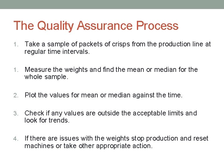
The Quality Assurance Process 1. Take a sample of packets of crisps from the production line at regular time intervals. 1. Measure the weights and find the mean or median for the whole sample. 2. Plot the values for mean or median against the time. 3. Check if any values are outside the acceptable limits and look for trends. 4. If there are issues with the weights stop production and reset machines or take other appropriate action.

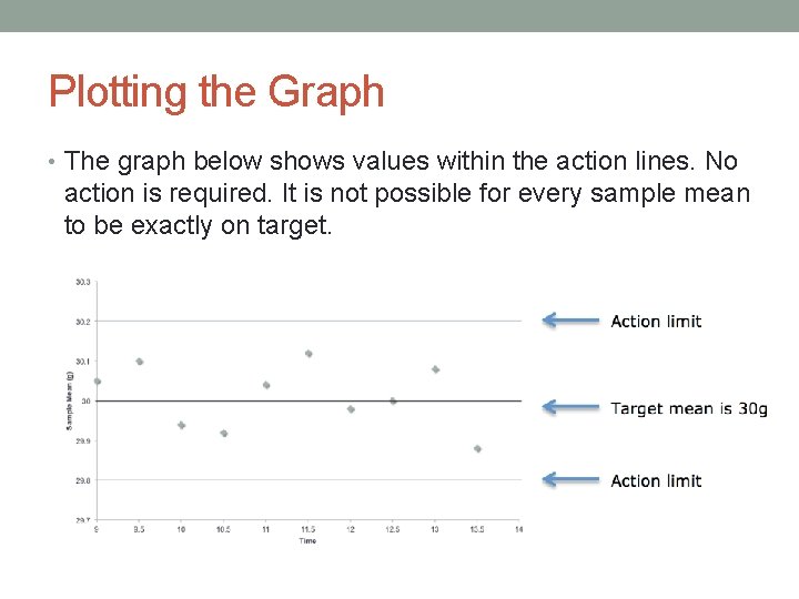
Plotting the Graph • The graph below shows values within the action lines. No action is required. It is not possible for every sample mean to be exactly on target.

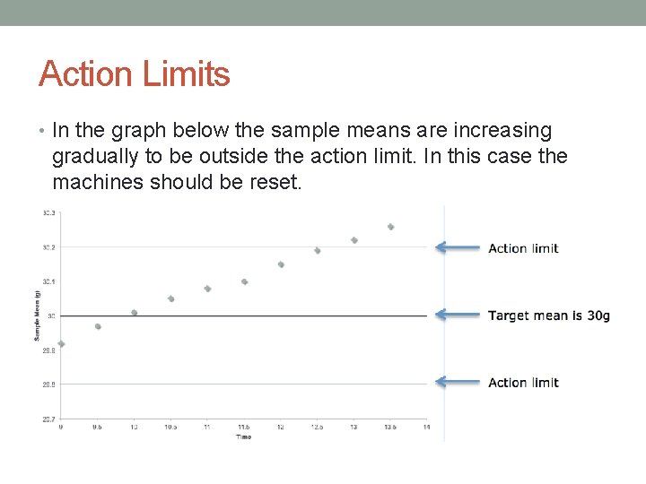
Action Limits • In the graph below the sample means are increasing gradually to be outside the action limit. In this case the machines should be reset.

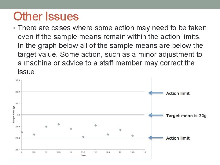
Other Issues • There are cases where some action may need to be taken even if the sample means remain within the action limits. In the graph below all of the sample means are below the target value. Some action, such as a minor adjustment to a machine or advice to a staff member may correct the issue.

Setting Higher Limits • In practice a company may set the target mean to be slightly higher than the stated weight. For example if the crisp company set the target mean at 31 g then customers will be unlikely to get a packet with a weight of less than 30 g.

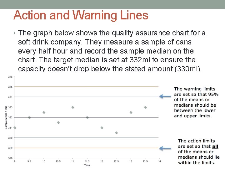
Action and Warning Limits • Quality assurance graphs will sometimes be drawn with both warning and action limits. • If the data is normally distributed the warning lines will be 2 standard deviations away from the target mean/median as this will include 95% of all the data. • • The action limits will be 3 standard deviations either side of the target mean/median.

Action and Warning Lines • The graph below shows the quality assurance chart for a soft drink company. They measure a sample of cans every half hour and record the sample median on the chart. The target median is set at 332 ml to ensure the capacity doesn’t drop below the stated amount (330 ml).

What Action to take? • In the previous chart all the sample median values are within the warning limits and production can continue as normal. If sample median is between the warning and action limits another sample should be taken immediately to check for a problem. If a sample median is outside the action limit then production should be stopped.