PYTHON PLOTTING CURVES CHAPTER 105 FROM THINK PYTHON


![LINE AND TEXT PROPERTIES import matplotlib. pyplot as plt. plot([1, 2, 3, 4], [1, LINE AND TEXT PROPERTIES import matplotlib. pyplot as plt. plot([1, 2, 3, 4], [1,](https://slidetodoc.com/presentation_image/0fa60437a2c89e54b68ce8b305fed758/image-4.jpg)

- Slides: 5

PYTHON PLOTTING CURVES CHAPTER 10_5 FROM THINK PYTHON HOW TO THINK LIKE A COMPUTER SCIENTIST

MATPLOTLIB matplotlib. pyplot is a collection of command style functions that make matplotlib work like MATLAB. Each pyplot function makes some change to a figure: eg, create a figure, create a plotting area in a figure, plot some lines in a plotting area, decorate the plot with labels, etc. . import matplotlib. pyplot as plt. plot([1, 2, 3, 4]) plt. ylabel('some numbers') plt. show() from matplotlib. pyplot import * plot([1, 2, 3, 4]) ylabel('some numbers') show() Auto generates x values here!

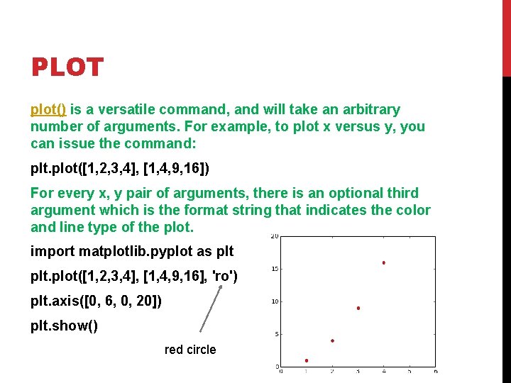
PLOT plot() is a versatile command, and will take an arbitrary number of arguments. For example, to plot x versus y, you can issue the command: plt. plot([1, 2, 3, 4], [1, 4, 9, 16]) For every x, y pair of arguments, there is an optional third argument which is the format string that indicates the color and line type of the plot. import matplotlib. pyplot as plt. plot([1, 2, 3, 4], [1, 4, 9, 16], 'ro') plt. axis([0, 6, 0, 20]) plt. show() red circle
![LINE AND TEXT PROPERTIES import matplotlib pyplot as plt plot1 2 3 4 1 LINE AND TEXT PROPERTIES import matplotlib. pyplot as plt. plot([1, 2, 3, 4], [1,](https://slidetodoc.com/presentation_image/0fa60437a2c89e54b68ce8b305fed758/image-4.jpg)
LINE AND TEXT PROPERTIES import matplotlib. pyplot as plt. plot([1, 2, 3, 4], [1, 4, 9, 16], linewidth=8. 0 ) #thick line plt. axis([0, 6, 0, 20]) #sets y axis values plt. xlabel('This is the x axis', fontsize=14, color = 'red') plt. ylabel('This is the y axis') plt. title('Our Example Graph') plt. show() Text Properties 2 d Line Properties

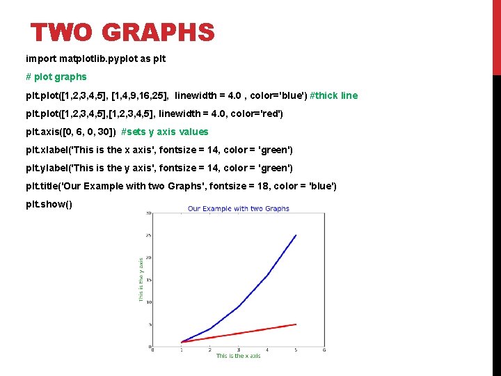
TWO GRAPHS import matplotlib. pyplot as plt # plot graphs plt. plot([1, 2, 3, 4, 5], [1, 4, 9, 16, 25], linewidth = 4. 0 , color='blue') #thick line plt. plot([1, 2, 3, 4, 5], linewidth = 4. 0, color='red') plt. axis([0, 6, 0, 30]) #sets y axis values plt. xlabel('This is the x axis', fontsize = 14, color = 'green') plt. ylabel('This is the y axis', fontsize = 14, color = 'green') plt. title('Our Example with two Graphs', fontsize = 18, color = 'blue') plt. show()