Push the power button Statistics By Group III

Push the power button


Statistics By Group III Neasure of central tendency HIstograms Neasure of Dispersion Ogives

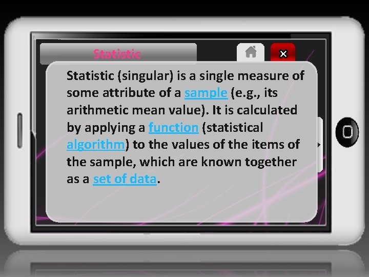
Statistic (singular) is a single measure of some attribute of a sample (e. g. , its arithmetic mean value). It is calculated by applying a function (statistical algorithm) to the values of the items of the sample, which are known together as a set of data.

Data Set A data set is a collection of numbers or values that relate to a particular subject. For example, the test scores of each student in a particular class is a data set. The number of fish eaten by each dolphin at an aquarium is a data set.
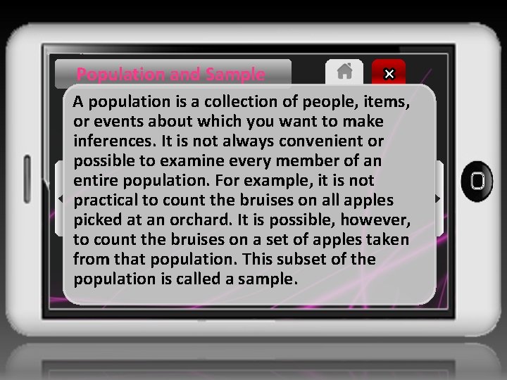
Population and Sample A population is a collection of people, items, or events about which you want to make inferences. It is not always convenient or possible to examine every member of an entire population. For example, it is not practical to count the bruises on all apples picked at an orchard. It is possible, however, to count the bruises on a set of apples taken from that population. This subset of the population is called a sample.
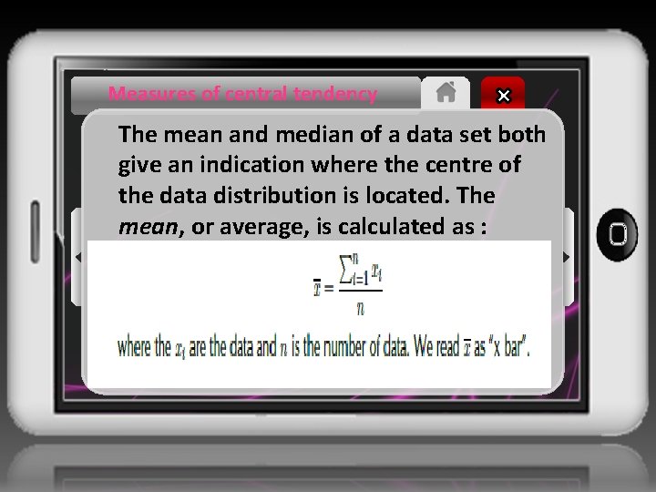
Measures of central tendency The mean and median of a data set both give an indication where the centre of the data distribution is located. The mean, or average, is calculated as :
Measures of central tendency The median is the middle value of an ordered data set. To find the median, we first sort the data and then pick out the value in the middle of the sorted list. If the middle is in between two values, the median is the average of those two values.
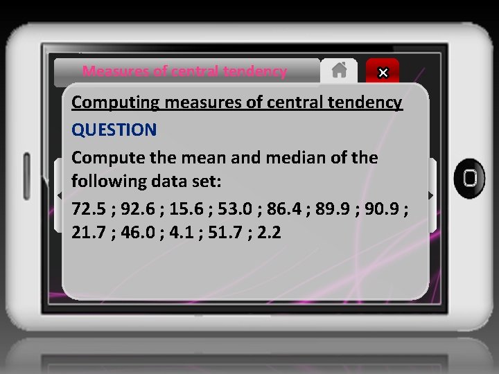
Measures of central tendency Computing measures of central tendency QUESTION Compute the mean and median of the following data set: 72. 5 ; 92. 6 ; 15. 6 ; 53. 0 ; 86. 4 ; 89. 9 ; 90. 9 ; 21. 7 ; 46. 0 ; 4. 1 ; 51. 7 ; 2. 2
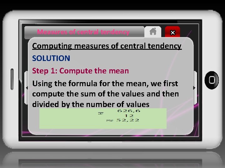
Measures of central tendency Computing measures of central tendency SOLUTION Step 1: Compute the mean Using the formula for the mean, we first compute the sum of the values and then divided by the number of values
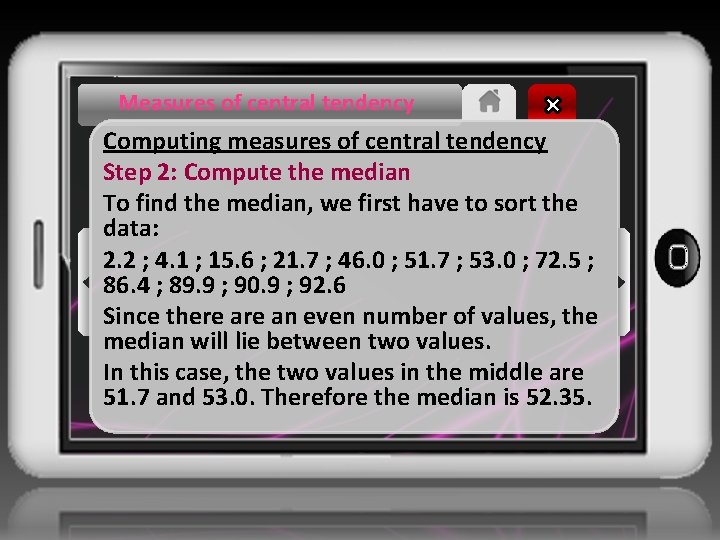
Measures of central tendency Computing measures of central tendency Step 2: Compute the median To find the median, we first have to sort the data: 2. 2 ; 4. 1 ; 15. 6 ; 21. 7 ; 46. 0 ; 51. 7 ; 53. 0 ; 72. 5 ; 86. 4 ; 89. 9 ; 90. 9 ; 92. 6 Since there an even number of values, the median will lie between two values. In this case, the two values in the middle are 51. 7 and 53. 0. Therefore the median is 52. 35.
Measures of dispersion tell us how spread out a data set is. If a measure of dispersion is small, the data are clustered in a small region. If a measure of dispersion is large, the data are spread out over a large region. The range is the difference between the maximum and minimum values in the data set.
Measures of dispersion The inter-quartile range is the difference between the first and third quartiles of the data set. The quartiles are computed in a similar way to the median. The median is halfway into the ordered data set and is sometimes also called the second quartile. The first quartile is one quarter of the way into the ordered data set; whereas the third quartile is three quarters of the way into the ordered data set.
Measures of dispersion QUESTION Determine the range and the inter-quartile range of the following data set. SOLUTION 14 ; 17 ; 45 ; 20 ; 19 ; 36 ; 7 ; 30 ; 8 Step 1: Sort the values in the data set To determine the range we need to find the minimum and maximum values in the data set. To determine the inter-quartile range we need to compute the first and third quartiles of the data set. For both of these requirements, it is easier to order the data set first. The sorted data set is 7 ; 8 ; 14 ; 17 ; 19 ; 20 ; 36 ; 45
Measures of dispersion Step 2: Find the minimum, maximum and range The minimum value is the first value in the ordered data set, namely 7. The maximum is the last value in the ordered data set, namely 45. The range is the difference between the minimum and maximum: 45 − 7 = 38. Step 3: Find the quartiles and inter-quartile range The diagram below shows how we find the quartiles one quarter, one half and three quarters of the way into the ordered list of values.
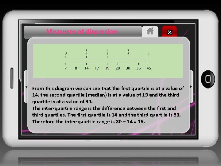
Measures of dispersion From this diagram we can see that the first quartile is at a value of 14, the second quartile (median) is at a value of 19 and the third quartile is at a value of 30. The inter-quartile range is the difference between the first and third quartiles. The first quartile is 14 and the third quartile is 30. Therefore the inter-quartile range is 30 − 14 = 16.
Five Number Summary The five number summary combines a measure of central tendency, namely the median, with measures of dispersion, namely the range and the inter-quartile range. This gives a good overview of the overall data distribution. More precisely, the five number summary is written in the following order: • minimum; • first quartile; • median; • third quartile; • maximum.
Histogram A histogram is a graphical representation of how many times different, mutually exclusive events are observed in an experiment. To interpret a histogram, we find the events on the x-axis and the counts on the y-axis. Each event has a rectangle that shows what its count (or frequency) is.

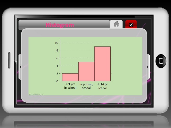
Histogram QUESTION Use the following histogram to determine the events that were recorded and the relative frequency of each event. Summarise your answer in a table.
Histogram

Histogram SOLUTION Step 1: Determine the events The events are shown on the x-axis. In this example we have “not yet in school”, “in primary school” and “in high school”. Step 2: Read off the count for each event The counts are shown on the y-axis and the height of each rectangle shows the frequency for each event. • not yet in school: 2 • in primary school: 5 • in high school: 9
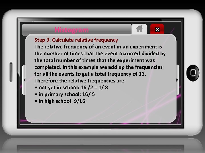
Histogram Step 3: Calculate relative frequency The relative frequency of an event in an experiment is the number of times that the event occurred divided by the total number of times that the experiment was completed. In this example we add up the frequencies for all the events to get a total frequency of 16. Therefore the relative frequencies are: • not yet in school: 16 /2 = 1/ 8 • in primary school: 16/ 5 • in high school: 9/16
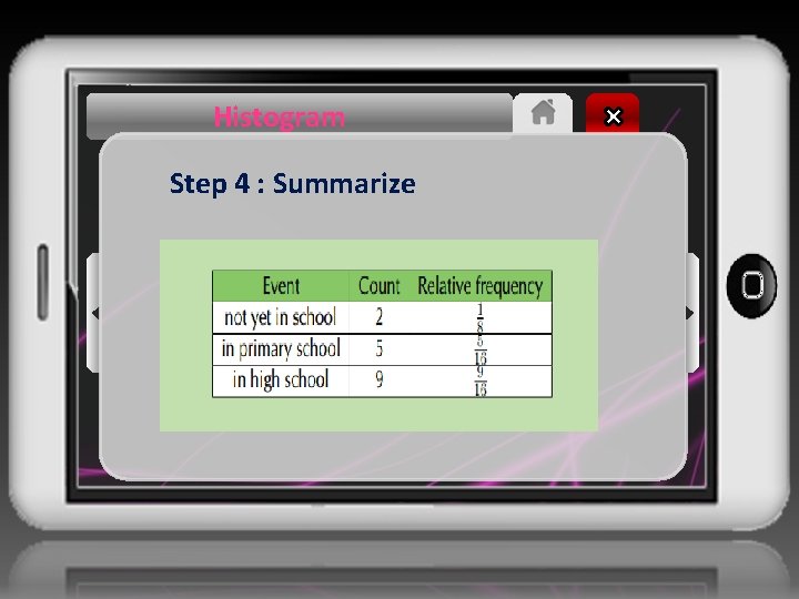
Histogram Step 4 : Summarize
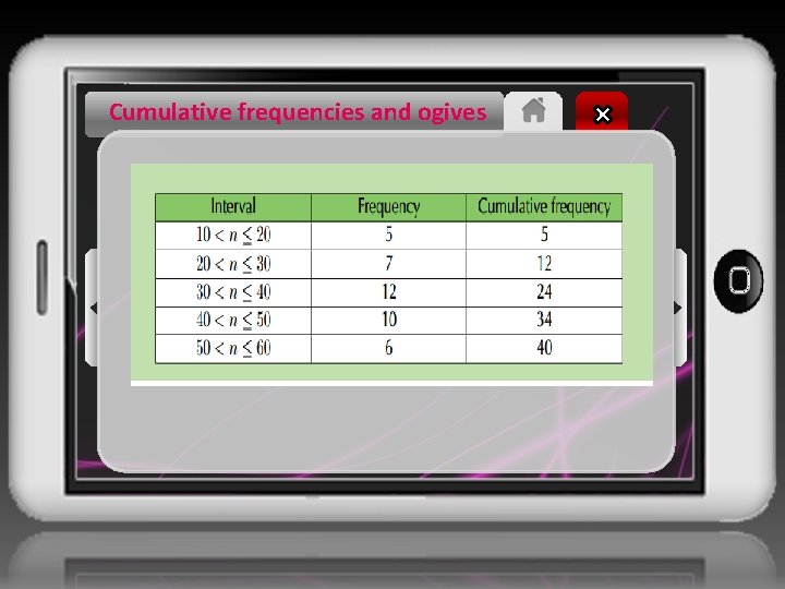
Ogives Cumulative frequency Cumulative histograms, also known as ogives, are graphs that can be used to determine how many data values lie above or below a particular value in a data set. The cumulative frequency is calculated from a frequency table, by adding each frequency to the total of the frequencies of all data values before it in the data set.

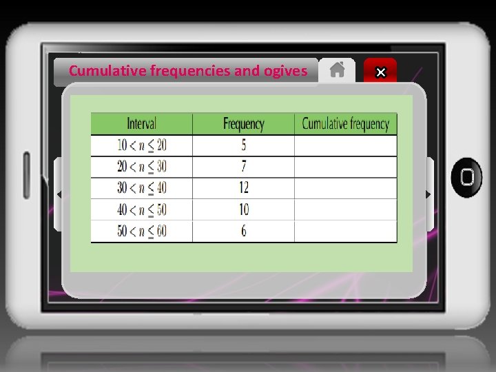
Cumulative frequencies and ogives QUESTION Determine the cumulative frequencies of the following grouped data and complete the table below. Use the table to draw an ogive of the data.
Cumulative frequencies and ogives
Cumulative frequencies and ogives SOLUTION Step 1: Compute cumulative frequencies To determine the cumulative frequency, we add up the frequencies going down the table. The first cumulative frequency is just the same as the frequency, because we are adding it to zero. The final cumulative frequency is always equal to the sum of all the frequencies. This gives the following table:
Cumulative frequencies and ogives
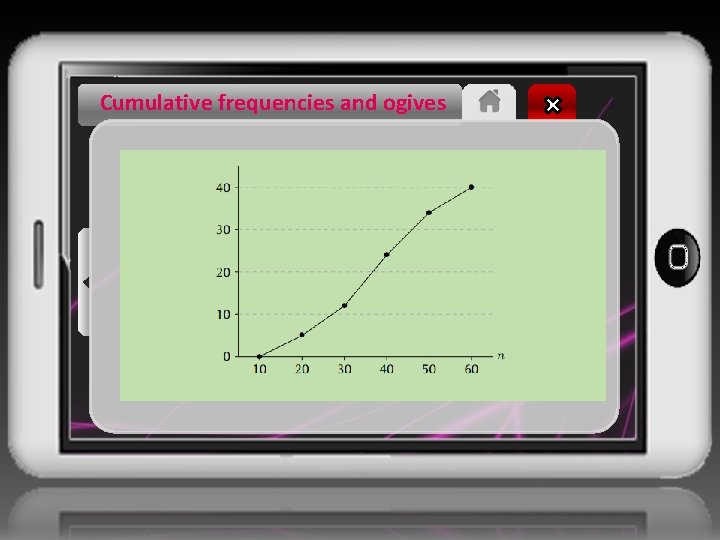
Cumulative frequencies and ogives Step 2: Plot the ogive The first coordinate in the plot always starts at a y-value of 0 because we always start from a count of zero. So, the first coordinate is at (10; 0) — at the beginning of the first interval. The second coordinate is at the end of the first interval (which is also the beginning of the second interval) and at the first cumulative count, so (20; 5).

Cumulative frequencies and ogives Step 2: Plot the ogive The third coordinate is at the end of the second interval and at the second cumulative count, namely (30; 12), and so on. Computing all the coordinates and connecting them with straight lines gives the following ogive.
Cumulative frequencies and ogives
- Slides: 33