PROGRAM PATHWAYS STRATEGIC DESIGN MANAGEMENT SIDDHI MAHAJAN Founded


- Slides: 11
PROGRAM PATHWAYS STRATEGIC DESIGN MANAGEMENT -SIDDHI MAHAJAN
Founded 1903 Founder William S. Harley Arthur Davidson Walter Davidson William A. Davidson The very first Harley-Davidson motorcycle was officially assembled in 1903. It was in 1910 that the first version of the company’s distinctive ‘Bar and Shield’ logo was created.
The design featured just three colors; black, white and orange. These made the company’s logo distinctive and different from other companies in the motor industry. The logo simply contained the words Harley-Davidson’ in capital letter on a bar. Behind the bar, there is a shield with the word ‘Motor’ above the shield and the word ‘Cycles’ below the shield, both in capitalized letters.
In 1953 Harley-Davidson celebrated their 50 year anniversary, issuing this elaborate new logo design in order to commemorate it. The ‘V’ was included in order to honour the type of engine so commonly used in the company’s bikes, while a medallion version of this logo went on to appear on the front fenders of the 1954 models.
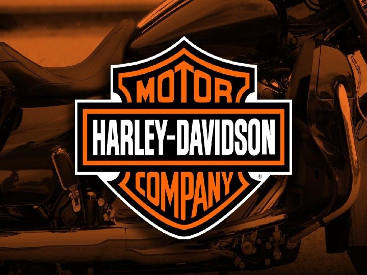
This version of the classic logo, arguably the most iconic, was introduced in 1965. Although this logo has pretty much remained standard, each proper Harley-Davidson dealership tends to have its own unique logo.
A 100 th anniversary is nothing to be sniffed at, and neither is the logo Harley -Davidson commissioned to mark theirs. Featuring the unmistakeable Bar and Shield logo nestled between a pair of wings bearing the all-important dates, it appeared as part of a variety of different types of Harley merchandise in 2003.
Harley-Davidson’s 105 th anniversary logo bore some similarities to the 2003 version in that it also featured wings either side of the company’s traditional emblem. In this 2008 iteration, however, the wings curved upwards and were more or less contained within a circular border bearing the dates. Limited edition 105 th anniversary styling was specifically available for the Dyna Fat Bob, Rocker and Rocker C.
The Harley Owners Group, colloquially known as HOG, uses the following rather impressive logo. Created in 1983 in order to build and maintain lasting relationships between Harley-Davidson and their customers, you can find HOG chapters all over the world.
CURRENT LOGO
Font used has Sheer cut, clear verges tell of temper and aggression. But let’s not forget that the colors were perfectly combined too. The colors of Harley-Davidson logo are black, orange and white and they manifest brand reliability and bikers’ coolness as well. THANK YOU.