Process Analysis in management 4 1 Process Analysis



- Slides: 49

Process Analysis in management 4– 1

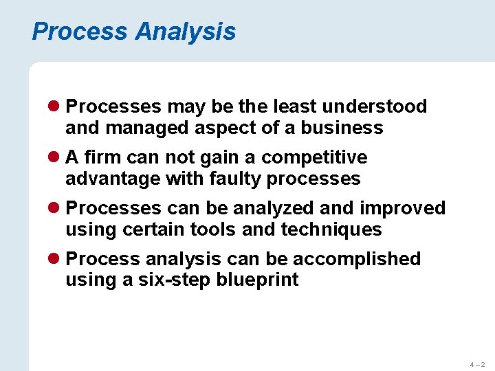
Process Analysis l Processes may be the least understood and managed aspect of a business l A firm can not gain a competitive advantage with faulty processes l Processes can be analyzed and improved using certain tools and techniques l Process analysis can be accomplished using a six-step blueprint 4– 2

A Systematic Approach Define scope 2 Identify opportunity 1 Document process 3 Implement changes 6 Evaluate performance 4 Redesign process 5 Figure 4. 1 – Blueprint for Process Analysis 4– 3

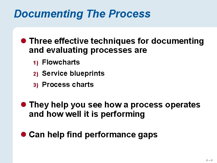
Documenting The Process l Three effective techniques for documenting and evaluating processes are 1) Flowcharts 2) Service blueprints 3) Process charts l They help you see how a process operates and how well it is performing l Can help find performance gaps 4– 4

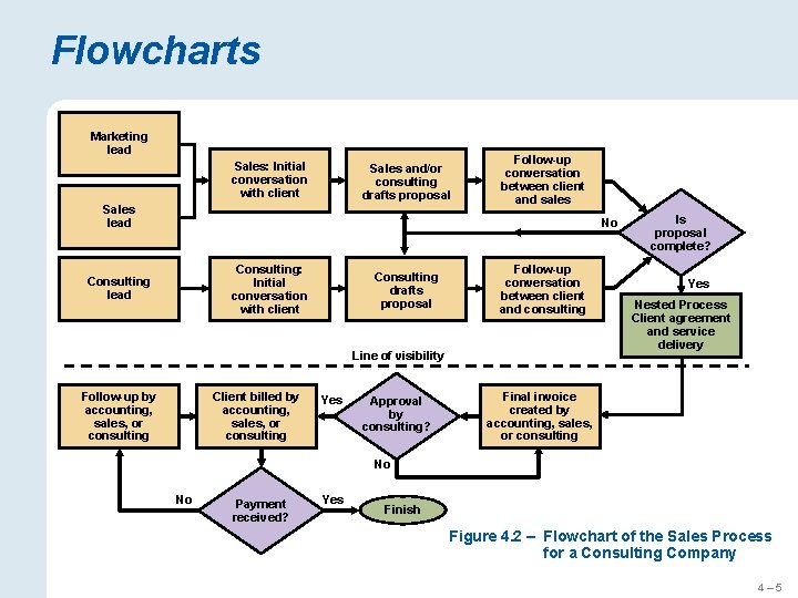
Flowcharts Marketing lead Sales: Initial conversation with client Sales and/or consulting drafts proposal Sales lead Follow-up conversation between client and sales No Consulting: Initial conversation with client Consulting lead Consulting drafts proposal Follow-up conversation between client and consulting Line of visibility Client billed by accounting, sales, or consulting Follow-up by accounting, sales, or consulting Yes Approval by consulting? Is proposal complete? Yes Nested Process Client agreement and service delivery Final invoice created by accounting, sales, or consulting No No Payment received? Yes Finish Figure 4. 2 – Flowchart of the Sales Process for a Consulting Company 4– 5

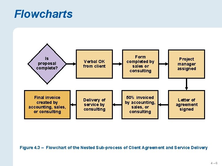
Flowcharts Is proposal complete? Final invoice created by accounting, sales, or consulting Verbal OK from client Form completed by sales or consulting Project manager assigned Delivery of service by consulting 50% invoiced by accounting, sales, or consulting Letter of agreement signed Figure 4. 3 – Flowchart of the Nested Sub-process of Client Agreement and Service Delivery 4– 6

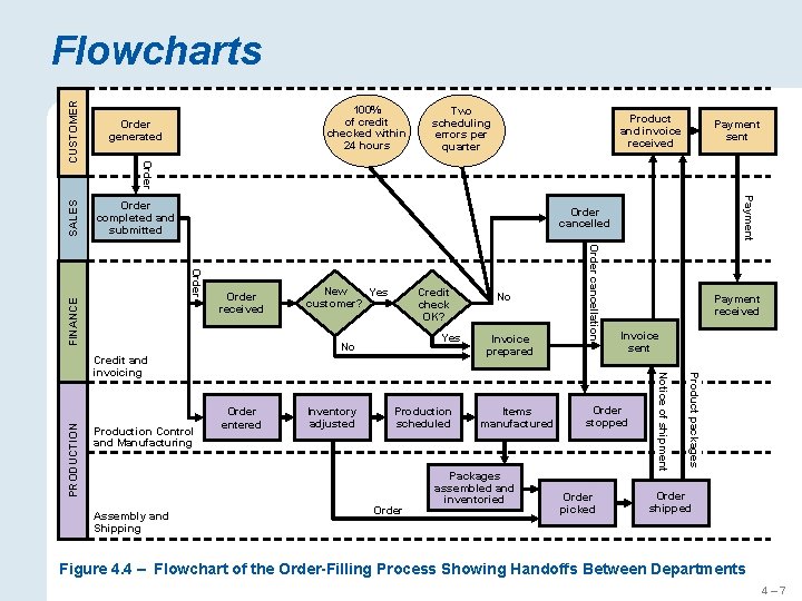
CUSTOMER Order completed and submitted 100% of credit checked within 24 hours Two scheduling errors per quarter Payment sent FINANCE New Yes customer? Credit check OK? Yes Production scheduled Order Items manufactured ` Packages assembled and inventoried Invoice sent Order stopped Order picked Product packages Inventory adjusted Invoice prepared Payment received Notice of shipment Production Control and Manufacturing Order entered No Order cancellation Order received No Assembly and Shipping Payment Order cancelled Credit and invoicing PRODUCTION Product and invoice received Order generated SALES Flowcharts Order shipped Figure 4. 4 – Flowchart of the Order-Filling Process Showing Handoffs Between Departments 4– 7

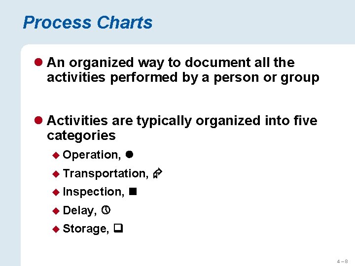
Process Charts l An organized way to document all the activities performed by a person or group l Activities are typically organized into five categories u Operation, u Transportation, u Inspection, u Delay, u Storage, 4– 8

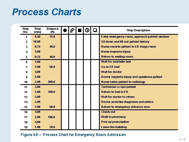
Process Charts Step No. Time (min) Distance (ft) 1 0. 50 15. 0 2 10. 00 3 0. 75 4 3. 00 5 0. 75 6 1. 00 7 1. 00 8 4. 00 9 5. 00 10 2. 00 11 3. 00 12 2. 00 13 3. 00 14 2. 00 15 1. 00 16 4. 00 17 2. 00 18 4. 00 19 1. 00 Enter emergency room, approach patient window X Sit down and fill out patient history X 40. 0 Nurse escorts patient to ER triage room X Nurse inspects injury X 40. 0 Return to waiting room X X 60. 0 X Nurse takes patient to radiology X Technician x-rays patient X Return to bed in ER X X Walk to pharmacy Pick up prescription X 20. 0 Return to emergency entrance area Check out X 180. 0 Wait for doctor to return Doctor provides diagnosis and advice X 60. 0 Wait for doctor Doctor inspects injury and questions patient X 200. 0 Wait for available bed Go to ER bed X 200. 0 Step Description X Leave the building Figure 4. 5 – Process Chart for Emergency Room Admission 4– 9

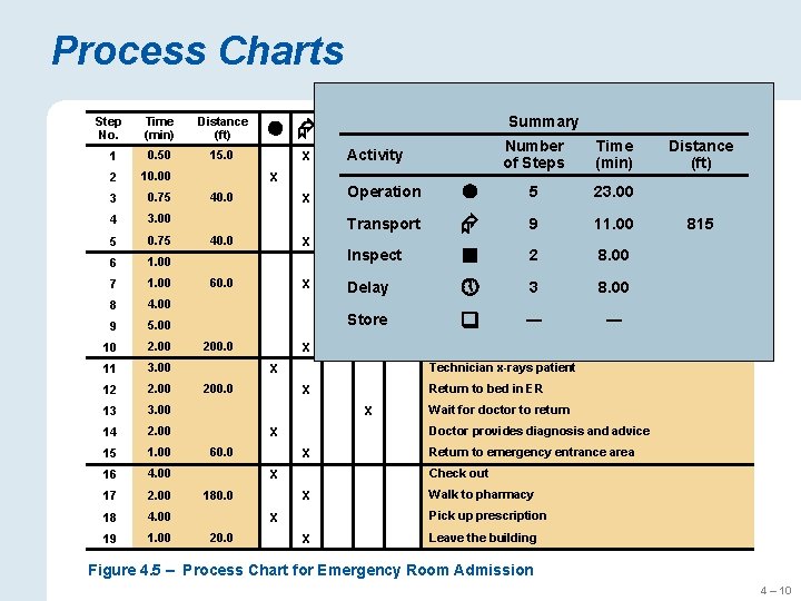
Process Charts Step No. Time (min) Distance (ft) 1 0. 50 15. 0 2 10. 00 3 0. 75 4 3. 00 5 0. 75 6 1. 00 7 1. 00 8 4. 00 9 5. 00 10 2. 00 11 3. 00 12 2. 00 13 3. 00 14 2. 00 15 1. 00 16 4. 00 17 2. 00 18 4. 00 19 1. 00 Activity X X 40. 0 Operation X X 40. 0 X 60. 0 X Transport Inspect X Delay X X 200. 0 Store 200. 0 Distance (ft) Sit down and fill out patient history Nurse inspects injury 9 11. 00 815 Return to waiting room 8. 00 available 2 bed Wait for Go to ER bed 3 8. 00 Wait for doctor ― and questions ― inspects injury Doctor patient 5 to ER triage 23. 00 room Nurse escorts patient Return to bed in ER X Wait for doctor to return Doctor provides diagnosis and advice X X Return to emergency entrance area Check out X 180. 0 Time (min) Technician x-rays patient X 60. 0 Number of Steps Enter emergency room, approach patient window Nurse takes patient to radiology X X X Walk to pharmacy Pick up prescription X 20. 0 Summary Step Description X Leave the building Figure 4. 5 – Process Chart for Emergency Room Admission 4 – 10

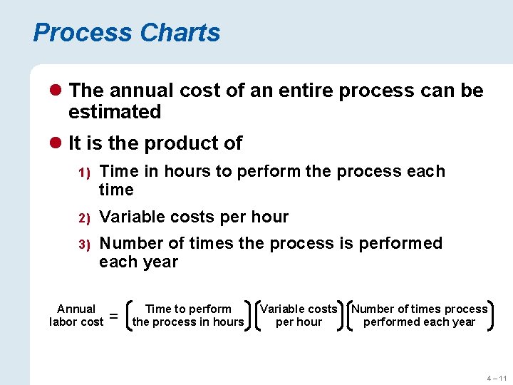
Process Charts l The annual cost of an entire process can be estimated l It is the product of 1) Time in hours to perform the process each time 2) Variable costs per hour 3) Number of times the process is performed each year Annual labor cost = Time to perform the process in hours Variable costs per hour Number of times process performed each year 4 – 11

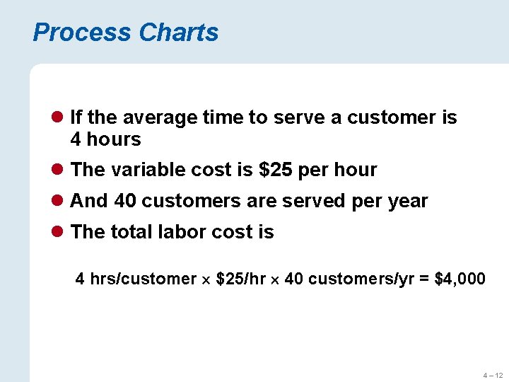
Process Charts l If the average time to serve a customer is 4 hours l The variable cost is $25 per hour l And 40 customers are served per year l The total labor cost is 4 hrs/customer $25/hr 40 customers/yr = $4, 000 4 – 12

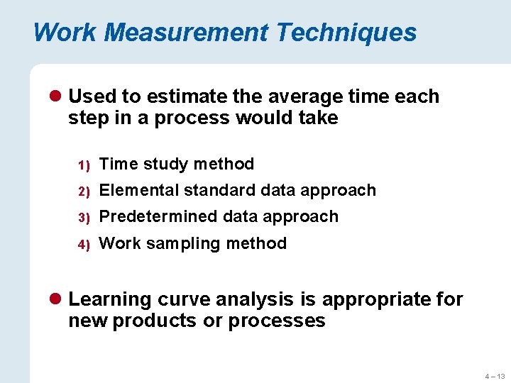
Work Measurement Techniques l Used to estimate the average time each step in a process would take 1) Time study method 2) Elemental standard data approach 3) Predetermined data approach 4) Work sampling method l Learning curve analysis is appropriate for new products or processes 4 – 13

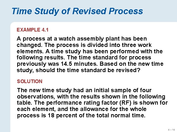
Time Study of Revised Process EXAMPLE 4. 1 A process at a watch assembly plant has been changed. The process is divided into three work elements. A time study has been performed with the following results. The time standard for process previously was 14. 5 minutes. Based on the new time study, should the time standard be revised? SOLUTION The new time study had an initial sample of four observations, with the results shown in the following table. The performance rating factor (RF) is shown for each element, and the allowance for the whole process is 18 percent of the total normal time. 4 – 14

Time Study of Revised Process Obs 1 Obs 2 Obs 3 Obs 4 Average (min) RF Normal Time Element 1 2. 60 2. 34 3. 12 2. 86 2. 730 1. 0 2. 730 Element 2 4. 94 4. 78 5. 10 4. 68 4. 875 1. 1 5. 363 Element 3 2. 18 1. 98 2. 13 2. 25 2. 135 0. 9 1. 922 Total Normal Time = 10. 014 The normal time for an element in the table is its average time, multiplied by the RF. The total normal time for the whole process is the sum of the normal times for the three elements, or 10. 01 minutes. To get the standard time (ST) for the process, just add in the allowance, or ST = 10. 014(1 + 0. 18) = 11. 82 minutes/watch 4 – 15

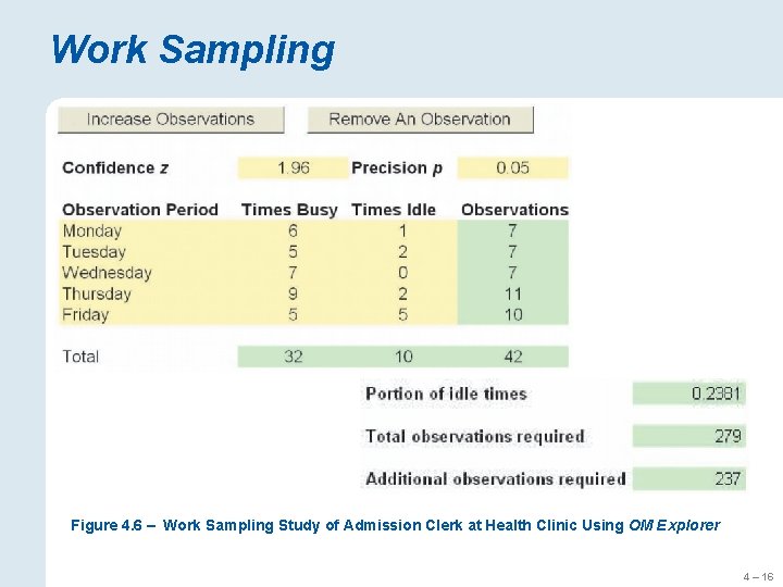
Work Sampling Figure 4. 6 – Work Sampling Study of Admission Clerk at Health Clinic Using OM Explorer 4 – 16

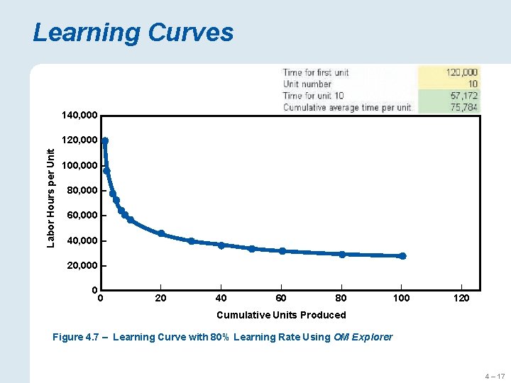
Learning Curves 140, 000 Labor Hours per Unit 120, 000 – 100, 000 – 80, 000 – 60, 000 – 40, 000 – 20, 000 – 0| 0 | | | 20 40 60 80 100 120 Cumulative Units Produced Figure 4. 7 – Learning Curve with 80% Learning Rate Using OM Explorer 4 – 17

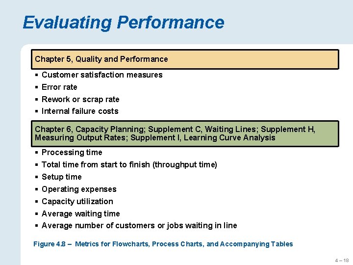
Evaluating Performance Chapter 5, Quality and Performance § Customer satisfaction measures § Error rate § Rework or scrap rate § Internal failure costs Chapter 6, Capacity Planning; Supplement C, Waiting Lines; Supplement H, Measuring Output Rates; Supplement I, Learning Curve Analysis § Processing time § Total time from start to finish (throughput time) § Setup time § Operating expenses § Capacity utilization § Average waiting time § Average number of customers or jobs waiting in line Figure 4. 8 – Metrics for Flowcharts, Process Charts, and Accompanying Tables 4 – 18

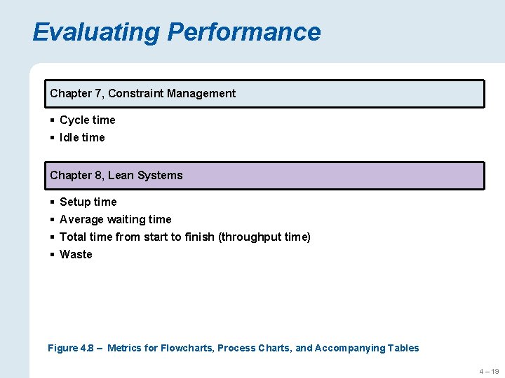
Evaluating Performance Chapter 7, Constraint Management § Cycle time § Idle time Chapter 8, Lean Systems § Setup time § Average waiting time § Total time from start to finish (throughput time) § Waste Figure 4. 8 – Metrics for Flowcharts, Process Charts, and Accompanying Tables 4 – 19

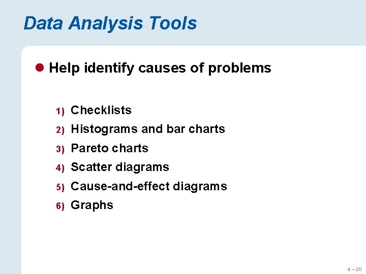
Data Analysis Tools l Help identify causes of problems 1) Checklists 2) Histograms and bar charts 3) Pareto charts 4) Scatter diagrams 5) Cause-and-effect diagrams 6) Graphs 4 – 20

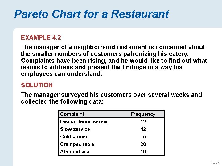
Pareto Chart for a Restaurant EXAMPLE 4. 2 The manager of a neighborhood restaurant is concerned about the smaller numbers of customers patronizing his eatery. Complaints have been rising, and he would like to find out what issues to address and present the findings in a way his employees can understand. SOLUTION The manager surveyed his customers over several weeks and collected the following data: Complaint Frequency Discourteous server 12 Slow service 42 Cold dinner 5 Cramped table 20 Atmosphere 10 4 – 21

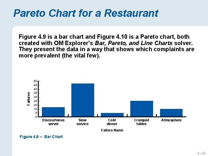
Pareto Chart for a Restaurant Failures Figure 4. 9 is a bar chart and Figure 4. 10 is a Pareto chart, both created with OM Explorer’s Bar, Pareto, and Line Charts solver. They present the data in a way that shows which complaints are more prevalent (the vital few). 50 – 45 – 40 – 35 – 30 – 25 – 20 – 10 – 5– 0– Discourteous server Slow service Cold dinner Cramped tables Atmosphere Failure Name Figure 4. 9 – Bar Chart 4 – 22

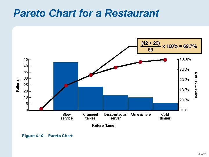
Pareto Chart for a Restaurant (42 + 20) 100% = 69. 7% 89 – 100. 0% 45 – 40 – Failures 30 – – 60. 0% 25 – – 40. 0% 20 – 10 – Percent of Total – 80. 0% 35 – – 20. 0% 5– 0– – 0. 0% Slow service Cramped tables Discourteous server Atmosphere Cold dinner Failure Name Figure 4. 10 – Pareto Chart 4 – 23

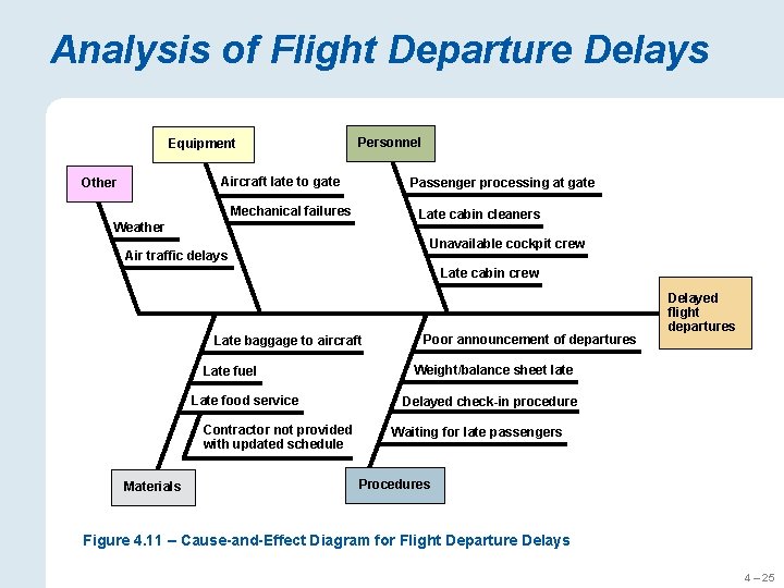
Analysis of Flight Departure Delays EXAMPLE 4. 3 The operations manager for Checker Board Airlines at Port Columbus International Airport noticed an increase in the number of delayed flight departures. SOLUTION To analyze all the possible causes of that problem, the manager constructed a cause-and-effect diagram, shown in Figure 4. 11. The main problem, delayed flight departures, is the “head” of the diagram. He brainstormed all possible causes with his staff, and together they identified several major categories: equipment, personnel, materials, procedures, and “other factors” that are beyond managerial control. Several suspected causes were identified for each major category. 4 – 24

Analysis of Flight Departure Delays Equipment Personnel Aircraft late to gate Other Passenger processing at gate Mechanical failures Late cabin cleaners Weather Unavailable cockpit crew Air traffic delays Late cabin crew Late baggage to aircraft Late fuel Late food service Contractor not provided with updated schedule Materials Poor announcement of departures Delayed flight departures Weight/balance sheet late Delayed check-in procedure Waiting for late passengers Procedures Figure 4. 11 – Cause-and-Effect Diagram for Flight Departure Delays 4 – 25

Data Analysis Tools l Tools can be used together for data snooping to analyze data and determine causes l Simulation can show a process changes over time l Process simulation is the act of reproducing the behavior of a process using a model that describes each step 4 – 26

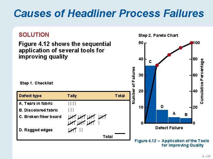
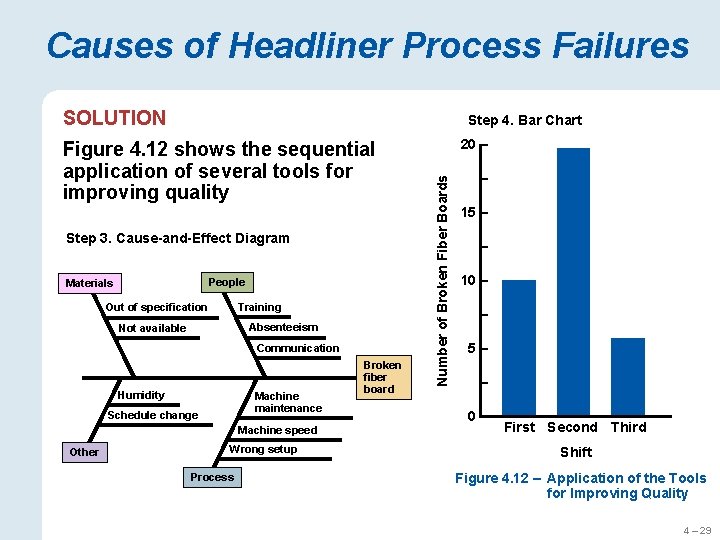
Causes of Headliner Process Failures EXAMPLE 4. 4 The Wellington Fiber Board Company produces headliners, the fiberglass components that form the inner roof of passenger cars. Management wanted to identify which process failures were most prevalent and to find the cause. SOLUTION Step 1: A checklist of different types of process failures is constructed from last month’s production records. Step 2: A Pareto chart is prepared from the checklist data. Step 3: A cause-and-effect diagram for identifies several potential causes for the problem. Step 4: The manager reorganizes the production reports into a bar chart according to shift because the personnel on the three shifts had varied amounts of experience. 4 – 27

Causes of Headliner Process Failures SOLUTION Step 2. Pareto Chart Figure 4. 12 shows the sequential application of several tools for improving quality 50 – Defect type Tally A. Tears in fabric || || 4 B. Discolored fabric ||| 3 C. Broken fiber board |||| |||| | D. Ragged edges Total |||| || 36 7 Total 50 – 80 C 30 – – 60 20 – – 40 10 – D Cumulative Percentage Step 1. Checklist Number of Failures 40 – – 100 – 20 A 0– B – 0 Defect Failure Figure 4. 12 – Application of the Tools for Improving Quality 4 – 28

Causes of Headliner Process Failures SOLUTION Step 4. Bar Chart Step 3. Cause-and-Effect Diagram People Materials Training Out of specification Absenteeism Not available Communication Humidity Machine maintenance Schedule change Machine speed Other Wrong setup Process Broken fiber board 20 – Number of Broken Fiber Boards Figure 4. 12 shows the sequential application of several tools for improving quality – 15 – – 10 – – 5– – 0– First Second Third Shift Figure 4. 12 – Application of the Tools for Improving Quality 4 – 29

Redesigning the Process l After a process is documented, metrics are collected, and disconnects are identified, the process analyst determines what changes should be made l People directly involved in the process are brought in to get their ideas and inputs 4 – 30

Generating Ideas l Ideas can be uncovered by asking six questions 1. What is being done? 2. When is it being done? 3. Who is doing it? 4. Where is it being done? 5. How is it being done? 6. How well does it do on the various metrics of importance? 4 – 31

Generating Ideas l Brainstorming involves a group of people knowledgeable about the process proposing ideas for change by saying whatever comes to mind l After brainstorming the design team evaluates ideas and identifies those with the highest payoff 4 – 32

Generating Ideas l Benchmarking is a systematic procedure that measures a firm’s processes, services, and products against another firm l Competitive benchmarking is based on comparisons with a direct competitor l Functional benchmarking compares areas with those of outstanding firms in any industry l Internal benchmarking compares an organizational unit with superior performance with other units 4 – 33

Benchmarking l There are four basic steps u Step 1. Planning u Step 2. Analysis u Step 3. Integration u Step 4. Action l Collecting data can be a challenge l Some corporations and government organizations have agreed to share data 4 – 34

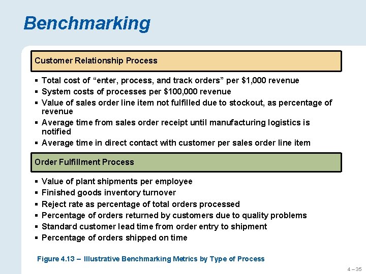
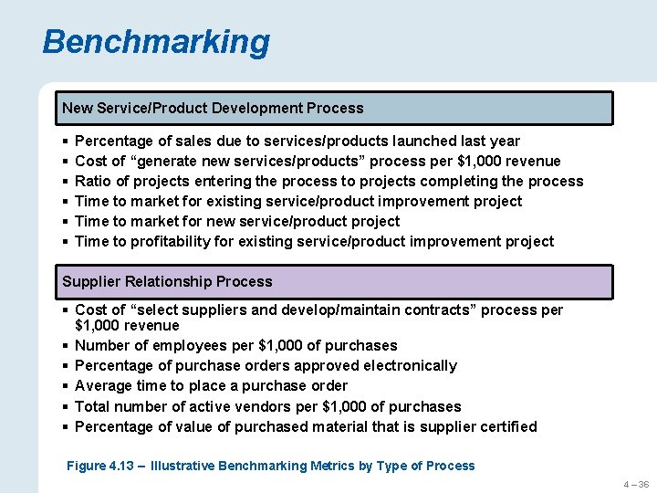
Benchmarking Customer Relationship Process § Total cost of “enter, process, and track orders” per $1, 000 revenue § System costs of processes per $100, 000 revenue § Value of sales order line item not fulfilled due to stockout, as percentage of revenue § Average time from sales order receipt until manufacturing logistics is notified § Average time in direct contact with customer per sales order line item Order Fulfillment Process § § § Value of plant shipments per employee Finished goods inventory turnover Reject rate as percentage of total orders processed Percentage of orders returned by customers due to quality problems Standard customer lead time from order entry to shipment Percentage of orders shipped on time Figure 4. 13 – Illustrative Benchmarking Metrics by Type of Process 4 – 35

Benchmarking New Service/Product Development Process § § § Percentage of sales due to services/products launched last year Cost of “generate new services/products” process per $1, 000 revenue Ratio of projects entering the process to projects completing the process Time to market for existing service/product improvement project Time to market for new service/product project Time to profitability for existing service/product improvement project Supplier Relationship Process § Cost of “select suppliers and develop/maintain contracts” process per $1, 000 revenue § Number of employees per $1, 000 of purchases § Percentage of purchase orders approved electronically § Average time to place a purchase order § Total number of active vendors per $1, 000 of purchases § Percentage of value of purchased material that is supplier certified Figure 4. 13 – Illustrative Benchmarking Metrics by Type of Process 4 – 36

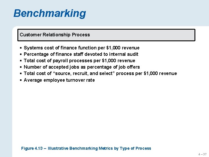
Benchmarking Customer Relationship Process § § § Systems cost of finance function per $1, 000 revenue Percentage of finance staff devoted to internal audit Total cost of payroll processes per $1, 000 revenue Number of accepted jobs as percentage of job offers Total cost of “source, recruit, and select” process per $1, 000 revenue Average employee turnover rate Figure 4. 13 – Illustrative Benchmarking Metrics by Type of Process 4 – 37

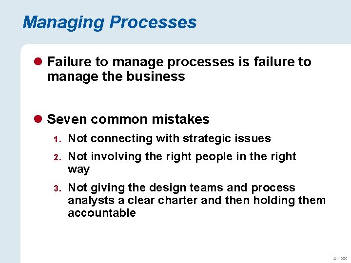
Managing Processes l Failure to manage processes is failure to manage the business l Seven common mistakes 1. Not connecting with strategic issues 2. Not involving the right people in the right way 3. Not giving the design teams and process analysts a clear charter and then holding them accountable 4 – 38

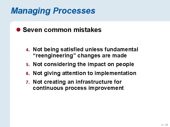
Managing Processes l Seven common mistakes 4. Not being satisfied unless fundamental “reengineering” changes are made 5. Not considering the impact on people 6. Not giving attention to implementation 7. Not creating an infrastructure for continuous process improvement 4 – 39

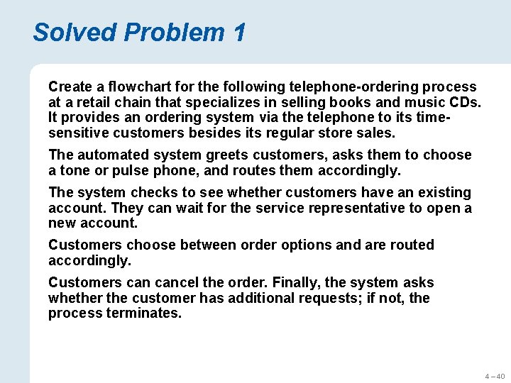
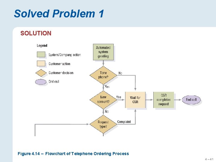
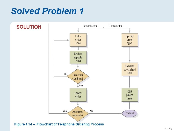
Solved Problem 1 Create a flowchart for the following telephone-ordering process at a retail chain that specializes in selling books and music CDs. It provides an ordering system via the telephone to its timesensitive customers besides its regular store sales. The automated system greets customers, asks them to choose a tone or pulse phone, and routes them accordingly. The system checks to see whether customers have an existing account. They can wait for the service representative to open a new account. Customers choose between order options and are routed accordingly. Customers cancel the order. Finally, the system asks whether the customer has additional requests; if not, the process terminates. 4 – 40

Solved Problem 1 SOLUTION Figure 4. 14 – Flowchart of Telephone Ordering Process 4 – 41

Solved Problem 1 SOLUTION Figure 4. 14 – Flowchart of Telephone Ordering Process 4 – 42

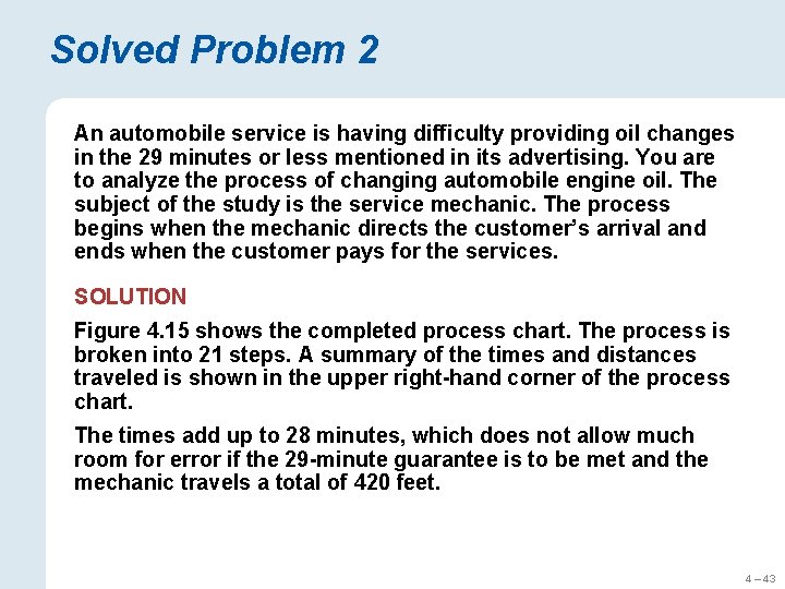
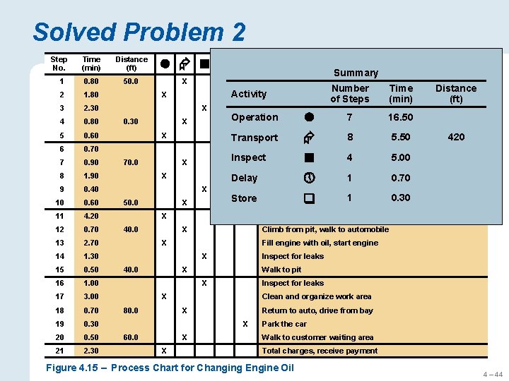
Solved Problem 2 An automobile service is having difficulty providing oil changes in the 29 minutes or less mentioned in its advertising. You are to analyze the process of changing automobile engine oil. The subject of the study is the service mechanic. The process begins when the mechanic directs the customer’s arrival and ends when the customer pays for the services. SOLUTION Figure 4. 15 shows the completed process chart. The process is broken into 21 steps. A summary of the times and distances traveled is shown in the upper right-hand corner of the process chart. The times add up to 28 minutes, which does not allow much room for error if the 29 -minute guarantee is to be met and the mechanic travels a total of 420 feet. 4 – 43

Solved Problem 2 Step No. Time (min) Distance (ft) 1 0. 80 50. 0 2 1. 80 3 2. 30 4 0. 80 5 0. 60 6 0. 70 7 0. 90 8 1. 90 9 0. 40 10 0. 60 11 4. 20 12 0. 70 13 2. 70 14 1. 30 15 0. 50 16 1. 00 17 3. 00 18 0. 70 19 0. 30 20 0. 50 21 2. 30 X Direct customer into service bay Number Time Activity. Record name and desired service of Steps (min) X X 0. 30 Open hood, verify engine type, inspect hoses, check fluids X X 50. 0 Recommend additional 8 services Transport 5. 50 Inspect. Walk to storeroom 5. 00 Wait for customer decision Delay X X Store X 40. 0 0. 70 0. 30 Inspect for leaks X Walk to pit X Inspect for leaks X Clean and organize work area X Return to auto, drive from bay X X X Check filter number(s) Fill engine with oil, start engine X 60. 0 to service 1 pit Carry filter(s) Look up filter number(s) 1 Climb from pit, walk to automobile X 80. 0 4 420 Perform under-car services X 40. 0 Distance (ft) 7 area 16. 50 Operation in waiting Walk to customer X 70. 0 Step Description Summary Park the car Walk to customer waiting area Total charges, receive payment Figure 4. 15 – Process Chart for Changing Engine Oil 4 – 44

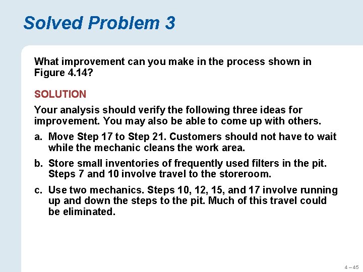
Solved Problem 3 What improvement can you make in the process shown in Figure 4. 14? SOLUTION Your analysis should verify the following three ideas for improvement. You may also be able to come up with others. a. Move Step 17 to Step 21. Customers should not have to wait while the mechanic cleans the work area. b. Store small inventories of frequently used filters in the pit. Steps 7 and 10 involve travel to the storeroom. c. Use two mechanics. Steps 10, 12, 15, and 17 involve running up and down the steps to the pit. Much of this travel could be eliminated. 4 – 45

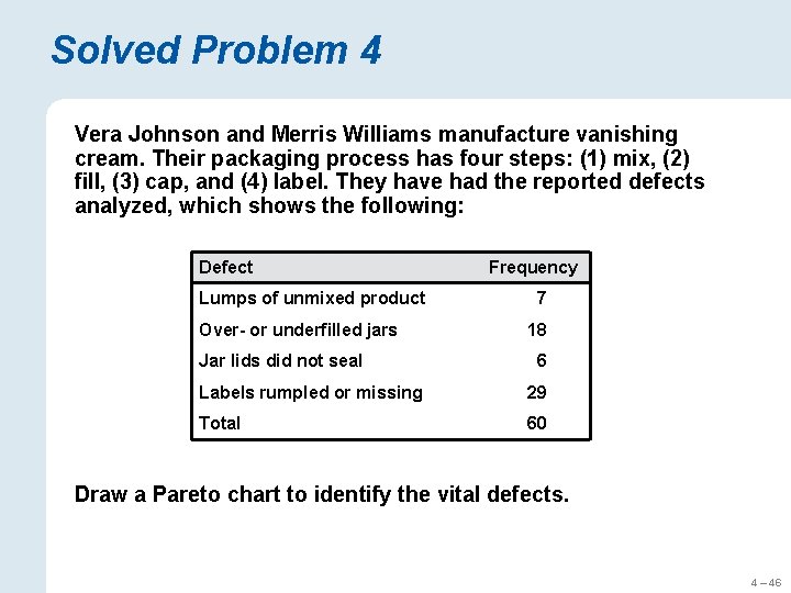
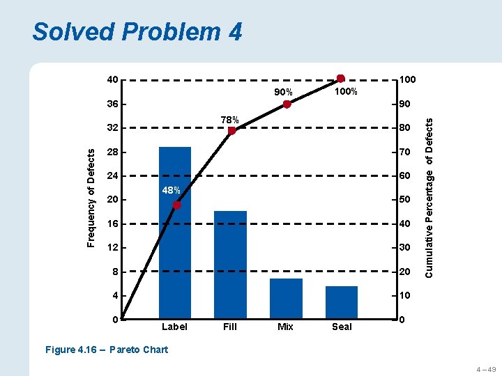
Solved Problem 4 Vera Johnson and Merris Williams manufacture vanishing cream. Their packaging process has four steps: (1) mix, (2) fill, (3) cap, and (4) label. They have had the reported defects analyzed, which shows the following: Defect Lumps of unmixed product Over- or underfilled jars Jar lids did not seal Frequency 7 18 6 Labels rumpled or missing 29 Total 60 Draw a Pareto chart to identify the vital defects. 4 – 46

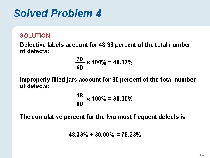
Solved Problem 4 SOLUTION Defective labels account for 48. 33 percent of the total number of defects: 29 100% = 48. 33% 60 Improperly filled jars account for 30 percent of the total number of defects: 18 100% = 30. 00% 60 The cumulative percent for the two most frequent defects is 48. 33% + 30. 00% = 78. 33% 4 – 47

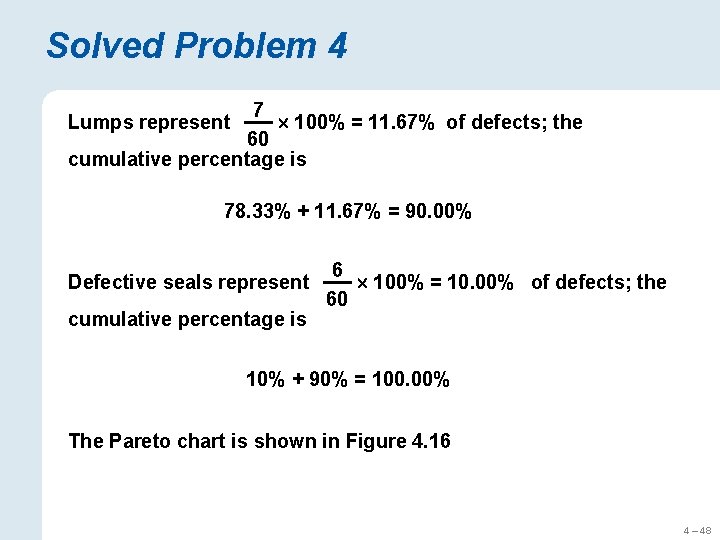
Solved Problem 4 7 100% = 11. 67% of defects; the 60 cumulative percentage is Lumps represent 78. 33% + 11. 67% = 90. 00% Defective seals represent cumulative percentage is 6 100% = 10. 00% of defects; the 60 10% + 90% = 100. 00% The Pareto chart is shown in Figure 4. 16 4 – 48

Solved Problem 4 40 – – 100 90% 100% – 90 78% Frequency of Defects 32 – – 80 28 – – 70 24 – – 60 20 – 48% – 50 16 – – 40 12 – – 30 8– – 20 4– – 10 0– Label Fill Mix Seal Cumulative Percentage of Defects 36 – – 0 Figure 4. 16 – Pareto Chart 4 – 49