Problem Solving Operation Analisis Tools Prosedur Sistematis untuk

Problem Solving & Operation Analisis Tools

Prosedur Sistematis untuk “PSK&E” � � � � Identifikasi Masalah Mengumpulkan data Menganalisa data Mengembangkan solusi alternatif Memilih solusi Menggunakan solusi Follow up
 �Masalah dapat diartikan sebagai sesuatu yang mengganggu sistem. �Gap antara harapan")
Definisi Masalah 1) �Masalah dapat diartikan sebagai sesuatu yang mengganggu sistem. �Gap antara harapan dan kenyataan Contoh : � Peralatan kerja tidak nyaman untuk melakukan aktivitas kerja � Lingkungan kerja yaitu pencahayaan tidak sesuai dengan aktivitas kerja yang dilakukan

Identifikasi Masalah Peralatan/Tools: - Pareto analysis - Fishbone diagram - Gantt chart - PERT chat Examples: - Product with low profit Bottleneck operations Workers complaints

Analysis Tools � 5 Why ◦ Why is this operation necessary? ◦ Why is this operation performed in this manner? ◦… � 4 W ◦ ◦ ◦ + 1 H How can the operation be performed better? Who can best perform the operation? Where could … When … Why …
![Pemborosan Shingo, Shigeo [1985] mengelompokkan pemborosan atas 7 (tujuh) macam, yaitu : 1. 2.](http://slidetodoc.com/presentation_image_h2/c440c7b0e0e8bc17d2beb8546ceb497d/image-6.jpg "Pemborosan Shingo, Shigeo [1985] mengelompokkan pemborosan atas 7 (tujuh) macam, yaitu : 1. 2.")
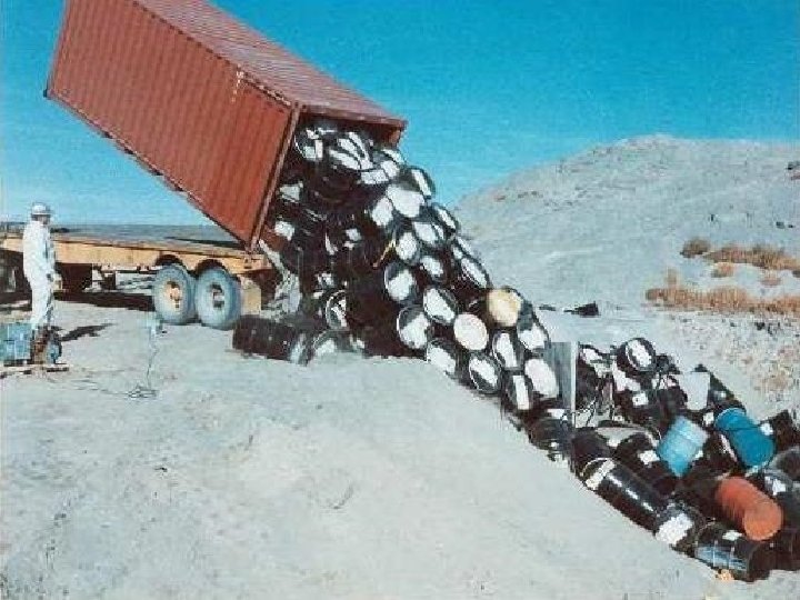
Pemborosan Shingo, Shigeo [1985] mengelompokkan pemborosan atas 7 (tujuh) macam, yaitu : 1. 2. 3. 4. 5. 6. 7. Over produksi Waktu menunggu Transportasi Pemrosesan (over proses) Tingkat persediaan barang Gerakan yang tidak perlu Cacat produksi 6

1. Produksi berlebihan Overproduction. u Produksi berlebihan adalah memproduksi barang sebelum barang itu sebenarnya diperlukan. u Produksi berlebihan sangat merugikan industri manufaktur karena menghambat aliran material dan sebenarnya menurunkan produktivitas dan mutu. 7

2. Menunggu - Waiting �Setiap saat barang-barang tidak berpindah atau tidak diolah maka terjadilah pemborosan menunggu. �Kebanyakan proses ini dikarenakan menunggu proses berikutnya, ini biasanya karena aliran material yang buruk, waktu pengolahan produksi yang terlalu lama, dan jarak antara proses kerja satu ke yang lainnya terlalu jauh. �Menghubungkan antar proses agar pasokan secara langsung ke dalam proses berikutnya secara dramatis akan mengurangi waktu tunggu. 8

3. Memindahkan – Transporting � Memindahkan atau mengangkut produk dari proses ke proses adalah kegiatan yang tidak menambahkan nilai ke dalam produk. � Pergerakan yang berlebihan dan penanganan yang berlebihan akan menimbulkan kerusakan dan kemungkinan mengakibatkan mutu produk yang menurun. � Hal ini sering disebabkan oleh layout pabrik yang buruk dimana proses sebelumnya atau proses berikutnya terletak saling berjauhan dan ini tidak menambahkan nilai dari sudut pandang pelanggan. � Transportasi menjadi sulit untuk dikurangi karena biaya pemindahan material dan biaya produksi yang menyatu. Sering kali sulit mengetahui proses mana sebaiknya yang menjadi proses berikutnya. Dengan memetakan aliran produk bisa membuat pemborosan ini lebih mudah dilihat 9

4. Pemrosesan - Processing �Sering kita mendengar istilah “membunuh nyamuk dengan bom”, ini terjadi di banyak organisasi menggunakan perlengkapan dengan tingkat akurasi yang tinggi dan biasanya mahal dimana sebenarnya cukup dengan alat yang lebih sederhana. � Toyota terkenal dengan penggunaan peralatan mereka berupa otomatisasi berbiaya rendah digabungkan dengan manajemen bebas perawatan, bahkan sering dengan mesin yang lebih tua. �Menggabungkan langkah secara signifikan akan mengurangi pemborosan proses yang tidak 10 sepantasnya.

5. Persediaan - Inventory �Kelebihan persediaan cenderung menyembunyikan masalah di dalam pabrik yang seharusnya dikenali dan diperbaiki untuk meningkatkan kinerja operasionalnya. �(Work in Progress - WIP), barang dalam proses secara langsung adalah akibat dari produksi yang berlebihan dan menunggu. �Dengan menciptakan aliran langsung dari proses ke proses di banyak industri manufaktur telah memperbaiki pelayanannya kepada pelanggan dan menghapuskan persediaan serta menghemat biaya. 11

6. Gerakan - Motion �Pemborosan ini berhubungan dengan motion study dan ergonomi, banyak gerakan yang tidak diperlukan dan ataupun gerakan yang harus dihilangkan �Pekerjaan dengan gerakan berlebihan sebaiknya dianalisa dan dirancang kembali dengan melibatkan para karyawan pabrik untuk memperbaiki kinerjanya. 12

7. Cacat - Defects � Pemborosan ini berdampak langsung kepada kelangsungan hidup perusahaan dimana produk cacat mengakibatkan kerja ulang atau membuat produk skrap, biaya yang dikeluarkan pun luar biasa. � Biaya-biaya ini termasuk mengarantinakan persediaan, memeriksa ulang, penjadwalan kembali, dan kehilangan kapasitas. Di banyak organisasi total biaya dari cacat sangat berarti bagi persentase biaya produksi. � Bagaimana akibatnya bila produk cacat ditemukan di pelanggan? Berapakah biaya yang harus dikeluarkan oleh perusahaan? � Dengan melibatkan karyawan dalam melakukan perbaikan proses yang berkesinambungan maka sangatlah besar kesempatan untuk mengurangi cacat di banyak proses kerja 13

Waste from overproduction

Waste from waiting times

Waste from scrap and defects

Seven Quality Tools �The Seven Tools 1. Histograms, 2. Pareto Charts, 3. Cause and Effect Diagrams, 4. Run Charts, 5. Scatter Diagrams, 6. Flow Charts, 7. Control Charts

Ishikawa’s Basic Tools of Quality �Kaoru Ishikawa developed seven basic visual tools of quality so that the average person could analyze and interpret data. �These tools have been used worldwide by companies, managers of all levels and employees.

Histograms Slide 1 of 3 �Histogram Defined ◦ A histogram is a bar graph that shows frequency data. ◦ Histograms provide the easiest way to evaluate the distribution of data.

Histograms Slide 2 of 3 �Creating a Histogram ◦ Collect data and sort it into categories. ◦ Then label the data as the independent set or the dependent set. �The characteristic you grouped the data by would be the independent variable. �The frequency of that set would be the dependent variable. ◦ Each mark on either axis should be in equal increments. ◦ For each category, find the related frequency and make the horizontal marks to show that frequency.

Histograms Slide 3 of 3 �Examples of How Histograms Can Be Used ◦ Histograms can be used to determine distribution of sales. ◦ Say for instance a company wanted to measure the revenues of other companies and wanted to compare numbers.

Pareto Charts Slide 1 of 4 �Pareto Chart Defined ◦ Pareto charts are used to identify and prioritize problems to be solved. ◦ They are actually histograms aided by the 80/20 rule adapted by Joseph Juran. �Remember the 80/20 rule states that approximately 80% of the problems are created by approximately 20% of the causes.

Pareto Charts Slide 2 of 4 �Constructing a Pareto Chart ◦ First, information must be selected based on types or classifications of defects that occur as a result of a process. ◦ The data must be collected and classified into categories. ◦ Then a histogram or frequency chart is constructed showing the number of occurrences.

Pareto Charts Slide 3 of 4 �An Example Used of How a Pareto Chart Can Be ◦ Pareto Charts are used when products are suffering from different defects but the defects are occurring at a different frequency, or only a few account for most of the defects present, or different defects incur different costs. What we see from that is a product line may experience a range of defects. The manufacturer could concentrate on reducing the defects which make up a bigger percentage of all the defects or focus on eliminating the defect that causes monetary loss. �Actual chart is on the next slide �Example and chart were obtained from: <www. yourmba. co. uk/pareto_diagram. htm>

Pareto Charts Slide 4 of 4

Cause and Effect Diagrams Slide 1 of 4 �Cause and Effect Diagram Defined ◦ The cause and effect diagram is also called the Ishikawa diagram or the fishbone diagram. ◦ It is a tool for discovering all the possible causes for a particular effect. ◦ The major purpose of this diagram is to act as a first step in problem solving by creating a list of possible causes.

Cause and Effect Diagrams Slide 2 of 4 �Constructing a Cause and Effect Diagram ◦ First, clearly identify and define the problem or effect for which the causes must be identified. Place the problem or effect at the right or the head of the diagram. ◦ Identify all the broad areas of the problem. ◦ Write in all the detailed possible causes in each of the broad areas. ◦ Each cause identified should be looked upon for further more specific causes. ◦ View the diagram and evaluate the main causes. ◦ Set goals and take action on the main causes.

Cause and Effect Diagrams Slide 3 of 4 �An Example of When a Cause and Effect Diagram Can Be Used ◦ This diagram can be used to detect the problem of incorrect deliveries. �Diagram on next slide �Diagram obtained from: <http: //www. hci. com. au/hcisite/toolkit/causeand. htm> ◦ When a production team is about to launch a new product, the factors that will affect the final product must be recognized. The fishbone diagram can depict problems before they have a chance to begin.

Cause and Effect Diagrams Slide 4 of 4 Diagram of the Incorrect Deliveries Example:

Scatter Diagrams Slide 1 of 4 �Scatter Diagrams Defined ◦ Scatter Diagrams are used to study and identify the possible relationship between the changes observed in two different sets of variables.

Scatter Diagrams Slide 2 of 4 � Constructing a Scatter Diagram ◦ First, collect two pieces of data and create a summary table of the data. ◦ Draw a diagram labeling the horizontal and vertical axes. �It is common that the “cause” variable be labeled on the X axis and the “effect” variable be labeled on the Y axis. ◦ Plot the data pairs on the diagram. ◦ Interpret the scatter diagram for direction and strength.

Scatter Diagrams Slide 3 of 4 �An Example of When a Scatter Diagram Can Be Used ◦ A scatter diagram can be used to identify the relationship between the production speed of an operation and the number of defective parts made.

Scatter Diagrams Slide 4 of 4 � An Example of When a Scatter Diagram Can Be Used (cont. ) ◦ Displaying the direction of the relationship will determine whether increasing the assembly line speed will increase or decrease the number of defective parts made. Also, the strength of the relationship between the assembly line speed and the number of defective parts produced is determined. �Example obtained from: <http: //www. sytsma. com/tqmtools/Scat. html>

Flow Charts Slide 1 of 3 �Flow Charts Defined ◦ A flow chart is a pictorial representation showing all of the steps of a process.

Flow Charts Slide 2 of 3 �Creating a Flow Chart ◦ First, familiarize the participants with the flow chart symbols. ◦ Draw the process flow chart and fill it out in detail about each element. ◦ Analyze the flow chart. Determine which steps add value and which don’t in the process of simplifying the work.

Flow Charts Slide 3 of 3 �Examples of When to Use a Flow Chart ◦ Two separate stages of a process flow chart should be considered: �The making of the product �The finished product

Run Charts Slide 1 of 3 �Run Charts Defined ◦ Run charts are used to analyze processes according to time or order.

Run Charts Slide 2 of 3 � Creating a Run ◦ Gathering Data Chart �Some type of process or operation must be available to take measurements for analysis. ◦ Organizing Data �Data must be divided into two sets of values X and Y. X values represent time and values of Y represent the measurements taken from the manufacturing process or operation. ◦ Charting Data �Plot the Y values versus the X values. ◦ Interpreting Data �Interpret the data and draw any conclusions that will be beneficial to the process or operation.

Run Charts Slide 3 of 3 �An Example of Using a Run Chart ◦ An organization’s desire is to have their product arrive to their customers on time, but they have noticed that it doesn’t take the same amount of time each day of the week. They decided to monitor the amount of time it takes to deliver their product over the next few weeks.

Control Charts Slide 1 of 3 �Control Charts Defined ◦ Control charts are used to determine whether a process will produce a product or service with consistent measurable properties.

Control Charts Slide 2 of 3 �Steps Used in Developing Process Control Charts ◦ Identify critical operations in the process where inspection might be needed. ◦ Identify critical product characteristics. ◦ Determine whether the critical product characteristic is a variable or an attribute. ◦ Select the appropriate process control chart. ◦ Establish the control limits and use the chart to monitor and improve. ◦ Update the limits.

Control Charts Slide 3 of 3 �An Example of When to Use a Control Chart ◦ Counting the number of defective products or services �Do you count the number of defects in a given product or service? �Is the number of units checked or tested constant?

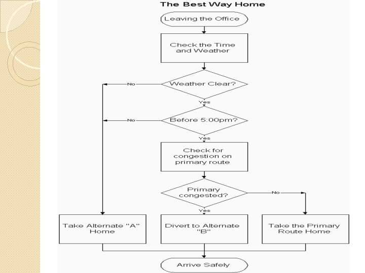
Activity �Process Flow Chart for Finding the Best Way Home ◦ Construct a process flow chart by making the best decisions in finding the best route home. ◦ Refer to the prior notes on flowcharts. �Remember: Define and analyze the process, build a step-by step picture of the process, and define areas of improvement in the process. �Answer is on the next slide �Example obtained from: <http: //deming. eng. clemson. edu/pub/tutorials/qctools/flow m. htm#Example>

Summary This presentation provided learning material for each of Ishikawa’s seven basic tools of quality. Each tool was clearly defined with definitions, a step-by-step process and an example of how the tool can be used. As seen through the presentation, these tools are rather simple and effective.

Works - Cited � � � � Histograms and Bar Graphs. <http: //www. shodor. org/interactivate/lessons/sm 3. html> Your MBA: The Business Study Reference Site. http: //yourmba. co. uk/pareto_diagram. htm Hci Home Services. Cause and Effect Diagram. http: //hci. com. au/hcisite/toolkit/causeand. htm Scatter Diagram. http: //sytsma. com/tqmtools/Scat. html Flowchart. <http: //deming. eng. clemson. edu/pub/tutorials/qctools/flowm. ht m> Run Charts/Time Plot/ Trend Chart. <http: //www. deming. edu. clemson. edu/pub/tutorials/qctools/runm. ht m> Foster Thomas S. Managing Quality An Integrative Approach. New Jersey: Prentice Hall, 2001
- Slides: 47