Probability Statistics Misuse of Statistics Misuse of Statistics
Probability & Statistics Misuse of Statistics
Misuse of Statistics Although statistics can be used as a valuable tool to study many different aspects of the world we live in, be careful. Many individuals, businesses, and advertising firms misuse statistics to their own advantage.
Misuse of Statistics When examining statistical information, consider the following: • • Was the sample used to gather the statistical data unbiased and of sufficient size? Is the statistical statement ambiguous, could it be interpreted in more than one way?
Misuse of Statistics Example: Misleading Statistics An advertisement says, “Fly Speedway Airlines and Save 20%”. • • Here there is not enough information given. The “Save 20%” could be off the original ticket price, the ticket price when you buy two tickets or of another airline’s ticket price.
Misuse of Statistics Example: Misleading Statistics A help wanted ad read, ” Salesperson wanted for Ryan’s Furniture Store. Average Salary: $32, 000. ” • • The word “average” can be very misleading. If most of the salespeople earn $20, 000 to $25, 000 and the owner earns $76, 000, this “average salary” is not a fair representation.
Misuse of Statistics Graphs can also be misleading, consider the following situation: We never really know what goes on behind closed doors regarding trades in professional sports. One (fairly unreliable) source reported that there were secret trade talks that took place between the Boston Celtics and the Los Angeles Lakers after the 2009 -10 basketball season. The value of Celtics' guard, Paul Pierce was the topic at hand.
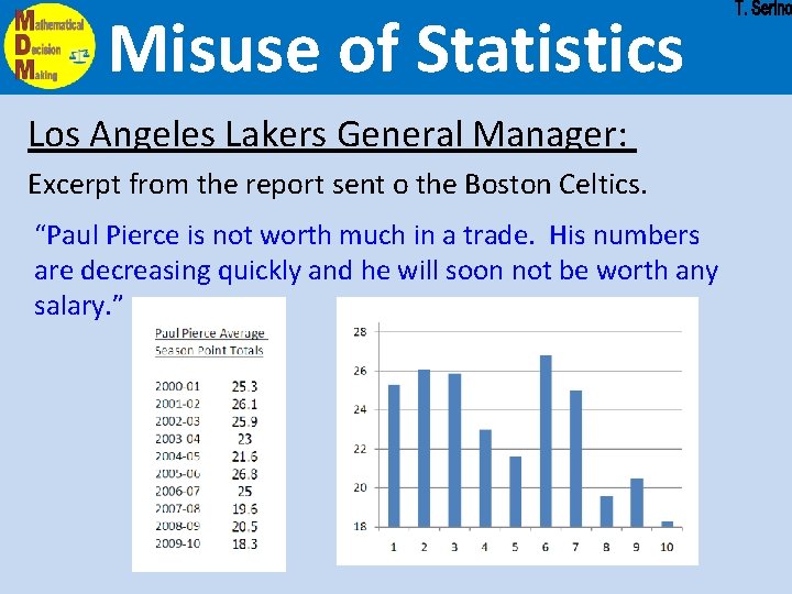
Misuse of Statistics Los Angeles Lakers General Manager: Excerpt from the report sent o the Boston Celtics. “Paul Pierce is not worth much in a trade. His numbers are decreasing quickly and he will soon not be worth any salary. ”
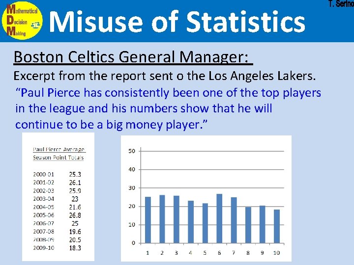
Misuse of Statistics Boston Celtics General Manager: Excerpt from the report sent o the Los Angeles Lakers. “Paul Pierce has consistently been one of the top players in the league and his numbers show that he will continue to be a big money player. ”
Misuse of Statistics Both graphs of Paul Pierce's stats (from the previous two slides) were based on exactly the same numbers. Neither of the General Managers lied about the stats and both graphs were completely accurate.
Misuse of Statistics The difference between the two graphs is simply the scales used. he Lakers used a scale of 2 on the y-axis (average points per game) and put the data on a broken graph starting with 18 points and going up to 28 points (a range of 10 points) The Celtics used a scale of 10 on the y-axis and showed point averages from 0 to 50 points per game (a range of 50 points). Does one of the graphs violate the area principle?
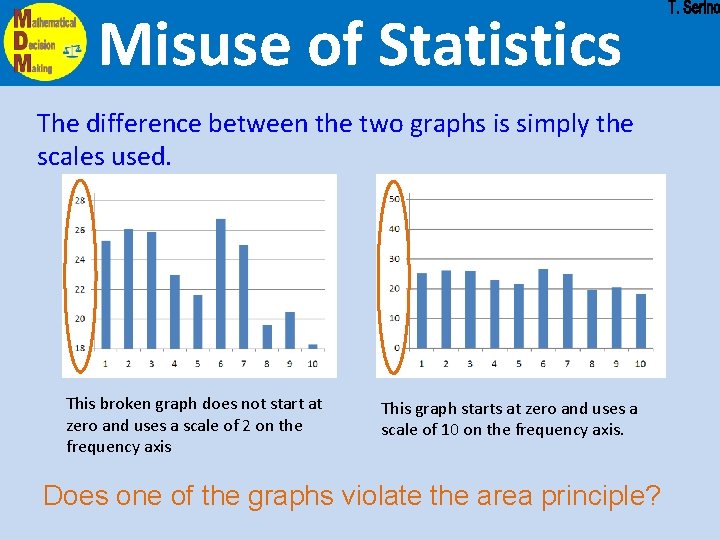
Misuse of Statistics The difference between the two graphs is simply the scales used. This broken graph does not start at zero and uses a scale of 2 on the frequency axis This graph starts at zero and uses a scale of 10 on the frequency axis. Does one of the graphs violate the area principle?
Misuse of Statistics Charts and Graphs Charts and graphs can also be misleading. • • Even though the data is displayed correctly, adjusting the vertical scale of a graph can give a different impression. A circle graph can be misleading if the sum of the parts of the graphs does not add up to 100%.
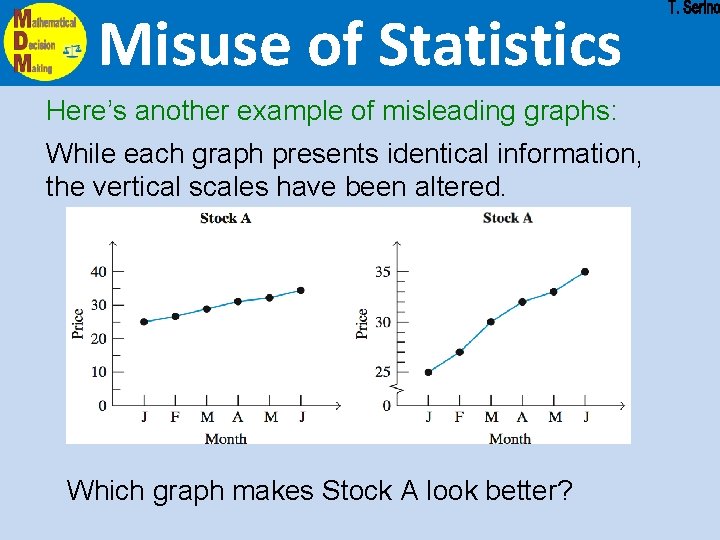
Misuse of Statistics Here’s another example of misleading graphs: While each graph presents identical information, the vertical scales have been altered. Which graph makes Stock A look better?
Misuse of Statistics In general, individuals, businesses, and advertising agencies will misuse statistics to make themselves, their products, or their clients appear to be better than others. For a graph to show data to look like there has been significant change: * Usually a broken graph se a small scale and a small range. For a graph to show data to look like there has been very little change: se a large scale and a large range.
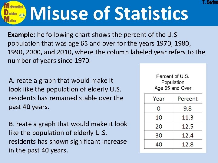
Misuse of Statistics Example: he following chart shows the percent of the U. S. population that was age 65 and over for the years 1970, 1980, 1990, 2000, and 2010, where the column labeled year refers to the number of years since 1970. A. reate a graph that would make it look like the population of elderly U. S. residents has remained stable over the past 40 years. B. reate a graph that would make it look like the population of elderly U. S. residents has shown significant increase in the past 40 years.

- Slides: 16