Print Layout Guidelines and conventions 1 Use a
- Slides: 8

Print Layout Guidelines and conventions

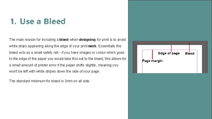
1. Use a Bleed The main reason for including a bleed when designing for print is to avoid white strips appearing along the edge of your print work. Essentially the bleed acts as a small safety net - if you have images or colour which goes to the edge of the paper you would take this out to the bleed, this allows for a small amount of printer error if the paper shifts slightly, meaning you won't be left with white stripes down the side of your page. The standard minimum for bleed is 3 mm on all side.

2. Make sure the color mode is correct The two main colour modes in print are CMYK and Pantone CMYK cyan, magenta, yellow and black (CMYK) ink is used in commercial printing presses. When designing work for print you should always work in CMYK, or convert the colours before printing to ensure they print to the same colours you see on screen. Pantone or spot colours may also be used for specific colours. For consistent branding and logos, Pantone is a better choice. For print jobs where exact color isn't a concern, CMYK is the best choice Web: RGB - red, green, blue should be used exclusively in the digital design industry because it represents the same colors used in computer screens, TV screens, as well as mobile device screens.

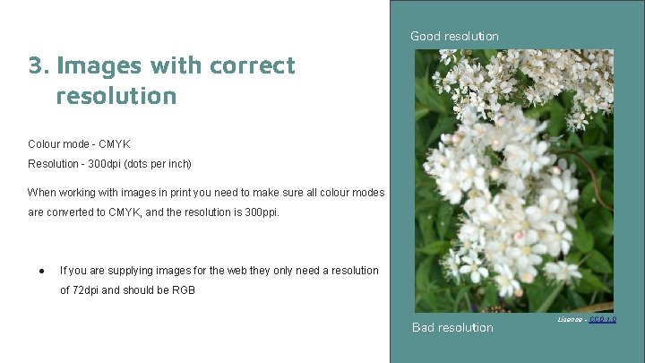
Good resolution 3. Images with correct resolution Colour mode - CMYK Resolution - 300 dpi (dots per inch) When working with images in print you need to make sure all colour modes are converted to CMYK, and the resolution is 300 ppi. ● If you are supplying images for the web they only need a resolution of 72 dpi and should be RGB Bad resolution License - CC 0 1. 0

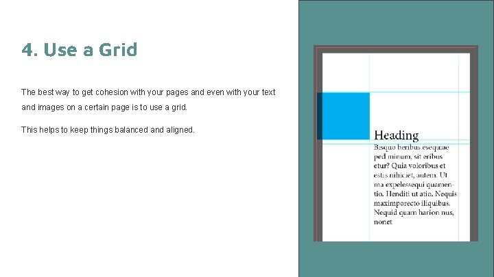
4. Use a Grid The best way to get cohesion with your pages and even with your text and images on a certain page is to use a grid. This helps to keep things balanced and aligned.

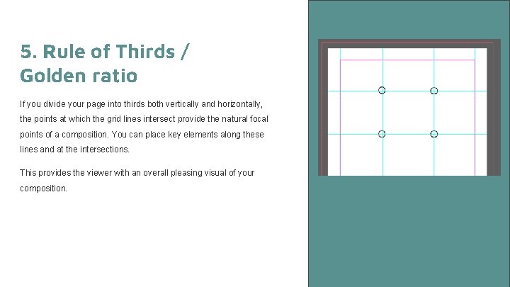
5. Rule of Thirds / Golden ratio If you divide your page into thirds both vertically and horizontally, the points at which the grid lines intersect provide the natural focal points of a composition. You can place key elements along these lines and at the intersections. This provides the viewer with an overall pleasing visual of your composition.

6. Use the design principles White space - Using negative space, or white space allows the viewers eye to rest. Repetition - Repeating design elements adds continuity and a sense of relationship between elements and text. Repetition can be in the form of elements, colours and even fonts and sizes. Contrast - Contrast can allow the eye to focus on a particular point, and helps to create emphasis. Alignment - Alignment is used to organise and provide structure to the page. It can be used with both elements and text and helps group relative aspects. Balance - The page should be visually balanced

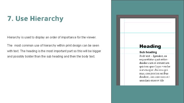
7. Use Hierarchy is used to display an order of importance for the viewer. The most common use of hierarchy within print design can be seen with text. The heading is the most important part so this will be bigger and possibly bolder than the sub heading and then the body text.