Principles of Visual Design 2720 Principles of Visual


- Slides: 83

Principles of Visual Design 2720 Principles of Visual Design LCC 2720 Instructor: Brian Schrank Intro to Typography

Principles of Visual Design 2720 Typography is the design of arranging text and modifying letters (type glyphs).

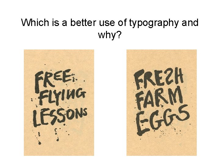
Principles of Visual Design 2720 Which is a better use of typography and why?

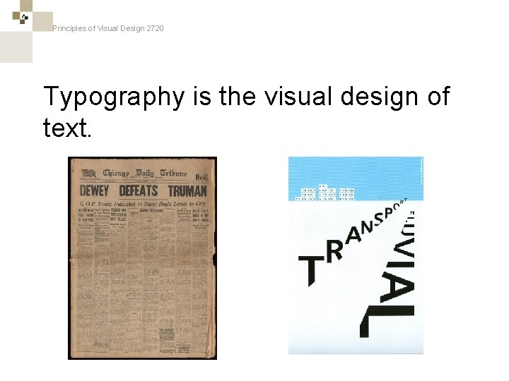
Principles of Visual Design 2720 Typography is the visual design of text.

Principles of Visual Design 2720 Text-heavy typography…

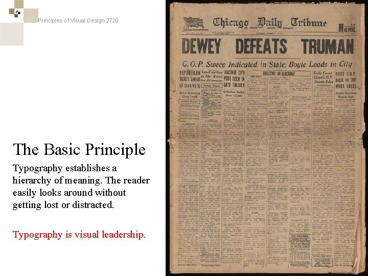
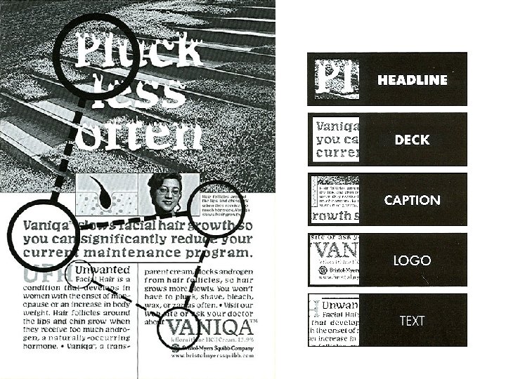
Principles of Visual Design 2720 The Basic Principle Typography establishes a hierarchy of meaning. The reader easily looks around without getting lost or distracted. Typography is visual leadership.

Principles of Visual Design 2720 Image-heavy typography…

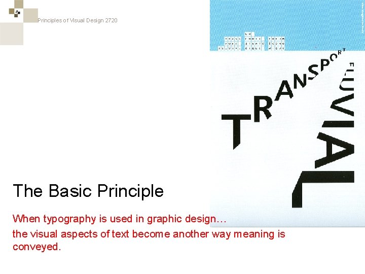
Principles of Visual Design 2720 The Basic Principle When typography is used in graphic design… the visual aspects of text become another way meaning is conveyed.

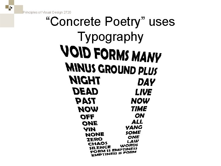
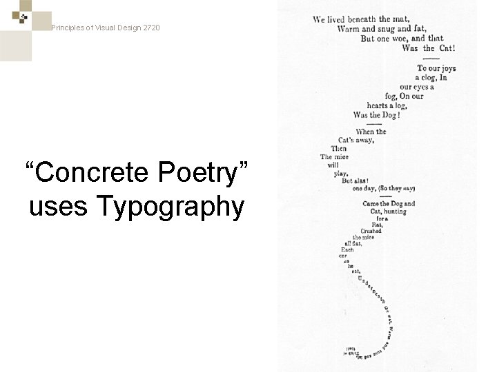
Principles of Visual Design 2720 “Concrete Poetry” uses Typography

Principles of Visual Design 2720 “Concrete Poetry” uses Typography

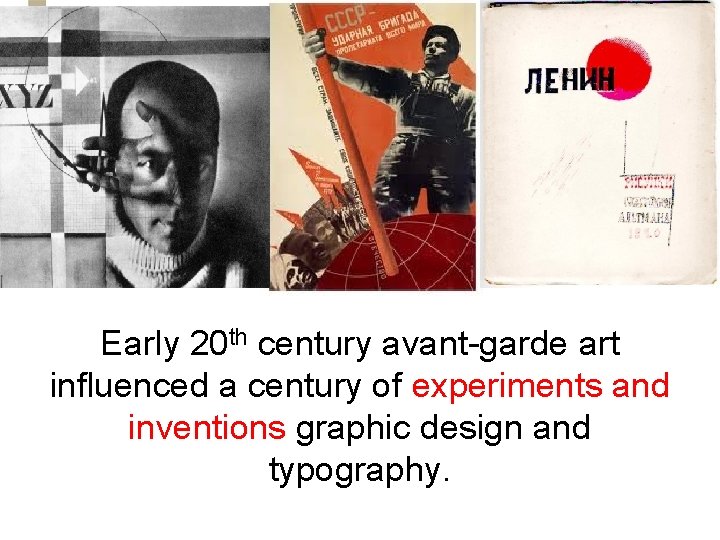
Principles of Visual Design 2720 Early 20 th century avant-garde art influenced a century of experiments and inventions graphic design and typography.

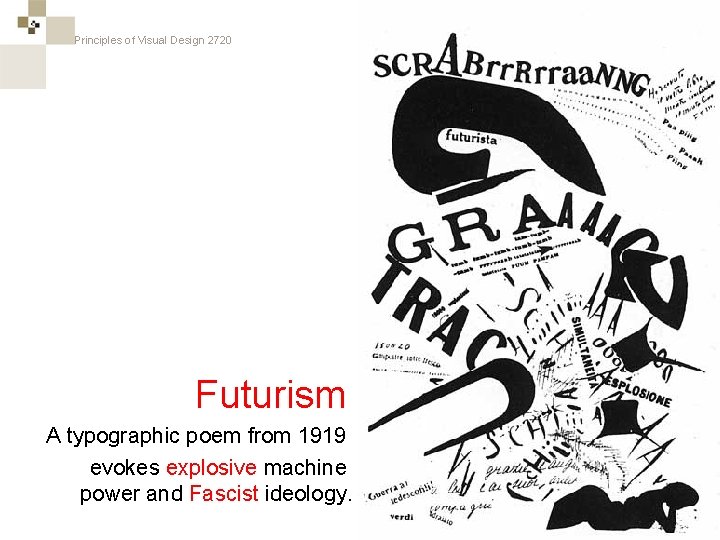
Principles of Visual Design 2720 Futurism A typographic poem from 1919 evokes explosive machine power and Fascist ideology.

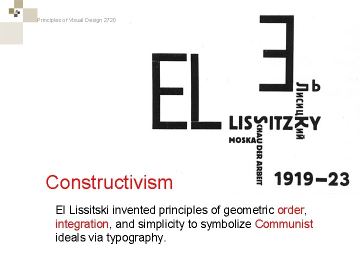
Principles of Visual Design 2720 = Constructivism El Lissitski invented principles of geometric order, integration, and simplicity to symbolize Communist ideals via typography.

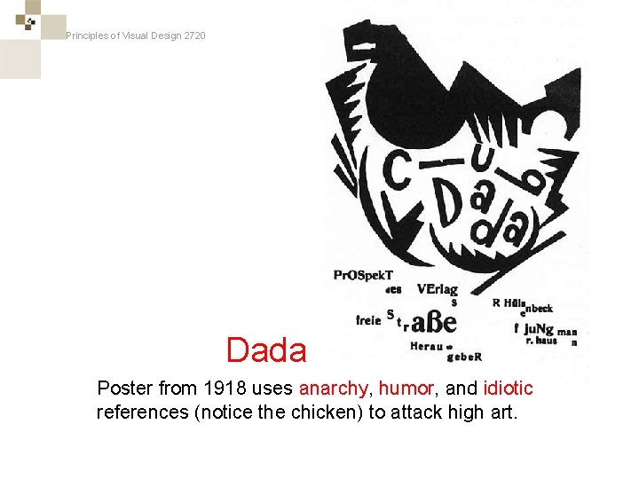
Principles of Visual Design 2720 Dada Poster from 1918 uses anarchy, humor, and idiotic references (notice the chicken) to attack high art.

Principles of Visual Design 2720 Logos use typography in obvious ways…

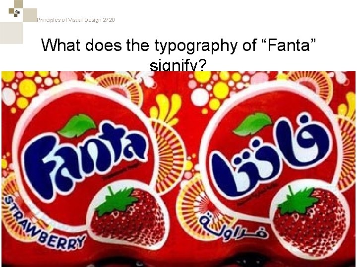
Principles of Visual Design 2720 What does the typography of “Fanta” signify?

Principles of Visual Design 2720 Logos use typography in subtle ways…

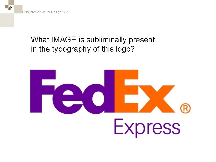
Principles of Visual Design 2720 What IMAGE is subliminally present in the typography of this logo?

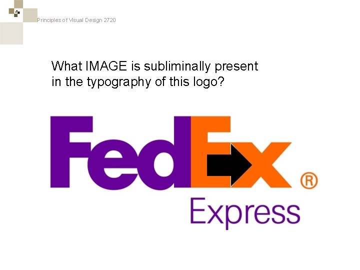
Principles of Visual Design 2720 What IMAGE is subliminally present in the typography of this logo?

Principles of Visual Design 2720

Principles of Visual Design 2720 Typefaces and Fonts

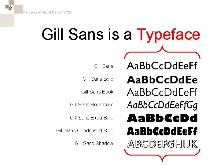
Principles of Visual Design 2720 Gill Sans is a Typeface Gill Sans Bold Gill Sans Book Italic Gill Sans Extra Bold Gill Sans Condensed Bold Gill Sans Shadow

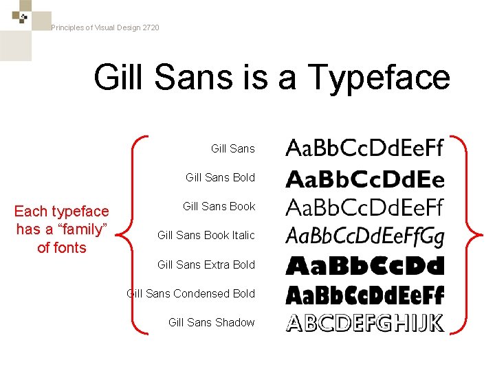
Principles of Visual Design 2720 Gill Sans is a Typeface Gill Sans Bold Each typeface has a “family” of fonts Gill Sans Book Italic Gill Sans Extra Bold Gill Sans Condensed Bold Gill Sans Shadow

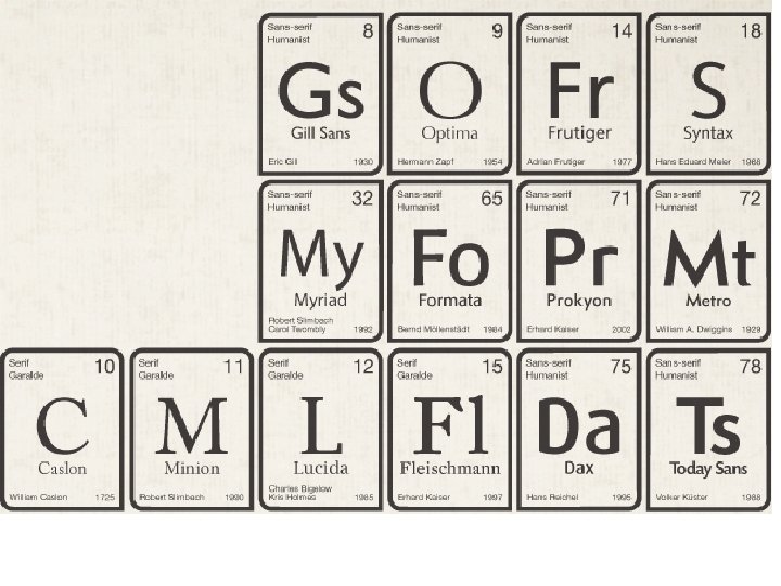
Principles of Visual Design 2720 You should be able to name at least 5 typefaces and understand when and how to use them.

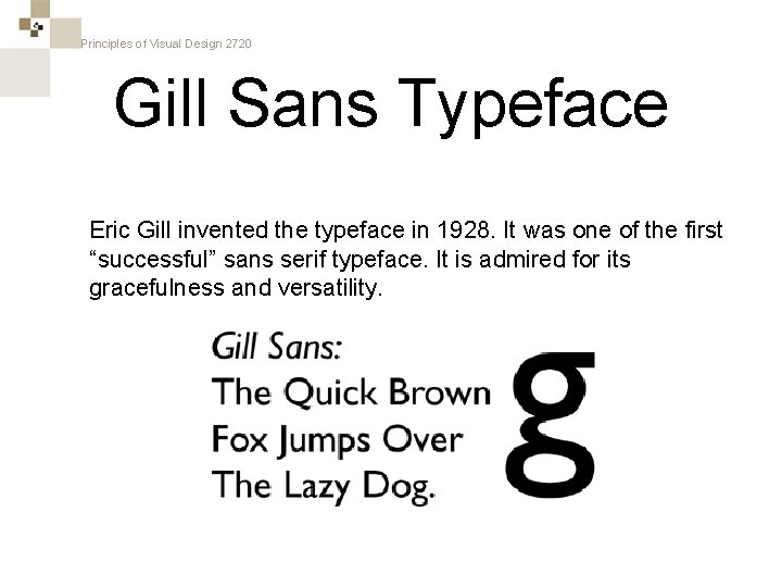
Principles of Visual Design 2720 Gill Sans Typeface Eric Gill invented the typeface in 1928. It was one of the first “successful” sans serif typeface. It is admired for its gracefulness and versatility.

Principles of Visual Design 2720 Gill Sans in Logos

Principles of Visual Design 2720 Gill Sans in Logos

Principles of Visual Design 2720

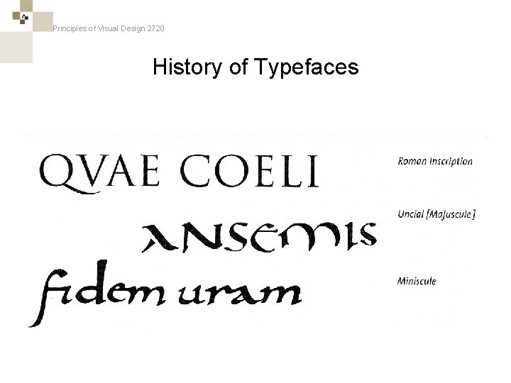
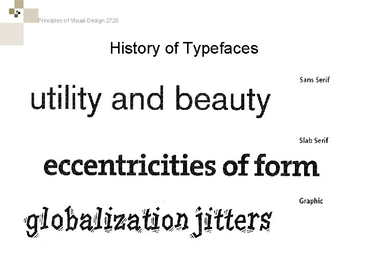
Principles of Visual Design 2720 History of Typefaces

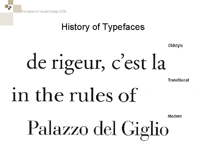
Principles of Visual Design 2720 History of Typefaces

Principles of Visual Design 2720 History of Typefaces

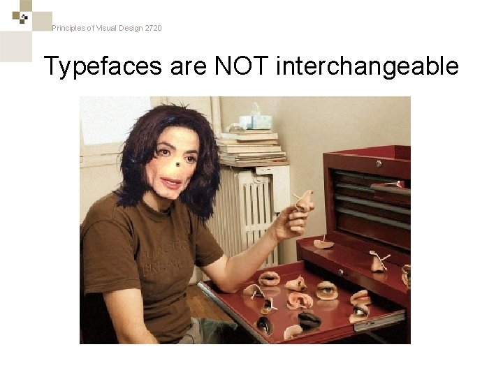
Principles of Visual Design 2720 Typefaces are NOT interchangeable

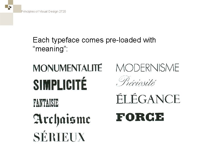
Principles of Visual Design 2720 Each typeface comes pre-loaded with “meaning”:

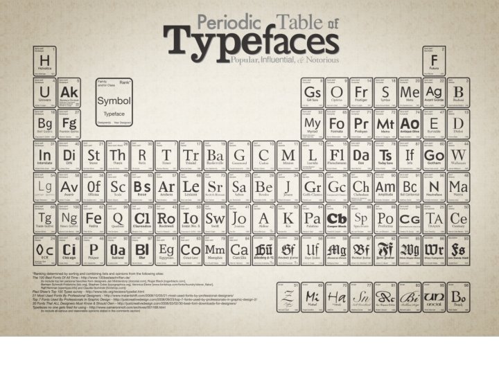
Principles of Visual Design 2720

Principles of Visual Design 2720

Principles of Visual Design 2720 Serif / Sans Serif

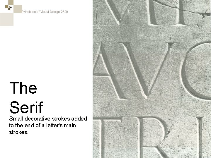
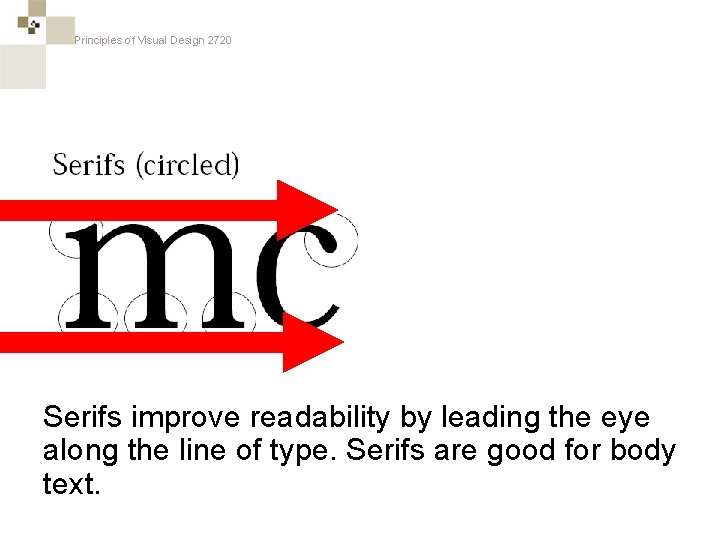
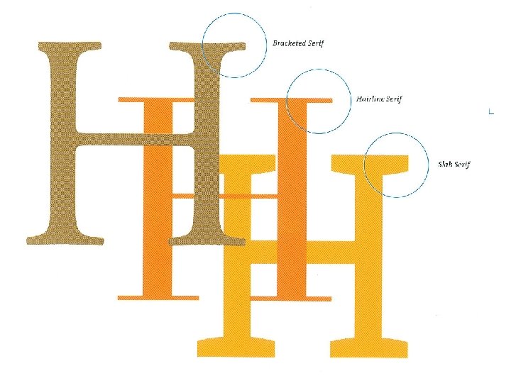
Principles of Visual Design 2720 The Serif Small decorative strokes added to the end of a letter's main strokes.

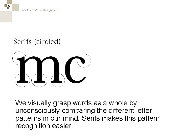
Principles of Visual Design 2720 We visually grasp words as a whole by unconsciously comparing the different letter patterns in our mind. Serifs makes this pattern recognition easier.

Principles of Visual Design 2720 Serifs improve readability by leading the eye along the line of type. Serifs are good for body text.

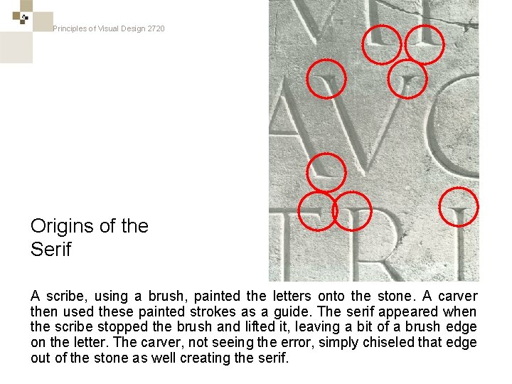
Principles of Visual Design 2720 Origins of the Serif A scribe, using a brush, painted the letters onto the stone. A carver then used these painted strokes as a guide. The serif appeared when the scribe stopped the brush and lifted it, leaving a bit of a brush edge on the letter. The carver, not seeing the error, simply chiseled that edge out of the stone as well creating the serif.

Principles of Visual Design 2720

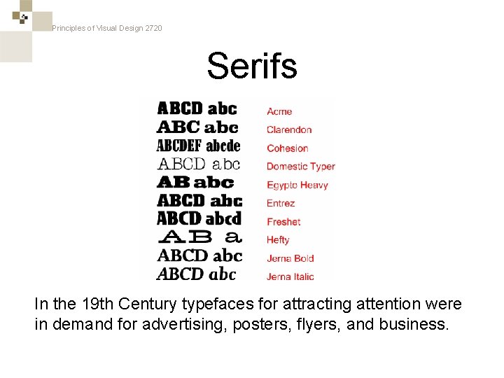
Principles of Visual Design 2720 Serifs In the 19 th Century typefaces for attracting attention were in demand for advertising, posters, flyers, and business.

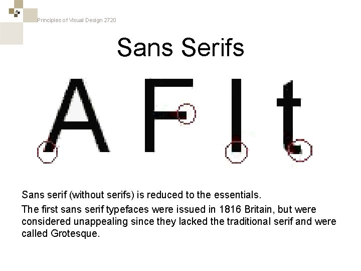
Principles of Visual Design 2720 Sans Serifs Sans serif (without serifs) is reduced to the essentials. The first sans serif typefaces were issued in 1816 Britain, but were considered unappealing since they lacked the traditional serif and were called Grotesque.

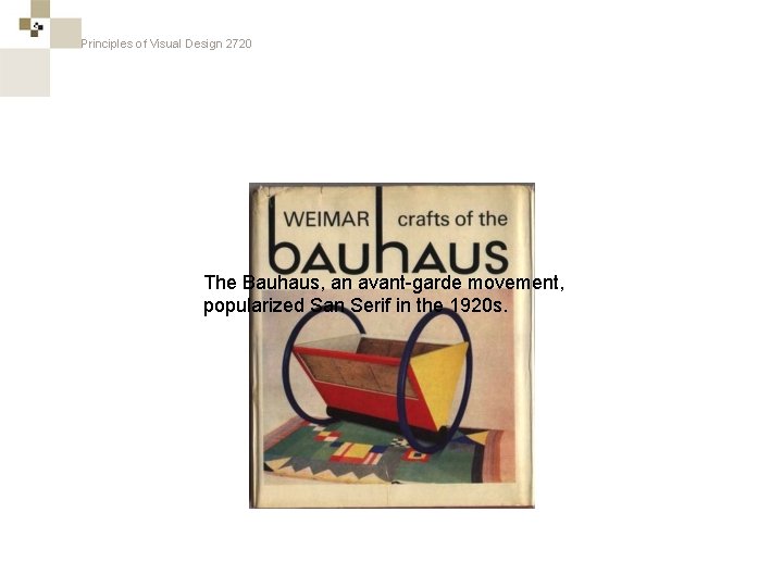
Principles of Visual Design 2720 The Bauhaus, an avant-garde movement, popularized San Serif in the 1920 s.

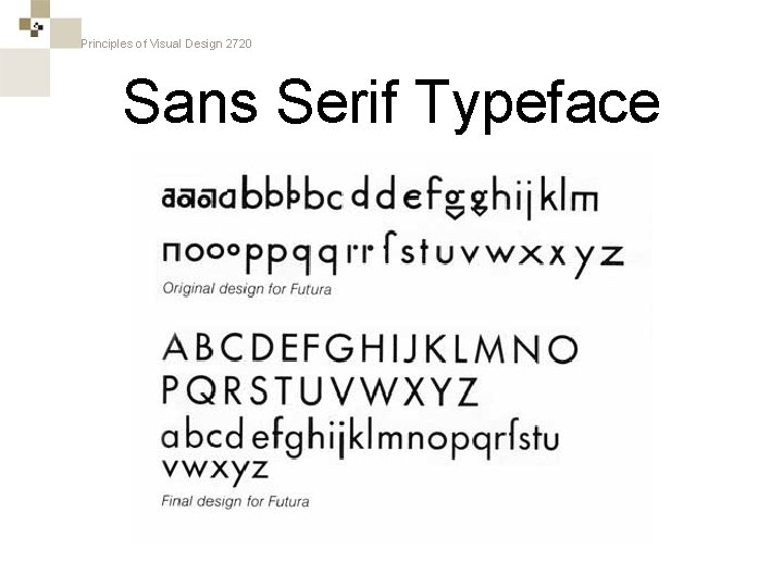
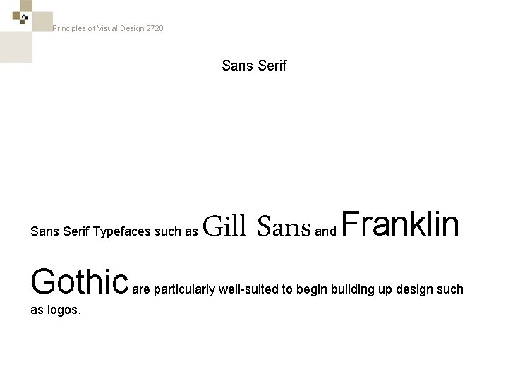
Principles of Visual Design 2720 Sans Serif Typeface

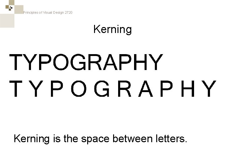
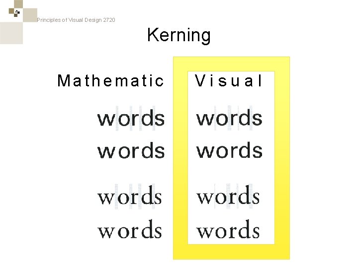
Principles of Visual Design 2720 Kerning

Principles of Visual Design 2720 Kerning is the space between letters.

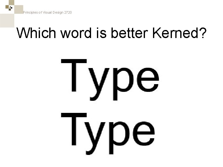
Principles of Visual Design 2720 Which word is better Kerned?

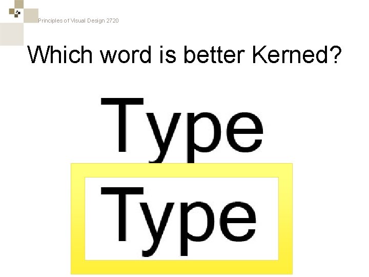
Principles of Visual Design 2720 Which word is better Kerned?

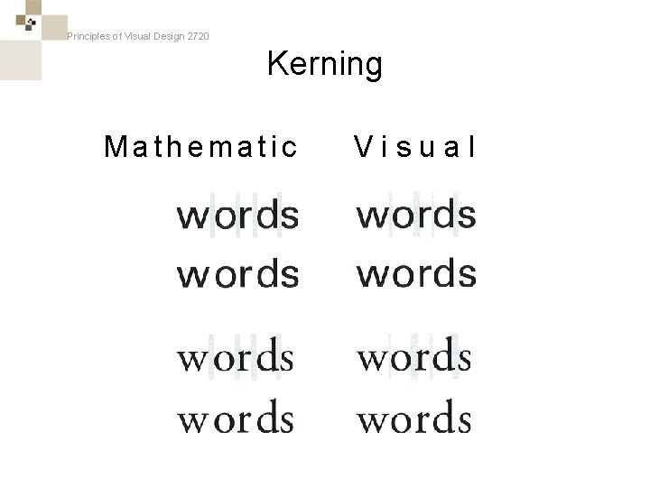
Principles of Visual Design 2720 Kerning Mathematic Visual

Principles of Visual Design 2720 Kerning Mathematic Visual

Principles of Visual Design 2720 Sans Serif Typefaces such as Gothic as logos. Gill Sans and Franklin are particularly well-suited to begin building up design such

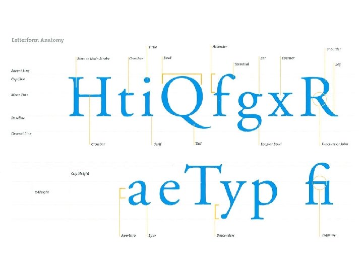
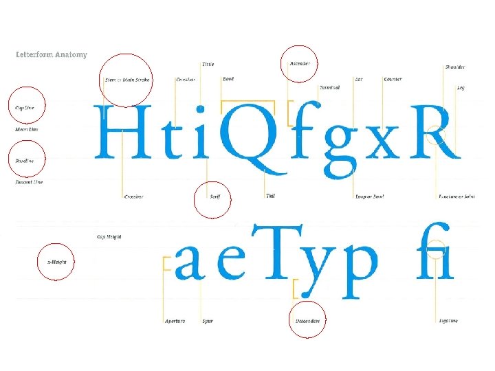
Principles of Visual Design 2720 Anatomy of Text

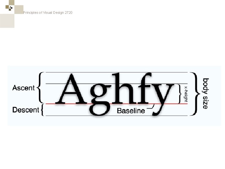
Principles of Visual Design 2720

Principles of Visual Design 2720

Principles of Visual Design 2720

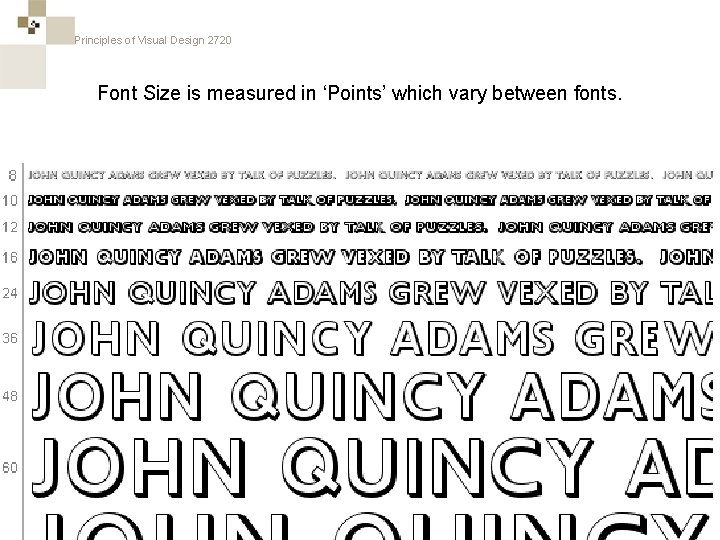
Principles of Visual Design 2720 Font Size is measured in ‘Points’ which vary between fonts. • c

Principles of Visual Design 2720

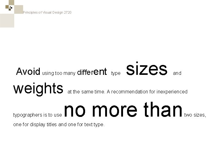
Principles of Visual Design 2720 Avoid using too many different weights typographers is to use type sizes and at the same time. A recommendation for inexperienced no more than one for display titles and one for text type. two sizes,

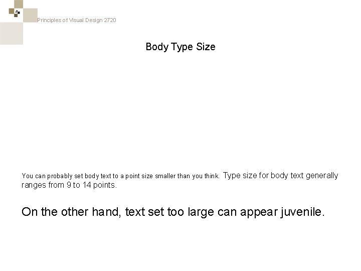
Principles of Visual Design 2720 Body Type Size You can probably set body text to a point size smaller than you think. Type size for body text generally ranges from 9 to 14 points. On the other hand, text set too large can appear juvenile.

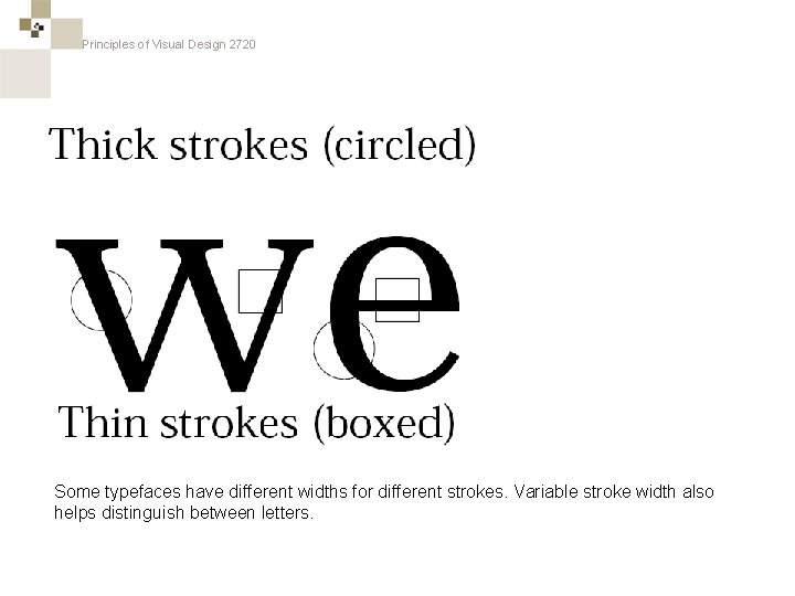
Principles of Visual Design 2720 Some typefaces have different widths for different strokes. Variable stroke width also helps distinguish between letters.

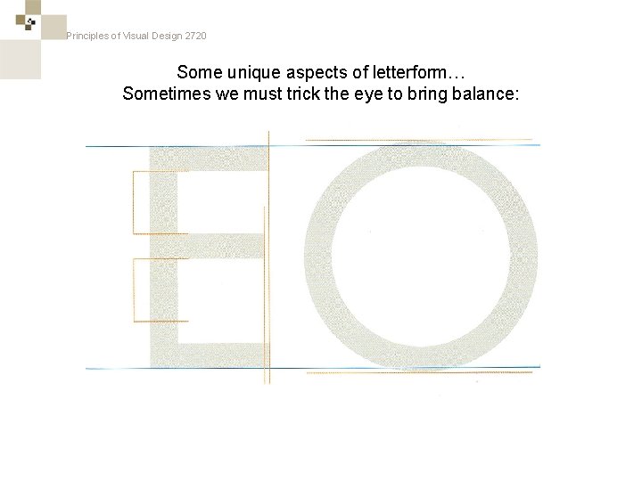
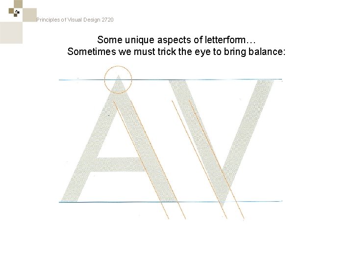
Principles of Visual Design 2720 Some unique aspects of letterform… Sometimes we must trick the eye to bring balance:

Principles of Visual Design 2720 Some unique aspects of letterform… Sometimes we must trick the eye to bring balance:

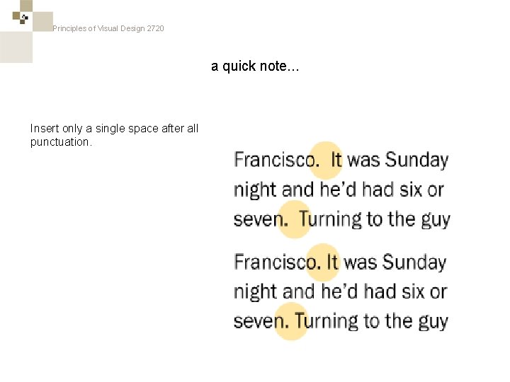
Principles of Visual Design 2720 a quick note. . . Insert only a single space after all punctuation.

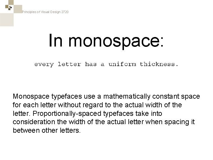
Principles of Visual Design 2720 In monospace: Monospace typefaces use a mathematically constant space for each letter without regard to the actual width of the letter. Proportionally-spaced typefaces take into consideration the width of the actual letter when spacing it between other letters.

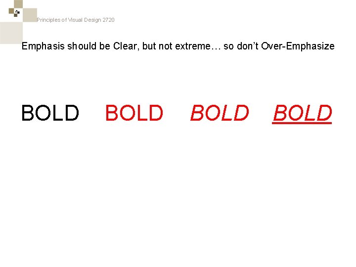
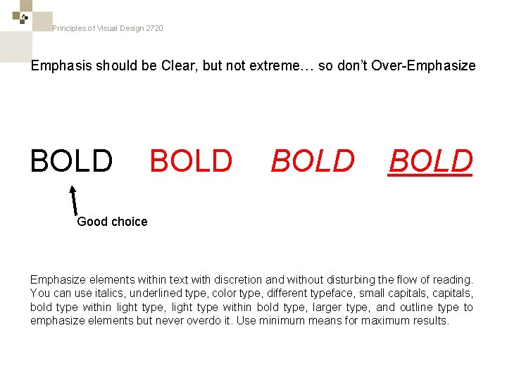
Principles of Visual Design 2720 Emphasis should be Clear, but not extreme… so don’t Over-Emphasize BOLD

Principles of Visual Design 2720 Emphasis should be Clear, but not extreme… so don’t Over-Emphasize BOLD Good choice Emphasize elements within text with discretion and without disturbing the flow of reading. You can use italics, underlined type, color type, different typeface, small capitals, bold type within light type, light type within bold type, larger type, and outline type to emphasize elements but never overdo it. Use minimum means for maximum results.

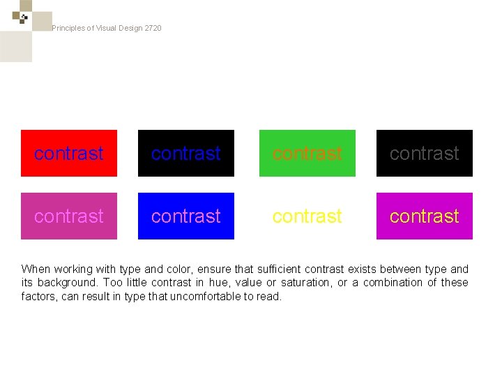
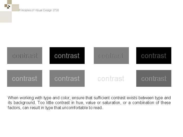
Principles of Visual Design 2720 contrast contrast When working with type and color, ensure that sufficient contrast exists between type and its background. Too little contrast in hue, value or saturation, or a combination of these factors, can result in type that uncomfortable to read.

Principles of Visual Design 2720 contrast contrast When working with type and color, ensure that sufficient contrast exists between type and its background. Too little contrast in hue, value or saturation, or a combination of these factors, can result in type that uncomfortable to read.

Principles of Visual Design 2720

Principles of Visual Design 2720

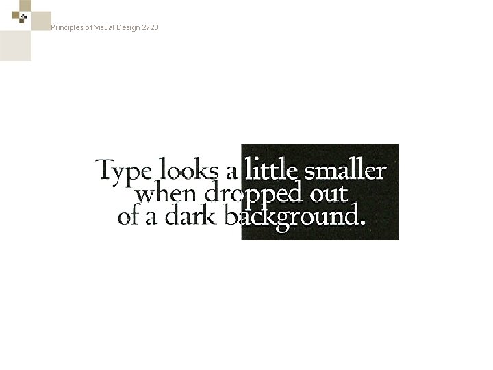
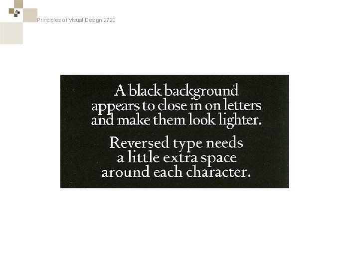
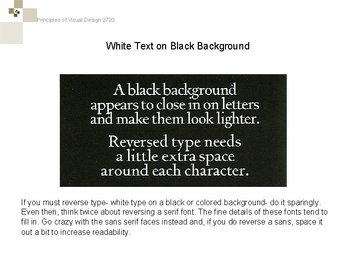
Principles of Visual Design 2720 White Text on Black Background If you must reverse type- white type on a black or colored background- do it sparingly. Even then, think twice about reversing a serif font. The fine details of these fonts tend to fill in. Go crazy with the sans serif faces instead and, if you do reverse a sans, space it out a bit to increase readability.

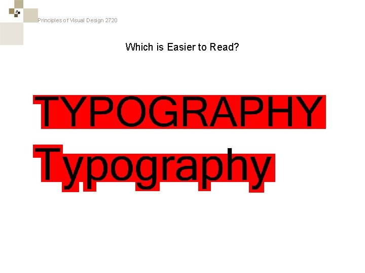
Principles of Visual Design 2720 Which is Easier to Read?

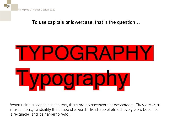
Principles of Visual Design 2720 To use capitals or lowercase, that is the question… When using all capitals in the text, there are no ascenders or descenders. They are what makes it easy to identify the shape of a word. The shape of almost every word becomes a rectangle, and it's harder to read.

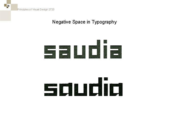
Principles of Visual Design 2720 Negative Space in Typography

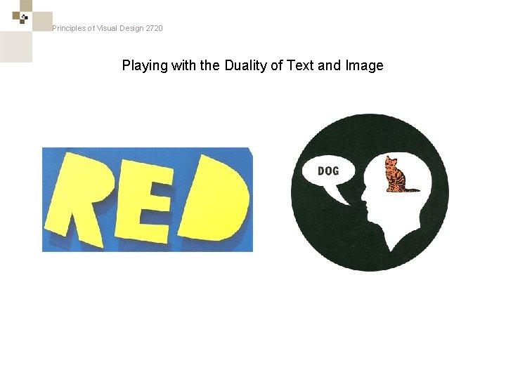
Principles of Visual Design 2720 Playing with the Duality of Text and Image

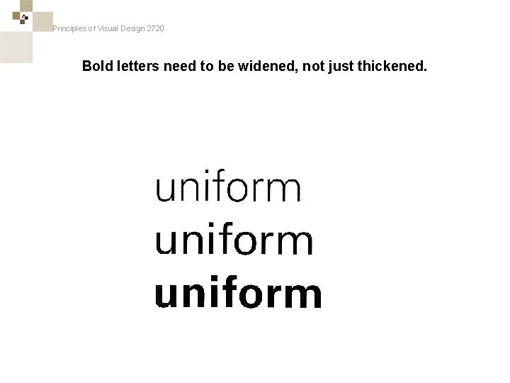
Principles of Visual Design 2720 Bold letters need to be widened, not just thickened.

Principles of Visual Design 2720

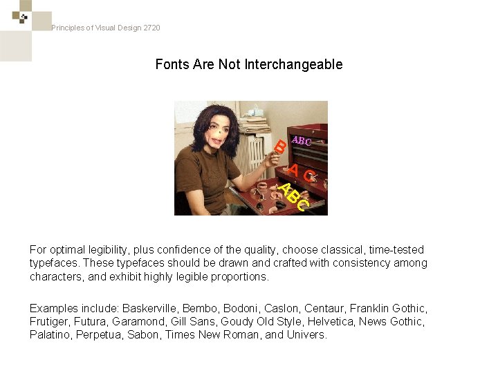
Principles of Visual Design 2720 Fonts Are Not Interchangeable B ABC AC C B A For optimal legibility, plus confidence of the quality, choose classical, time-tested typefaces. These typefaces should be drawn and crafted with consistency among characters, and exhibit highly legible proportions. Examples include: Baskerville, Bembo, Bodoni, Caslon, Centaur, Franklin Gothic, Frutiger, Futura, Garamond, Gill Sans, Goudy Old Style, Helvetica, News Gothic, Palatino, Perpetua, Sabon, Times New Roman, and Univers.

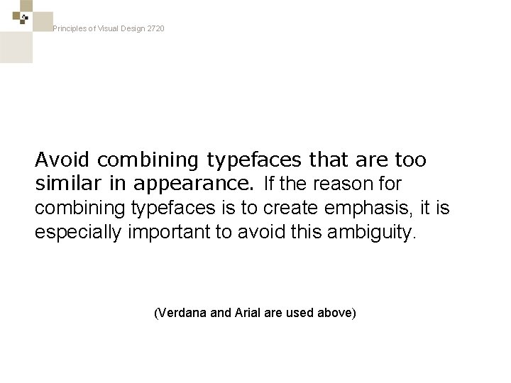
Principles of Visual Design 2720 Avoid combining typefaces that are too similar in appearance. If the reason for combining typefaces is to create emphasis, it is especially important to avoid this ambiguity. (Verdana and Arial are used above)

Principles of Visual Design 2720 The Soft Limit of Typefaces Per Design is: 2 The main reason for using more than one typeface is to create emphasis or to separate one part of the text from another. When too many different typefaces are used, the reader is unable to determine what is and what is not important.

Principles of Visual Design 2720

Principles of Visual Design 2720 Questions? ?