Principles of Design The principles use the elements


 and filled space ◦ Text and images ◦ Color")


 over and over")


 and decorative art (which")


 v. Use Color v. Place information in")


- Slides: 121
Principles of Design The principles use the elements of design to create a composition.
Elements of Design The building blocks of design.
Balance is the act of comparing or estimating two things, one against the other, and the contrast between:
Balance �Balance is a feeling of visual equality in shape, form, value, color, etc. Balance can be symmetrical or evenly balanced or asymmetrical and un-evenly balanced. Objects, values, colors, textures, shapes, forms, etc. , can be used in creating a balance in a composition.
◦ Empty space (white space) and filled space ◦ Text and images ◦ Color and no colors and different colors ◦ Textures against flat colors Balance
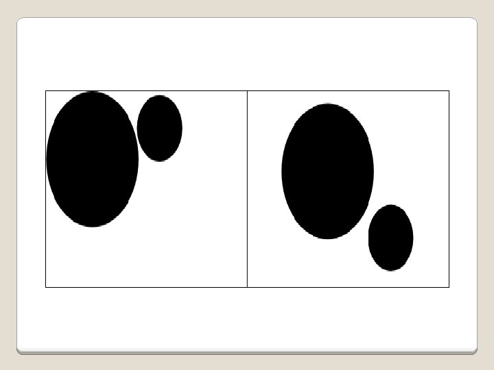
�There are three different types of balance when using color, shape, and position: ◦ Symmetry ◦ Asymmetry ◦ Radial symmetry Balance in composition
Examples of radial balance
�What is it and how is it achieved on a flat surface? To answer this question, we must first think of a three dimensional work of art. �If the pieces were not physically balanced or anchored, they would fall over. Balance
�For images created on a flat surface such as a canvas the same principle of balance applies. �However, instead of having actual or physical balance, the artist needs to create an illusion of balance, referred to as visual balance. Balance
�In visual balance, each area of the painting suggests a certain visual weight, a certain degree of lightness or heaviness. �For example, light colors appear lighter in weight than dark colors. �Brilliant colors visually weigh more than neutral colors in the same areas. Balance
�Warm colors, such as yellow tend to expand an area in size, whereas cool colors like blue tend to contract an area. �And transparent areas seem to visually weigh less than opaque areas. Balance
Balance �Balancing the components of a painting can best be illustrated by weighing scales or a child's playground see-saw. �Visually the scale can be pictured as an apparatus for weighing or a see-saw which has a beam poised on a central pivot or fulcrum.
�In using this scale or see-saw, balance is not achieved through an actual physical weighing process, but through visual judgment on the part of the observer. �In this respect, visual balance refers to a "felt" optical equilibrium between all parts of the painting. Balance
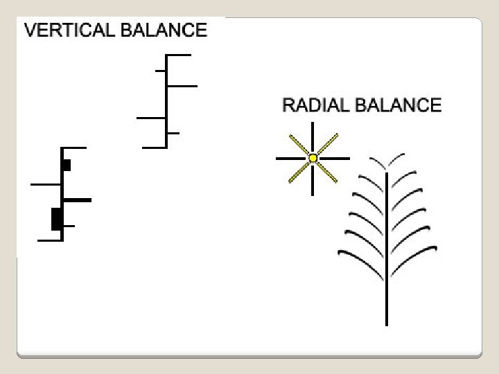
To balance a composition is to distribute its parts in such a way that the viewer is satisfied that the piece is not about to pull itself over. When components are balanced left and right of a central axis they are balanced horizontally. When they are balanced above and below they are said to be balanced vertically. And when components are distributed around the center point, or spring out from a central line, this is referred to as radial balance.
There are two forms of visual balance. These are symmetrical balance, also known as symmetry or formal balance, and asymmetrical balance, also known as asymmetry or informal balance.
Symmetrical balance �Symmetrical balance is when the weight is equally distributed on both sides of the central axis. �Symmetry is the simplest and most obvious type of balance. It creates a secure, safe feeling and a sense of solidity. �Symmetrical balance can be achieved in two ways. �One way is by "pure symmetry, " and the other way is by "approximate symmetry. "
Symmetrical balance �In pure symmetry identical parts are equally distributed on either side of the central axis in mirror-like repetition. �A good example of pure symmetry is the human face. It is the same on both the right side and the left side of the nose. �Pure symmetry has its place in certain art works, however, because of its identical repetition, pure symmetry for a composition can easily become too monotonous and uninteresting to look at.
Symmetrical balance �Approximate symmetry on the other hand has greater appeal and interest for the viewer. �The two sides of a composition are varied and are more interesting to view. �Even though they are varied somewhat, they are still similar enough to make their repetitious relationship symmetrically balanced.
Symmetrical or formal balance �You can usually identify at least one of three lines of symmetry. ◦ Horizontal ◦ Vertical ◦ Diagonal
Symmetrical balance
Examples of symmetrical balance
Examples of asymmetrical balance
�The use of asymmetry in design allows for more freedom of creativity, because there are unlimited arrangements that may be devised using asymmetrical balance. Asymmetrical Balance
�The way to use asymmetry is by balancing two or more unequal components on either side of the fulcrum by varying their size, value or distance from the center. Asymmetrical Balance
�Asymmetrical balance is when both sides of the central axis are not identical, yet appear to leave the same visual weight. �It is a "felt" equilibrium or balance between the parts of a composition rather than actual. Asymmetrical Balance
�If the artist can feel, judge or estimate the various elements and visual weight, this should allow him/her to balance them as a whole. �As a result, a more interesting composition will occur in the work.
This flower resting a tea cup on the left is a good example of radial balance. The pedals radiate out from a central point. On this side radial balance is created by the flowers which spring out of the center of the vase. Examples of The Effective Use Of Balance
Horizontal Balance
Vertical Balance Do you see the vertical balance suggested in the painting on the left? Look at where the foreground ends and you will quickly see how it is balanced by the building in the background This painting on the right is a little more obvious in it's vertical balance. Notice how the three objects in the top part of the painting balance the apparent heaviness of the one object (the plate of pancakes) in the lower part of the painting.
Contrast is the juxtaposition of opposing elements
“The difference in brightness between the light and dark areas of a picture, such as a photograph or video image ” “The use of opposing elements, such as colors, forms, or lines, in proximity to produce an intensified Contrast effect in a work of art “
Example of Nature Contrast
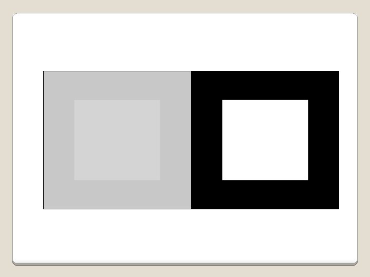
Contrast �Contrast in art and design occurs when two related elements are different. �The greater the difference the greater the contrast. Contrast adds variety to the total design and creates unity. �It is what draws the viewer's eye into the painting and helps to guide the viewer around the art piece.
� Contrast in art also adds visual interest. Most designs require a certain amount of contrast. Too much similarity of the components in any design becomes monotonous. � In other words the use of too little contrast can cause a design to be bland uninteresting. � On the other hand too much contract can be confusing. Just the right amount of contrast engages the viewer's participation in comparing various components of the work. Contrast
�For instance, the viewer will compare light and dark areas of a painting, wide lines and thin lines, light-weight forms and heavy forms, filled spaces and unfilled spaces, etc. �The key to working with contrast is to make sure the differences are obvious. The most common ways of creating contrast are by creating differences in: Contrast
�The key to working with contrast is to make sure the differences are obvious. The most common ways of creating contrast are by creating differences in: • size • value • color • type • texture • shape • alignment • direction • movement Contrast
In the painting on the left is another example of contrast between light and darkness. Contrast in the painting on the right is much more subtle. Contrast this painting is in texture. Notice the hard texture on the fence as contrasted with the softness of the butterflies and the kittens. Also a contrast exists between the soil and the foliage.
Contrast The contrast in the illustration to the left is quite obvious. Notice the contrast of the light background (wall) with dark foreground (table cloth) and the contrast of the dark shadows on the tea pot and cup against the wall and with the lights of the same objects against a dark window. There is also a contrast of thin and thick lines in the napkin, straight and curved lines, and don't miss the dark steam as contrasted with the light clouds off in the distance On the right a contrast exists between the lights and darks. Also notice the contrast of the roundness of the objects in the foreground against the flatness of the background.
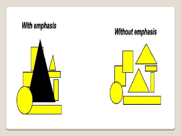
Emphasis is used to make certain parts of their artwork stand out and grab your attention. The center of interest or focal point is the place a work draws your eye to first.
Emphasis: To express with particular stress or force. What message is stressed here?
Emphasis � Emphasis is the stressing of a particular area of focus rather than the presentation of a maze of details of equal importance. When a composition has no emphasis nothing stands out. However the effective use of emphasis calls attention to important areas of the painting. By placing emphasis on certain areas of the composition, an artist creates elements of interest which causes the eye to return to again and again. �
Emphasis � One way of achieving emphasis is by creating center of interest, a. k. a. a focal point. � A focal point is an area where the eye tends to center. It is the focus of the viewer's attention. � A focal point is created by making one area of element of the painting dominant, or most important visually with all other areas contributing but subordinate. � is canceled out.
�The focal point may be the largest, brightest, darkest, or most complex part of the whole, or it may get special attention because it stands out for some other reason. �No more than one component should vie for primary attention. Where several components get equal billing, emphasis Emphasis
�The second way to create emphasis is by contrasting the primary element with its subordinates, or emphasis can be created by a sudden change in direction, size, shape, texture, color, tone or line. Emphasis
�No matter what element is chosen for emphasis it should never demand all the attention. �Emphasis is necessary, but a good composition is one in which all the elements work together for a unifying effect. Emphasis
In this painting it is easy to see how the artist used light to emphasize the chef. He stands out as the main focal point of the entire the painting. The artist created emphasis in this painting through the use of color. By painting the cowboy's shirt red he was able to create a center of interest.
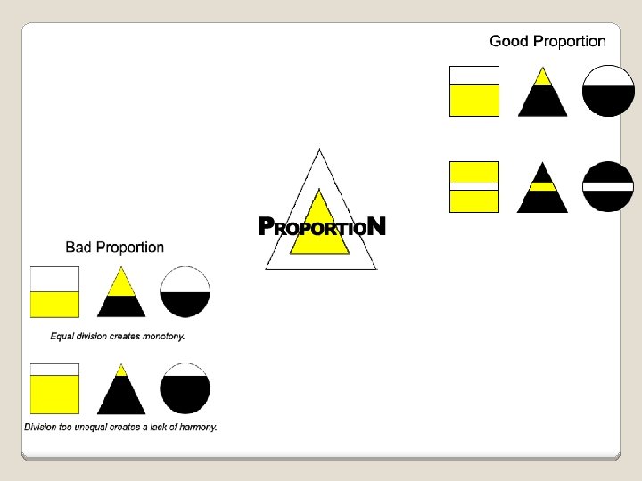
Proportion describes the size, location or amount of one thing compared to another.
�Proportion in art is the comparative harmonious relationship between two or more elements in a composition with respect to size, color, quantity, degree, setting, etc. ; i. e. ratio. �A relationship is created when two or more elements are put together in a painting. Proportion
�This relationship is said to be harmonious when a correct or desirable relationship exists between the elements. �This refers to the correct sizing and distribution of an element or object which creates good proportion. �Good proportion adds harmony and symmetry or balance among the parts of a design as a whole. Proportion
�When the principle of proportion is applied to a work of art it is usually in the relationship of size. �That is, the size of one element of the composition as compared to the size of another related element. Proportion
Proportion �In the instance of a relationship of size a comparison is made between the: ◦ height, width and depth of one element to that of another ◦ size of one area to the size of another area ◦ size of one element to the size of another element ◦ amount of space between two or more elements
Proportion �Proportion is usually not even noticed until something is out of proportion. When the relative size of two elements being compared seems wrong or out of balance it is said to be "out of proportion". �For example if a person has a head larger than their entire body, then we would say that they were out of proportion.
� There are several ways for achieving good proportion: � Place together elements which are similar in character or have some feature in common. � Create major and minor areas in the design, as equal parts can quickly become monotonous and boring. However, the differences in size must not be so great as to make the parts appear unrelated and therefore, out of harmony with each other. Good Proportion
� Arrangement of space should be in such a way that the eye does not perceive a standard mathematical relationship. Dividing up the composition in halves, quarters and thirds should be avoided. A subtle relationship creates a more dynamic design. � Create harmony in the art work. Harmony is an agreement between the shapes that stresses the similarities of all parts. In other words, the shape of one part should "fit" the shape of the adjoining elements. Shapes should "fit" properly in their positions and spaces. Good Proportion
In the two paintings above proportion emphasizes the distance of the ship and the vastness of the ball room. There is a real sense of proportion in each of the two paintings above. Without the effective use of the principle of proportion you would not experience the majesty of the mountain cliffs in the painting on the left or the towering height of the trees in the painting on the right.
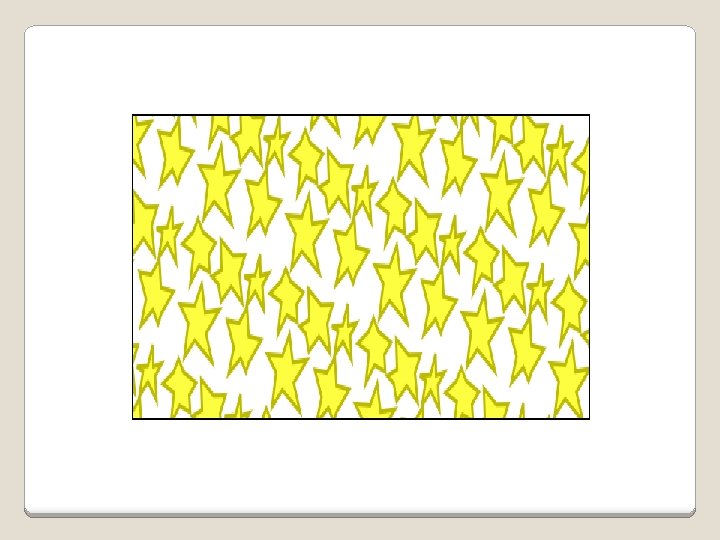
Pattern is created by repeating an element (line, shape or color) over and over again.
Gradation of size and direction produce linear perspective. Gradation of color from warm to cool and tone from dark to light produce aerial perspective. Gradation can add interest and movement to a shape. A gradation from dark to light will cause the eye to move along a shape.
Graphic design principles are ways in which elements are used together. Movement Balance Emphasis Unity
MOVEMENT Movement is the use of lines, color, and repetition to create the illusion of motion.
�Curved forms or lines �Repetition of geometric forms �Fuzzy lines or outlines Movement
Alignment “Nothing should be placed on the page arbitrarily. Every item should have a visual connection with something else on the page. ”
Alignment No element has any connection to the others. § Elements aligned
Alignment Here’s a pretty standard layout, centered.
Alignment But look how much crisper it looks with alignment, plus some thought about proximity.
Alignment Trapped white space pushes elements apart Does the text go with the cartoon, or are they independent chunks of information? The ragged right type seems to separate the elements.
Alignment “Find a strong line and use it. ” Flush right type makes use of image’s border. Change the alignment, and it becomes obvious that they go together. Note the strong lines Robin Williams uses in this example to get alignment. Flush right type, strong vertical line on the cartoon.
Alignment “Find a strong line and use it. ” Flush right type makes use of image’s border. Change the alignment, and it becomes obvious that they go together. Note the strong lines Robin Williams uses in this example to get alignment. Flush right type, strong vertical line on the cartoon.
Repetition Repeat some aspect of the design throughout the entire piece. ”
Repetition When you get to the end of the information, does your eye just wander off the card? Here we go with the band again. Not a bad card, right? But note the question here: Now look at the change. . .
Repetition Repeated bold type encourages reader to “bounce” between the two dominant typefaces Boldfacing that number, so it pairs with the headline, really makes it jump, and it hold your eye on the information.
Proximity “Proximity, or closeness, implies a relationship. ”
Key idea: “Group related items together” Proximity
Proximity Solution: Contents are grouped Contrast is added with headlines/rules
Problem: Reader’s eye must bounce all around card to obtain information Proximity
Proximity Solution: Group together related elements
Proximity Problems: The two items in top left are in close proximity but not related Gaps separate related items
Proximity Solution: Regroup information Change to caps/lowercase Use squared edges Let image break out of box
Proximity Problem: Everything is close to everything else
Scale Dimensional element's defined by other elements of design-size relative to other art, its surroundings, or in relation to human size.
� �Unusual or even unexpected scale can certainly be used as a attention grabber. �Another consideration for size and scale is to look at the elements within the creation itself. �. Scale
Scale �Scale can attract in different ways. It can be use to draw attention to the unexpected or exaggerated - this is often the case in advertising. �Changing the natural scale is certainly not unusual. It is frequently used in religious painting
Scale �A scale model is a physical model, a representation or copy of an object that is larger or smaller than the actual size of the object, which seeks to maintain the relative proportions (the scale factor) of the physical size of the original object.
Scale
Scale
Scale
Scale Very often the scale model is smaller than the original and used as a guide to making the object in full size. Scale models are built or collected for many reasons.
Variety A way of accomplishing this is to establish an approach which involves theme and variations-repeating the same image, but in different sizes, colors, values and shapes.
Variety By varying the components of a visual design, the artist creates interest and avoids monotony.
Harmony
Examples of the effective use of Harmony It is easy to observe harmony in action in nature. Notice how the individual wedges "fit" the orange in the painting above. In the coat of arms above we observe how the different elements "fit" together perfectly inside each other to create harmony.
Realistic, Stylized, Abstract The less a work of art resembles something in the physical world, the more stylized it is.
One of the fundamental properties of visual art is the degree to which it is realistic or stylized (abstract). Realistic, Stylized, Abstract
realism ◄—————————-------► stylization A very realistic statue. A significantly stylized statue; note the rigid facial expression, stiff posture, and patterned hair texture. An extremely stylized sculpture One of the fundamental properties of visual art is the degree to which it is realistic or stylized (abstract). The less a work of art resembles something in the physical world, the more stylized it is.
realism ◄—————————-------► stylization A very realistic painting A significantly stylized painting; note the simplified/distorted shapes and colors. A completely stylized painting Art that resembles nothing in the physical world is called abstract, while art that portrays something recognizable (however distorted) is called representational.
One can also distinguish narrative art (which tells a story) and decorative art (which doesn't). A decorative work can be abstract or representational. A story (in the usual sense), however, can only be told through representational art. Abstract art is inherently decorative This representational art is decorative: the octopus is not doing anything, it is simply "there". This representational art is narrative: the figures are involved in an action/story.
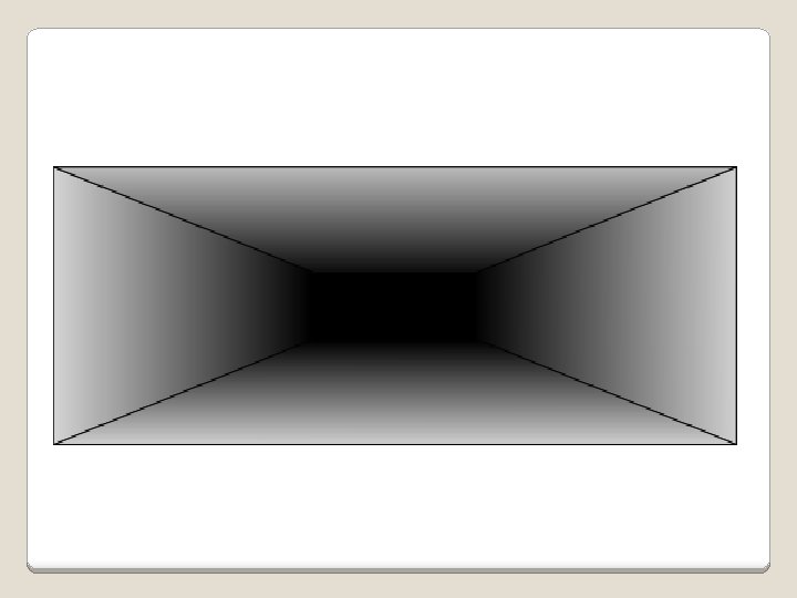
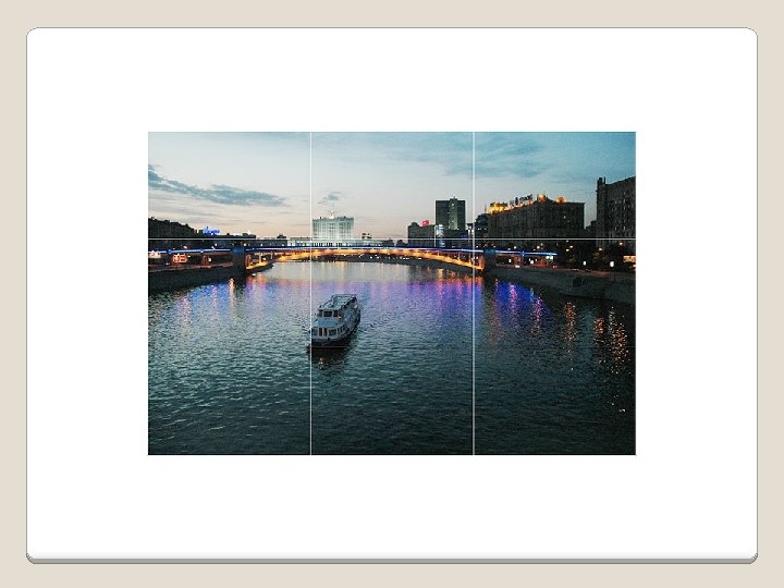
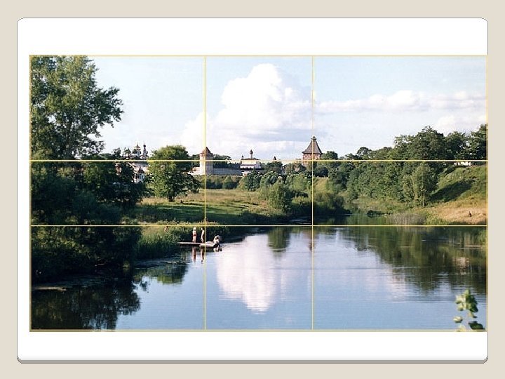
Rule of Thirds The Rule of Thirds is based on the fact that the human eye is naturally drawn to a point about two-thirds up a page. Crop your photo so that the main subjects are located around one of the intersection points rather than in the center of the image:
More on Rules �rules of composition �the rule of thirds �golden section/rectangle. �harmony �balance �discord �drama.
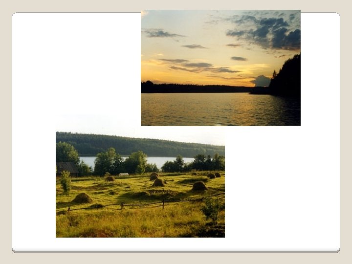
� Your landscapes will be optimally pleasing to the eye if you apply the Rule of Thirds when you place your horizon line. � If the area of interest is land or water, the horizon line will usually be two-thirds up from the bottom. � Alternately, if the sky is the area of emphasis, the horizon line may be one-third up from the bottom, leaving the sky to take up the top twothirds of the picture: Rule of Thirds
�It has been found that certain points in a picture's composition automatically attract the viewer's attention. �Similarly, many natural or man-made objects and scenes with certain proportions (whether by chance or by design) automatically please us. Rule of Thirds
�Leonardo da Vinci investigated the principle that underlies our notions of beauty and harmony and called it the Golden Section. �Long before Leonardo, however, Babylonian, Egyptian, and ancient Greek masters also applied the Golden Section proportion in architecture and art. Golden Section rule
� To get a clearer sense of these special "Golden" composition points, imagine a picture divided into nine unequal parts with four lines. � Each line is drawn so that the width of the resulting small part of the image relates to that of the big part exactly as the width of the whole image relates to the width of the big part. � Points where the lines intersect are the "golden" points of the picture: Golden Section rule
� One side of the picture is divided into two, and then each half is divided into three parts. � The adjacent side is divided so that the lines connecting the resulting points form a diagonal frame. � According to the Diagonal Rule, important elements of the picture should be placed along these diagonals: Diagonal rule
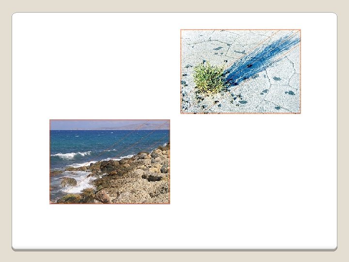
Linear elements, such as roads, waterways, and fences placed diagonally, are generally perceived as more dynamic than horizontally placed ones:
Composition The combining of distinct elements to form a whole
Don’t Be a Wimp (in your designs) v. Use Color v. Place information in frames and boxes (remove the lines) v. Hierarchy, Hierarchy v. Use Clip Art v. Make it to add to your materials FUN for you and your reader!
Solution: § Contrast §Repetition §Alignment § Proximity Contrast, Repetition, Alignment, and Proximity Here is an ad with all four principles being applied. How are they being used here?
Summary �The basis of good graphic design is use of design elements and their thoughtful application in the form of design principles. �Clearly identify what you are trying to accomplish — use design to convey your message. �Brainstorm alternatives.