
Principles of Design Original by Linda Rist Modified
Principles of Design Original by Linda Rist Modified by Georgia Agricultural Education Curriculum Office June, 2002 August 2008
Balance • A. Stability of an arrangement – 1. Arrangement appears secure and stable – 2. Balance must be both visual and actual August 2008
Balance • A. visual balance refers to the way an arrangement appears to the eye. • B. visual balance is achieved by the proper use of plant materials according to size. August 2008
Balance • C. visual weight refers to how heavy an object appears in an arrangement August 2008
Balance • 1. Dark flowers appear heavier than light ones. • 2. Flowers or objects of coarse texture appear heavier than those with a smooth texture. August 2008
Balance • 3. Heavy flowers or objects need to be placed near the base of arrangements. Lighter ones are placed near the edges to give visual balance August 2008
Balance • D. actual or mechanical balance achieved by proper placement of flowers. • E. equal amounts of weight on both sides of the central axis of the arrangement. August 2008
Balance • F. If mechanical balance is not achieved, the arrangement may topple. August 2008
Balance • 3. Symmetrical and Asymmetrical balance are commonly used. August 2008
Balance • Symmetrical or formal- equal visual weight on each side of an imaginary, central, vertical line. August 2008
Balance • 1. Equal visual weight does not have to be expressed by identical materials. The materials are usually very similar. August 2008
Balance • 2. More traditional types of arrangements are based on this type of balance. August 2008
Balance • 3. Symmetrical arrangements should be displayed against a symmetrical background. August 2008
Balance • 4. Arrangements placed on the altar and at the head table at a banquet are usually symmetrically balanced. August 2008
Balance • B. Asymmetrical or informal arrangements- equal visual weight on both sides of the central axis, but each side is different in plant materials and the arrangement. August 2008
Balance • C. Japanese styles of arranging are based on asymmetrical balance. • D. Asymmetrical balance suggests movement to the eye. August 2008
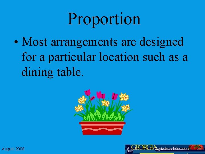
Proportion • Most arrangements are designed for a particular location such as a dining table. August 2008
Proportion • The size of the table and the colors in the room will determine the flowers used the size and shape of the arrangement, and the container chosen. This relationship is known as proportion. August 2008
Proportion • The interrelationship of all parts of an arrangement. – 1. Plant materials should be 1 1/2 times as high as the height of the container or 1 1/2 the width of a low container. (minimum dimensions) August 2008
Proportion – 2. Maximum dimensions depend on the background space and the weight of the material to be used. August 2008
Proportion • A. If the materials to be used are light and airy, the arrangement may be 2 to 3 times or more the height of the container. August 2008
Proportion • B. containers made of sturdy materials and dark colors can hold much larger arrangements. • C. Choose flowers that fit with the size and character of the container. August 2008
Proportion • 3. Scale refers to the relationship between an arrangement and the area in which it is to be displayed. August 2008
Focal Point • Attracts and holds the attention of the viewer. • 1. Also called the center of interest • 2. Located near the place where the stems or lines appear to meet. • 3. Balance requires that the center of interest be near the design base August 2008
Focal Point – 4. There should be only a single focal point in a design. • A. arrangements with more than one create restless movement of the eye. • 1. Unity in the arrangement is destroyed. August 2008

Focal Point • 5. Suggestions for creating a focal point: – Bring the main lines of the design to the point. – Place the largest flower there – Concentrate the plant material in that area August 2008
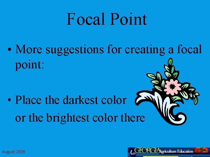
Focal Point • More suggestions for creating a focal point: • Place the darkest color or the brightest color there August 2008
Focal Point • Place strongly contrasting colors or textures at this point • Place an unusually shaped flower there August 2008
Emphasis • A. Closely related to focal point. Focuses the attention on one feature and keeps everything else secondary. • B. Can be created by texture, color, and kind of flower and movement. August 2008
Emphasis • C. In a finished arrangement, different kinds of flowers, foliage and colors compete for dominance and the arrangement loses its interest. August 2008
Emphasis – 1. Uses a predominance of one color, texture, line or kind of flower and complement this with small amounts of other colors and flowers. – 2. Maintaining dominance of one type of material, the finished design is more pleasing August 2008
Rhythm • A. Movement of the eye through a design toward or away from the center of interest. • 1. Flow of lines, textures, and colors that evokes a sense of motion. August 2008
Rhythm • 2. Created by repetition, radiation, progression and transition. August 2008
Rhythm • Repetition • 1. Simplest way to develop rhythm in an arrangement. • 2. Accomplished by repeating the leading color, strongest line, the dominant form or texture. August 2008
Rhythm • 3. Select a flower of the desired color and repeat the use of the flower throughout the arrangement. August 2008
Rhythm • Radiation – 1. The attempt to make all stems appear to come from one central axis. August 2008
Rhythm • D. Progression – 1. Gradual change by increasing or decreasing one or more qualities. Such as size, color to texture of the material used, or space between flowers. August 2008
Rhythm – 2. Progression develops movement in a certain direction. – 3. Using flowers of increasing size. Large flowers at the bottom and center, buds and small flowers near the edge, medium between them. August 2008
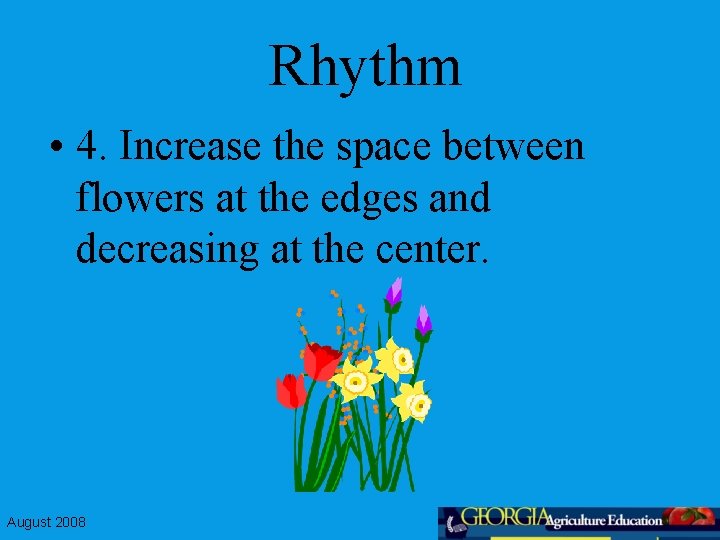
Rhythm • 4. Increase the space between flowers at the edges and decreasing at the center. August 2008
Rhythm • 5. Progression in texture is achieved through using fine textured materials at the edge and working in with more coarse textured material. August 2008
Rhythm • 6. Progression in color is accomplished by using flowers of light value at the edges and top and moving in with darker values. August 2008
Transition • 1. Making a gradual change • 2. Blending colors, line patterns and textures • 3. Progression and transition are closely related and progression is often used to create a transition. August 2008
Transition • 4. Don’t section the design- use of one color or texture in one area and different in another. • 5. Blend colors, textures and shapes together to unify the design. August 2008
Transition • 6. Transition should also exist between the container and the arrangement. Allow some plant material to over hang the rim. This allows the eye to move easily from the container to the arrangement. August 2008
Harmony • A. Blending of all components of the design. • B. A pleasing relationship within the design in color, texture, shape, size, and line. August 2008
Unity • A. When all the parts of the design suggest a single idea or impression. • B. Repeating colors throughout the design. August 2008
Unity • C. Establish a focal point and a dominant flower in the arrangement. • D. Do not create horizontal layer of colors or textures. August 2008
Design Elements • The visual qualities of a composition. August 2008
A. Line • 1. Provides a visual path for the eye to follow. • 2. Framework that holds the entire arrangement together. August 2008
Design Elements • 3. Create line by using linear materials such as stems, branches, or line flowers. • 4. The lines of a design must never be broken. August 2008
Design Elements • 5. Lines should appear to originate from one point. August 2008
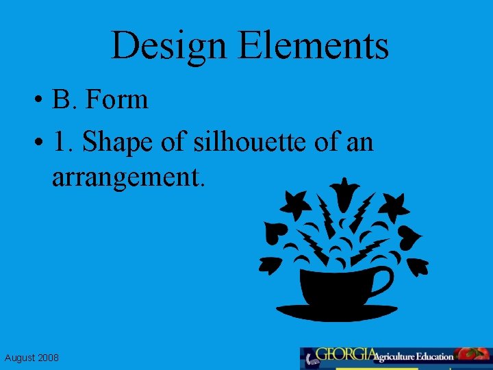
Design Elements • B. Form • 1. Shape of silhouette of an arrangement. August 2008
Texture • Surface appearance of flowers, foliage, container and accessories, such as ribbons and balloons. August 2008
Design Elements • 2. Generally designated as fine, medium, or coarse. • 3. Fine textures and smooth, shiny surfaces give the appearance of formality or elegance. • 4. Coarse textures and rough, dull surfaces are more informal and casual. August 2008
Design Elements • D. Color • 1. Single most important element of floral design. • 2. Necessary to understand a few basic principles to make effective use of color. August 2008
Design Elements • The color wheel is made up of 12 colors August 2008
Design Elements • a. Six colors make up the visible light spectrum called primary and secondary colors August 2008
Design Elements • Intermediate or tertiary colors are created when primary colors are mixed in equal amounts with an adjacent secondary color. August 2008
Secondary colors • Also called hues August 2008
Design Elements • C. Primary colors - blue, yellow, and red cannot be made by mixing any other combinations of colors. August 2008
Design Elements • D. Secondary colors are composed by mixing two primary colors. August 2008
Design Elements • E. Chroma is a measure of brightness or dullness and is determined by the amount of pigment in the flower. August 2008
Design Elements • 1. Pigments are minerals or other chemicals that reflect light in specific ways so that we see color. August 2008
Design Elements • f. Value is how light or dark a color is. Colors are lightened by the addition of white, muted by gray, and darkened by adding black. August 2008
Design Elements • 1. Add white to a color to create a tint, gray for a tone, black for a shade. August 2008
Design Element • 2. Lighter tints and tones should be used in greater amounts than darker ones. August 2008
Design Element • In an arrangement containing three colors 65% should be of the lightest value, 25% in the mid range and 10% darkest value. August 2008
Design Elements • 3. Color harmonies combination of colors that are pleasing to the eye. Grouping different hues or combining tints, tones and shades of a single hue. August 2008
Design Elements • 4. Monochromatic - consists of a single hue and its variations in tint, tone and shade August 2008
Design Elements • 5. Analogous harmony - using three or more hues which occur next to each other on the color wheel. One should be a primary color. August 2008
Design Elements • 6. Complementary - any two colors opposite each other on the color wheel August 2008
Design Elements • 7. Split complimentary uses one color and the colors on either side of compliment of the original color. August 2008
Design Elements • 8. Triadic - three colors equally spaced on the wheel. August 2008
Design Elements • 9. Polychromatic - three or more unrelated colors. August 2008
- Slides: 74