Principals of design Presentation Principals of design The


- Slides: 21

Principals of design. Presentation.

Principals of design. • The principles of design suggest effective and pleasing ways to arrange text and graphics on the page as well as the arrangement of individual elements within illustration, logos, and the overall graphic design of a document. Generally, all the principles of design apply to any piece you may create. How you apply those principles of design determines how effective your design is in conveying the desired message and how attractive it appears. • There is seldom only one correct way to apply each of these graphic design principles. Not all sources agree on which are the most important graphic design principles although alignment, balance, consistency, contrast, proximity, and white space are the most widely recognized principles of design.

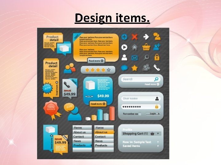
Use of design items. • Use of elements and principles of design is insightful and memorable. -The elements shouldn’t annoy the viewer, they should be simple and relating to theme.

Design items.

Accuracy. • The information provided to the class is accurate purposeful, international, effective and easy to understand. -The accuracy of factual information can help you judge the credibility of the author. Accuracy of information can also provide clues to possible bias in the resource under investigation.

Research. • Thorough development of the finished product is explicitly tied to research based on the project plan.

Completed media. • The product is perceptive and captivates the Intended audience. -Elements should facilitate engagement Encourage people to click, log-in, scroll, and engage with tangible elements on the page. Unlike other forms of media (like radio, youtube and television), online media is interactive. Online, people interact with pages and absorb information with more than just their eyes and ears. On blog posts, incorporate elements to get them commenting. Be careful not to overdo it, however, and don’t beat people over the head. More often than not, engagement is subtle.

Presentation. • Presentation thoroughly engages the audience.

Elements of design. • The elements of design are the building blocks of all designs, chosen to convey the message — beyond the actual words or photos used. Desktop publishing documents utilize the five elements of design : lines | shapes | mass | texture | color. • Other concepts sometimes listed as elements of design are form, space, and value (as in lightness or darkness of color). Get to know and learn how to use all the elements through the tutorials on these pages.

Graphic Design Basics. • You don't need a degree in graphic design to do desktop publishing. But an understanding of the graphic design basics, including the elements and principles of graphic design, will help you do better work as a designer, publisher, and visual communicator. Explore these lessons in the free Graphic Design Basics Course for Desktop Publishing.

Alignment. • Can you imagine how difficult it would be to find your car in a crowded parking lot if everyone ignored the parking lot stripes and parked in every which direction and angle? Imagine trying to get out of there! Alignment brings order to chaos, in a parking lot and on a piece of paper. How you align type and graphics on a page and in relation to each other can make your layout easier or more difficult to read, foster familiarity, or bring excitement to a stale design.

Color as an Element of Design. • One of the elements of design, color is not essential to a good design. However, color is an added dimension that can evoke moods and make powerful statements when used wisely. Explore theories and symbolism of color as used in graphic design.

-How color works? • To use color in desktop publishing we need to understand at least the basics of color theory, how color is perceived, and the different ways of representing color on screen and in print. Start with the basics of color wheels, subtractive and additive color, and RGB vs. CMYK.

-What color means? • Paying attention to color meaning can add a new dimen. Learn to your design work. Learn how to select and use color effectively in desktop publishing. Explore a variety of color palettes. Learn about what colors mean in various cultures and traditions and get help choosing color for meaning and color coordination.

Balance. • Try walking a long distance with a 2 pound bag of rocks in one hand a 10 pound bag of marbles in the other. After awhile you'll be wanting to shift your load around, putting a few marbles in the rock bag to balance your load, make it easier to walk. This is how balance works in design. Visual balance comes from arranging elements on the page so that no one section is heavier than the other. Or, a designer may intentionally throw elements out of balance to create tension or a certain mood.

Consistency and Repetition. • What if Stop signs came in pink squares, yellow circles, or green triangles, depending on the changing whims of a town and a few of its residents? Imagine the ensuing traffic jams and accidents. Repeating design elements and consistent use of type and graphics styles within a document shows a reader where to go and helps them navigate your designs and layouts safely. Explore the principles of repetition, consistency, and unity in page design.

Contrast. • On the basketball court, one pro team looks much like another. But send a few of those players for a stroll down most any major city street and something becomes apparent — those players are much taller than your average guy on the street. That's contrast. In design, big and small elements, black and white text, squares and circles, can all create contrast in design.

Gestalt. • "The sum of the whole is greater than its parts" is the idea behind the principle of gestalt. It's the perception of a composition as a whole. While each of the individual parts have meaning on their own, taken together, the meaning may change. Our perception of the piece is based on our understanding of all the bits and pieces working in unison.

Proximity. • Observe a group of people in a room. You can often learn a lot about who is listening intently to another person, which are strangers, or who is ignoring who by how close together they sit or stand. In design, proximity or closeness creates a bond between people and between elements on a page. How close together or far apart elements are placed suggests a relationship (or lack of) between otherwise disparate parts. Unity is also achieved by using a third element to connect distant parts.

White space. • Did you ever participate in that crazy college pasttime of VW Beetle stuffing? Were you ever the guy on the bottom struggling for a breath of fresh air or the last one in trying to find a place to stick your left elbow so the door will close? It wasn't comfortable, was it? Imagine trying to drive the car under those conditions. Designs that try to cram too much text and graphics onto the page are uncomfortable and may be impossible to read. White space gives your design breathing room.

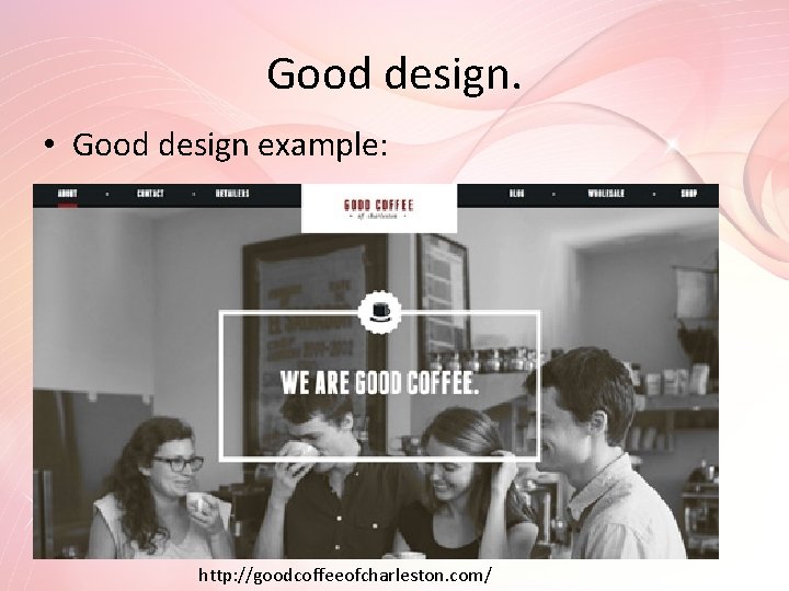
Good design. • Good design example: http: //goodcoffeeofcharleston. com/