Presenting Data Visually Dr Carolyn Rainey Professor Emeritus

- Slides: 9

Presenting Data Visually Dr. Carolyn Rainey Professor Emeritus

What is Microsoft Certification? • Microsoft Office Specialist (MOS) • www. certiport. com – http: //www. certiport. com/Portal/desktopdefault. aspx? page=common /pagelibrary/MOS_what. Is. html – Microsoft Office 2010 Exam Objectives – Exam voucher – http: //www. measureup. com/Microsoft-Office-Specialist-MOS 200720102013 -Exam-Voucher-P 3195. aspx

Overview of Workshops • Workshop One (10/22) - Managing the Worksheet Environment • Workshop Two (10/24) - Creating Cell Data, Formatting/Revising Worksheets/Workbooks • Workshop Three (10/29) - Applying Formulas and Functions • Workshop Four (10/31) - Presenting Data Visually • Workshop Five (11/5) - Data Analysis

Presenting Data Visually • Open file: Wear. Ever. Sales-03 http: //highered. mcgraw-hill. com/sites/0073519383/student_view 0/data_files. html • Select a Chart Area • Select a Chart Type • Move/drag/size a Chart Object • Move chart to new location • Create and manage Comments

Presenting Data Visually • • Filter the Source data Apply a chart style Switch rows and columns Add and remove Chart Elements – Chart Title – Edit Alternative Text – Data Labels – Change a Series color

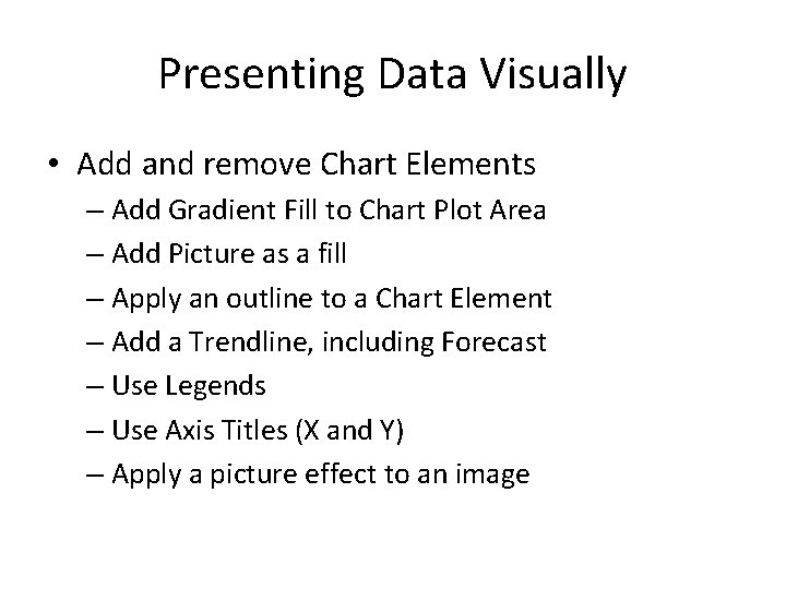
Presenting Data Visually • Add and remove Chart Elements – Add Gradient Fill to Chart Plot Area – Add Picture as a fill – Apply an outline to a Chart Element – Add a Trendline, including Forecast – Use Legends – Use Axis Titles (X and Y) – Apply a picture effect to an image

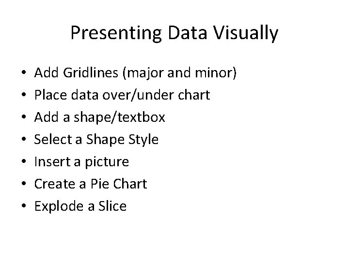
Presenting Data Visually • • Add Gridlines (major and minor) Place data over/under chart Add a shape/textbox Select a Shape Style Insert a picture Create a Pie Chart Explode a Slice

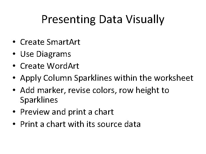
Presenting Data Visually Create Smart. Art Use Diagrams Create Word. Art Apply Column Sparklines within the worksheet Add marker, revise colors, row height to Sparklines • Preview and print a chart • Print a chart with its source data • • •

Presenting Data Visually • Review Certiprep exam questions • Review Workshops One, Two, Three • Preview Workshop Five • Preview Workshop Six