Presentation of Data Prepared by Ms Bernabeth Jo

Presentation of Data Prepared by: Ms. Bernabeth Jo T. Tendero

Textual Presentation • Presented in paragraph or in sentences • Includes : - enumeration of important characteristics - emphasizing the most significant features - highlighting the most striking attributes of the set of data (Basilia Ebora Blay)
")
Textual Presentation Disadvantage: • Readers sometimes get bored (Basilia Ebora Blay)

Tabular Presentation • Very effective and efficient means of organizing and summarizing data • A lot of information can be seen in one table • Makes comparison of figures quick under each category (Luis A. Tattao)

Parts of a Tables Table Heading Table Number Table 6. Fat Content of Diet by Age Bracket Block Fat Content of Diet (Age Bracket) Extremely Low Fairly Low Moderately Low 15 – 24 0. 73 0. 67 0. 15 25 – 35 0. 86 0. 75 0. 21 36 – 44 0. 94 0. 81 0. 26 45 – 54 1. 40 1. 32 0. 75 55 – 64 1. 62 1. 41 0. 78

Parts of the Table • Table heading – includes the table number and the title • Body – main part of the table containing the figures being presented

Parts of a Tables Table Heading Table Number Table 6. Fat Content of Diet by Age Bracket Block Fat Content of Diet (Age Bracket) Extremely Low Fairly Low Moderately Low 15 – 24 0. 73 0. 67 0. 15 25 – 35 0. 86 0. 75 0. 21 36 – 44 0. 94 0. 81 0. 26 45 – 54 1. 40 1. 32 0. 75 55 – 64 1. 62 1. 41 0. 78 Stubs and Classes

Parts of the Table • Table heading – includes the table number and the title • Body – main part of the table containing the figures being presented • Stubs or classes – the categories describing the data, usually found at the left-hand side of the table

Parts of a Tables Table Heading Table Number Table 6. Fat Content of Diet by Age Bracket Block Fat Content of Diet (Age Bracket) Extremely Low Fairly Low Moderately Low 15 – 24 0. 73 0. 67 0. 15 25 – 35 0. 86 0. 75 0. 21 36 – 44 0. 94 0. 81 0. 26 45 – 54 1. 40 1. 32 0. 75 55 – 64 1. 62 1. 41 0. 78 Stubs and Classes Caption

Parts of the Table • Table heading – includes the table number and the title • Body – main part of the table containing the figures being presented • Stubs or classes – the categories describing the data, usually found at the left-hand side of the table • Caption – designations of the information contained in columns, usually found at the top of the column. (Luis A. Tattao)

Frequency Distribution Table • A summary table in which data are arranged into conveniently established, numerically ordered class grouping or categories • A tabular presentation of data grouped into classes together with the number of observations in each class (Luis A. Tattao)

Steps in Constructing a Frequency Distribution Table 1. Determine the Range, R: Range = Highest Value – Lowest Value 2. Determine the approximate number of class intervals , k k = 1 + 3. 3 log N N = population or the total number of observation 3. Obtain the class width , C
 Use the")
Steps in Constructing a Frequency Distribution Table 4. For Class Intervals (CI) Use the lowest score as the lower limit (LL) of the first interval , add (C-1) to it to obtain the upper limit (UL) of the first interval LL = LL of the previous interval + C UL = LL + (C-1)

Example Age of Patients in Hospital X, June 2004 25 28 27 30 32 25 31 26 29 6 31 20 21 32 18 50 53 60 50 54 45 40 37 25 20 27 32 24 29 30 25 24 10 12 15 28

Solution: 1. Determine the Range, R: R = 60 - 6 = 54 2. k = 1 + 3. 3 log N = 1 + 3. 3 log 36 = 6. 1358 6

Solution 3. Obtain the class width , C =9 4. Class Intervals 6 is the LL of the 1 st interval UL = 6 + (9 -1) = 14 of the 1 st interval

Solution 2 nd interval LL = 6 + 9 = 15 UL = 15 + 8 = 23 Compute for the other intervals
 Tally")
Table 1. Ages of Patients in Hospital X, June 2004 Age (in years) Tally Marks Frequency 60 – 68 I 1 51 – 59 II 2 42 – 50 III 3 33 – 41 II 2 24 – 32 IIIII – IIIII 20 15 – 23 IIIII 5 6 – 14 III 3 N = 36

Assignment • Construct the frequency distribution table for the student’s scores in a statistics quiz 5 6 4 5 2 3 8 8 6 7 8 7 7 7 6 6 6 9 2 5 6 3 9 5 5 6 6 7 6 7 6 8 3 3 4 5 5 5 4 4 4 9 9 9 2 2 2 4 4 3 4 3 9 5 5 4 8 6 9 2 7 7 3 3 5 8 8 9 2

Answer to Assignment 1. Determine the Range, R: R=9– 2 =7 2. k = 1 + 3. 3 log N = 1 + 3. 3 log 77 = 7. 2254 7

Solution 3. Obtain the class width , C =1 4. Class Intervals Since there is only the class width is only 1 that means the frequency distribution table is ungrouped.

Table 1. Frequency Distribution of the students’ scores in a quiz in Statistics Scores Frequency 9 8 8 7 7 9 6 12 5 14 4 11 3 9 2 7
 • Midpoint of a class interval • Example: 60 – 68")
Class Mark (x) • Midpoint of a class interval • Example: 60 – 68

Class Boundaries • A. k. a. exact limits • Obtained by subtracting 0. 5 from the LL and adding 0. 5 to UL • Example: 60 – 68 • 60 – 0. 5 = 59. 5 • 68 + 0. 5 = 68. 5 • Class Boundary: 59. 5 – 68. 5
 Tally")
Table 1. Ages of Patients in Hospital X, June 2004 Age (in years) Tally Marks Frequency 60 – 68 I 1 51 – 59 II 2 42 – 50 III 3 33 – 41 II 2 24 – 32 IIIII – IIIII 20 15 – 23 IIIII 5 6 – 14 III 3 N = 36 Calculate the class mark and the class boundaries of this FDT
 Frequency")
Table 1. Ages of Patients in Hospital X, June 2004 Age (in years) Frequency Class Mark Class Boundary 60 – 68 1 64 59. 5 – 68. 5 51 – 59 2 55 50. 5 – 59. 5 42 – 50 3 46 41. 5 – 50. 5 33 – 41 2 37 32. 5 – 41. 5 24 – 32 20 28 23. 5 – 32. 5 15 – 23 5 19 14. 5 – 23. 5 6 – 14 3 10 5. 5 – 14. 5 N = 36
 • Percentage of frequency • Written in decimal form")
Relative frequency (rf) • Percentage of frequency • Written in decimal form
 Frequency")
Table 1. Ages of Patients in Hospital X, June 2004 Age (in years) Frequency 60 – 68 1 51 – 59 2 42 – 50 3 33 – 41 2 24 – 32 20 15 – 23 5 6 – 14 3 N = 36
 Frequency")
Table 1. Ages of Patients in Hospital X, June 2004 Age (in years) Frequency Class Mark Class Boundary Relative Frequency 60 – 68 1 64 59. 5 – 68. 5 0. 0278 51 – 59 2 55 50. 5 – 59. 5 0. 0556 42 – 50 3 46 41. 5 – 50. 5 0. 0833 33 – 41 2 37 32. 5 – 41. 5 0. 0556 24 – 32 20 28 23. 5 – 32. 5 0. 5556 15 – 23 5 19 14. 5 – 23. 5 0. 1389 6 – 14 3 10 5. 5 – 14. 5 0. 0833 N = 36
 • Obtained by cumulating frequency from top to bottom")
Less than Cumulative frequency (<cf) • Obtained by cumulating frequency from top to bottom
 Frequency")
Table 1. Ages of Patients in Hospital X, June 2004 Age (in years) Frequency Class Mark Class Boundary Relative Frequency 60 – 68 1 64 59. 5 – 68. 5 0. 0278 51 – 59 2 55 50. 5 – 59. 5 0. 0556 42 – 50 3 46 41. 5 – 50. 5 0. 0833 33 – 41 2 37 32. 5 – 41. 5 0. 0556 24 – 32 20 28 23. 5 – 32. 5 0. 5556 15 – 23 5 19 14. 5 – 23. 5 0. 1389 6 – 14 3 10 5. 5 – 14. 5 0. 0833 N = 36
 Frequency")
Table 1. Ages of Patients in Hospital X, June 2004 Age (in years) Frequency Class Mark Class Boundary Relative Frequency Less than cumulative frequency (<cf) 60 – 68 1 64 59. 5 – 68. 5 0. 0278 1 51 – 59 2 55 50. 5 – 59. 5 0. 0556 3 42 – 50 3 46 41. 5 – 50. 5 0. 0833 6 33 – 41 2 37 32. 5 – 41. 5 0. 0556 8 24 – 32 20 28 23. 5 – 32. 5 0. 5556 28 15 – 23 5 19 14. 5 – 23. 5 0. 1389 33 6 – 14 3 10 5. 5 – 14. 5 0. 0833 36 N = 36
 • Obtained by cumulating the frequency from bottom to")
More than cumulative frequency (>cf) • Obtained by cumulating the frequency from bottom to top
 Frequency")
Table 1. Ages of Patients in Hospital X, June 2004 Age (in years) Frequency Class Mark Class Boundary Relative Less than More than Frequency cumulative comulative frequency (<cf) (>cf) 60 – 68 1 64 59. 5 – 68. 5 0. 0278 1 36 51 – 59 2 55 50. 5 – 59. 5 0. 0556 3 35 42 – 50 3 46 41. 5 – 50. 5 0. 0833 6 32 33 – 41 2 37 32. 5 – 41. 5 0. 0556 8 30 24 – 32 20 28 23. 5 – 32. 5 0. 5556 28 10 15 – 23 5 19 14. 5 – 23. 5 0. 1389 33 5 6 – 14 3 10 5. 5 – 14. 5 0. 0833 36 2 N = 36
 of First Year High School Students in XYZ School")
Practice Weights (in lbs. ) of First Year High School Students in XYZ School 105 107 120 94 107 105 95 115 106 85 105 117 103 86 96 94 96 99 100 115 99 107 85 86 87 86 85 95 89 96 85 117 86 95 116

R = 120 – 35 = 35 k = 1 + 3. 3 log 36 = 6. 14 = 6 C = 35/6 = 5. 8 = 6 Weight (in Frequency lbs. ) Class Mark Class Boundary Relative Less than More than Frequency cumulative comulative frequency (<cf) (>cf) 85 – 90 10 87. 5 84. 5 – 90. 5 27. 78 10 36 91 – 96 8 93. 5 90. 5 – 96. 5 22. 22 18 26 97 – 102 3 99. 5 96. 5 – 102. 5 8. 33 21 18 103 – 108 8 105. 5 102. 5 – 108. 5 22. 22 29 15 109 – 114 0 111. 5 108. 5 – 114. 5 0 29 7 115 – 120 7 117. 5 114. 5 – 120. 5 19. 44 36 7 N = 36

Contingency Table • Has two or more frequencies shown • Use to record analyzed the relationship between 2 or more variables

Example Table 3. 5. The Contingency Table for the Opinion of Viewers on the New Program Choice/Sample Men Women Children Total Like the program 50 56 45 151 Indifferent 23 16 12 51 Do not like the program 43 55 40 138 Total 116 127 97 340

Graphical Presentation • Data are presented in a form of graph or a diagram • A graph is a geometrical presentation of data • A graph must have a figure number and a title. If data came from another source, a source note should be incuded.

Advantages of a Graph • Helps to visualize certain properties and characteristics of the data at one glance (Tattao) • Helps facilitate comparison and interpretation without going through the numerical data (Blay)

TYPES OF GRAPH

Bar Graph • Comparing numbers by means of rectangles of uniform widths but of lengths proportional to the numbers being represented (Tattao) • Can be simple or compound • Can be vertical or horizontal • Used both for qualitative and quantitative data

Simple and Vertical

Horizontal and Compound

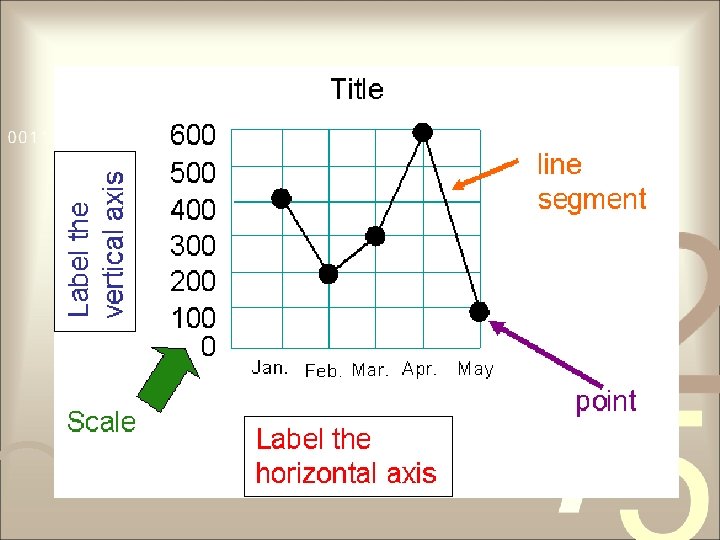
Line graph • Shows trends and increases and decreases in data sets • Obtained by plotting the frequency of the category above the point of the horizontal axis representing that category, and then joining the points with a straight line • Also used for both qualitative and quantitative data

From Table to Graph Temperatures In NY City Day Temperature 1 43° F 2 53° F 3 50° F 4 57° F 5 59° F 6 67° F

From Table to Graph Value of Sarah’s Car Year Value 2001 $24, 000 2002 $22, 500 2003 $19, 700 2004 $17, 500 2005 $14, 500 2006 $10, 000 2007 $ 5, 800

From Table to Graph Sam’s Weight Month Weight in kg January 49 February 54 March 61 April 69 May 73

Pie Chart • Useful when presenting the sizes of components that make up a certain whole entity • A circle subdivided into slices that represents various categories • Each slice is proportional to the percentages corresponding to that category

Constructing Pie Chart Table 3. 12. Monthly Expenses of a Filipino Family with Four Children. Monthly Expenses Food Transportation Miscellaneous Amount in Pesos P 9, 000 P 2, 000 P 3, 000 Total P 14, 000

Constructing Pie Chart 1. Obtain the percentage for each category. Example: Monthly Expenses Amount in Pesos Food P 9, 000 Transportation P 2, 000 Miscellaneous P 3, 000 Total P 14, 000 Percentage (%) 64. 3 14. 3 21. 4 100

Constructing Pie Chart 2. Convert percentage into degrees using this conversion factor: Example: Monthly Expenses Amount in Pesos Percentage (%) Degrees Food Transportation Miscellaneous Total P 9, 000 P 2, 000 P 3, 000 P 14, 000 64. 3 14. 3 21. 4 100 231. 5 51. 5 77. 0 360

Constructing Pie Chart 3. Use protractor to measure the degrees needed to make each slices

Pictograph • Makes use of symbols • Used to compare few discrete data usually of one kind

Example of Pictograph

Example of Pictograph

Example of Pictograph

Statistical Map • Shows the graphical location • may contain different symbols on the map • Legend tells what symbols represent

Statistical Map

Histogram • Representation of frequency distribution table • Rectangles has widths that represent class intervals and areas are proportional to frequencies • Constructed by marking off true class boundaries along horizontal axis and erecting over each class interval a rectangle whose height equals the frequency of that class

Example of Histogram
 Frequency")
Table 1. Ages of Patients in Hospital X, June 2004 Age (in years) Frequency Class Mark Class Boundary 60 – 68 1 64 59. 5 – 68. 5 51 – 59 2 55 50. 5 – 59. 5 42 – 50 3 46 41. 5 – 50. 5 33 – 41 2 37 32. 5 – 41. 5 24 – 32 20 28 23. 5 – 32. 5 15 – 23 5 19 14. 5 – 23. 5 6 – 14 3 10 5. 5 – 14. 5 N = 36

Frequency Polygon • Line graph associated with Frequency Distribution Table • Obtained by plotting the Class Mark vs. the Frequency of that class. Points are joined with straight lines.

Example of Frequency Polygon

Ogive • Graphical presentation of the cumulative frequency of an FDT • Constructed by plotting lower class boundary of each class vs. the cumulative frequency of the corresponding class. Points are joined with straight lines

Example of Ogive
- Slides: 67