Presentation Guidelines Oral Presentation When giving an oral


- Slides: 15

Presentation Guidelines

Oral Presentation When giving an oral presentation, pay attention to your q Rate q Volume q Body Language q Eye Contact

Oral Presentation When giving an oral presentation, pay attention to your q Rate q How fast or slow you are talking q Volume q How soft or loud you are talking q Body Language q Including body position and motion q Eye Contact q Where your eyes are focused

Visual Presentations One Thing at a Time What ever you are talking about should be on the screen. Your slide should not be your script, it should only enhance what you are talking about. You should never have more than about 30 words on a slide– No paragraphs!!

Visual Presentations Structure Counts! Your slides should be in an logical order: they should build upon one another. Presentations (like papers) should have a beginning, a middle, and an end or an introduction, body, and conclusion

Visual Presentations Design: Fonts Use decorative fonts only for headers and only if they are easy to read. Use standard fonts for slide content Don’t ever write in red font—Some people cannot see it. Align text either to the right or left. Centered text is more difficult to read.

Visual Presentations Design: Backgrounds Put dark text on a light background or light text on a dark background. Lighter text should be larger because it can be more difficult to read. Choose background designs that are appropriate for topic and purpose.

Visual Presentations Design: Images Avoid clutter– a headline, a few bullets and maybe an image is enough. Anything else is distracting to the audience. Use images with meaning– Graphs and videos are appropriate. Avoid clip art from Office. It is familiar and loses effectiveness. Be sure your images enhance your presentation and have a purpose.

Visual Presentations Design: Animation Don’t over-animate! Animate at effective speeds

Visual Presentations Design: White Space What space is the space on a slide that isn’t full. Don’t have too much or too little white space on a slide. Be sure every bit of your slide has purpose even the white space

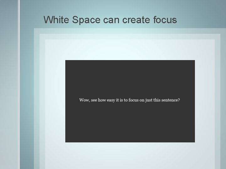
White Space can create focus

Too little white space can be too busy for the eye.

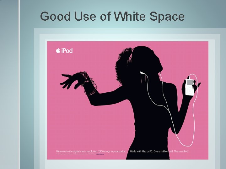
Good Use of White Space

Good Use of White Space

Think Outside the Screen Remember your digital presentation is only meant to enhance your oral presentation. You still must present in a way that is engaging to the audience. You are the focus of the presentation, not your visual aid. Don’t read your visual aid word for word. We can read and you will bore your audience. Don’t turn your body to focus on your visual aid. Refer to your visual aid during your presentation.