Power Point Slide Design INEFFECTIVE EXAMPLE OF SLIDE


- Slides: 3

Power. Point Slide Design INEFFECTIVE EXAMPLE OF SLIDE DESIGN 1

Simplicity • In the design of visual aids, particularly computer-generated slides, the speaker should remember to adhere to the 6 × 6 rule or the rule of 7. These rules limit the number of words per line and lines per slide, such that you have either six lines of text with six words per line or seven lines of text with seven word per line for each slide. These lines of text should not be full sentences or paragraphs but merely phrases or words— much like you would use when drafting an outline for a report, paper, or presentation. • For most individuals, processing more than seven points of information at any given time may be too complex or even impossible. To ensure the speaker’s message is communicated in a simple and direct manner, visuals should be limited to a series of related concepts. INEFFECTIVE EXAMPLE OF SLIDE DESIGN 2

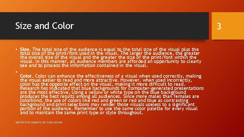
Size and Color • Size. The total size of the audience is equal to the total size of the visual plus the total size of the print/font used in the visual. The larger the audience, the greater the overall size of the visual and the greater the size of the print/font within the visual. In this manner, all audience members are afforded an opportunity to clearly see and to process the information contained in the visual. • Color can enhance the effectiveness of a visual when used correctly, making the visual easier to read and more attractive. However, when used incorrectly, color has the opposite effect on the visual, making it more difficult to read. Research has indicated that blue backgrounds for computer-generated presentations are the most effective. Using a yellow or white type on the blue background produces the best results among all audiences. Since more males than females are colorblind, the use of colors like red and green or red and blue as contrasting background and print selections may render those visuals useless to a significant portion of the audience. Remember to use the same color palette for every visual and to maintain the same print type or style throughout. INEFFECTIVE EXAMPLE OF SLIDE DESIGN 3