Power Point Design Guidelines to help avoid common

- Slides: 18

Power Point Design Guidelines to help avoid common presentation mistakes

Design Guidelines n n 2 Simplicity is your friend Lots of white Organized Path for the eye n n 10/3/2020 Rule of seven Color and contrast Typography Content Hale - Huff - Patience

Simplicity is your friend ` < Content is center stage Draw attention to presentation, not special effects 4 Text ¤ Graphics è Sound f Background i Co l o rs e 3 Consistency - slides, bullets, fonts 10/3/2020 Hale - Huff - Patience

Simplicity Is Your Friend n n Content (and speaker) is center stage Draw attention to presentation, not special effects – – n n 4 Text, graphics and background Sound Colors Consistency - slides, bullets, fonts 10/3/2020 Hale - Huff - Patience

Lots of White Space n n Too much filler will overwhelm the viewer Makes your eyes tired – n n n 5 You won’t bother to read it If you have a lot of information to share in a slide, consider either using Power. Point to display the point and you discuss it, or break things up into several slides You need a place for the viewer to focus on as you discuss a point - otherwise, he or she could just read it themselves. . . 10/3/2020 Hale - Huff - Patience

Lots of White 6 n Don’t want to overwhelm audience n Place for focus n Keep things short n Break up into several slides 10/3/2020 Hale - Huff - Patience

Organized n n n Audience feels movement to a conclusion Easy to see progress Pace of slides (rehearse) n n 7 Too fast, exhausts them Too slow, put them to sleep 10/3/2020 Hale - Huff - Patience

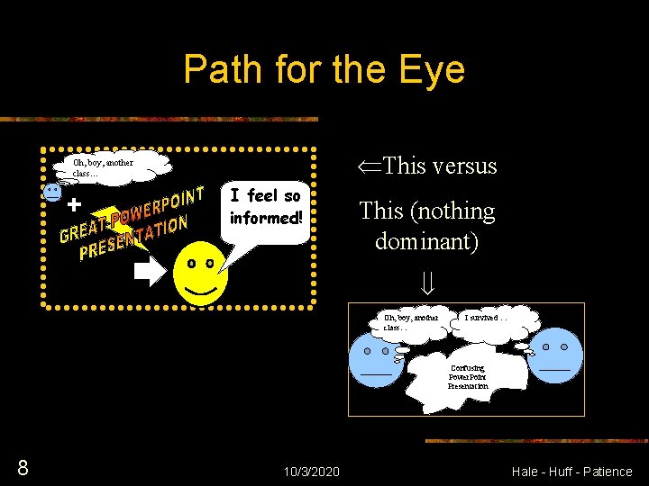
Path for the Eye This versus Oh, boy, another class… I feel so informed! This (nothing dominant) Oh, boy, another class… I survived … Confusing Power. Point Presentation 8 10/3/2020 Hale - Huff - Patience

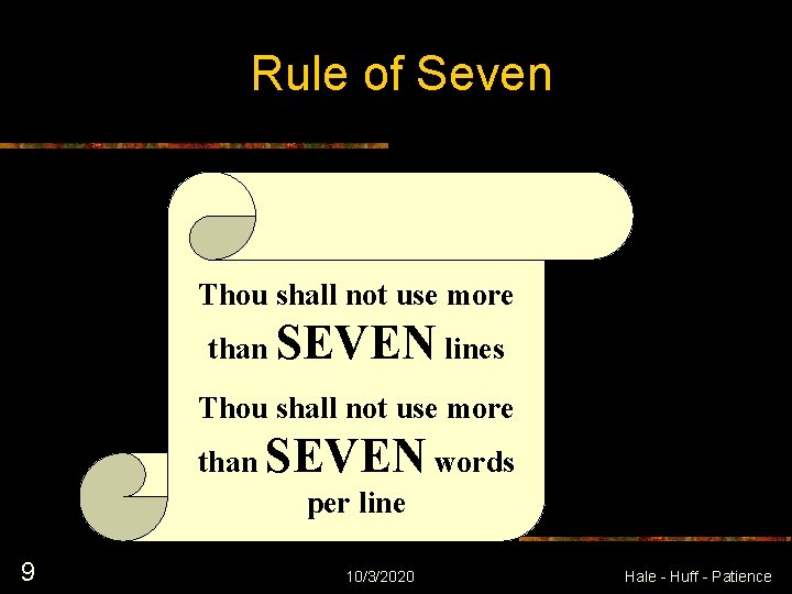
Rule of Seven Thou shall not use more than SEVEN lines Thou shall not use more than SEVEN words per line 9 10/3/2020 Hale - Huff - Patience

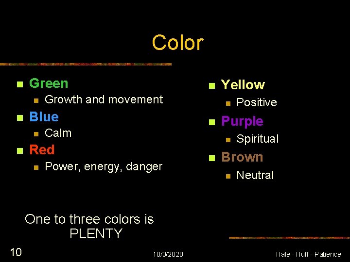
Color n Green n n Growth and movement Blue n n n Power, energy, danger n Positive Purple n Red n n n Calm Yellow Spiritual Brown n Neutral One to three colors is PLENTY 10 10/3/2020 Hale - Huff - Patience

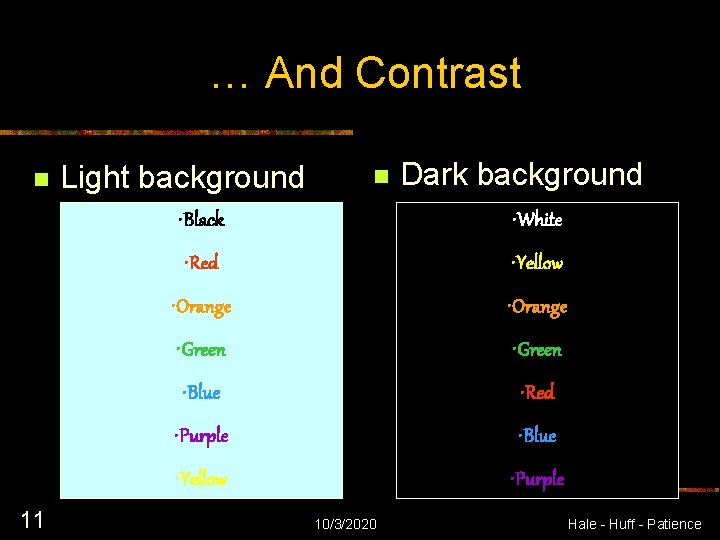
… And Contrast n 11 Light background n Dark background • Black • White • Red • Yellow • Orange • Green • Blue • Red • Purple • Blue • Yellow • Purple 10/3/2020 Hale - Huff - Patience

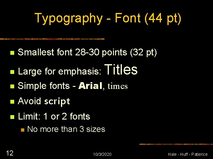
Typography - Font (44 pt) n Smallest font 28 -30 points (32 pt) n Large for emphasis: Titles n Simple fonts - Arial, times n Avoid script n Limit: 1 or 2 fonts n 12 No more than 3 sizes 10/3/2020 Hale - Huff - Patience

Typography - Style n n n 13 Don’t hyphenate Errors: check, recheck, someone proof Avoid italics – least likely to be read 10/3/2020 Hale - Huff - Patience

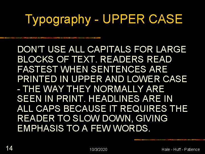
Typography - UPPER CASE DON’T USE ALL CAPITALS FOR LARGE BLOCKS OF TEXT. READERS READ FASTEST WHEN SENTENCES ARE PRINTED IN UPPER AND LOWER CASE - THE WAY THEY NORMALLY ARE SEEN IN PRINT. HEADLINES ARE IN ALL CAPS BECAUSE IT REQUIRES THE READER TO SLOW DOWN, GIVING EMPHASIS TO A FEW WORDS. 14 10/3/2020 Hale - Huff - Patience

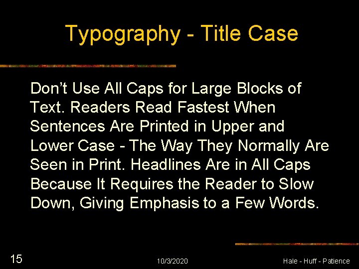
Typography - Title Case Don’t Use All Caps for Large Blocks of Text. Readers Read Fastest When Sentences Are Printed in Upper and Lower Case - The Way They Normally Are Seen in Print. Headlines Are in All Caps Because It Requires the Reader to Slow Down, Giving Emphasis to a Few Words. 15 10/3/2020 Hale - Huff - Patience

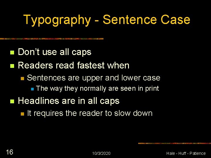
Typography - Sentence Case n n Don’t use all caps Readers read fastest when n Sentences are upper and lower case n n Headlines are in all caps n 16 The way they normally are seen in print It requires the reader to slow down 10/3/2020 Hale - Huff - Patience

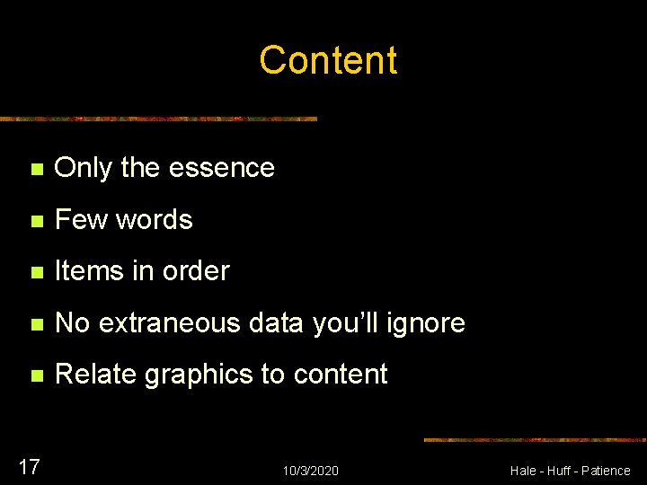
Content n Only the essence n Few words n Items in order n No extraneous data you’ll ignore n Relate graphics to content 17 10/3/2020 Hale - Huff - Patience

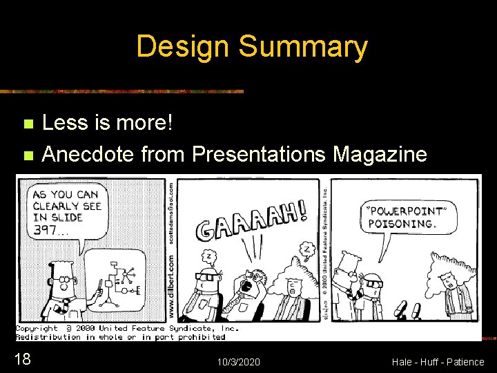
Design Summary n n 18 Less is more! Anecdote from Presentations Magazine 10/3/2020 Hale - Huff - Patience