Poster Design Post r Design Design Post r


 • Remember")


- Slides: 23
Poster Design
Post r Design
Design Post r
Context • Where is the poster going to be? • Who is going to see it? • What will they be doing while they look at it? • What do they want?
Purpose • What do you want to convey TO your viewers? • What do you want FROM your viewers?
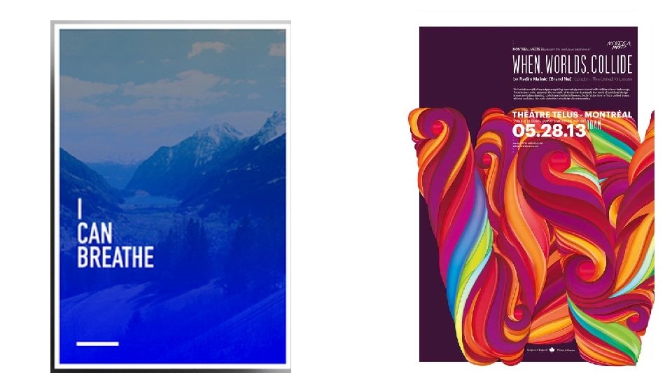
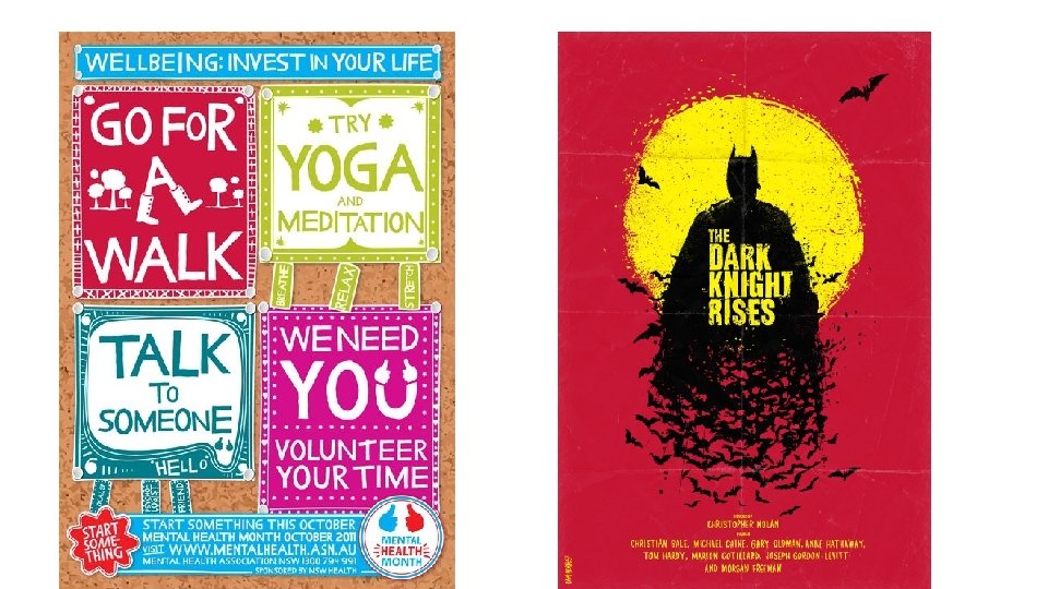
Color • Bold contrasts • Texture • Other-than-white background IF the context is right
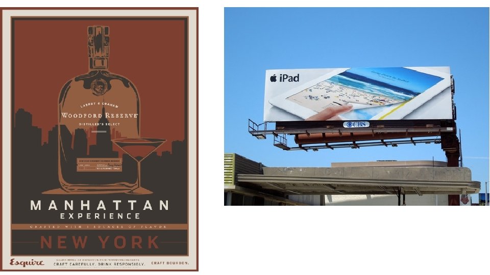
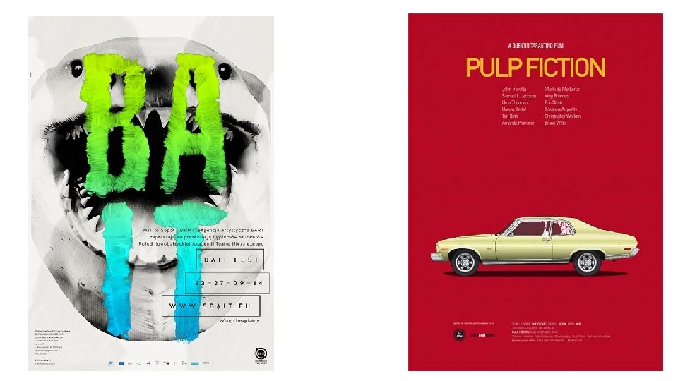
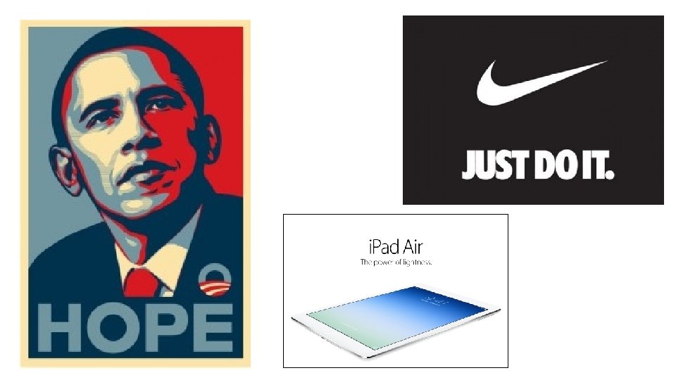
Dominant Visuals • 1 Dominant Image • Close-up crops of faces or elements • Sharp focal points
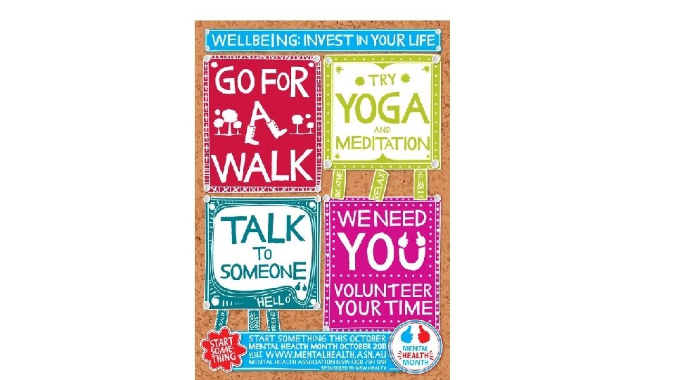
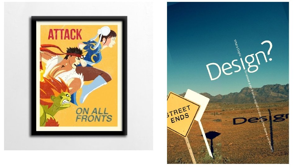
Space • Negative space is your friend! Don’t clutter it. Leave space • Around margins • Around the most important elements in the design • Between images and text • Between lines of text • Between individual letters
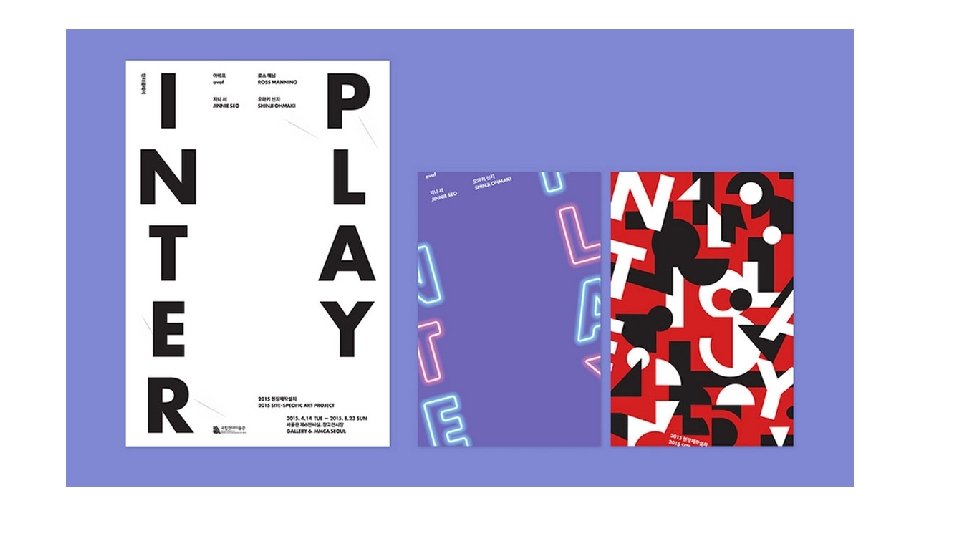
Typography is also graphic design • Type that is readable • Type that conveys an appropriate mood for the event • Bigger type than you imagine • Play with direction • Play with the interaction with image • Do NOT use multiple fonts—be consistent
Balance, not Centering • Resist the temptation to center everything (especially text) • Remember that “diagonal” is a direction, too
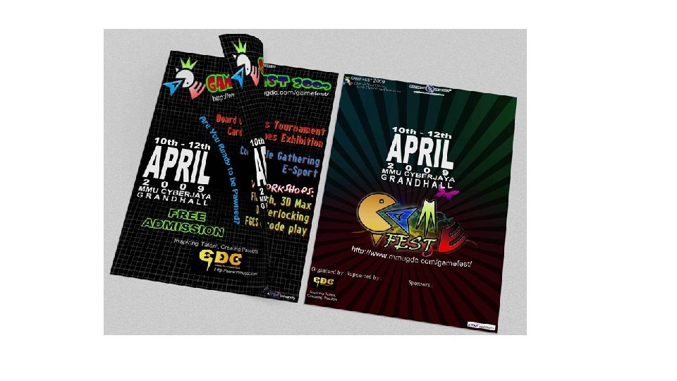
Simplicity is in • Allow us to focus on what you’re trying to convey—makes it easier to decipher “the message” & participate in filling in the gaps
Academic Posters • Draw their attention • Give them what they need to know • Give them needed details • Put everything where they expect to see it