Position vs Time Relationships between position and time

� Position vs. Time � Relationships between position and time graphs � Direct and Inverse Relationships � Independent and Dependent variaables � MIX and DRY � Steps to make a graph and reading a graph � Slope

� Motion graphs are an important tool used to show the relationships between position, speed, and time. A runner can learn more about performance by studying data and graphs.

� � Position vs. time data tells you the runner’s position at different points in time. The runner is at 50 meters after 10 sec. , 100 meters after 20 sec. and 150 meters at 30 sec.

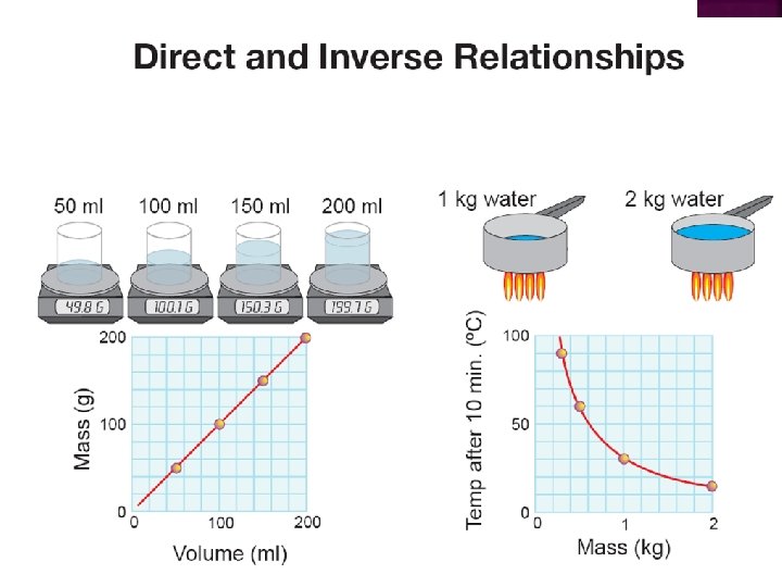
� � A good way to show a relationship between two variables is to use a graph. A graph makes it easy to see if changes in one variable cause changes in the other variable (the effect).
 axis.")
� � � To graph data, you put position on the vertical (y) axis. Time goes on the horizontal (x) axis. Data are plotted between x and y axis.

� An object moving at a constant speed always creates a position vs. time graph that is a straight line.

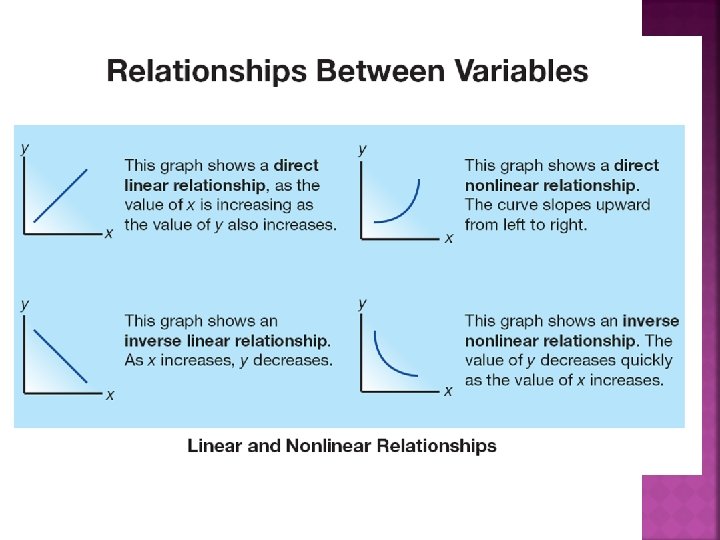
� Two �a variables may have: strong relationship, �a weak relationship, �or no relationship at all.

� This table shows how quickly the car gets from A to B as the angle of the track changes.

� If we plot the data on a graph, what kind of relationship does the graph show?
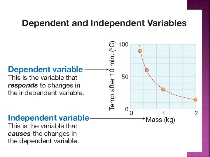

�M anipulated �I ndependent variable �X- axis �D ependent variable �R esponds �Y- axis

Step 1: Choose which will be the dependent and independent variables. The dependent variable goes on the y-axis and the independent variable goes on the xaxis. Step 2: Make a scale for each axis by counting boxes to fit your largest value. Count by multiples of 1, 2, 5, or 10. Step 3: Plot each point by finding the x-value and drawing a lin upward until you get to the right y-value. Step 4: Draw a smooth curve that shows the pattern of the points. Do not just connect the dots.

� � � A graph can give you an accurate answer even without doing the experiment. Students doing an experiment measured the speed of the car at 20, 40, 60, and 80 cm positions. They want to know the speed at 50 cm.

� You can use position vs. time graphs to quickly compare the speeds of different objects. A steeper line on a position vs. time graph means a faster speed.

� � The “steepness” of a line is called its slope. Visualize a triangle with the slope as the hypotenuse. The rise is equal to the height of the triangle. The run is equal to the length along the base of the triangle.
 to the")
� � The slope is the ratio of the “rise” (vertical change) to the “run” (horizontal change). The slope is therefore a distance divided by a time, which equals speed.

� The position vs. time graph has position on the yaxis and time on the x-axis. Which runner has the fastest constant speed?

These graphs each show the same event. What differences do you notice?

Do these graphs display the same data?

� A speed vs. time graph can also be used to find the distance the object has traveled.
- Slides: 22