Population Pyramids a k a Population Diagrams Population


- Slides: 14
Population Pyramids a. k. a. • Population Diagrams • Population Structures • Age-Sex Diagrams • Age-Sex Structures • Age-Sex Pyramids
What is a population pyramid? A visual representation of the population of a country. • graphically display a population's age and gender composition • show numbers or proportions of males and females in each age group • show gains of members due to immigration and birth, and loss of members due to emigration and death • reflect population growth or decline
Interpreting a Population Pyramid • Remember that a population pyramid is basically a bar graph turned on its side. Each line is showing you what percentage of the population is a certain age. • Examine the title and the type of data presented. (ex. Age breakup, numbers listed below, male-female notation. ) • True pyramids are developing countries. The majority of the population is younger and not many people live to an old age. Developed countries are more rectangular; the population is spread more equally through the age groups.
How to interpret population pyramids There main types of pyramids – Rapid growth – Slow growth – Negative growth Shape of rapid growth Shape of Slow growth Shape of negative growth
High, Slow & Negative Growth
Rapid growth
Rapid growth pyramids • Have a large base to show high birth rates • Amount of people decreases as the ages goes up indicating a lower standard of living • Associated with developing countries like Brazil, Uganda, China
Slow Growth
Slow growth pyramids • Take on a more rectangular shape • Indicates population is remaining fairly steady • Birth rates and death rates are similar • Associated with developed countries like the UK, Germany, Canada
Negative growth
Negative growth pyramids • Looks like a reverse pyramid • Indicates the population of the country is decreasing • Death rates are higher than birth rates • Associated with developed countries like Austria, Japan, Italy
What does a ‘Baby Boom’ look like over time? http: //www. nd. edu/~dmyers/courses/old/102 au 00/bb. jpg
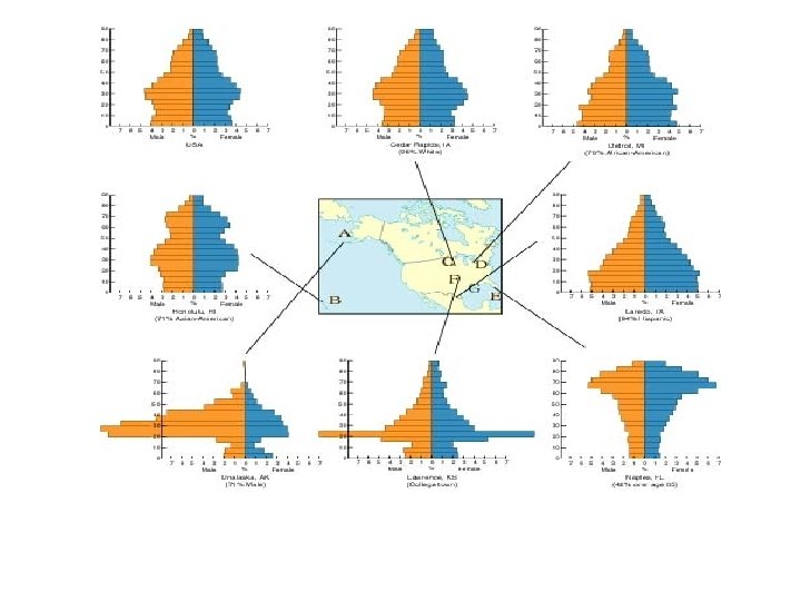
Look at what else one can ‘see’ in these diagrams