Population change Population data Lesson 1 What is

- Slides: 16

Population change Population data: Lesson 1

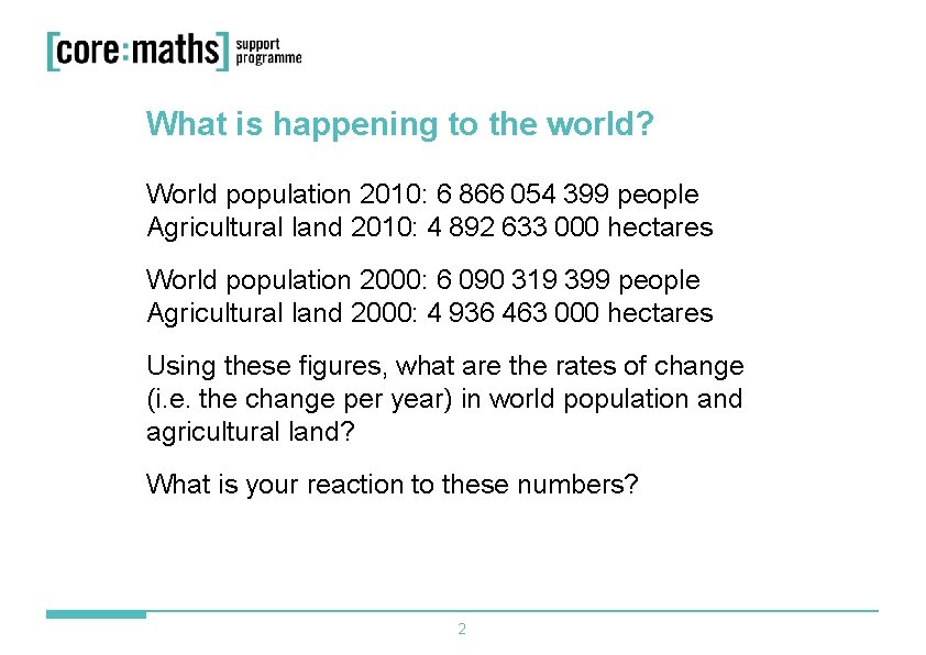
What is happening to the world? World population 2010: 6 866 054 399 people Agricultural land 2010: 4 892 633 000 hectares World population 2000: 6 090 319 399 people Agricultural land 2000: 4 936 463 000 hectares Using these figures, what are the rates of change (i. e. the change per year) in world population and agricultural land? What is your reaction to these numbers? 2

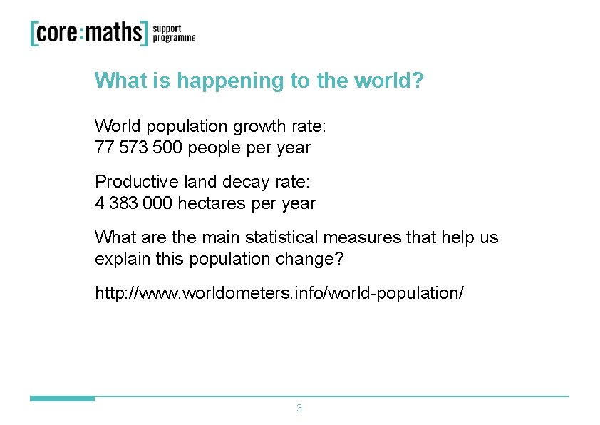
What is happening to the world? World population growth rate: 77 573 500 people per year Productive land decay rate: 4 383 000 hectares per year What are the main statistical measures that help us explain this population change? http: //www. worldometers. info/world-population/ 3

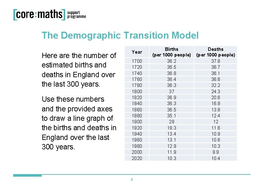
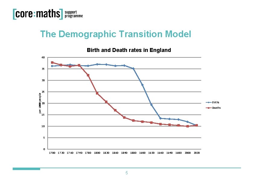
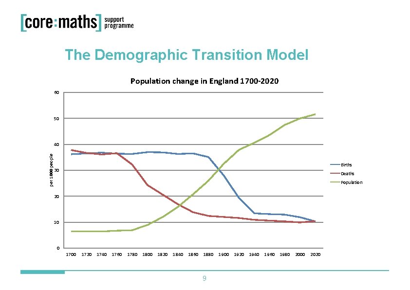
The Demographic Transition Model Here are the number of estimated births and deaths in England over the last 300 years. Use these numbers and the provided axes to draw a line graph of the births and deaths in England over the last 300 years. Year 1700 1720 1740 1760 1780 1800 1820 1840 1860 1880 1900 1920 1940 1960 1980 2000 2020 4 Births (per 1000 people) 36. 2 36. 5 36. 8 36. 4 36. 3 37 36. 9 36. 3 36. 5 35. 1 28 19. 3 13. 4 13. 1 12. 9 11. 9 10. 3 Deaths (per 1000 people) 37. 8 36. 7 36. 1 36. 6 32. 2 24. 3 20. 6 16. 9 13. 8 12. 4 12 11. 6 10. 9 10. 6 10. 3 9. 9 10. 4

The Demographic Transition Model Birth and Death rates in England 40 35 per 1000 people 30 25 Births 20 Deaths 15 10 5 0 1700 1720 1740 1760 1780 1800 1820 1840 1860 1880 1900 1920 1940 1960 1980 2000 2020 5

The Demographic Transition Model Interpret what is happening to the population of England in the following periods of time: § Stage 1: 1700 to 1760 § Stage 2: 1761 to 1880 § Stage 3: 1881 to 1940 § Stage 4: 1941 to 2000 § Stage 5: 2001 to 2020 (and beyond) Referring to the birth and death rates, try to explain why these population changes have come about. 6

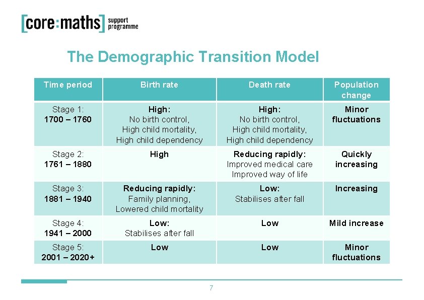
The Demographic Transition Model Time period Birth rate Death rate Population change Stage 1: 1700 – 1760 High: No birth control, High child mortality, High child dependency Minor fluctuations Stage 2: 1761 – 1880 High Reducing rapidly: Improved medical care Improved way of life Quickly increasing Stage 3: 1881 – 1940 Reducing rapidly: Family planning, Lowered child mortality Low: Stabilises after fall Increasing Stage 4: 1941 – 2000 Low: Stabilises after fall Low Mild increase Stage 5: 2001 – 2020+ Low Minor fluctuations 7

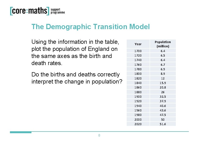
The Demographic Transition Model Using the information in the table, plot the population of England on the same axes as the birth and death rates. Do the births and deaths correctly interpret the change in population? 8 Year 1700 1720 1740 1760 1780 1800 1820 1840 1860 1880 1900 1920 1940 1960 1980 2000 2020 Population (million) 6. 4 6. 5 6. 4 6. 7 6. 9 8. 9 12 15. 9 20. 8 26 32. 5 37. 9 40. 6 43. 6 47. 5 50 51. 6

The Demographic Transition Model Population change in England 1700 -2020 60 50 per 1000 people 40 Births 30 Deaths Population 20 10 0 1700 1720 1740 1760 1780 1800 1820 1840 1860 1880 9 1900 1920 1940 1960 1980 2000 2020

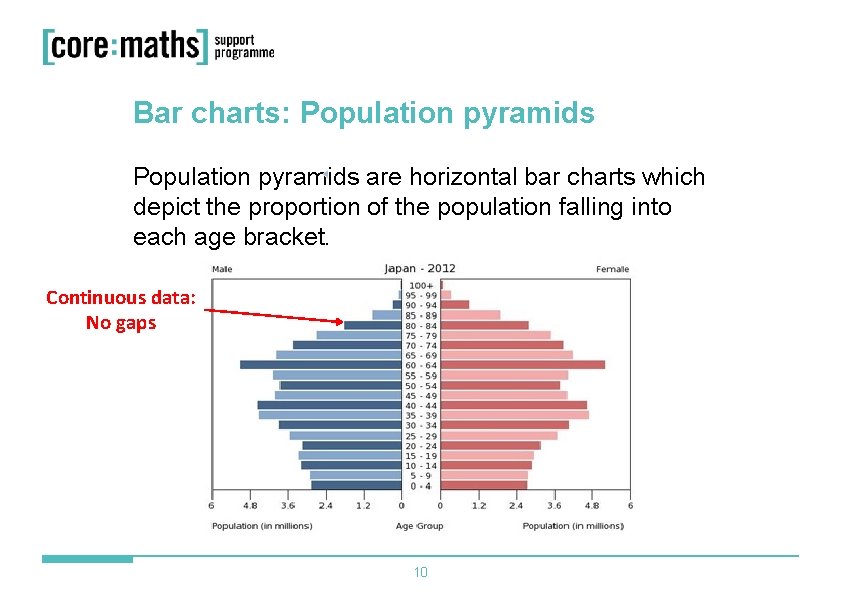
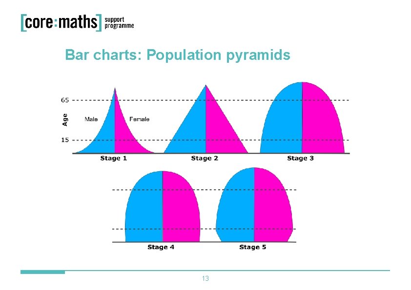
Bar charts: Population pyramids are horizontal bar charts which depict the proportion of the population falling into each age bracket. Continuous data: No gaps 10

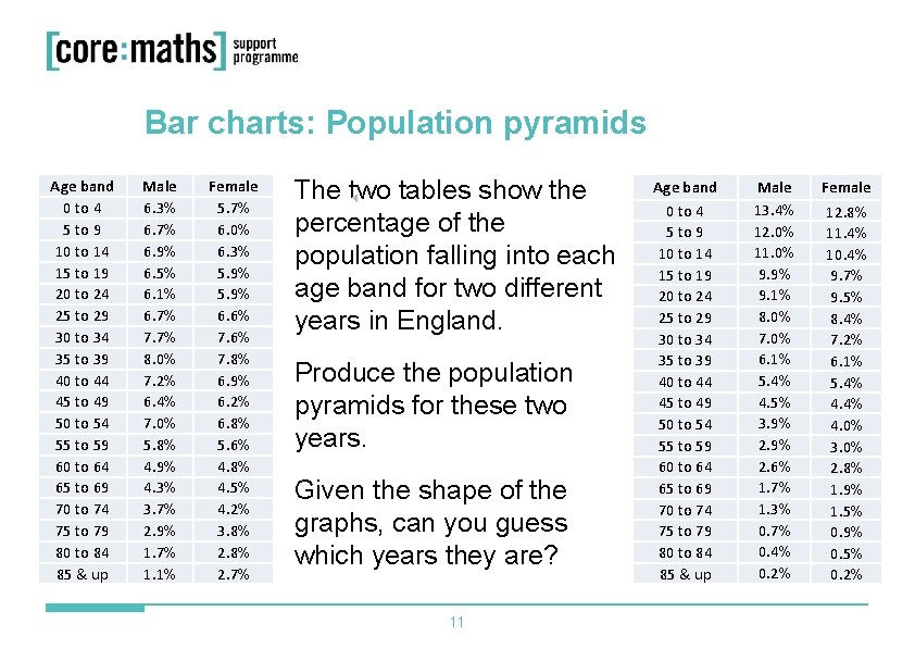
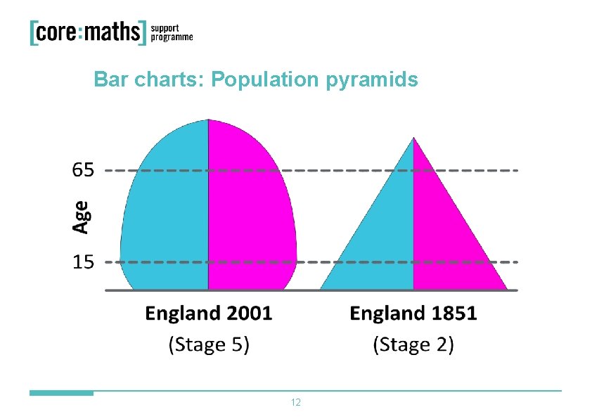
Bar charts: Population pyramids Age band 0 to 4 5 to 9 10 to 14 15 to 19 20 to 24 25 to 29 30 to 34 35 to 39 40 to 44 45 to 49 50 to 54 55 to 59 60 to 64 65 to 69 70 to 74 75 to 79 80 to 84 85 & up Male 6. 3% 6. 7% 6. 9% 6. 5% 6. 1% 6. 7% 7. 7% 8. 0% 7. 2% 6. 4% 7. 0% 5. 8% 4. 9% 4. 3% 3. 7% 2. 9% 1. 7% 1. 1% Female 5. 7% 6. 0% 6. 3% 5. 9% 6. 6% 7. 8% 6. 9% 6. 2% 6. 8% 5. 6% 4. 8% 4. 5% 4. 2% 3. 8% 2. 7% The two tables show the percentage of the population falling into each age band for two different years in England. Produce the population pyramids for these two years. Given the shape of the graphs, can you guess which years they are? 11 Age band 0 to 4 5 to 9 10 to 14 15 to 19 20 to 24 25 to 29 30 to 34 35 to 39 40 to 44 45 to 49 50 to 54 55 to 59 60 to 64 65 to 69 70 to 74 75 to 79 80 to 84 85 & up Male 13. 4% 12. 0% 11. 0% 9. 9% 9. 1% 8. 0% 7. 0% 6. 1% 5. 4% 4. 5% 3. 9% 2. 6% 1. 7% 1. 3% 0. 7% 0. 4% 0. 2% Female 12. 8% 11. 4% 10. 4% 9. 7% 9. 5% 8. 4% 7. 2% 6. 1% 5. 4% 4. 0% 3. 0% 2. 8% 1. 9% 1. 5% 0. 9% 0. 5% 0. 2%

Bar charts: Population pyramids 12

Bar charts: Population pyramids 13

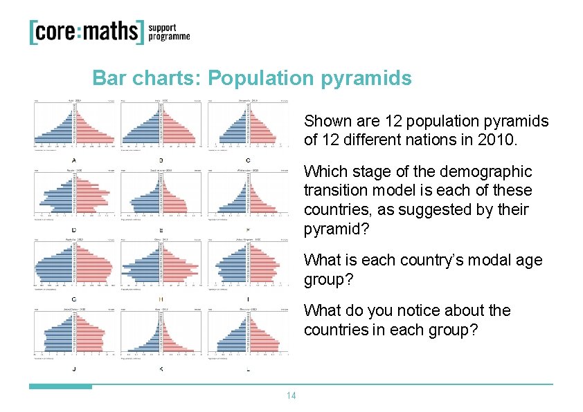
Bar charts: Population pyramids Shown are 12 population pyramids of 12 different nations in 2010. Which stage of the demographic transition model is each of these countries, as suggested by their pyramid? What is each country’s modal age group? What do you notice about the countries in each group? 14

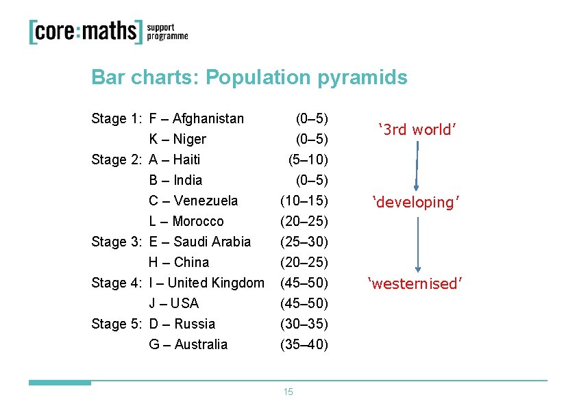
Bar charts: Population pyramids Stage 1: F – Afghanistan K – Niger (0– 5) Stage 2: A – Haiti B – India C – Venezuela L – Morocco Stage 3: E – Saudi Arabia H – China (5– 10) (0– 5) (10– 15) (20– 25) (25– 30) (20– 25) Stage 4: I – United Kingdom J – USA Stage 5: D – Russia G – Australia (45– 50) (30– 35) (35– 40) 15 ‘ 3 rd world’ ‘developing’ ‘westernised’

Core Maths Support Programme 60 Queens Road Reading RG 1 4 BS E-mail cmsp@cfbt. com Call 0118 902 1243