Plotting and Graphics Plotting and Graphics Several types

![Plotting and Graphics 2 - Polar plots theta = [0: pi/90: 2*pi]; r = Plotting and Graphics 2 - Polar plots theta = [0: pi/90: 2*pi]; r =](https://slidetodoc.com/presentation_image_h2/a6fb44fcab4bb9ee57f66be49326d0d9/image-15.jpg)
![Plotting and Graphics 3 - Bar plots Vertical Bar plots x = [1: 5]; Plotting and Graphics 3 - Bar plots Vertical Bar plots x = [1: 5];](https://slidetodoc.com/presentation_image_h2/a6fb44fcab4bb9ee57f66be49326d0d9/image-16.jpg)
![Plotting and Graphics Horizontal Bar plots x = [1: 5]; y = [50, 98, Plotting and Graphics Horizontal Bar plots x = [1: 5]; y = [50, 98,](https://slidetodoc.com/presentation_image_h2/a6fb44fcab4bb9ee57f66be49326d0d9/image-17.jpg)
![Plotting and Graphics Adding the name of bar Y = [70 85 75 90]; Plotting and Graphics Adding the name of bar Y = [70 85 75 90];](https://slidetodoc.com/presentation_image_h2/a6fb44fcab4bb9ee57f66be49326d0d9/image-18.jpg)
![Plotting and Graphics 4 - Stem plots t = [0: 5: 200]; f = Plotting and Graphics 4 - Stem plots t = [0: 5: 200]; f =](https://slidetodoc.com/presentation_image_h2/a6fb44fcab4bb9ee57f66be49326d0d9/image-21.jpg)
![Plotting and Graphics 5 - contour plots [x, y] = meshgrid(-5: 0. 1: 5, Plotting and Graphics 5 - contour plots [x, y] = meshgrid(-5: 0. 1: 5,](https://slidetodoc.com/presentation_image_h2/a6fb44fcab4bb9ee57f66be49326d0d9/image-22.jpg)
![Plotting and Graphics 2 - Contour plots [x, y]=meshgrid(-pi: 0. 1: pi); z=sin(x). *sinc(y); Plotting and Graphics 2 - Contour plots [x, y]=meshgrid(-pi: 0. 1: pi); z=sin(x). *sinc(y);](https://slidetodoc.com/presentation_image_h2/a6fb44fcab4bb9ee57f66be49326d0d9/image-27.jpg)
![Setting Axis Limit x = [0: 0. 01: 5]; y = sin(2*x + 3); Setting Axis Limit x = [0: 0. 01: 5]; y = sin(2*x + 3);](https://slidetodoc.com/presentation_image_h2/a6fb44fcab4bb9ee57f66be49326d0d9/image-35.jpg)
![Setting Axis Limit x = [0: 0. 01: 5]; y = sin(2*x + 3); Setting Axis Limit x = [0: 0. 01: 5]; y = sin(2*x + 3);](https://slidetodoc.com/presentation_image_h2/a6fb44fcab4bb9ee57f66be49326d0d9/image-36.jpg)
![Setting Axis Ticks set(gca, 'xtick', [1 2 3 4 5 ]) set(gca, 'ytick', [-1 Setting Axis Ticks set(gca, 'xtick', [1 2 3 4 5 ]) set(gca, 'ytick', [-1](https://slidetodoc.com/presentation_image_h2/a6fb44fcab4bb9ee57f66be49326d0d9/image-38.jpg)
- Slides: 39

Plotting and Graphics

Plotting and Graphics Several types of graphs can be created in MATLAB, including: 1 - 2 -D plots • x-y charts • Contour plots • Surface plots • Polar plots • Bar plots • Stem plots • Pie plots • Histograms plots 2 - 3 -D plots • x-y-z charts • Contour plots • Surface plots

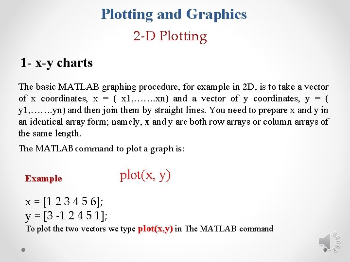
Plotting and Graphics 2 -D Plotting 1 - x-y charts The basic MATLAB graphing procedure, for example in 2 D, is to take a vector of x coordinates, x = ( x 1, ……. xn) and a vector of y coordinates, y = ( y 1, ……. yn) and then join them by straight lines. You need to prepare x and y in an identical array form; namely, x and y are both row arrays or column arrays of the same length. The MATLAB command to plot a graph is: Example plot(x, y) x = [1 2 3 4 5 6]; y = [3 -1 2 4 5 1]; To plot the two vectors we type plot(x, y) in The MATLAB command

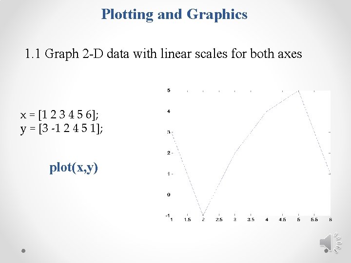
Plotting and Graphics 1. 1 Graph 2 -D data with linear scales for both axes x = [1 2 3 4 5 6]; y = [3 -1 2 4 5 1]; plot(x, y)

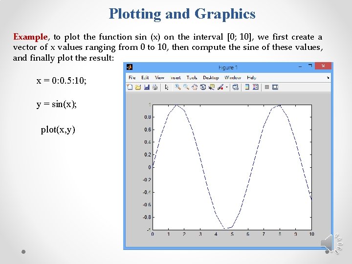
Plotting and Graphics Example, to plot the function sin (x) on the interval [0; 10], we first create a vector of x values ranging from 0 to 10, then compute the sine of these values, and finally plot the result: x = 0: 0. 5: 10; y = sin(x); plot(x, y)

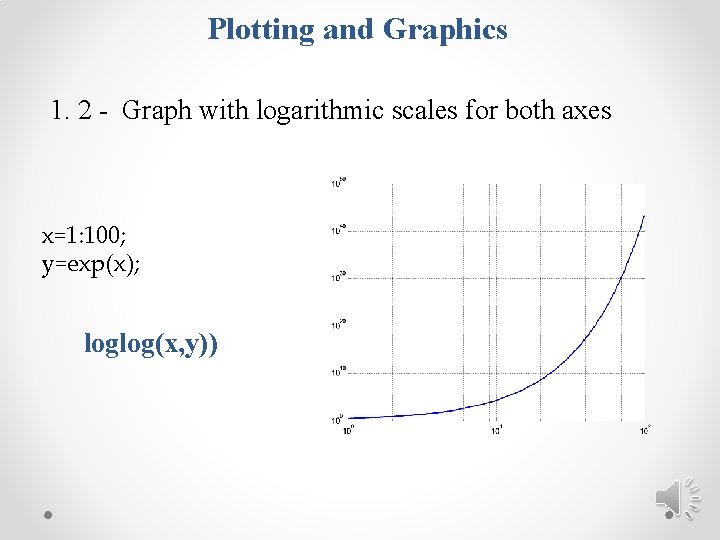
Plotting and Graphics 1. 2 - Graph with logarithmic scales for both axes x=1: 100; y=exp(x); loglog(x, y))

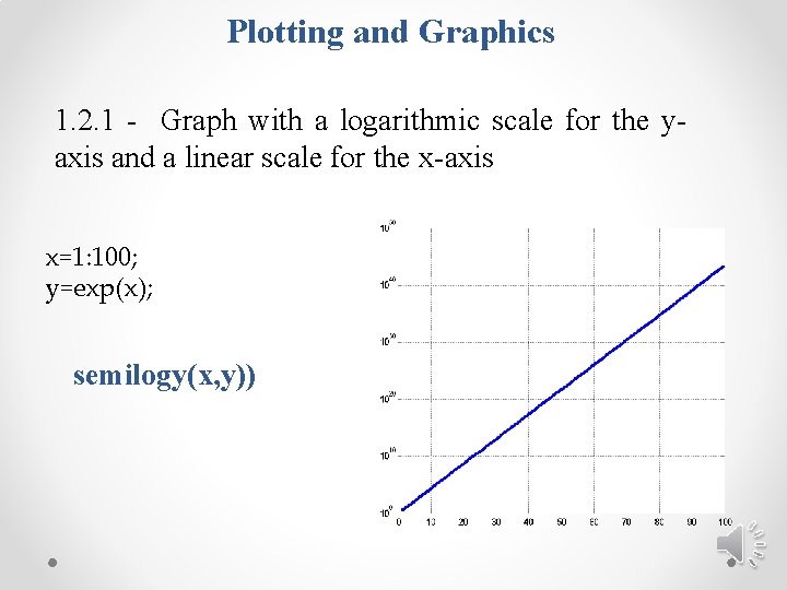
Plotting and Graphics 1. 2. 1 - Graph with a logarithmic scale for the yaxis and a linear scale for the x-axis x=1: 100; y=exp(x); semilogy(x, y))

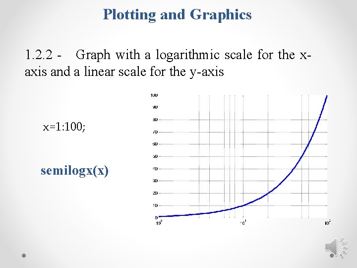
Plotting and Graphics 1. 2. 2 - Graph with a logarithmic scale for the xaxis and a linear scale for the y-axis x=1: 100; semilogx(x)

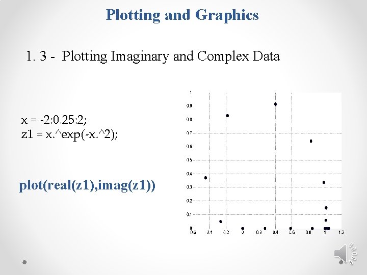
Plotting and Graphics 1. 3 - Plotting Imaginary and Complex Data x = -2: 0. 25: 2; z 1 = x. ^exp(-x. ^2); plot(real(z 1), imag(z 1))

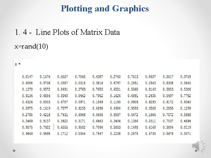
Plotting and Graphics 1. 4 - Line Plots of Matrix Data x=rand(10)

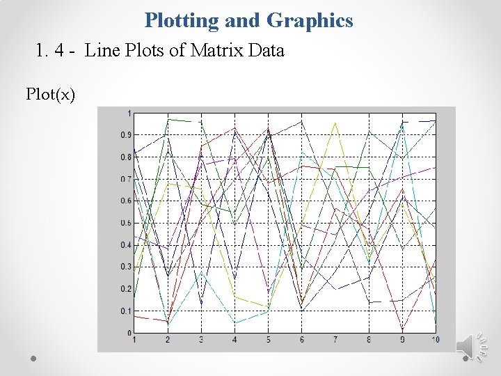
Plotting and Graphics 1. 4 - Line Plots of Matrix Data Plot(x)

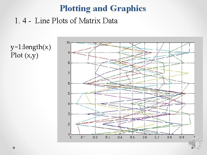
Plotting and Graphics 1. 4 - Line Plots of Matrix Data y=1: length(x) Plot (x, y)

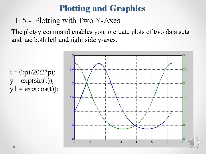
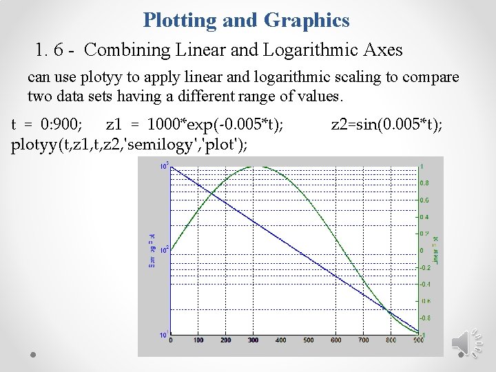
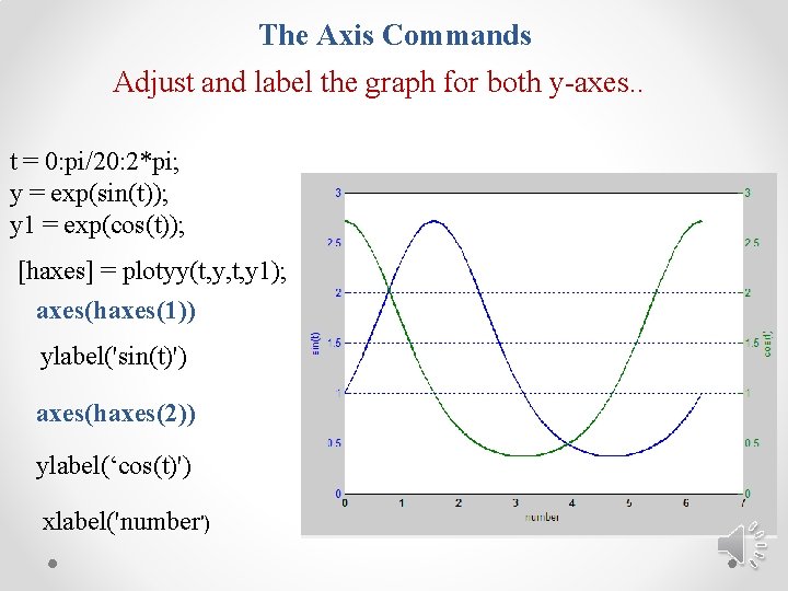
Plotting and Graphics 1. 5 - Plotting with Two Y-Axes The plotyy command enables you to create plots of two data sets and use both left and right side y-axes. t = 0: pi/20: 2*pi; y = exp(sin(t)); y 1 = exp(cos(t));

Plotting and Graphics 1. 6 - Combining Linear and Logarithmic Axes can use plotyy to apply linear and logarithmic scaling to compare two data sets having a different range of values. t = 0: 900; z 1 = 1000*exp(-0. 005*t); plotyy(t, z 1, t, z 2, 'semilogy', 'plot'); z 2=sin(0. 005*t);
![Plotting and Graphics 2 Polar plots theta 0 pi90 2pi r Plotting and Graphics 2 - Polar plots theta = [0: pi/90: 2*pi]; r =](https://slidetodoc.com/presentation_image_h2/a6fb44fcab4bb9ee57f66be49326d0d9/image-15.jpg)
Plotting and Graphics 2 - Polar plots theta = [0: pi/90: 2*pi]; r = a*theta; plot(theta, r) polar ( theta, r)
![Plotting and Graphics 3 Bar plots Vertical Bar plots x 1 5 Plotting and Graphics 3 - Bar plots Vertical Bar plots x = [1: 5];](https://slidetodoc.com/presentation_image_h2/a6fb44fcab4bb9ee57f66be49326d0d9/image-16.jpg)
Plotting and Graphics 3 - Bar plots Vertical Bar plots x = [1: 5]; y = [50, 98, 75, 80, 98]; bar(x, y)
![Plotting and Graphics Horizontal Bar plots x 1 5 y 50 98 Plotting and Graphics Horizontal Bar plots x = [1: 5]; y = [50, 98,](https://slidetodoc.com/presentation_image_h2/a6fb44fcab4bb9ee57f66be49326d0d9/image-17.jpg)
Plotting and Graphics Horizontal Bar plots x = [1: 5]; y = [50, 98, 75, 80, 98]; barh(x, y)
![Plotting and Graphics Adding the name of bar Y 70 85 75 90 Plotting and Graphics Adding the name of bar Y = [70 85 75 90];](https://slidetodoc.com/presentation_image_h2/a6fb44fcab4bb9ee57f66be49326d0d9/image-18.jpg)
Plotting and Graphics Adding the name of bar Y = [70 85 75 90]; h = bar(Y); l = cell(1, 4); l{1}='Ahmed'; l{2}='Mohmmad'; l{3}='Ali'; l{4}='Amr'; set(gca, 'xticklabel', l) grid on

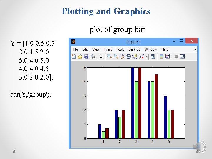
Plotting and Graphics plot of group bar Y = [1. 0 0. 5 0. 7 2. 0 1. 5 2. 0 5. 0 4. 5 3. 0 2. 0]; bar(Y, 'group');

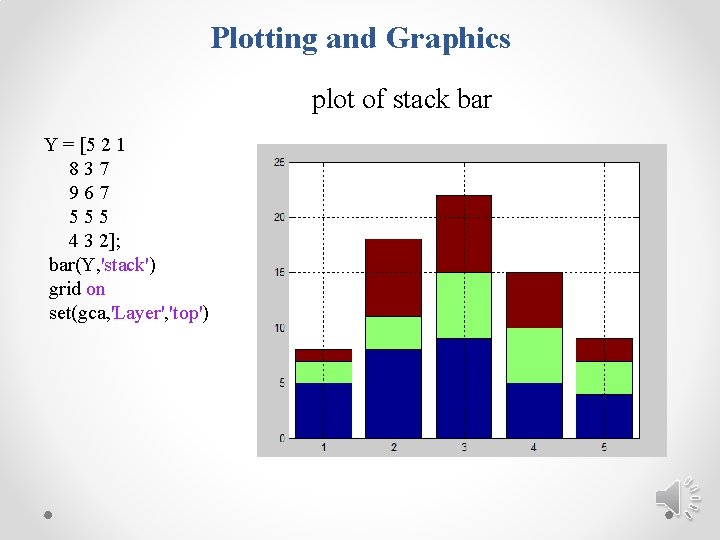
Plotting and Graphics plot of stack bar Y = [5 2 1 837 967 555 4 3 2]; bar(Y, 'stack') grid on set(gca, 'Layer', 'top')
![Plotting and Graphics 4 Stem plots t 0 5 200 f Plotting and Graphics 4 - Stem plots t = [0: 5: 200]; f =](https://slidetodoc.com/presentation_image_h2/a6fb44fcab4bb9ee57f66be49326d0d9/image-21.jpg)
Plotting and Graphics 4 - Stem plots t = [0: 5: 200]; f = exp(-0. 01*t). *sin(t/4) plot(t, f) stem(t, f)
![Plotting and Graphics 5 contour plots x y meshgrid5 0 1 5 Plotting and Graphics 5 - contour plots [x, y] = meshgrid(-5: 0. 1: 5,](https://slidetodoc.com/presentation_image_h2/a6fb44fcab4bb9ee57f66be49326d0d9/image-22.jpg)
Plotting and Graphics 5 - contour plots [x, y] = meshgrid(-5: 0. 1: 5, -3: 0. 1: 3); z = x. ^2+y. ^2; contour(x, y, z)

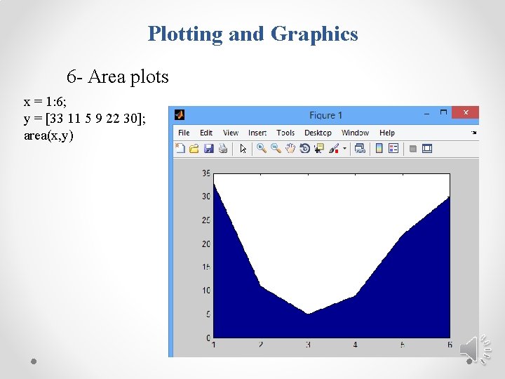
Plotting and Graphics 6 - Area plots x = 1: 6; y = [33 11 5 9 22 30]; area(x, y)

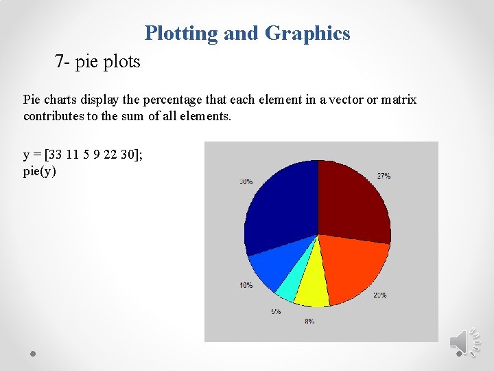
Plotting and Graphics 7 - pie plots Pie charts display the percentage that each element in a vector or matrix contributes to the sum of all elements. y = [33 11 5 9 22 30]; pie(y)

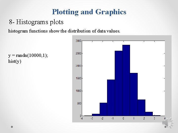
Plotting and Graphics 8 - Histograms plots histogram functions show the distribution of data values. y = randn(10000, 1); hist(y)

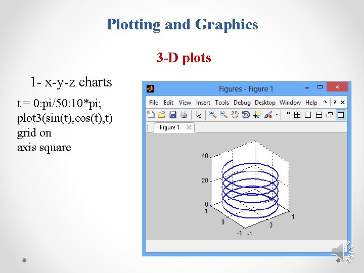
Plotting and Graphics 3 -D plots 1 - x-y-z charts t = 0: pi/50: 10*pi; plot 3(sin(t), cos(t), t) grid on axis square
![Plotting and Graphics 2 Contour plots x ymeshgridpi 0 1 pi zsinx sincy Plotting and Graphics 2 - Contour plots [x, y]=meshgrid(-pi: 0. 1: pi); z=sin(x). *sinc(y);](https://slidetodoc.com/presentation_image_h2/a6fb44fcab4bb9ee57f66be49326d0d9/image-27.jpg)
Plotting and Graphics 2 - Contour plots [x, y]=meshgrid(-pi: 0. 1: pi); z=sin(x). *sinc(y); mesh(z);

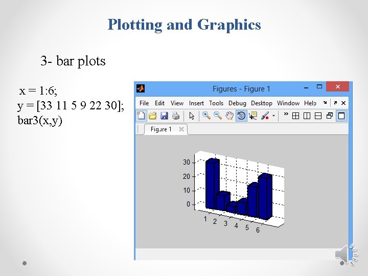
Plotting and Graphics 3 - bar plots x = 1: 6; y = [33 11 5 9 22 30]; bar 3(x, y)

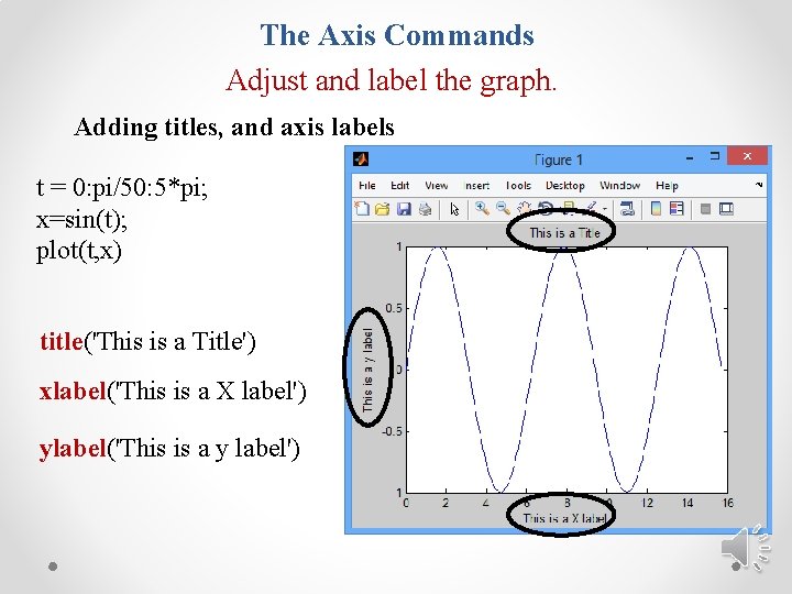
The Axis Commands Adjust and label the graph. Adding titles, and axis labels t = 0: pi/50: 5*pi; x=sin(t); plot(t, x) title('This is a Title') xlabel('This is a X label') ylabel('This is a y label')

The Axis Commands Adjust and label the graph for both y-axes. . t = 0: pi/20: 2*pi; y = exp(sin(t)); y 1 = exp(cos(t)); [haxes] = plotyy(t, y, t, y 1); axes(haxes(1)) ylabel('sin(t)') axes(haxes(2)) ylabel(‘cos(t)') xlabel('number')

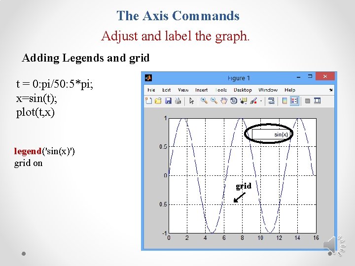
The Axis Commands Adjust and label the graph. Adding Legends and grid t = 0: pi/50: 5*pi; x=sin(t); plot(t, x) legend('sin(x)') grid on grid

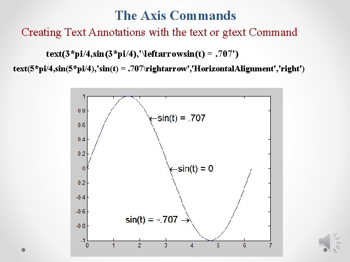
The Axis Commands Creating Text Annotations with the text or gtext Command text(3*pi/4, sin(3*pi/4), 'leftarrowsin(t) =. 707') text(5*pi/4, sin(5*pi/4), 'sin(t) =. 707rightarrow', 'Horizontal. Alignment', 'right')

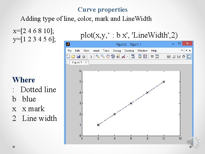
Curve properties Adding type of line, color, mark and Line. Width x=[2 4 6 8 10]; y=[1 2 3 4 5 6]; Where : Dotted line b blue x x mark 2 Line width plot(x, y, ‘ : b x', 'Line. Width', 2)

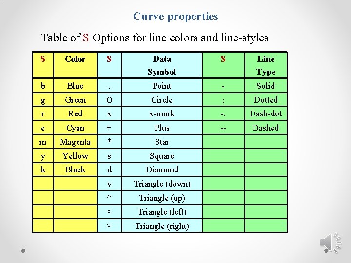
Curve properties Table of S Options for line colors and line-styles S Color S Data Symbol S Line Type b Blue . Point - Solid g Green O Circle : Dotted r Red x x-mark -. Dash-dot c Cyan + Plus -- Dashed m Magenta * Star y Yellow s Square k Black d Diamond v Triangle (down) ^ Triangle (up) < Triangle (left) > Triangle (right)
![Setting Axis Limit x 0 0 01 5 y sin2x 3 Setting Axis Limit x = [0: 0. 01: 5]; y = sin(2*x + 3);](https://slidetodoc.com/presentation_image_h2/a6fb44fcab4bb9ee57f66be49326d0d9/image-35.jpg)
Setting Axis Limit x = [0: 0. 01: 5]; y = sin(2*x + 3); plot(x, y) axis([1 4 0 1]) AXIS ([XMIN XMAX YMIN YMAX])
![Setting Axis Limit x 0 0 01 5 y sin2x 3 Setting Axis Limit x = [0: 0. 01: 5]; y = sin(2*x + 3);](https://slidetodoc.com/presentation_image_h2/a6fb44fcab4bb9ee57f66be49326d0d9/image-36.jpg)
Setting Axis Limit x = [0: 0. 01: 5]; y = sin(2*x + 3); plot(x, y) xlim ([1 4]) ylim ([0 1])

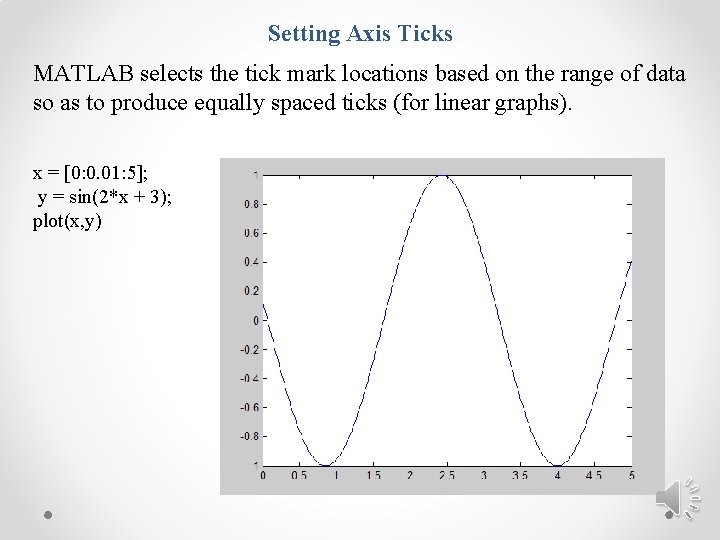
Setting Axis Ticks MATLAB selects the tick mark locations based on the range of data so as to produce equally spaced ticks (for linear graphs). x = [0: 0. 01: 5]; y = sin(2*x + 3); plot(x, y)
![Setting Axis Ticks setgca xtick 1 2 3 4 5 setgca ytick 1 Setting Axis Ticks set(gca, 'xtick', [1 2 3 4 5 ]) set(gca, 'ytick', [-1](https://slidetodoc.com/presentation_image_h2/a6fb44fcab4bb9ee57f66be49326d0d9/image-38.jpg)
Setting Axis Ticks set(gca, 'xtick', [1 2 3 4 5 ]) set(gca, 'ytick', [-1 -0. 5 0 0. 5 1])

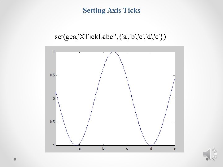
Setting Axis Ticks set(gca, 'XTick. Label', {'a', 'b', 'c', 'd', 'e'})