PIE CHARTS INTERPRETING EXAMPLE 1 30 cars 1



- Slides: 13

PIE CHARTS INTERPRETING EXAMPLE 1 30 cars 1) What is the mode car colour? Black 2) Which colour is represented by the orange sector of the pie chart? Other 3) What fraction of cars were black? = 25% 4) What percentage were either silver or blue? 5) 30 cars were black, how many were surveyed altogether? 30 + 30 = 60 cars

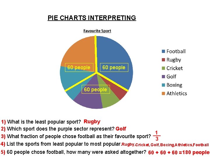
PIE CHARTS INTERPRETING 60 people 1) What is the least popular sport? Rugby 2) Which sport does the purple sector represent? Golf 3) What fraction of people chose football as their favourite sport? 4) List the sports from least popular to most popular. Rugby, Cricket, Golf, Boxing, Athletics, Football 5) 60 people chose football, how many were asked altogether? 60 + 60 = 180 people

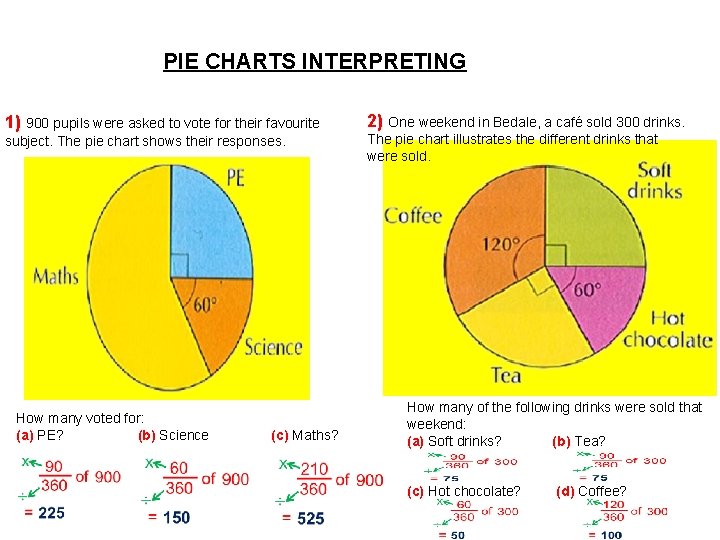
PIE CHARTS INTERPRETING 1) 900 pupils were asked to vote for their favourite 2) One weekend in Bedale, a café sold 300 drinks. subject. The pie chart shows their responses. The pie chart illustrates the different drinks that were sold. How many voted for: (a) PE? (b) Science (c) Maths? How many of the following drinks were sold that weekend: (a) Soft drinks? (b) Tea? (c) Hot chocolate? (d) Coffee?

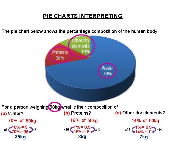
PIE CHARTS INTERPRETING The pie chart below shows the percentage composition of the human body. For a person weighing 50 kg what is their composition of : (c) Other dry elements? (b) Proteins? (a) Water? 16% of 50 kg 14% of 50 kg 70% of 50 kg x 7 10% = 5 70% = 35 35 kg x 7 x 16 1% = 0. 5 16% = 8 8 kg x 16 x 14 1% = 0. 5 14% = 7 7 kg x 14

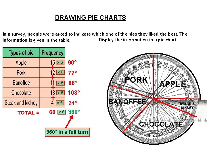
DRAWING PIE CHARTS In a survey, people were asked to indicate which one of the pies they liked the best. The Display the information in a pie chart. information is given in the table. TOTAL = + + 90° 60 360° 72° 66° PORK 108° 24° BANOFFEE APPLE . CHOCOLATE 360° in a full turn

Thurday 27 th June 2019. 27/06/2019 Constructing Pie Charts LO: to be able to construct pie charts given data. Keywords Sector percentage Compare • Success Criteria All: will know that a Pie chart is 360 degrees • Most: will know how to work out percentages of pie charts • Some: will be able to interpret Pie carts scaling up/ down

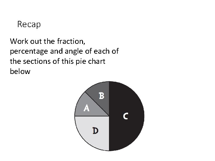
Recap Work out the fraction, percentage and angle of each of the sections of this pie chart below

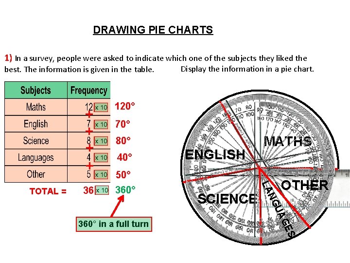
DRAWING PIE CHARTS 1) In a survey, people were asked to indicate which one of the subjects they liked the best. The information is given in the table. 36 360° 70° MATHS 80° 40° 50° . SCIENCE OTHER S GE UA NG 360° in a full turn ENGLISH LA TOTAL = + + 120° Display the information in a pie chart.

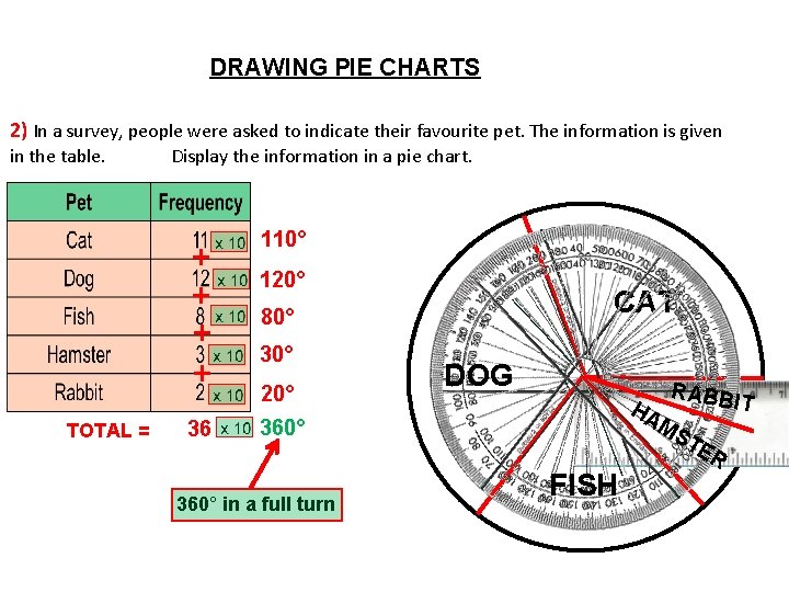
DRAWING PIE CHARTS 2) In a survey, people were asked to indicate their favourite pet. The information is given in the table. Display the information in a pie chart. + + TOTAL = 36 110° 120° CAT 80° 30° 20° DOG . 360° in a full turn FISH RABB IT HA MS TE R

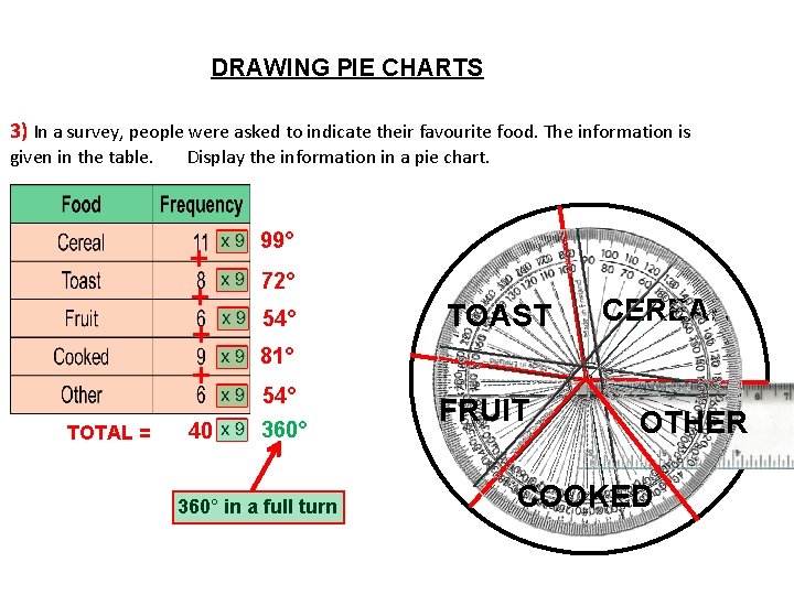
DRAWING PIE CHARTS 3) In a survey, people were asked to indicate their favourite food. The information is given in the table. TOTAL = Display the information in a pie chart. + + 99° 40 360° 72° 54° . 81° 54° 360° in a full turn CEREAL TOAST FRUIT OTHER COOKED

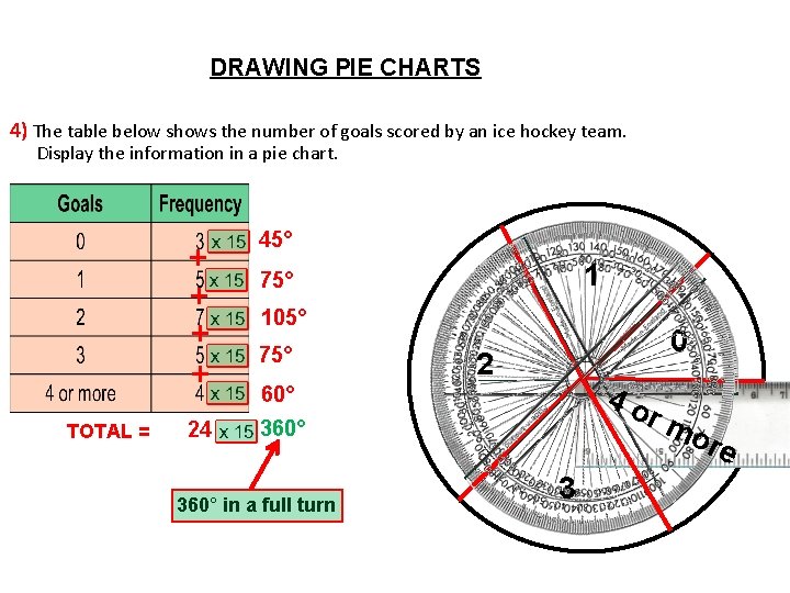
DRAWING PIE CHARTS 4) The table below shows the number of goals scored by an ice hockey team. Display the information in a pie chart. TOTAL = + + 45° 24 360° 1 75° 105° 75° . 2 60° 360° in a full turn 0 4 o rm ore 3

Design your own Pie chart to show your understanding. This can be based on anything. For example your favourite sport or colour. Things to remember: Create your table. Make sure your frequency can be added together and then divide 360 by the sum. Work out the angles. Measure the Angles. Don’t forget to label your diagram.

Extension: Worksheet with tables already drawn where pupils have to figure out the angle for themselves.